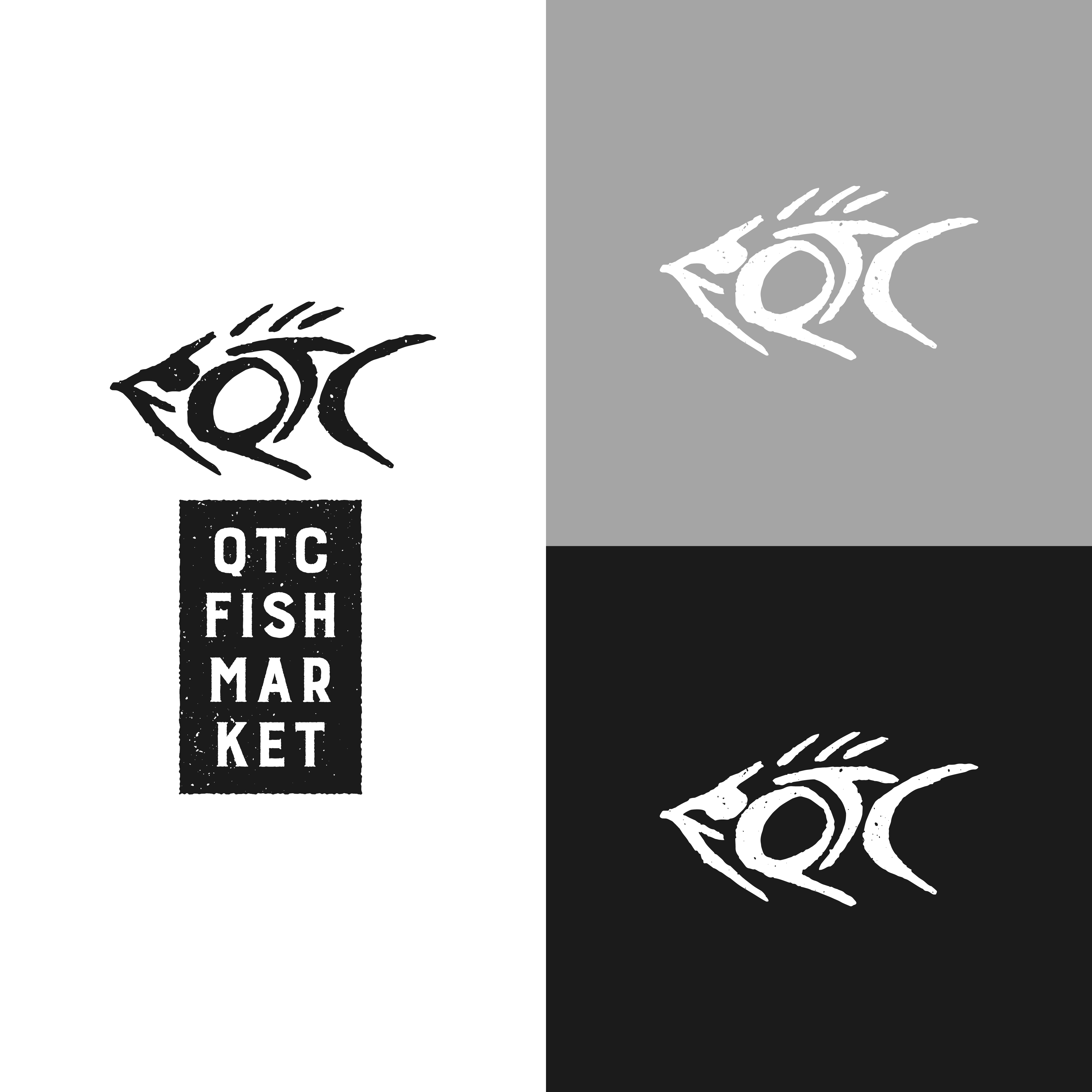
QTC Fish Market Logo
- Report
4 years ago by Enzo
I wanted to challenge myself by doing logo sprints when I have time to spare. For these sprints, I'm only allowing myself one hour to accomplish each brief. For this design, however, I spent an extra 20 minutes because I struggled with the placement of the typeface.
Just a disclaimer, this is not how a logo design project should be tackled and shouldn't rely solely on design aesthetics. This is just a way to test myself and see what kind of designs I could come up with under pressure.
Let me know what you think.
Just a disclaimer, this is not how a logo design project should be tackled and shouldn't rely solely on design aesthetics. This is just a way to test myself and see what kind of designs I could come up with under pressure.
Let me know what you think.
Hello,
I am Sook, founder of QTC Fish market. We are looking for someone that can design a professional logo for our Fish market. I think a lettermark will fit best. Would you be interested?
I am Sook, founder of QTC Fish market. We are looking for someone that can design a professional logo for our Fish market. I think a lettermark will fit best. Would you be interested?
 9 Likes
 3
3


