Anonymous
Posts
0
Likes
0
Liked Posts
4
Given Feedback
4
Feedback
This looks great! And if you're looking for a good app for designing logos, I suggest Inkscape.

2 years ago by Anonymous
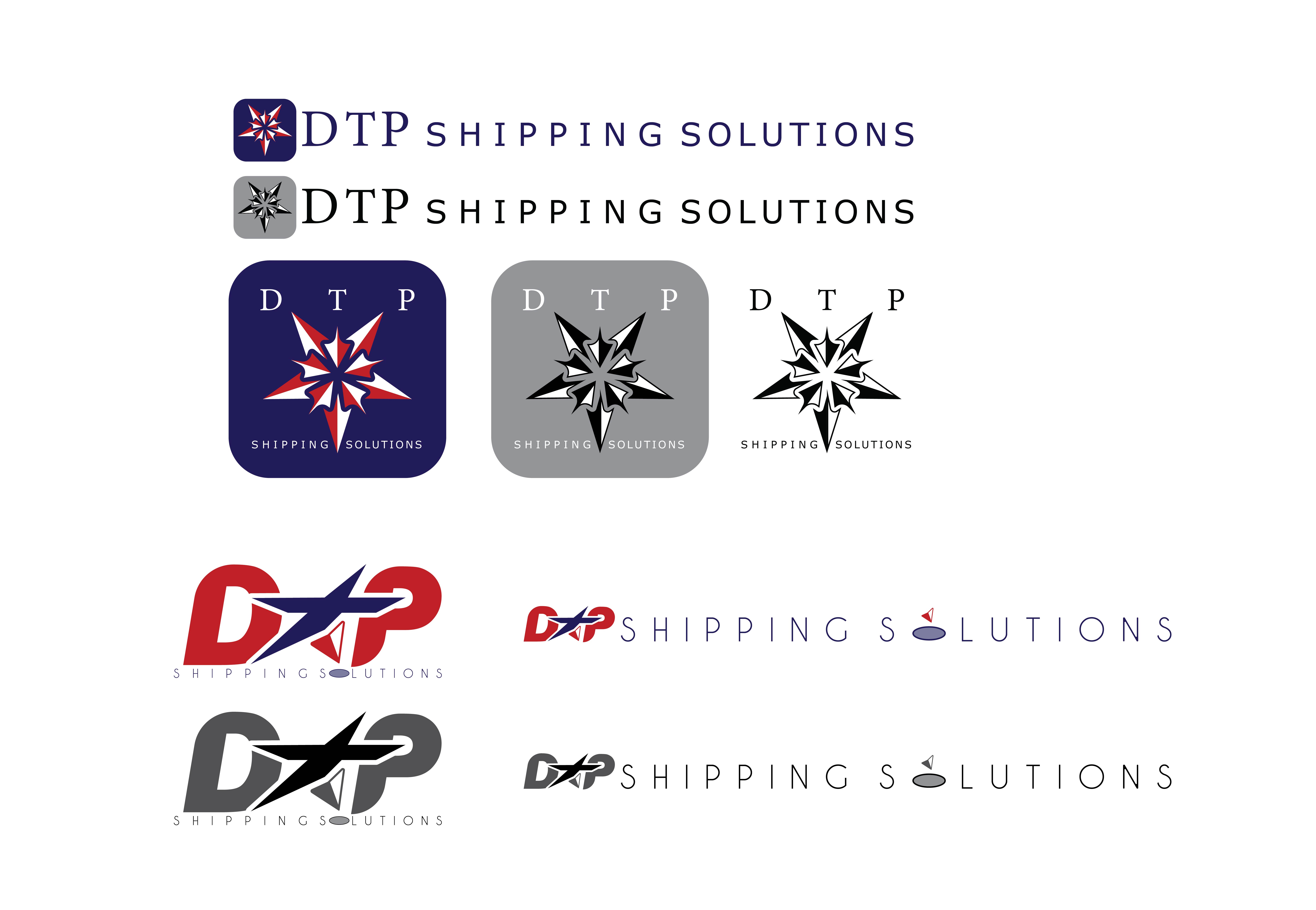
Isn't that just two logos? The brief asked for three.
Personally though, I love the one where you turned the T in DTP into a man.

2 years ago by Anonymous
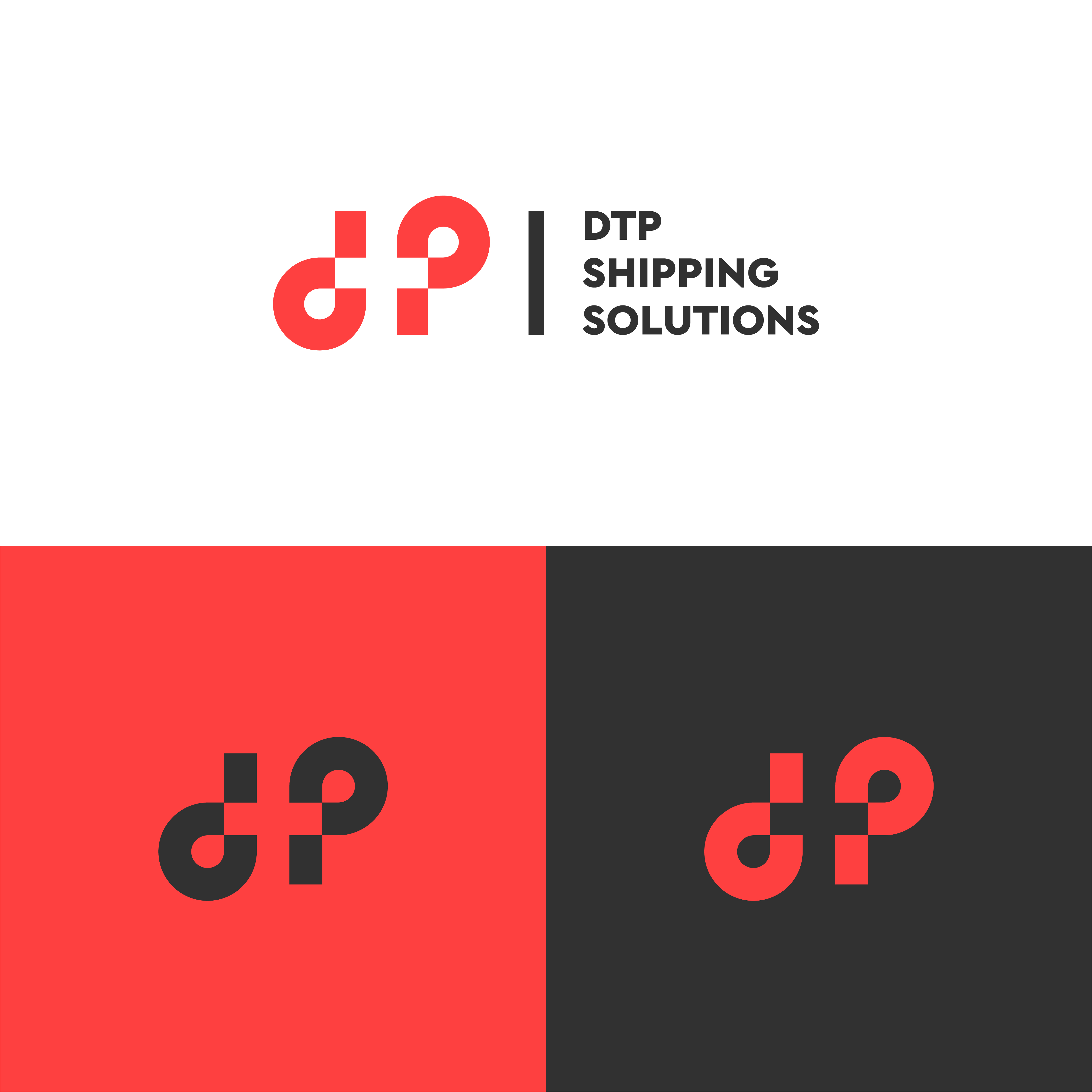
Negative space logos are really hard to get right - but they can look amazing when you do. Bravo!

2 years ago by Anonymous
Though this looks nice and isn't completely generic, I suggest you stay away from swooshes - they're way too common.

2 years ago by Anonymous