Ijeoma Theodora Osagie
Designer.
Posts
6
Likes
3
Liked Posts
21
Given Feedback
7
Feedback
Simple. Depicting comfort.
2 years ago by Ijeoma Theodora Osagie
Ok
2 years ago by Ijeoma Theodora Osagie
Very creative.

2 years ago by Ijeoma Theodora Osagie
Creative and simple. It may be confusing at first but after a second look, the beauty appears.
2 years ago by Ijeoma Theodora Osagie
Acceptable.
2 years ago by Ijeoma Theodora Osagie
Beautiful and creative.
2 years ago by Ijeoma Theodora Osagie
Cool.

2 years ago by Ijeoma Theodora Osagie
Posts
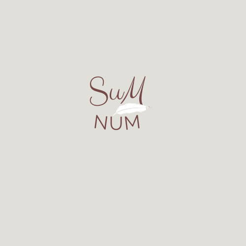
Sum-num
- Report
2 years ago by Ijeoma Theodora Osagie
Som-Numlogo
 Like
Like
 1
1
nice one
11 months ago by madhu - Reply
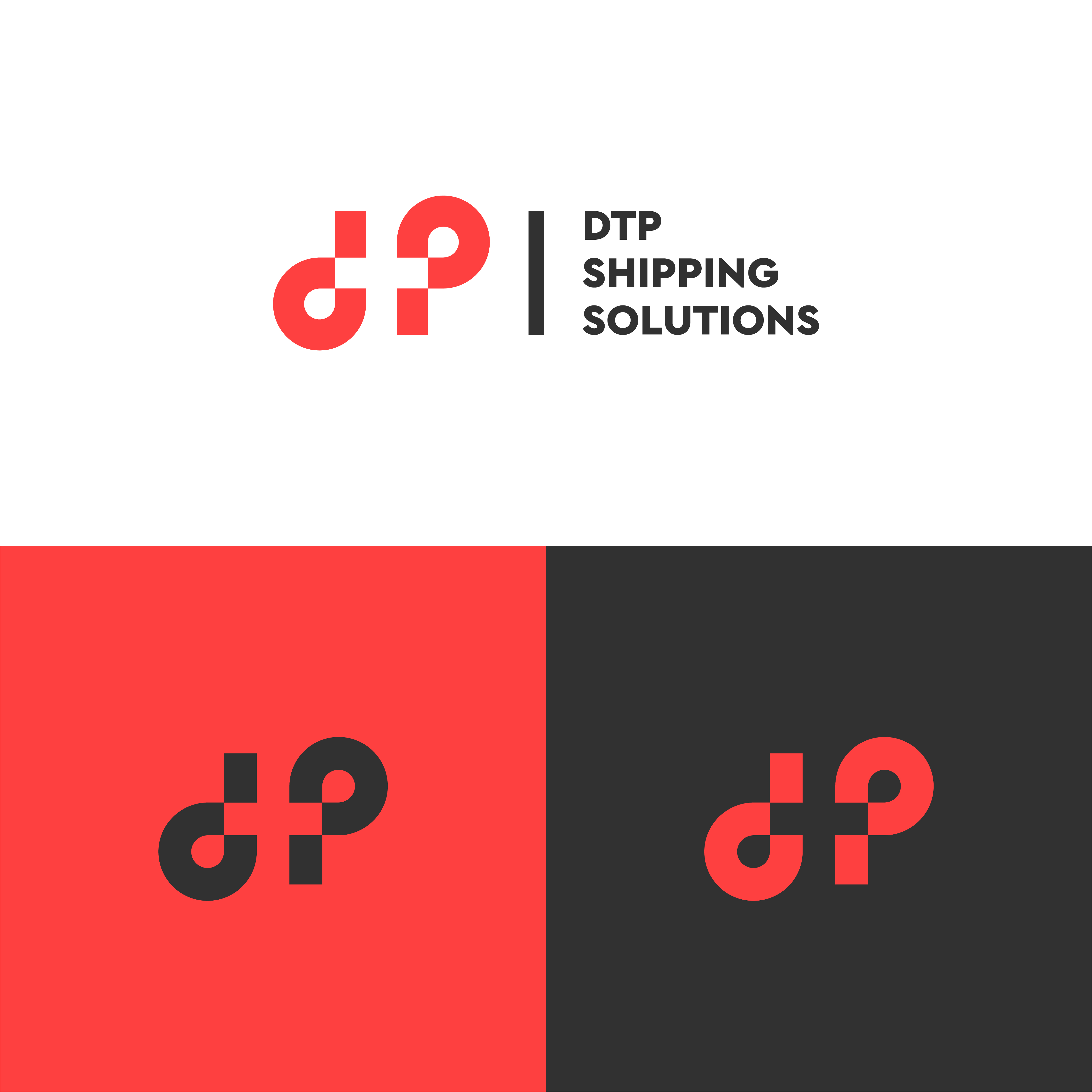
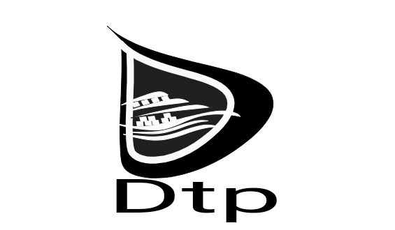
Dtp shipping solutions
- Report
2 years ago by Ijeoma Theodora Osagie
 1 Like
1
1 Like
1
nice work
11 months ago by madhu - Reply
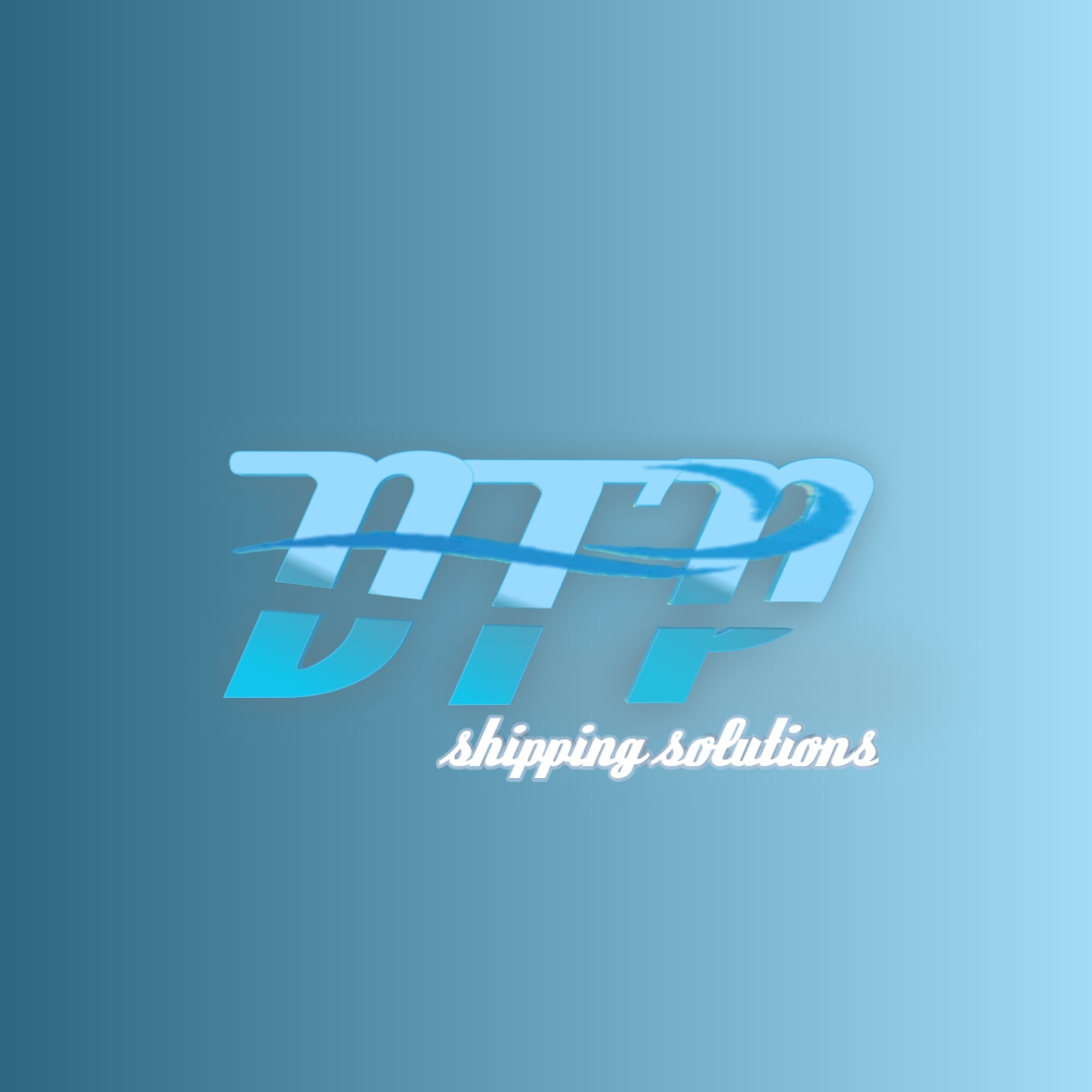
DTP Shipping Solutions
- Report
2 years ago by Ijeoma Theodora Osagie
Design 2 for DTP Shipping Solutions.
 Like
1
Like
1
Gradients are a no-go for logos, I would try using more solid colours to build and layer the design more. Also consider font choice, is a shipping company likely to use a script font? Also ask yourself what makes you think shipping in this logo? I know its difficult, but this should send you on the right path :-)
Well done though!
2 years ago by Heaven Persephone - Reply
DTP shipping company
- Report
2 years ago by Ijeoma Theodora Osagie
I tried to make this logo seem some enough considering shipping company logos are usually heavy looking. So a little anchor and waves to signify that it's a shipping company.
 Like
1
Like
1
Anchor and waves are not prominent enough. And the white contrasts with the black very strongly
10 months ago by Elizabeth Ko - Reply
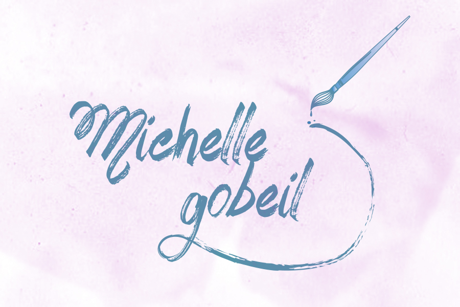
Michelle Gobeil
- Report
2 years ago by Ijeoma Theodora Osagie
Canva design.
Michelle Gobeillogo
 Like
1
Like
1
Wow
This very fine
10 months ago by Dichi - Reply