Abhilash Thekkel
Posts
0
Likes
0
Liked Posts
9
Given Feedback
6
Feedback
Great work!

4 years ago by Abhilash Thekkel
Good color selection. Keep it up.
4 years ago by Abhilash Thekkel
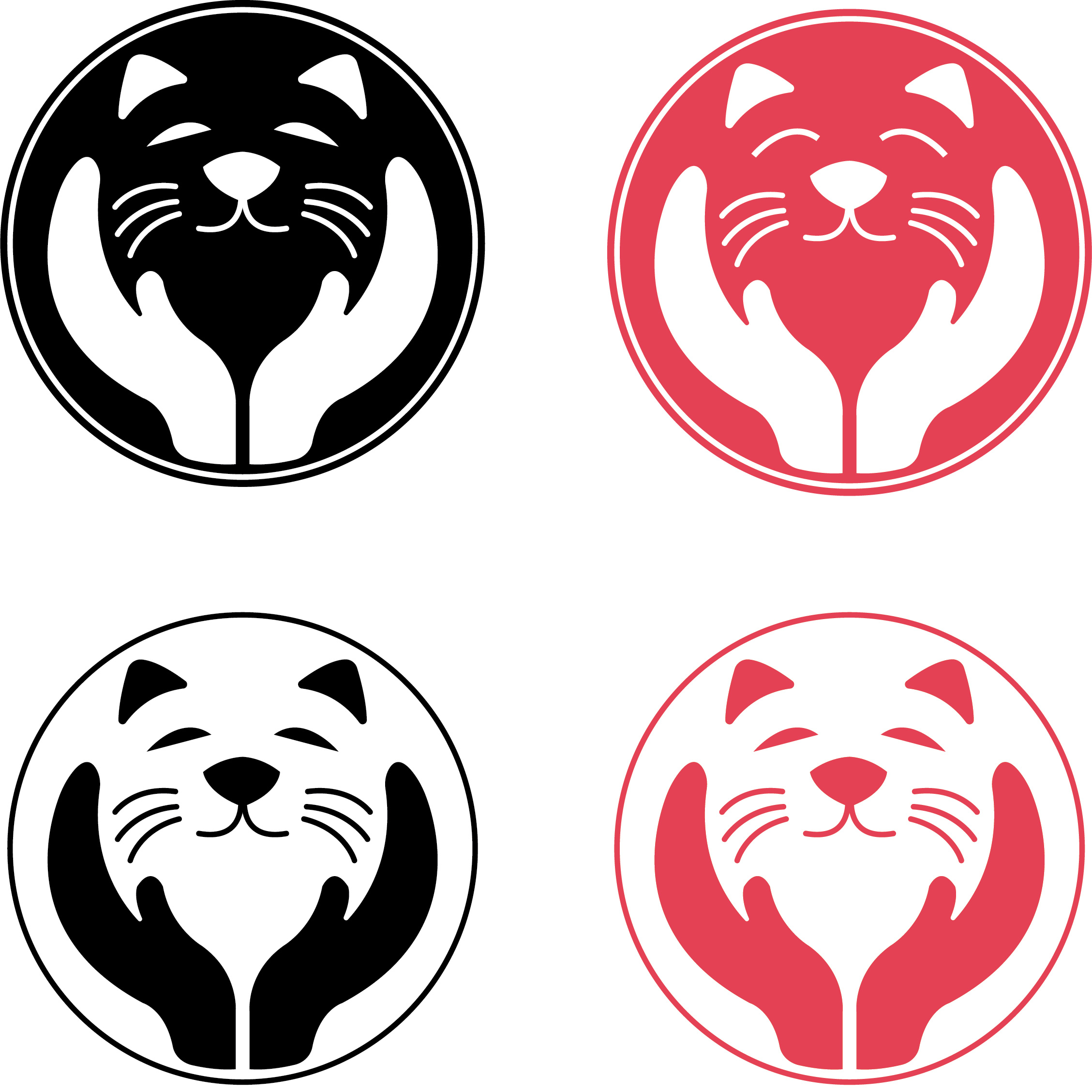
This is very cute, I was wondering how it will look without the outer circle.
4 years ago by Abhilash Thekkel
Very professional work.

4 years ago by Abhilash Thekkel
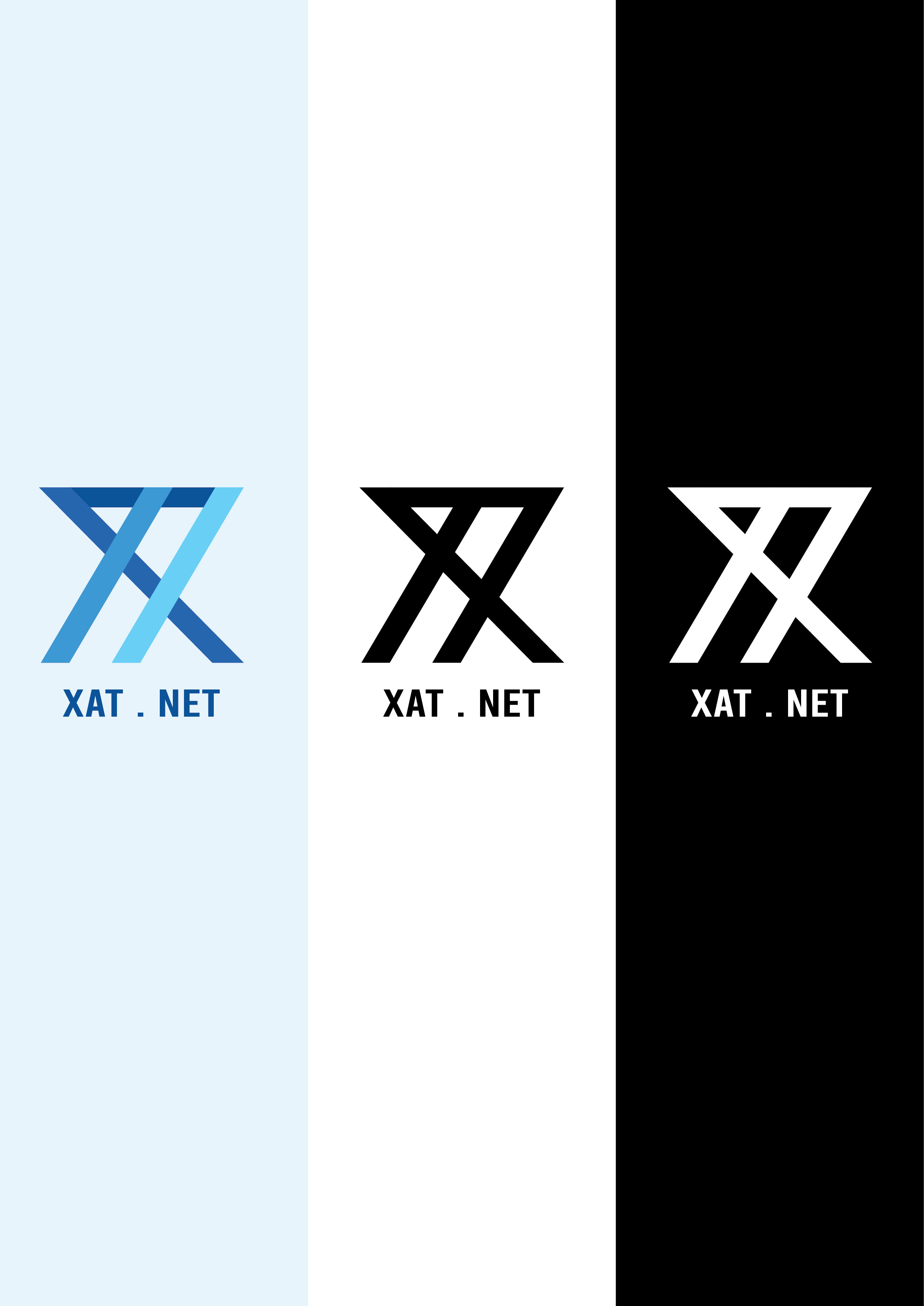
This looks great!! I think DTP. can be of a different font family. Preferably Sans Serif.

4 years ago by Abhilash Thekkel
The logo looks very good, I feel it would look a lot better if was 2px -3px thicker.
4 years ago by Abhilash Thekkel