Lan Gradi�ek
Posts
3
Likes
3
Liked Posts
5
Given Feedback
4
Feedback
Super nice design. Just out of curiosity, what program do you use?
4 years ago by Lan Gradi�ek
I personally would prefer flat colors here (and honestly on any logo). Granted I have no idea what it would look like without the gradients, and neither am I one, whoom's opinion you should take as fact. Regardless, geometrically it's damn genious :) .

4 years ago by Lan Gradi�ek
I don't know if I agree with your interpretation of the name, but I would have known this was a video game company immediately after seeing the logo, so good representation ;) .
4 years ago by Lan Gradi�ek
I can really see the left one on a neon sign outside :)
5 years ago by Lan Gradi�ek
Posts
Houston washing
- Report
Lan Gradi�ek • 4 years ago
"Hey,
I'm Nickie, owner of Houston Washing Service. We're looking for someone that can create a simple logo for our Washing Service. I think a lettermark will fit best. Would you be interested?"
Any critique would be greatly appreciatted :)
I'm Nickie, owner of Houston Washing Service. We're looking for someone that can create a simple logo for our Washing Service. I think a lettermark will fit best. Would you be interested?"
Any critique would be greatly appreciatted :)
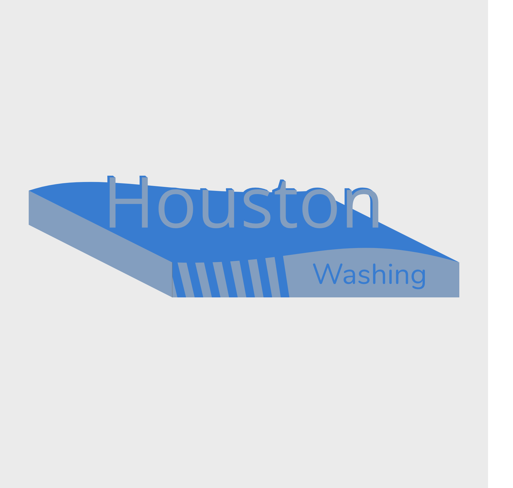


Could use a liiiiiiitle more contrast, old eyes might have a hard time seeing it. Also, having the text in the same perspective might help the design to look a bit more cohesive. However, I LOVE the wavy shape you used, your whole design is simple yet conveys some nice motion. Best of luck!
4 years ago by Kira K - Reply
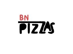
ZZ Cafetaria
- Report
Lan Gradi�ek • 4 years ago
The image is symbol for a photo of the cafetaria itself. I had to save it as a .jpg, to obey by the size limit. Any critic would be greatly appreciated :) .
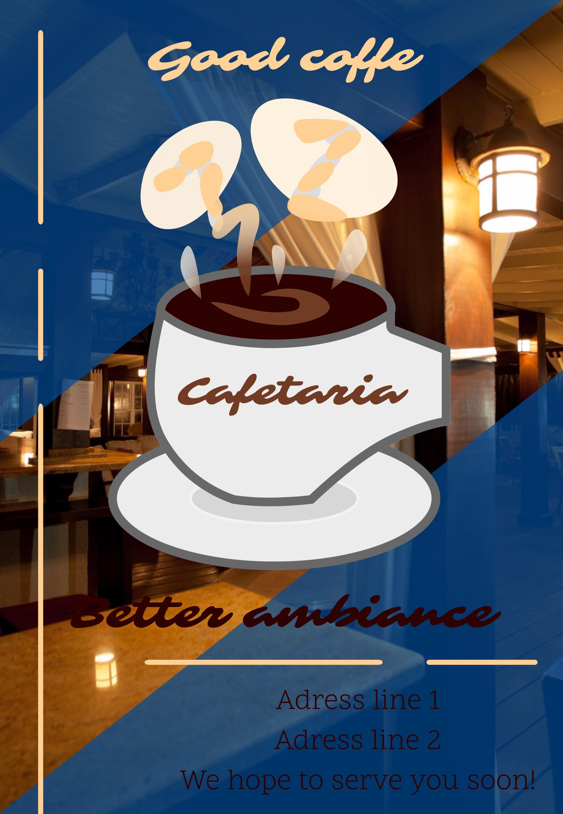

Great job! I just think the text is a bit hard to read. Maybe using a color like white would help give better contrast and easier readability. ?
4 years ago by Adetoro - Reply
New Dallas Bakery Logo
- Report
Lan Gradi�ek • 5 years ago
Client Briefing:
Hey There,
I'm Britta, creator of The New Dallas Bakery. I'm looking for someone that can make a good logo for my Bakery. I like pictorial marks. Would you be interested?
Hey There,
I'm Britta, creator of The New Dallas Bakery. I'm looking for someone that can make a good logo for my Bakery. I like pictorial marks. Would you be interested?
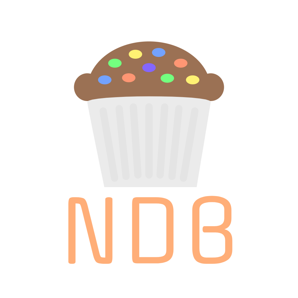

love this. maybe try putting NDB in the cakes case instead of the vertical lines. might look cool.
Also maybe change the colour of the dark blue sprinkle
4 years ago by Battery Barry - Reply
The logo is good, but you could make the pan a little bit shorter like a pie.
(This would make the logo more clean and more objective) - just my opinion i am not a the designer.
anyway your job is completed and the design is good :)
5 years ago by Thyago - Reply