Battery Barry
Posts
0
Likes
0
Liked Posts
10
Given Feedback
20
Feedback
I would define the Q a bit more.
just to differentiate between the A
4 years ago by Battery Barry
top notch
4 years ago by Battery Barry
love this.
great illustration
4 years ago by Battery Barry
love this. maybe try putting NDB in the cakes case instead of the vertical lines. might look cool.
Also maybe change the colour of the dark blue sprinkle

4 years ago by Battery Barry
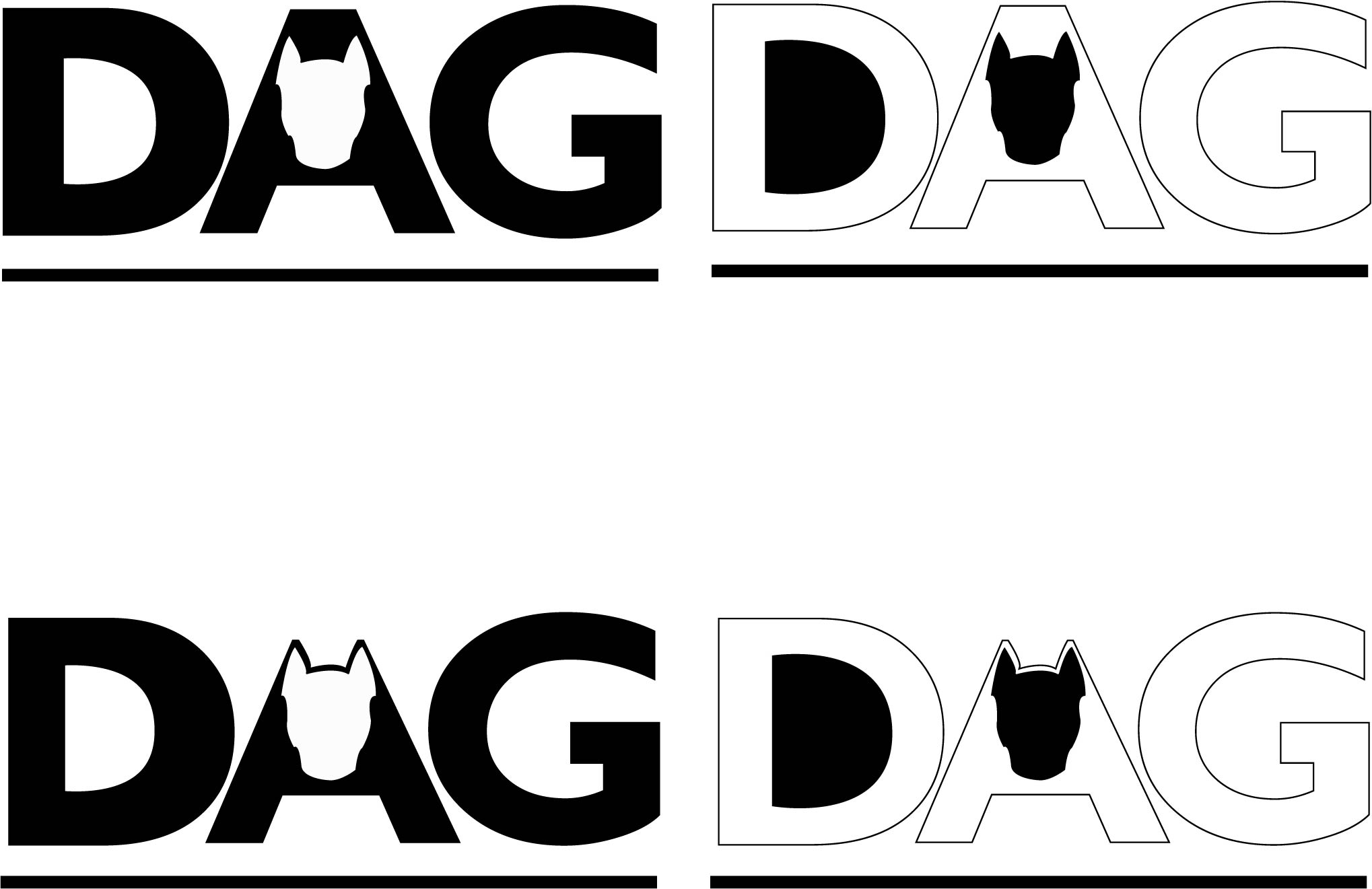
the black DAG works better for me. possibly the top left being the best one.
4 years ago by Battery Barry
love this design. the colours are great!
I would however use a bold font for this.
the 'sandwich bar' text is hard to read.
other than that, great job! well done
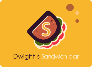
4 years ago by Battery Barry
maybe move OUSTON to the right a little and enlarge the font.

4 years ago by Battery Barry
Clever design. love the way the cutlery looks like carrots.
I would suggest to enlarge the catering rectangle a tiny bit and create more white space around 'catering'.

4 years ago by Battery Barry
great illustration. maybe fix the spike under the m in cream.

4 years ago by Battery Barry
very good cake illustration.
The name needs to be under the illustration here.
Always make sure the name is easy to read as this is the most important thing you want customers to notice.
I feel my head tilting every time I read the name.
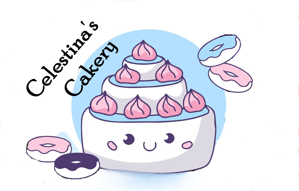
4 years ago by Battery Barry
I would try to have more white surrounding Elaina's Cafe.
maybe thin down the outer black ring and shrink the red circle a bit thus creating more space for the name.
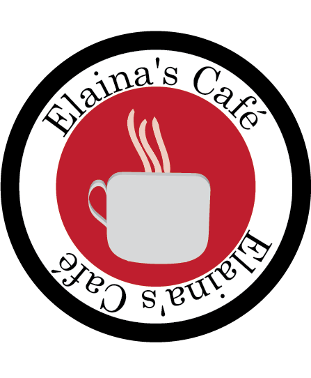
4 years ago by Battery Barry
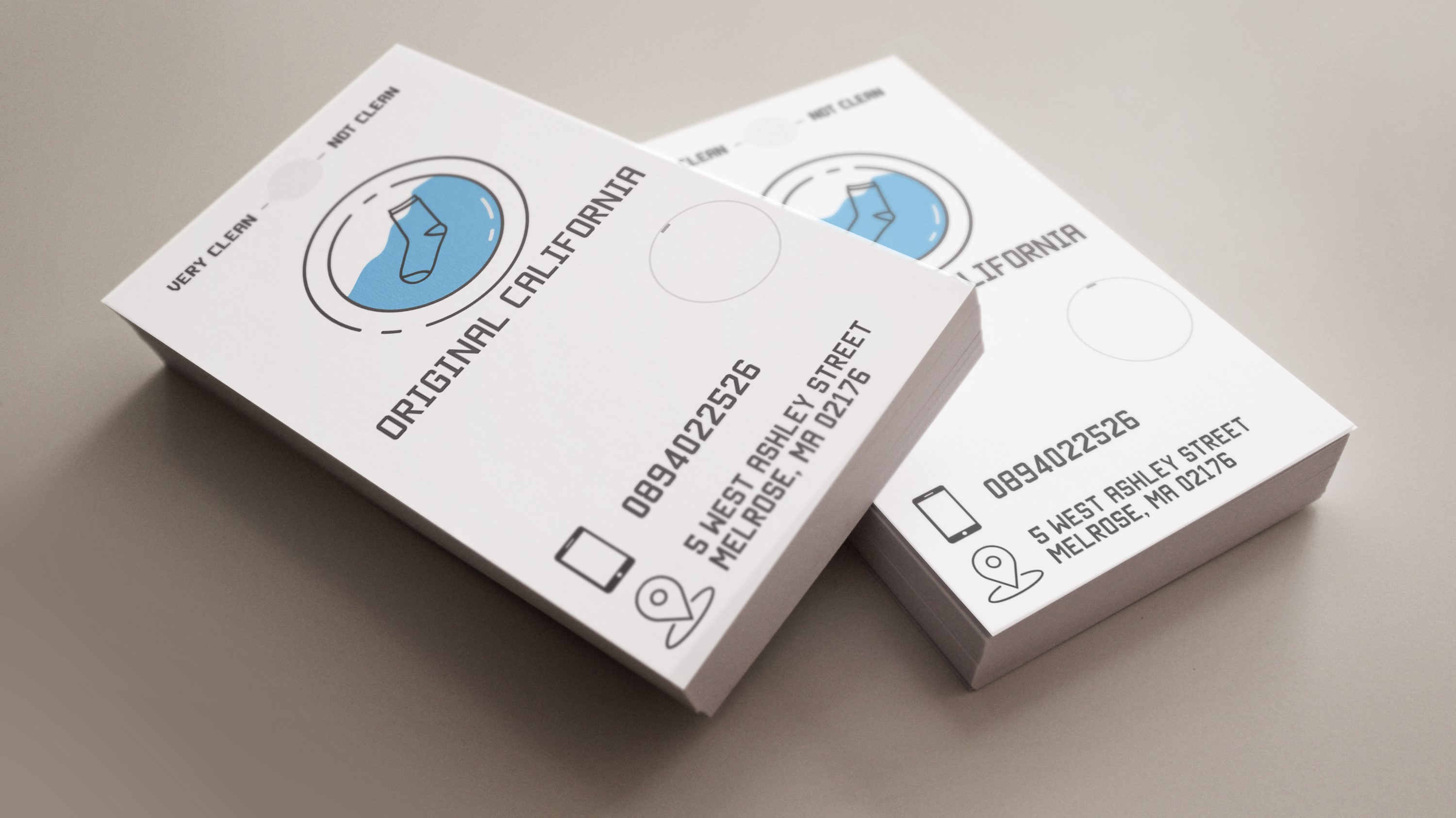
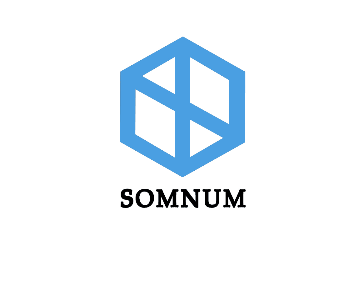
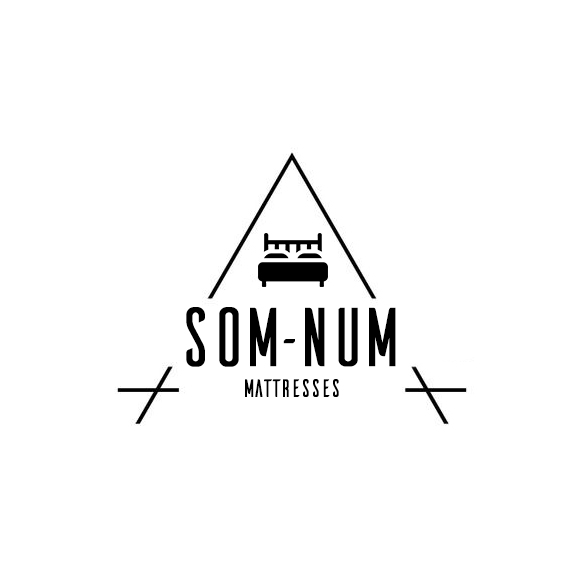
I wouldn't join the l and p in sleep. the som num with moon is really cool tho

4 years ago by Battery Barry
Very Classy design

4 years ago by Battery Barry
love this!!!
However I would just use a lighter shade of orange for the ring.
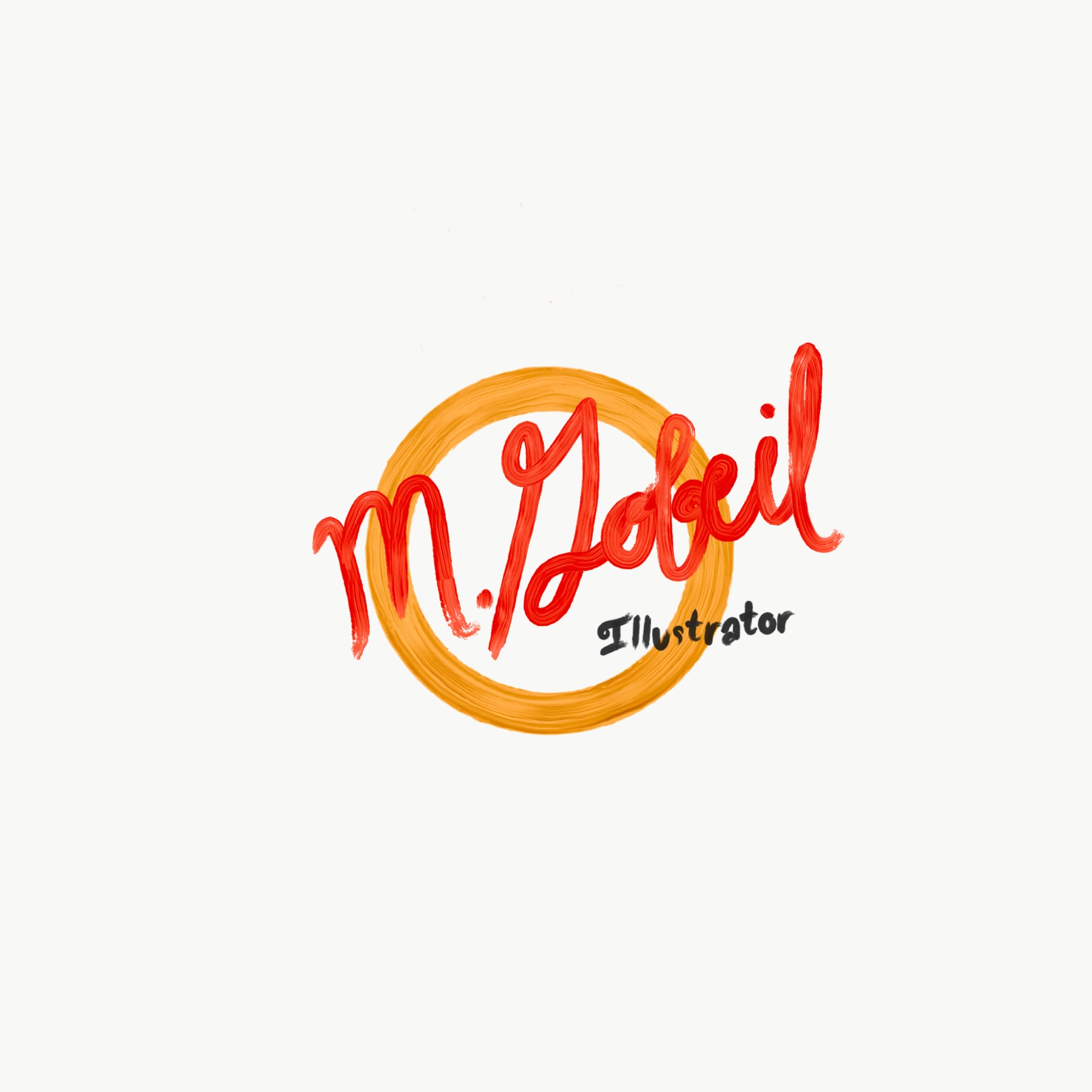
4 years ago by Battery Barry
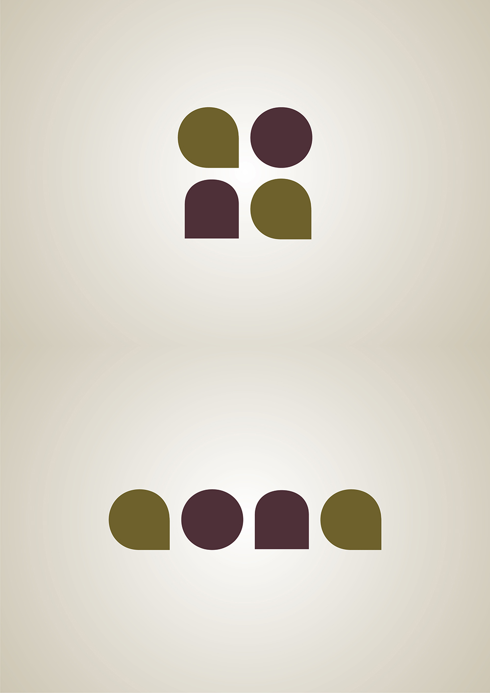
The simplicity of this logo really works for me.
I presume its meant to represent the quilt shapes on a mattress.
I would just suggest to use a different font with smooth, flowing letters.
4 years ago by Battery Barry
I really like this design. the colours work really well together.
I would suggest to simplify it a bit and just keep the hexagon with circles surrounding DPT.

4 years ago by Battery Barry
nice clean lines here. all works really well.
4 years ago by Battery Barry
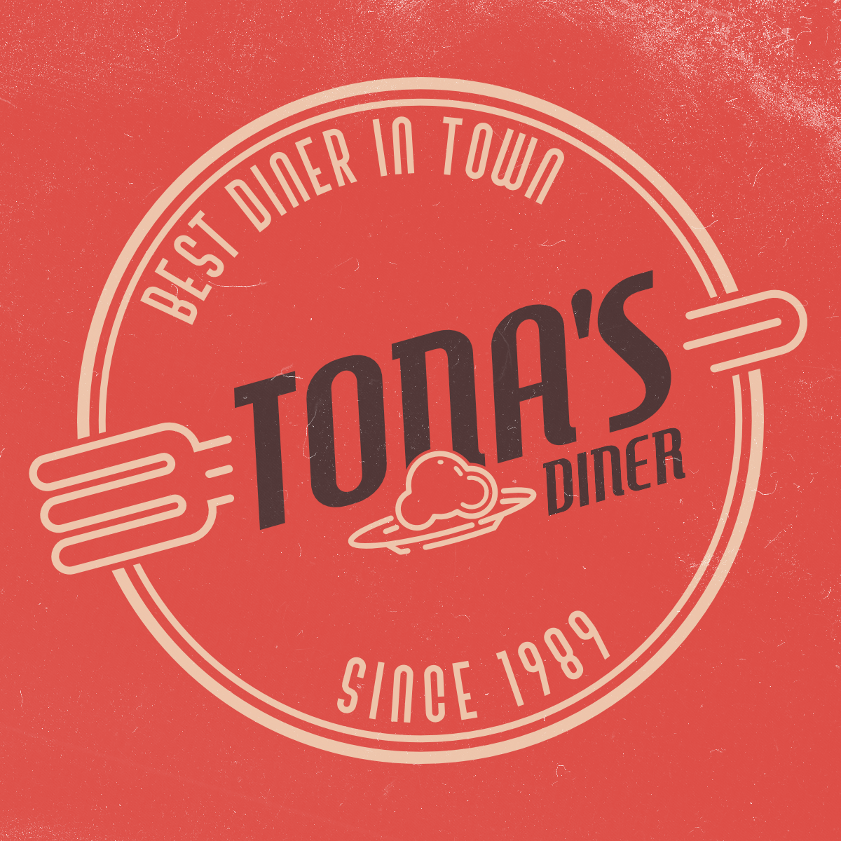
Very good work here. love the fork.
maybe move the food down from 'Tona'.
otherwise Tona might be read as toda.
Also you could include black in one of the outer rings, just to bring it all together.
4 years ago by Battery Barry
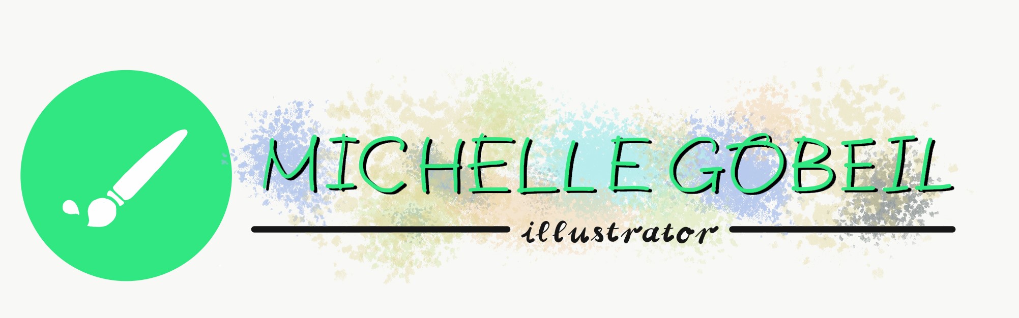
really good work here. I would suggest to use black for the font instead of green so it stands out more from the pastel in the background.
4 years ago by Battery Barry
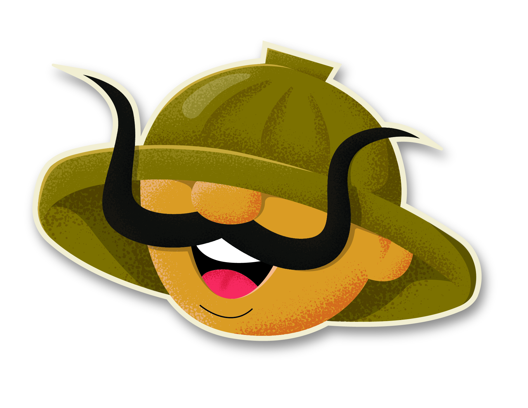
very clever design. love the simple icon like radio.
I would just suggest to make the radio speaker lines a bit more bold and also the white lines on the hut.
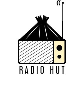
4 years ago by Battery Barry