BIKEPOINT logo design
- Report
Elena • 4 years ago
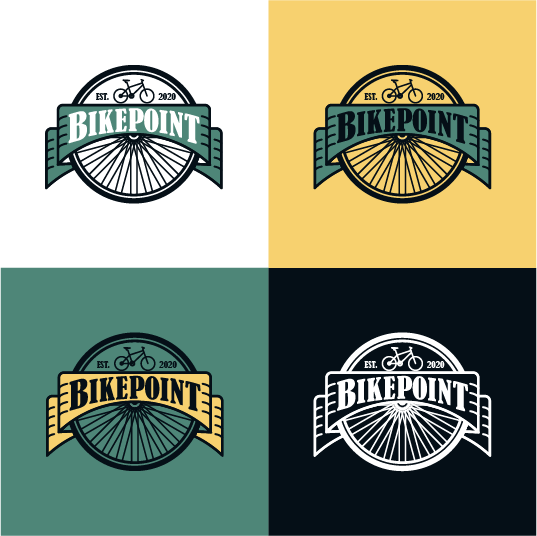
Client requested a logo for "Bikepoint". I wanted a batch-style logo, something that can be easily recognize on a park.
I'd love your feedback :)
I'd love your feedback :)
Very well done. You did the logo in different backgr how it should be done. Is easily recognisible and very related to what client requested. The black color is loosing in that green-ish backgr a bit. But overall looking ok.
2 years ago by Aurel - Reply
wow! this is really nice. i love the colors as well, really makes the work pop and easy to read. perhaps my only nitpick is making sure the bike is in contact with the border/line of the banner, it seems like in the other variants it's not touching. Otherwise, great work!

4 years ago by pndmx - Reply
great work keep it up.*would you like to give me feedback, check my recent works
4 years ago by kunal das - Reply
