Priyanka Salelkar
Posts
8
Likes
14
Liked Posts
6
Given Feedback
18
Feedback
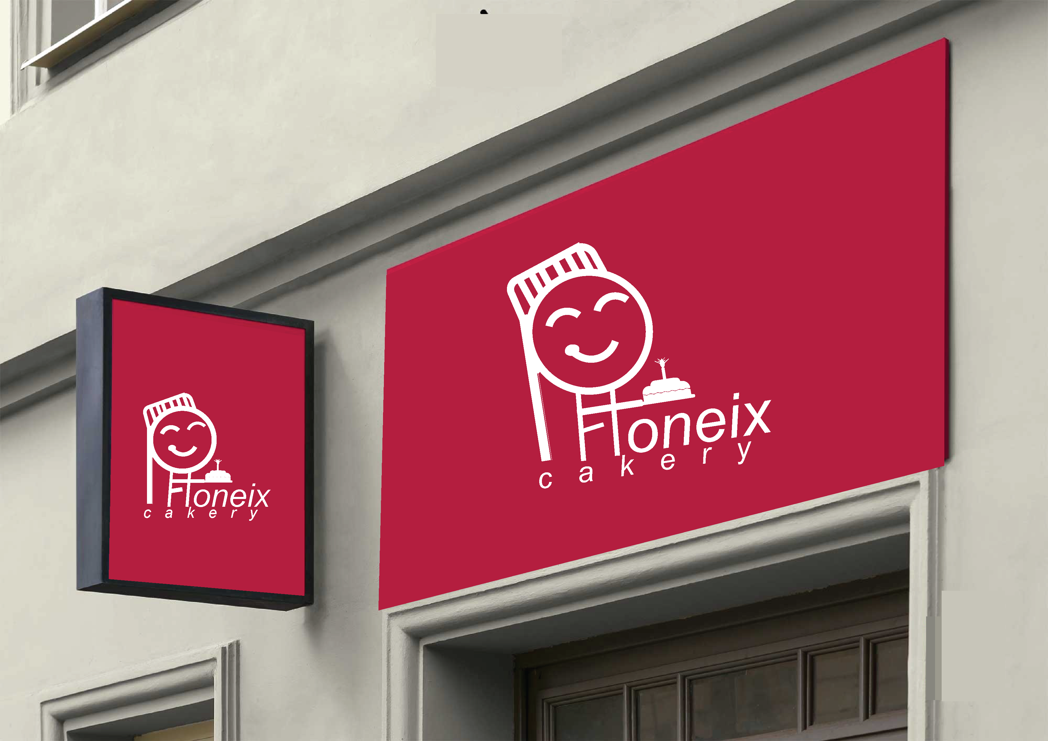
Such a cute and memorable mascot! The only thing is that I first read the logo as 'Foneix', but then thought maybe its an 'H', and finally got that its 'Phoneix'. So, however good the design idea be, if its harming the legibility, I think it should be altered or dropped. Also, all the letters don't have the same direction, so that can be improved.
2 years ago by Priyanka Salelkar
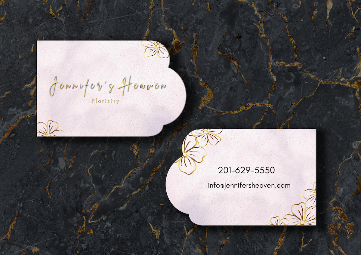
Love the brand mark - it is a line drawing giving a 3D effect, and is so uniquely memorable to identify the company with! But the business card should include details like phone number, email, address etc. as its main purpose is for people to know the contact details.
2 years ago by Priyanka Salelkar
Thank you! :)
2 years ago by Priyanka Salelkar
Great! Very clean and functional but you can the design more modern and interesting.
2 years ago by Priyanka Salelkar
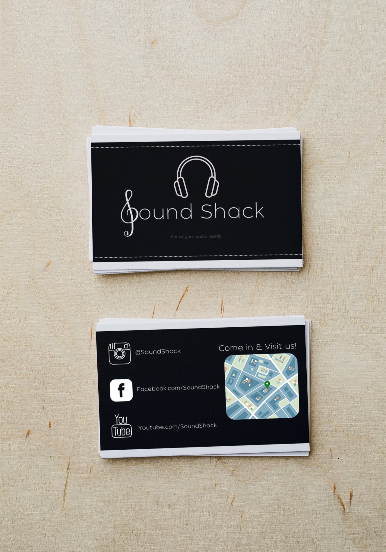
Great logo! The links are too widely spaced. Also, the maps are a heavy contrast, so if you can show the directions by line drawing, it would gel with the design. Instead of showing the links, only the social media logos can do the job of communicating that you can find us on these platforms. The back of the card can display only the directions and the social media, contact number and email can go with the logo. Sorry for bombarding with so many suggestions, but hope it helps!
2 years ago by Priyanka Salelkar
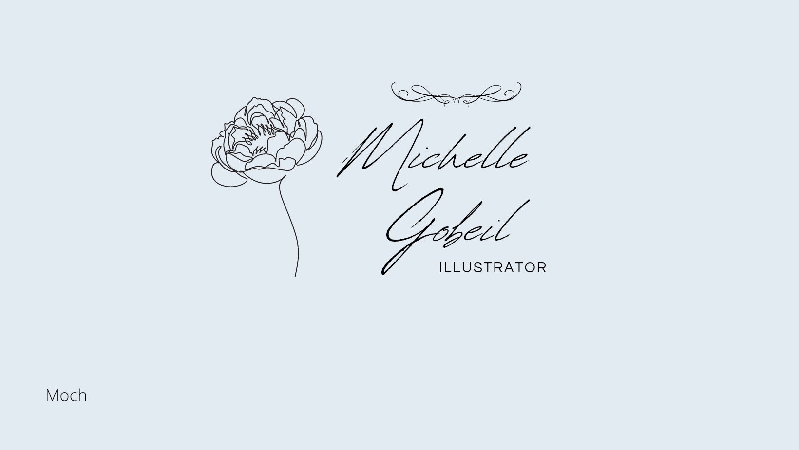
Beautiful! I feel the curvy lines on the top are unnecessary and confuse the design with too many elements. Gobeil and Illustrator can be moved to the left, so that there is no space gap between the flower and name. You can try different placements and see if all the elements lockup and fit together as one design piece. Great otherwise :)
2 years ago by Priyanka Salelkar
Thank you!
2 years ago by Priyanka Salelkar
Appreciate your feedback :)
2 years ago by Priyanka Salelkar
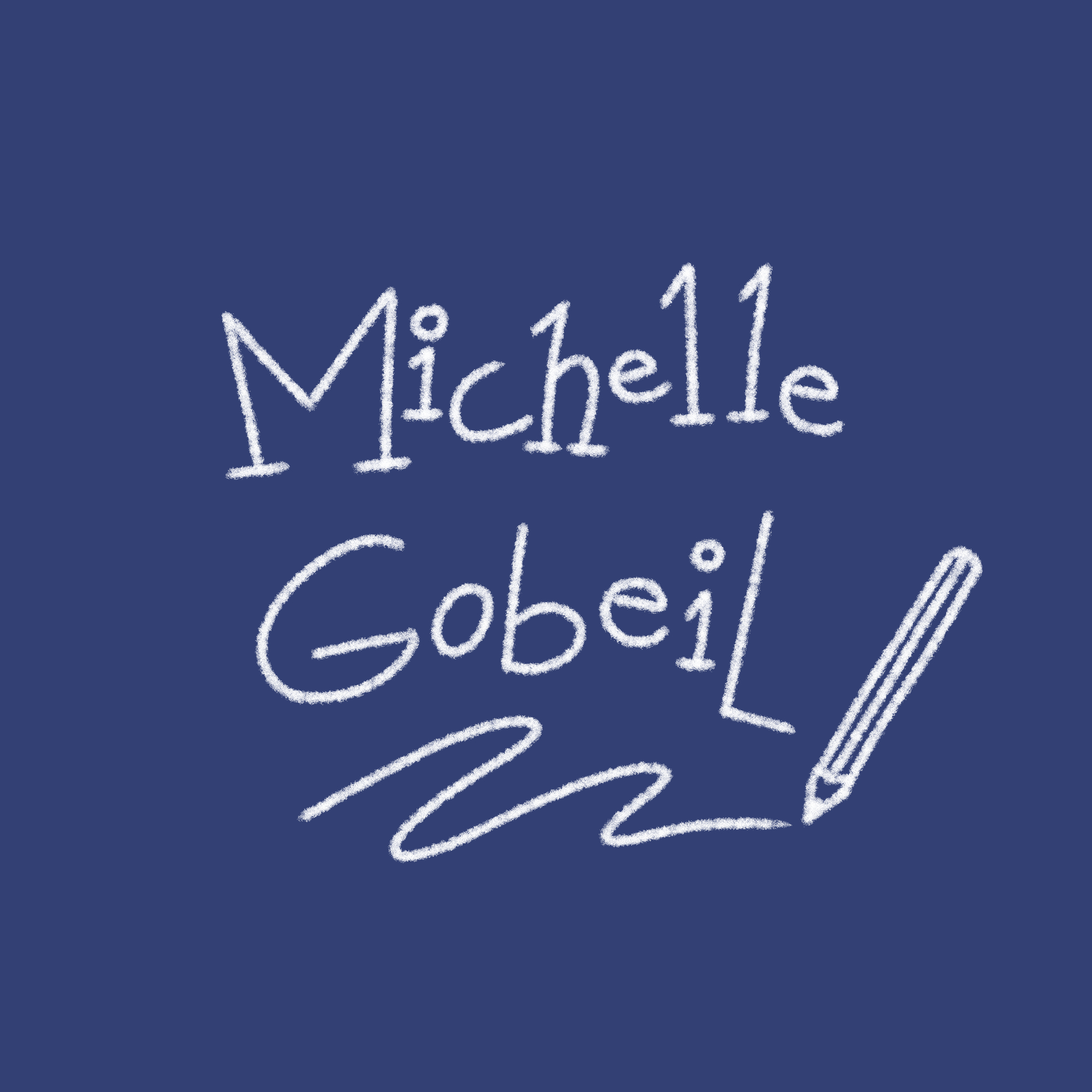
Very fun! Great job on creating a personality through the logo, looks like Michelle is a children's book illustrator :)
2 years ago by Priyanka Salelkar
Very clean and modern! Curious to know what the brief was about

2 years ago by Priyanka Salelkar
Great! But the font size is too small at some places and there's too much empty space on the sides, which doesn't blend in with the design.
2 years ago by Priyanka Salelkar
Hey thank you!
2 years ago by Priyanka Salelkar
Kudos to you for extending the brief so creatively and bringing out such an excellent design piece! I was so confused and disappointed after receiving a similar brief mentioning only the name of the business - "Qal", but your design gives me so much hope and inspiration! :)

2 years ago by Priyanka Salelkar
Wow this so good! Perfectly fits the brief 😍
2 years ago by Priyanka Salelkar
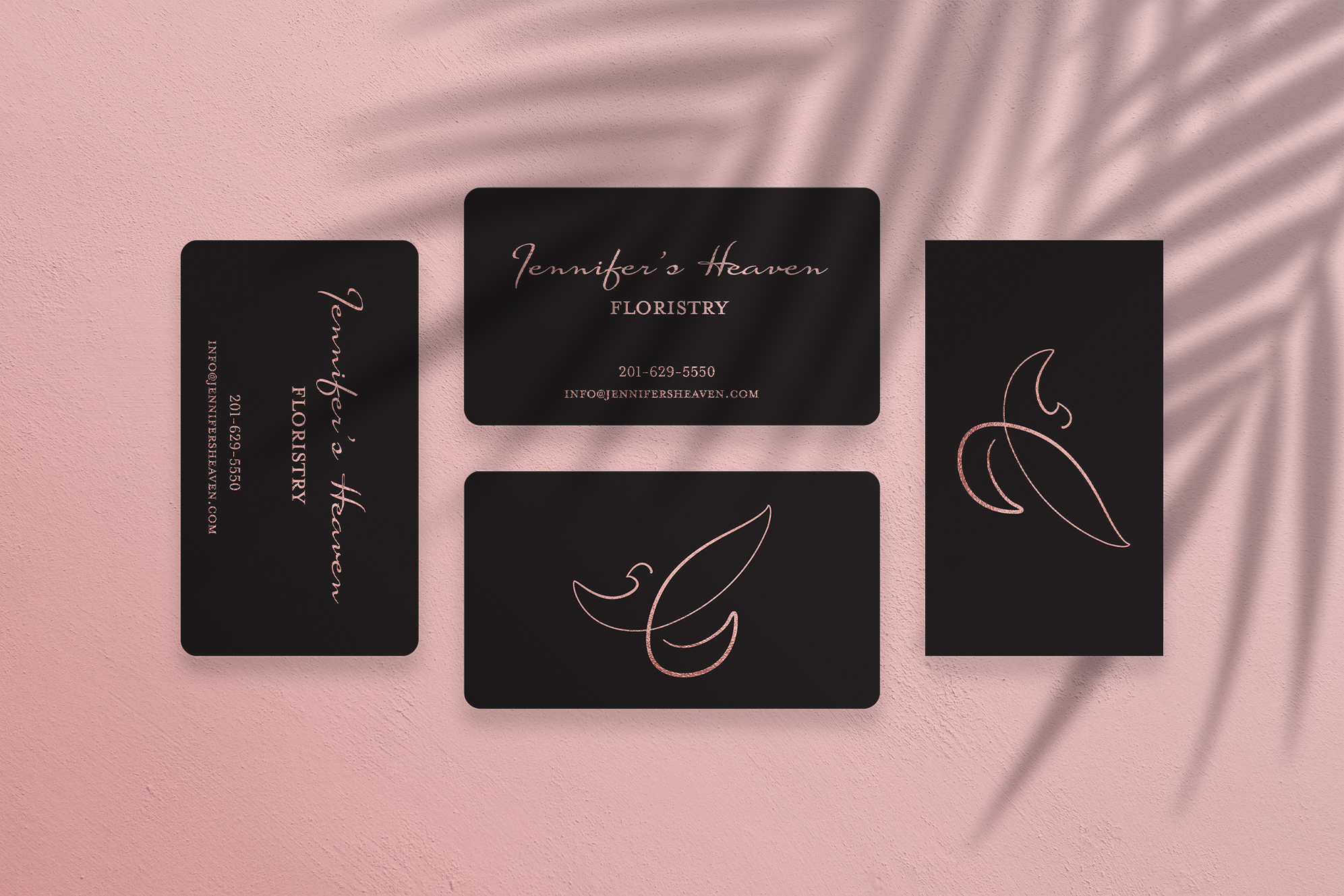
Wow looks so premium! Love the free flowing mark on the backside :)
2 years ago by Priyanka Salelkar
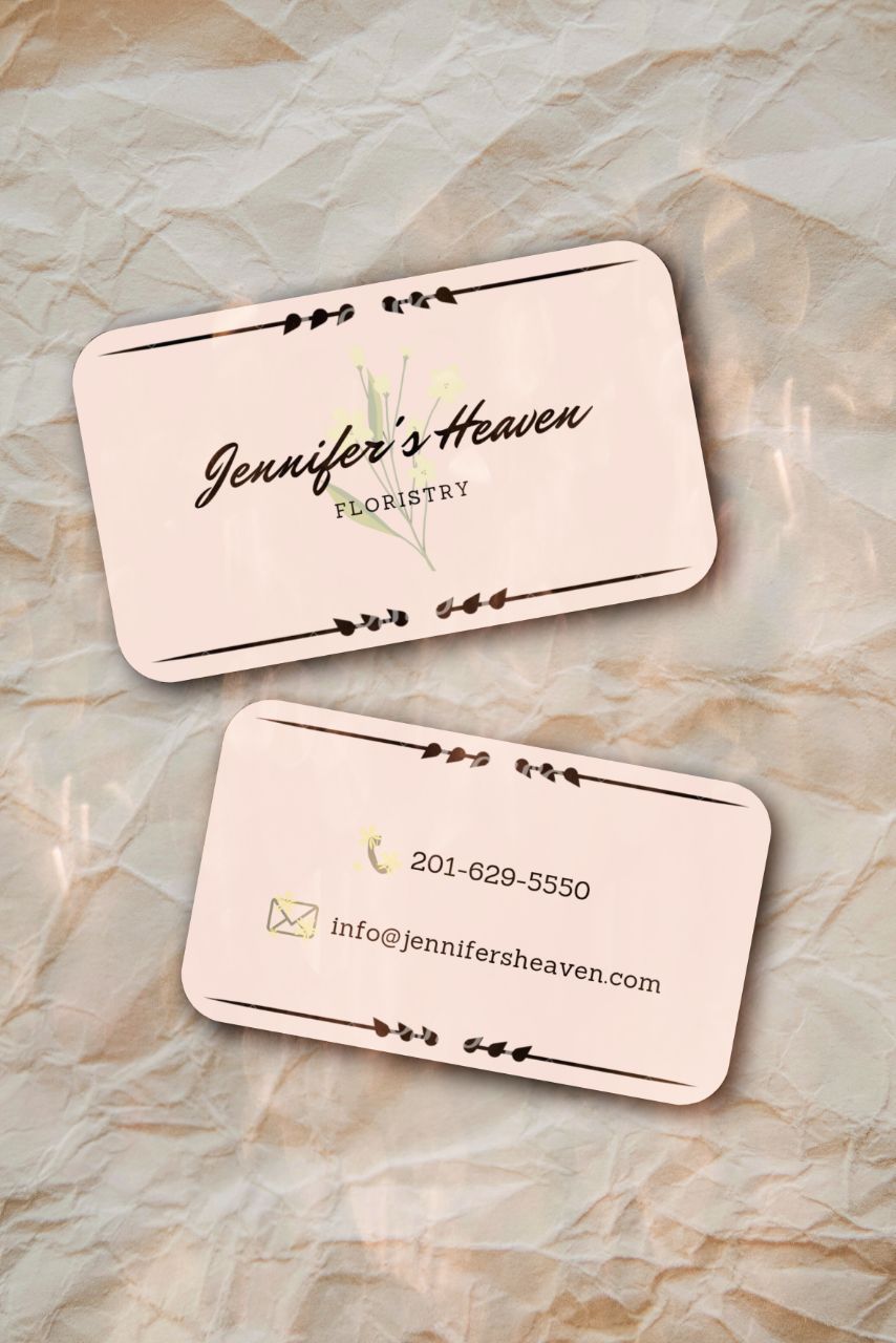
Has a heavenly feel, but does not look very premium. Maybe changing the typeface or simplifying the illustrated lines at the edges will help?
2 years ago by Priyanka Salelkar
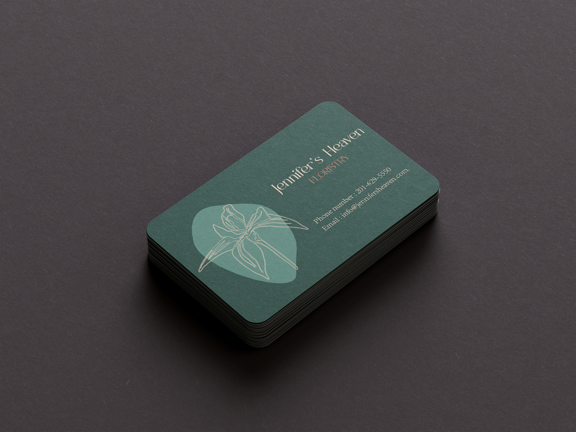
Looks very high-end, but misses the heavenly look because of the colour palette.
2 years ago by Priyanka Salelkar
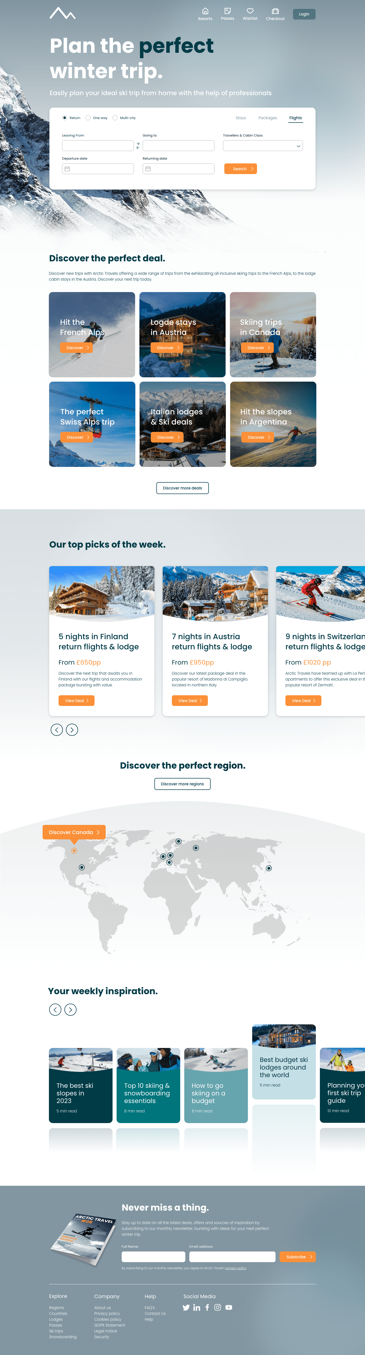
I'm not a UI/UX designer but as a consumer, I can say that this looks great! I especially like the inspiration tabs with reflections and the magazine beside Never miss a thing catches my attention. Great job :)
2 years ago by Priyanka Salelkar
Posts
Rexe
- Report
Priyanka Salelkar • 2 years ago
A combination mark logo for Rexe which I imagined to be a luxury jewellery brand.
Hello!
I am Angela, I just founded a new business called rexe.co. For a while now, I've been looking for a good logo for my business. I think a combination mark will fit best with the business. Would you be interested?
 Like
Like


pro
2 years ago by Giovanna Holthaus - Reply
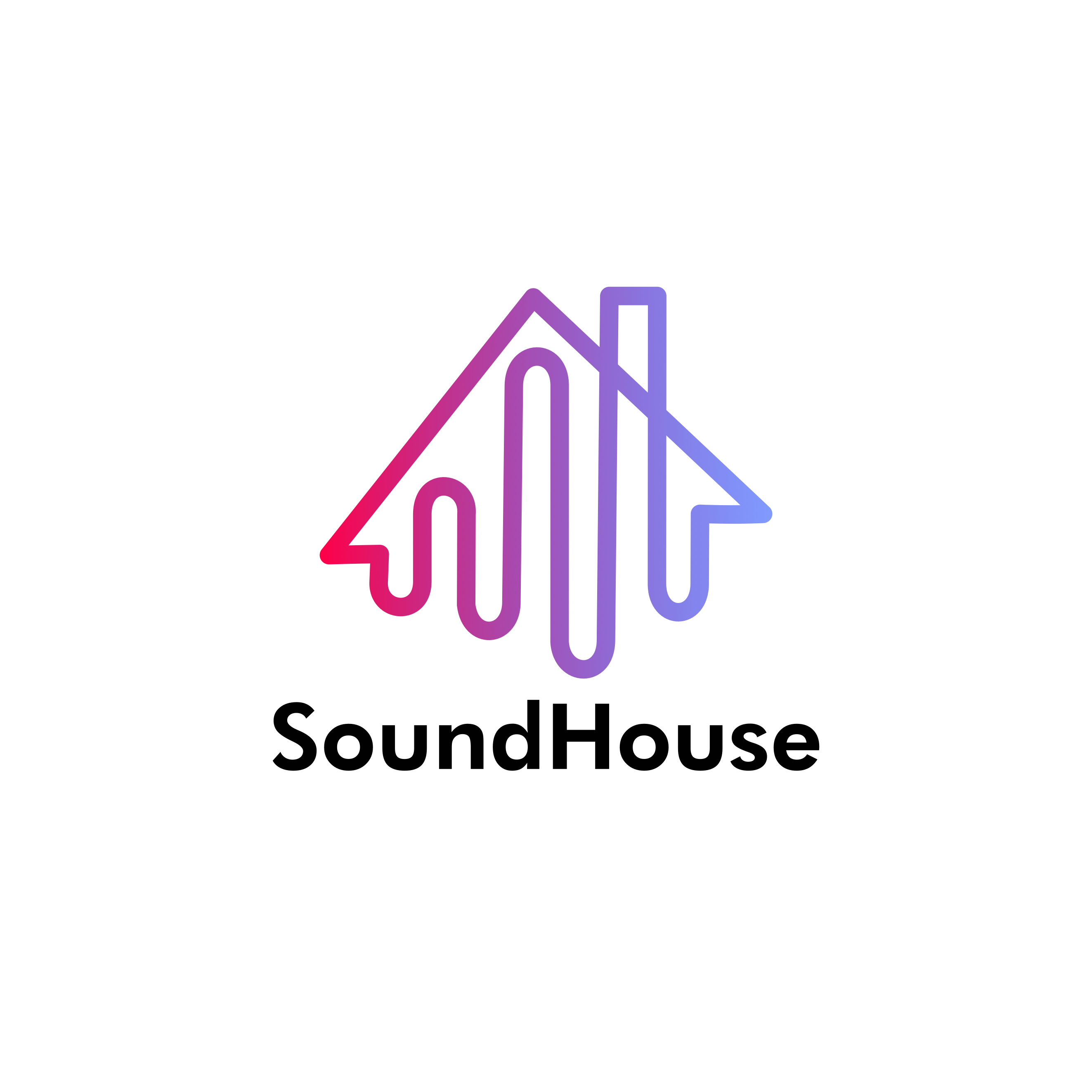
SoundHouse pictorial logo
- Report
Priyanka Salelkar • 2 years ago
Hey!
I am Celestina, I just founded a new business called SoundHouse. For a while now, we've been looking for a good logo for our business. I like pictorial marks. Can you help me out?

a strong pictorial mark and a good color scheme as well
1 month ago by Jess Watson - Reply
Clever! I love it!
2 years ago by Brittany - Reply
Thank you! :)
2 years ago by Priyanka Salelkar - Reply
Shonna's Ice Creams
- Report
Priyanka Salelkar • 2 years ago
A pictorial mark logo for Shonna's Ice Creams
Hey,
I'm Shonna, I recently started a new business called Shonna's Ice creams. I'm looking for someone that can create a simple logo for my business. I like pictorial marks. We would love to work with you!
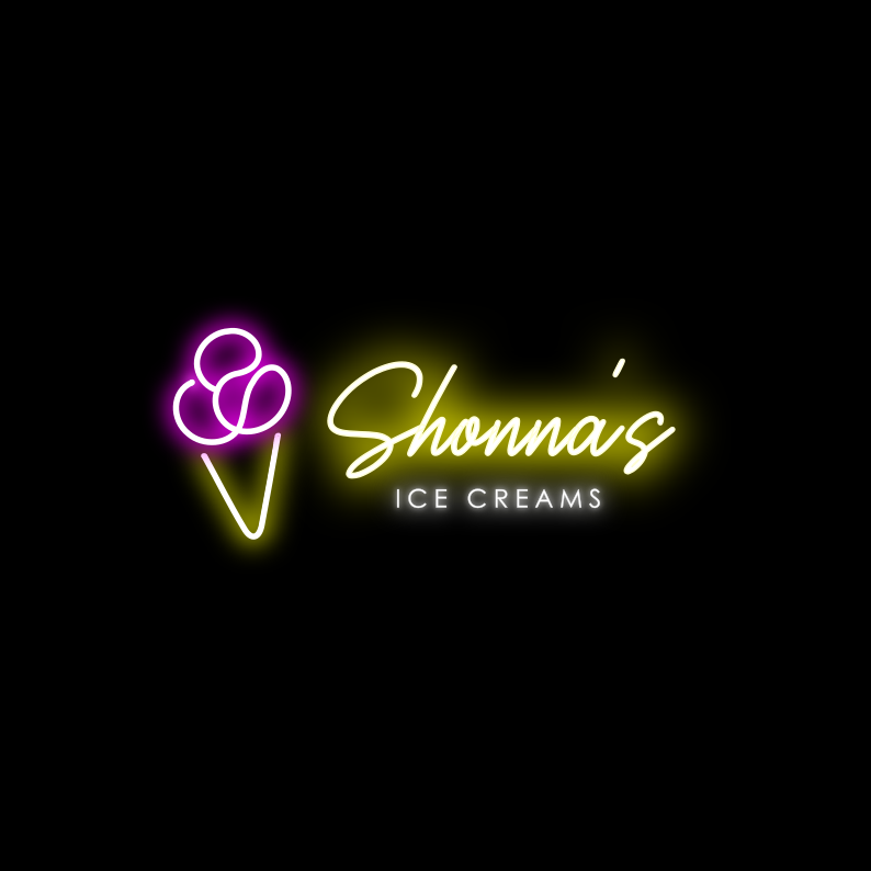

Cute!
1 year ago by Hooda S - Reply
MW Restaurant
- Report
Priyanka Salelkar • 2 years ago
The brief was to create a simple mascot logo for MW Restaurant.
Further imagination: MW Restaurant is a family restaurant serving traditional Arabic dishes with a modern touch. MW stands for Mehnaaz Waheed, the head chef of this restaurant, who is a young, friendly and hardworking lady.
P.S. This restaurant is pet-friendly :)
Further imagination: MW Restaurant is a family restaurant serving traditional Arabic dishes with a modern touch. MW stands for Mehnaaz Waheed, the head chef of this restaurant, who is a young, friendly and hardworking lady.
P.S. This restaurant is pet-friendly :)

superb
2 years ago by swetha - Reply
Thank you soo much John, You making thing easier. You got what I wanted.
2 years ago by John Lenon Bungar - Reply
Losa - Logo Design
- Report
Priyanka Salelkar • 2 years ago
A pictorial mark logo was to be designed for losa.org. I imagined it to be an aesthetic clothing brand for youngsters.
Hey!
I am Adele, I just founded a new business called losa.org. We're looking for someone that can create a simple logo for our business. I like pictorial marks. Can you do that?


You could have used a different font for the text and the logo more elaborate
2 years ago by Christine Thomas - Reply