Brittany
Just a gal in college preparing for the graphic design world!
Posts
3
Likes
2
Liked Posts
28
Given Feedback
18
Feedback
this is so cute and I didn't realize how much I needed this in my life! haha great job!

2 years ago by Brittany
This look great! Awesome job keep it up!
2 years ago by Brittany
The typeface looks great, however I recommend playing around with different colors or minimizing the white space!
2 years ago by Brittany
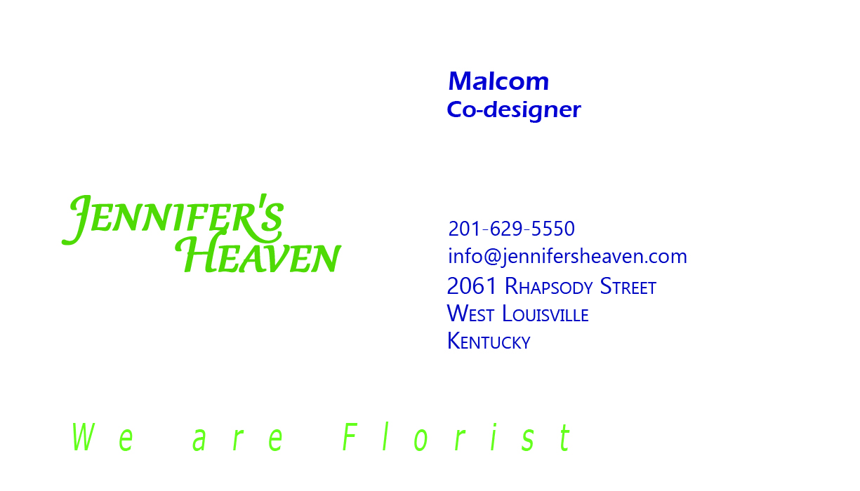
This looks amazing! I would personally include the owners name and position on the card to make it her own business card but this is very well done!
2 years ago by Brittany
I like this a lot! Simple and gets right to the point! I would shop here for my fish!

2 years ago by Brittany
Cute design! I also use Canva! If you need to avoid a watermark you could google a similar image and upload it! I hope this helps for future projects!

2 years ago by Brittany
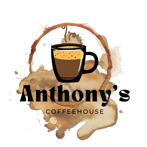
the coffee stain is very clever! nice job!
2 years ago by Brittany
Clever! I love it!

2 years ago by Brittany
This is very well done! Super pleasing to look at!
2 years ago by Brittany
very clean and professional!
2 years ago by Brittany
These are so creative! I love the layout! great job!

2 years ago by Brittany
This is so cute! I love the quill! Maybe even play around more with different typefaces!

2 years ago by Brittany
I appreciate the feedback this was very helpful thank you!
2 years ago by Brittany
Gotcha! As soon as I posted it I realized it probably should've been a Tik Tok link! Thanks for the feedback!
2 years ago by Brittany
They wanted a poster for "Chicago Tours" ! Thank you for your feedback!

2 years ago by Brittany
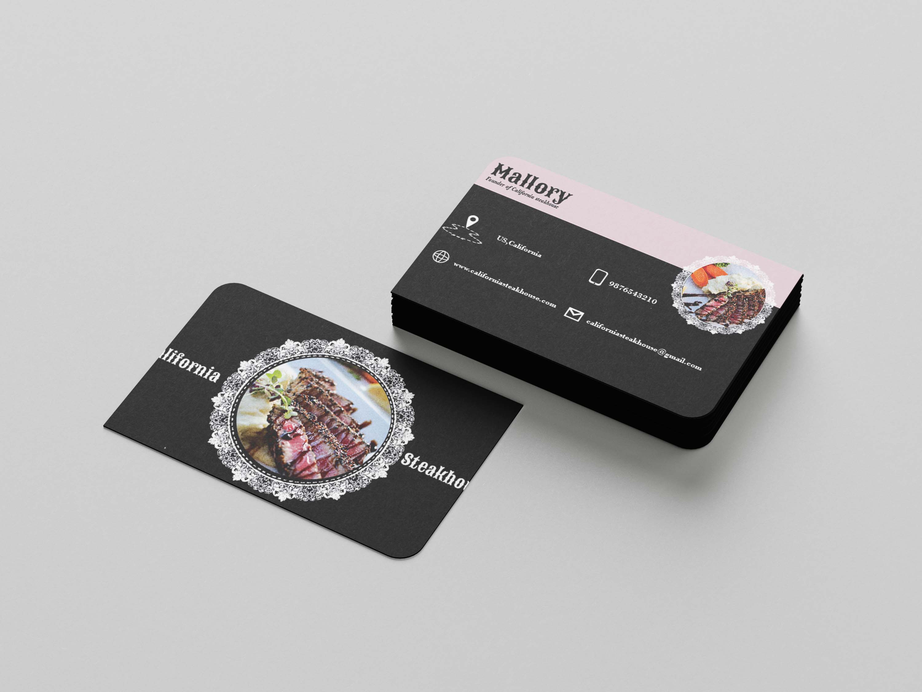
these look very professional! I personally would try to fit the words "California Steakhouse" completely on the front of the card but I love your style!
2 years ago by Brittany
This design is very clean and simple, I personally would change the background color to possible an off white or cream just to tone down the white space, but this is great!
2 years ago by Brittany
cute and simple. I love it!
2 years ago by Brittany
Posts
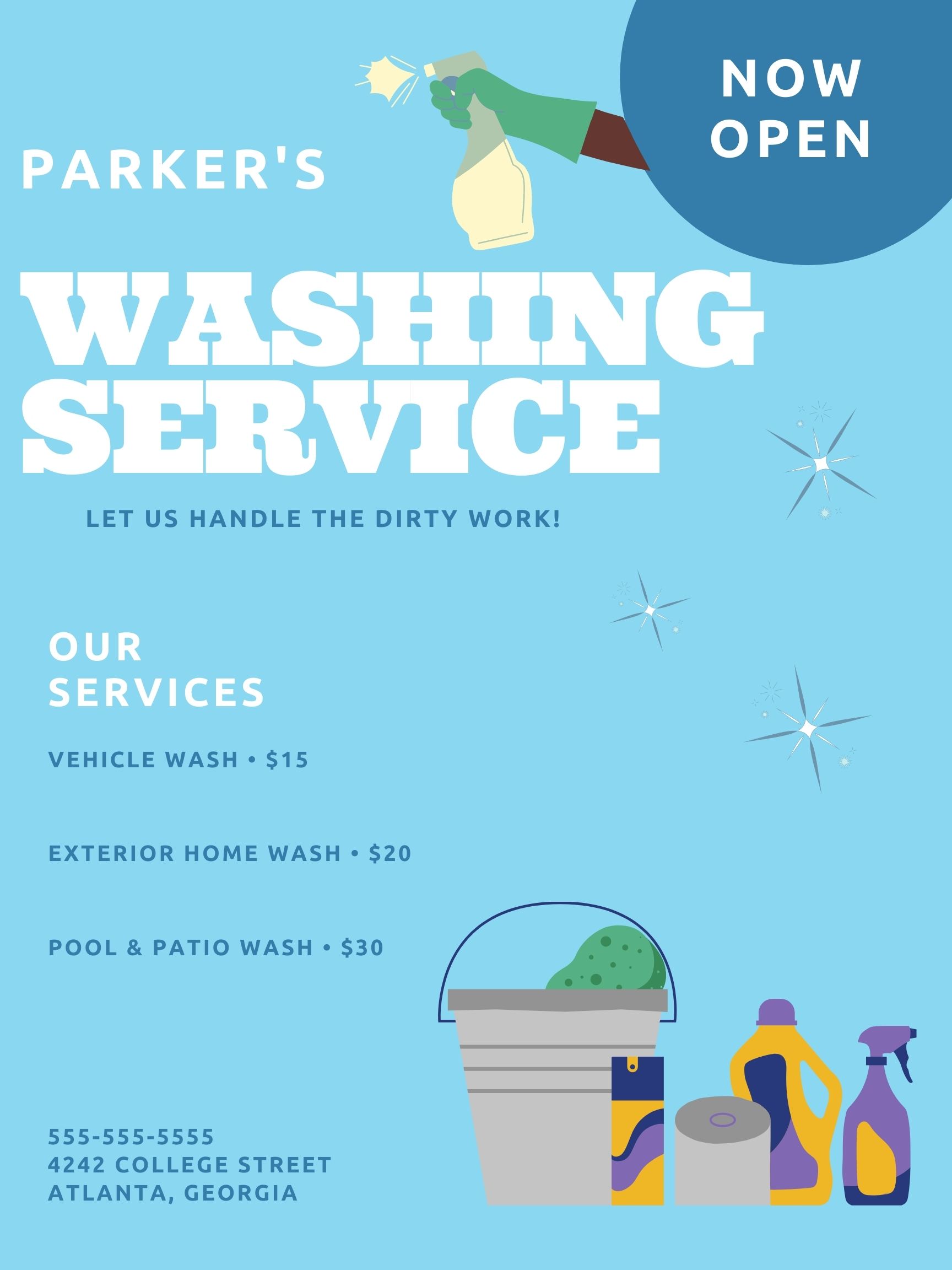
Parker's Washing Service
- Report
Brittany • 2 years ago
Let me know what you guys think! Feedback is greatly appreciated!
Hi!
I'm Parker, creator of Parker's Washing Service. For a while now, I've been looking for a good designer for my business. We will need a poster to advertise our business. We would love to work with you!
I'm Parker, creator of Parker's Washing Service. For a while now, I've been looking for a good designer for my business. We will need a poster to advertise our business. We would love to work with you!
 Like
Like


amazing
1 year ago by de_creative07 - Reply
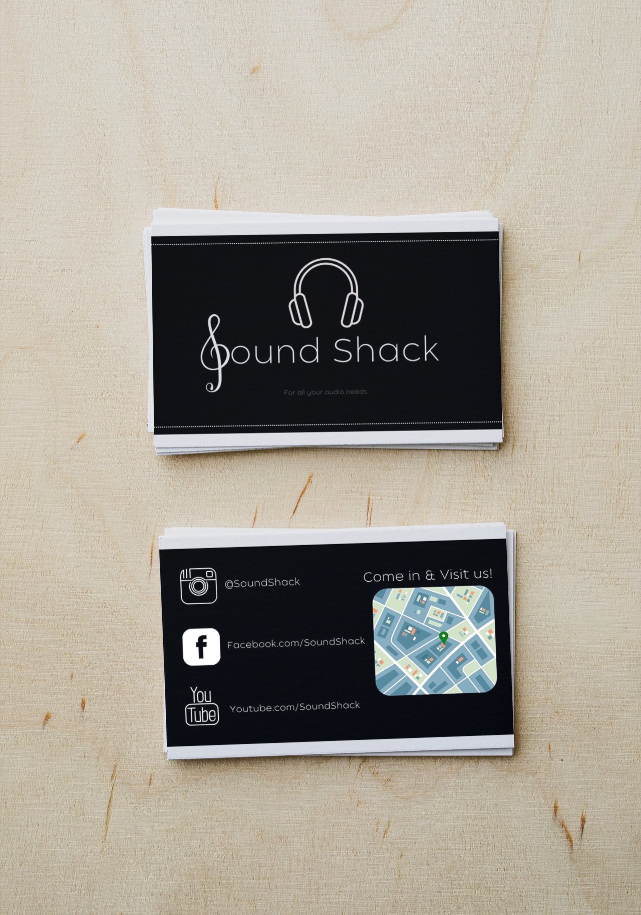
SoundShack Business cards
- Report
Brittany • 2 years ago
Some mock business cards!
Hey!
I am Eldridge, creator of SoundShack. For a while now, I've been looking for a good designer for my business. I want to have a business card for myself. We would love to work with you!
I am Eldridge, creator of SoundShack. For a while now, I've been looking for a good designer for my business. I want to have a business card for myself. We would love to work with you!

Very clean on the front, back side I think the map colour should be more fitting to the overall design
2 years ago by Nathaniel George - Reply
Great logo! The links are too widely spaced. Also, the maps are a heavy contrast, so if you can show the directions by line drawing, it would gel with the design. Instead of showing the links, only the social media logos can do the job of communicating that you can find us on these platforms. The back of the card can display only the directions and the social media, contact number and email can go with the logo. Sorry for bombarding with so many suggestions, but hope it helps!
2 years ago by Priyanka Salelkar - Reply
I appreciate the feedback this was very helpful thank you!
2 years ago by Brittany - Reply
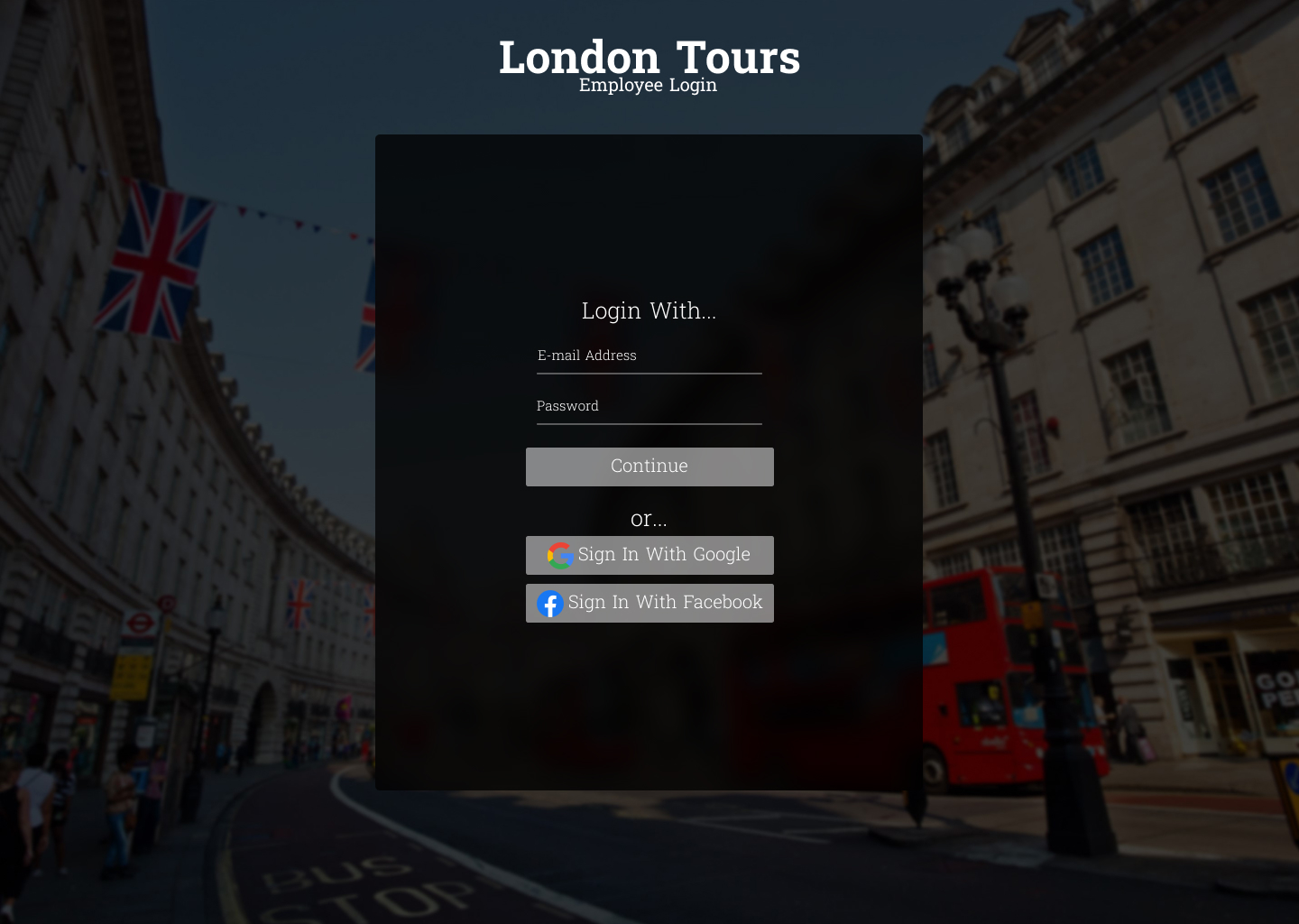
Chicago Tours
- Report
Brittany • 2 years ago
Just some graphic design practice! Let me know what you guys think!

Very clean and modern! Curious to know what the brief was about
2 years ago by Priyanka Salelkar - Reply
They wanted a poster for "Chicago Tours" ! Thank you for your feedback!
2 years ago by Brittany - Reply
Good
2 years ago by Fayaz - Reply