Jess Watson
Posts
7
Likes
6
Liked Posts
3
Given Feedback
24
Feedback
good design, I especially like how you incorporated the leaves within the design as well as the various shades of green

3 weeks ago by Jess Watson
the logo is solid, but the letter structure could've been a bit stronger
3 weeks ago by Jess Watson
good and organic lines, the stroke needs adjusting
3 weeks ago by Jess Watson
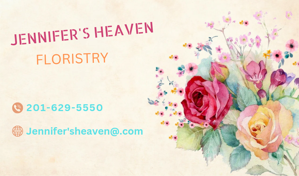
good and simple layout, I like the flowers
3 weeks ago by Jess Watson
very clean and structured properly
3 weeks ago by Jess Watson
oooh, I love the color scheme, looks well put together
3 weeks ago by Jess Watson
clean layout, but the numbers kind of blend in to the background
1 month ago by Jess Watson
you're welcome

2 months ago by Jess Watson
thank you for comment, I was thinking they might've been too far apart
2 months ago by Jess Watson
this a cute, lighthearted design. Definitely says 'Happy Birthday'
2 months ago by Jess Watson
solid design. I'd say that you accomplished the end goal

2 months ago by Jess Watson
the color scheme works well with the content
2 months ago by Jess Watson
the use of primary colors is good and the location logo reminds me of PacMan

3 months ago by Jess Watson
I like the design aesthetic of your work. Everything just seems to flow together from the image and color, as well as the font choice. Great job!

3 months ago by Jess Watson
solid structure, I would recommend that you increase the size of the text in the lower right hand corner
3 months ago by Jess Watson
I agree with your suggestion of using different font styles. Perhaps choosing a strong font pairing could possibly work as well
3 months ago by Jess Watson
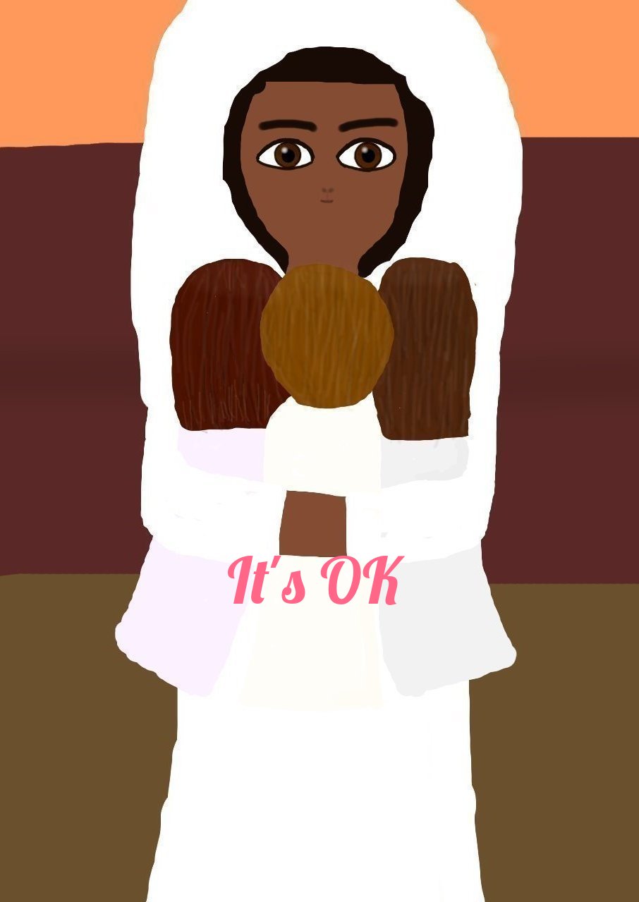
the white background behind the mother reminds me of angel wings
3 months ago by Jess Watson
a strong pictorial mark and a good color scheme as well

3 months ago by Jess Watson
good use of space, but having your name in the design does make it a bit distracting
3 months ago by Jess Watson
I like the simplicity of using black and white in your design. It makes it crisp
3 months ago by Jess Watson
I also realized I made a slight mistake by not adding a solid color background prior to submitting.
3 months ago by Jess Watson
thanks 🙂
3 months ago by Jess Watson
Type structure is solid, however the addition of cloud, rainbow, and flower basket make the design a bit clunky
3 months ago by Jess Watson
I like the inclusion of the sleeping bear. The letters could've been slightly more cloud like.

3 months ago by Jess Watson
Posts
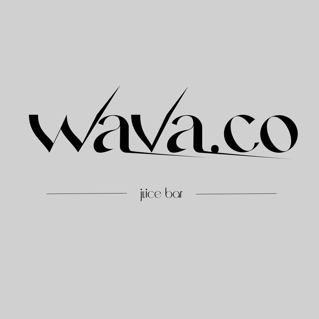
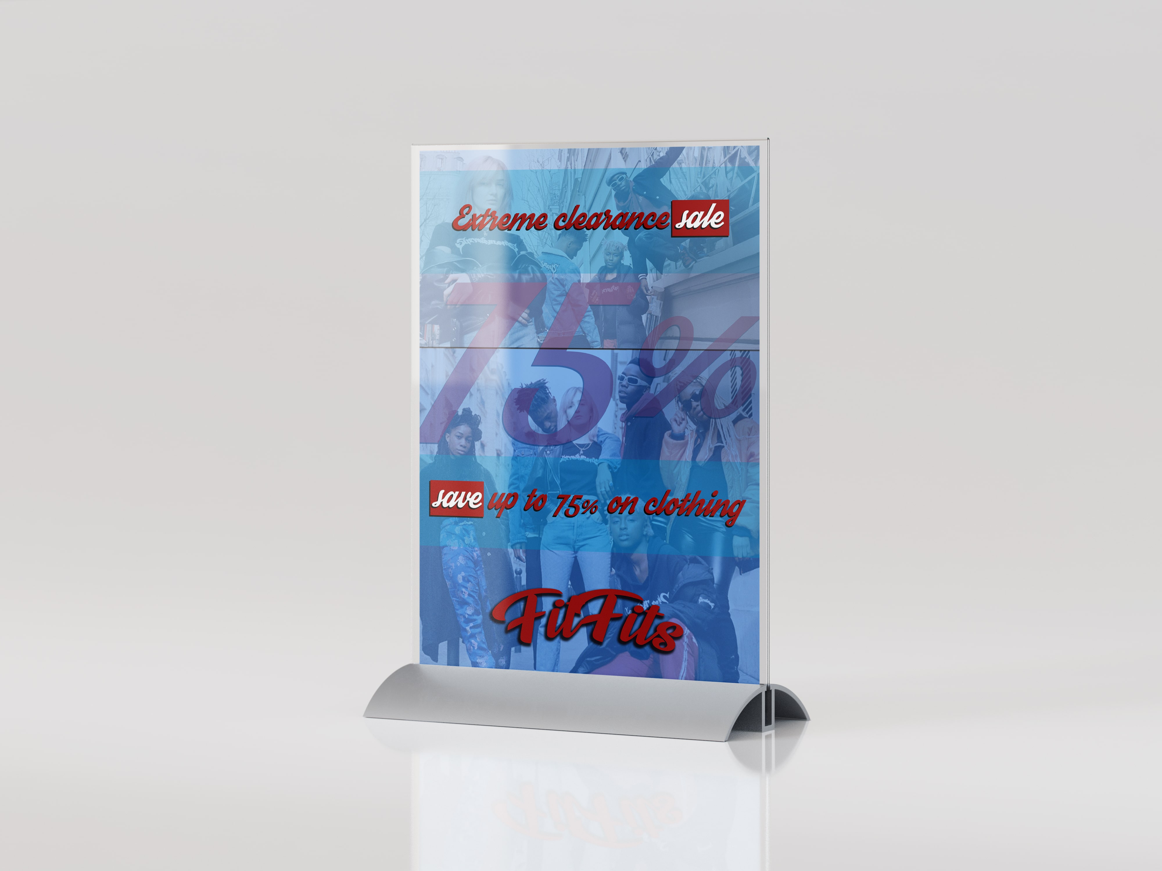
FitFits Flyer
- Report
Jess Watson • 3 weeks ago
here's my interpretation of a flyer for FitFits.
Software Used: Affinity Publisher v1
Font Used: Oswald
Images Used: Stock Photos via Pexels
Software Used: Affinity Publisher v1
Font Used: Oswald
Images Used: Stock Photos via Pexels
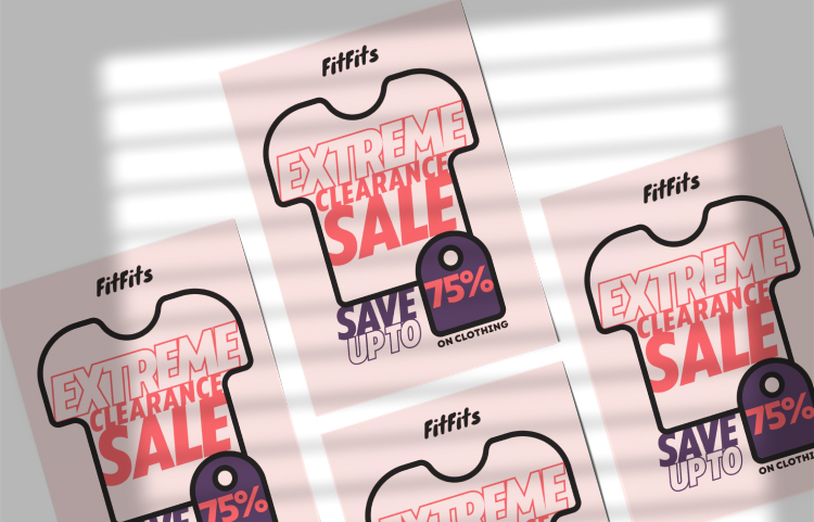
FitFitsgraphic


It looks good even though it's simple, but the text location kinda messy
2 weeks ago by Pradipta Falisha Hirsam - Reply
I like the layout of this flyer.
2 weeks ago by Nicole Q - Reply
Flyer is very basic, there is too many different font sizes that makes the design a bit chaotic.
2 weeks ago by Patryk Madej - Reply
nice and simple but the text seems a bit off-center
2 weeks ago by Amir - Reply
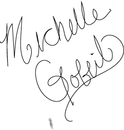
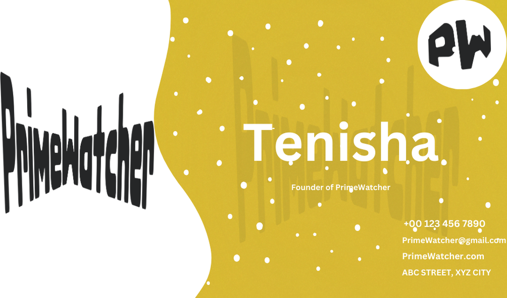
Michelle Gobeil Lettermark Logo
- Report
Jess Watson • 3 weeks ago
a simple lettermark logo created using the following:
Software: Affinity Designer v1
Font: Affectionately Yours font
Modifications: Marker Scribble 01 brush, 14.8 stroke weight
Software: Affinity Designer v1
Font: Affectionately Yours font
Modifications: Marker Scribble 01 brush, 14.8 stroke weight
Michelle Gobeillogo


nice, i like the brushwork
2 weeks ago by Nicole Q - Reply
The logo is visually striking and effectively represents the brand's identity. The color scheme is both modern and vibrant, creating a strong and memorable impression. The design elements are well-balanced and convey the core values of the brand with clarity and style. Excellent work!
2 weeks ago by Abby Jvns - Reply
it's very simple but lovely and easy to use, keep working
3 weeks ago by Diarry - Reply
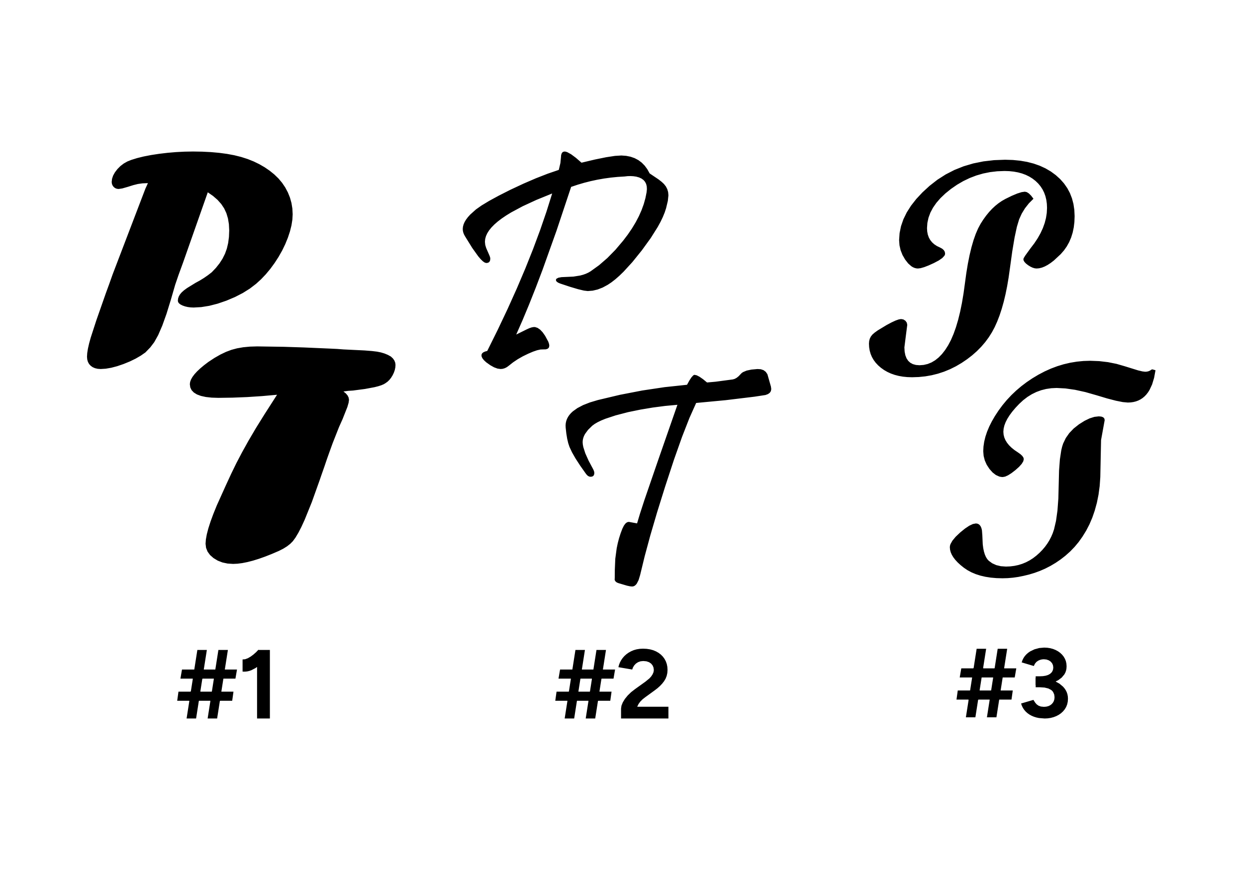
Piper's Tours Pictorial Mark Logo
- Report
Jess Watson • 2 months ago
here's a compilation of a pictorial mark logo for Piper's Tours. Fonts used: #1 - Forte; #2 - Pristina; #3 - Script MT Bold.
Hello,
I'm Piper, creator of Piper's Tours. We're looking for someone that can create a simple logo for our business. I like pictorial marks. Can you help me out?
I'm Piper, creator of Piper's Tours. We're looking for someone that can create a simple logo for our business. I like pictorial marks. Can you help me out?

I would make the P&T a little closer together, almost touching
2 months ago by Bobbie Hall - Reply
thank you for comment, I was thinking they might've been too far apart
2 months ago by Jess Watson - Reply
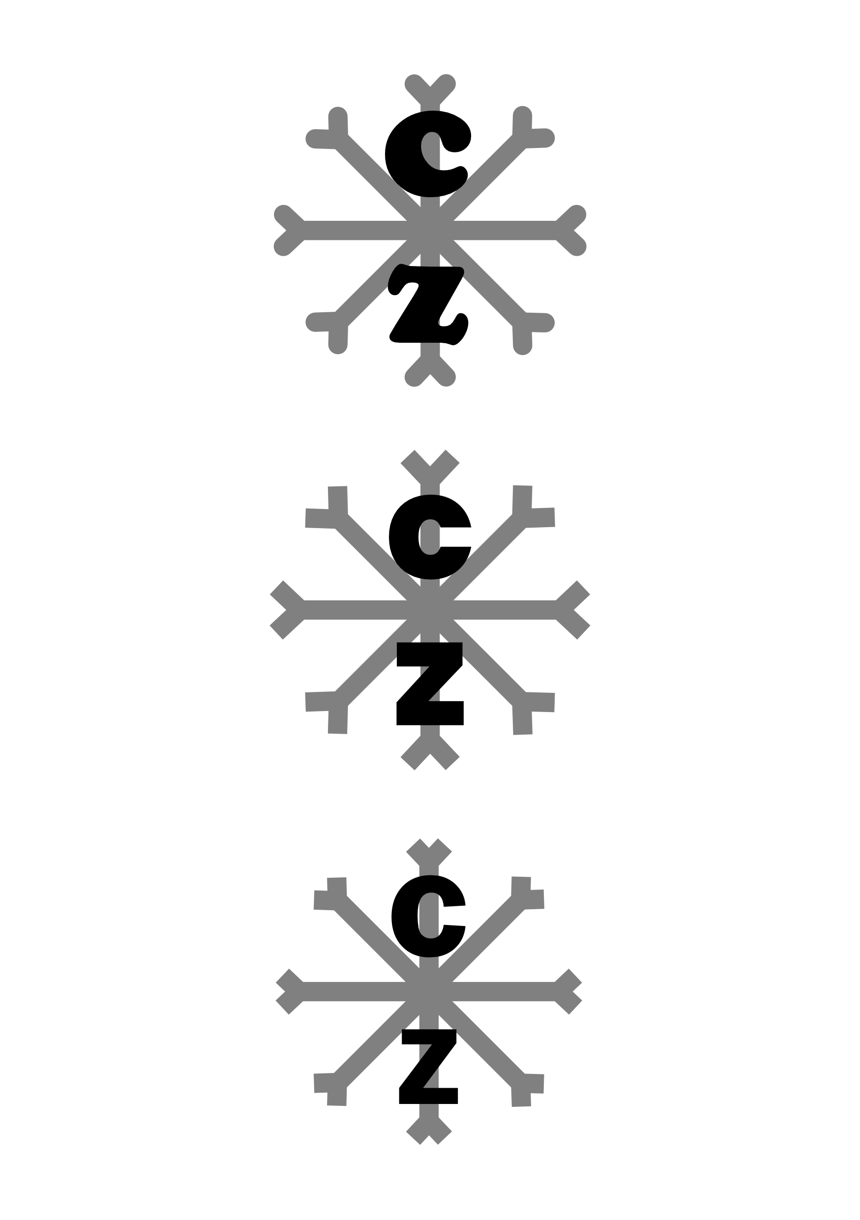
ColdZone Pictorial Mark Logo
- Report
Jess Watson • 3 months ago
here's my interpretation of a pictorial mark logo for ColdZone. I've created three (3) variations using various line weights and fonts. Fonts used: Cooper Std Black, Franklin Gothic Demi, and Poppins.
Hello,
I'm Fredricka, owner of ColdZone. We're looking for someone that can create a simple logo for our business. I like pictorial marks. Would you be interested?
I'm Fredricka, owner of ColdZone. We're looking for someone that can create a simple logo for our business. I like pictorial marks. Would you be interested?

coolesttty
2 months ago by evelyn - Reply
HotHut Pictorial Mark Logo
- Report
Jess Watson • 3 months ago
here's my interpretation of HotHut's pictorial mark logo. I opted to keep things simple by created a black and white logo versus using color.
Font used: Century Gothic
Font used: Century Gothic
Hey!
I am Ivonne, I recently started a new business called HotHut. For a while now, we've been looking for a good logo for our business. I like pictorial marks. Would you be interested?
I am Ivonne, I recently started a new business called HotHut. For a while now, we've been looking for a good logo for our business. I like pictorial marks. Would you be interested?


Simple and Perfect.
3 months ago by Isha More - Reply
It's says hothut
3 months ago by Lyn crystal - Reply