Amir
Posts
0
Likes
0
Liked Posts
10
Given Feedback
29
Feedback
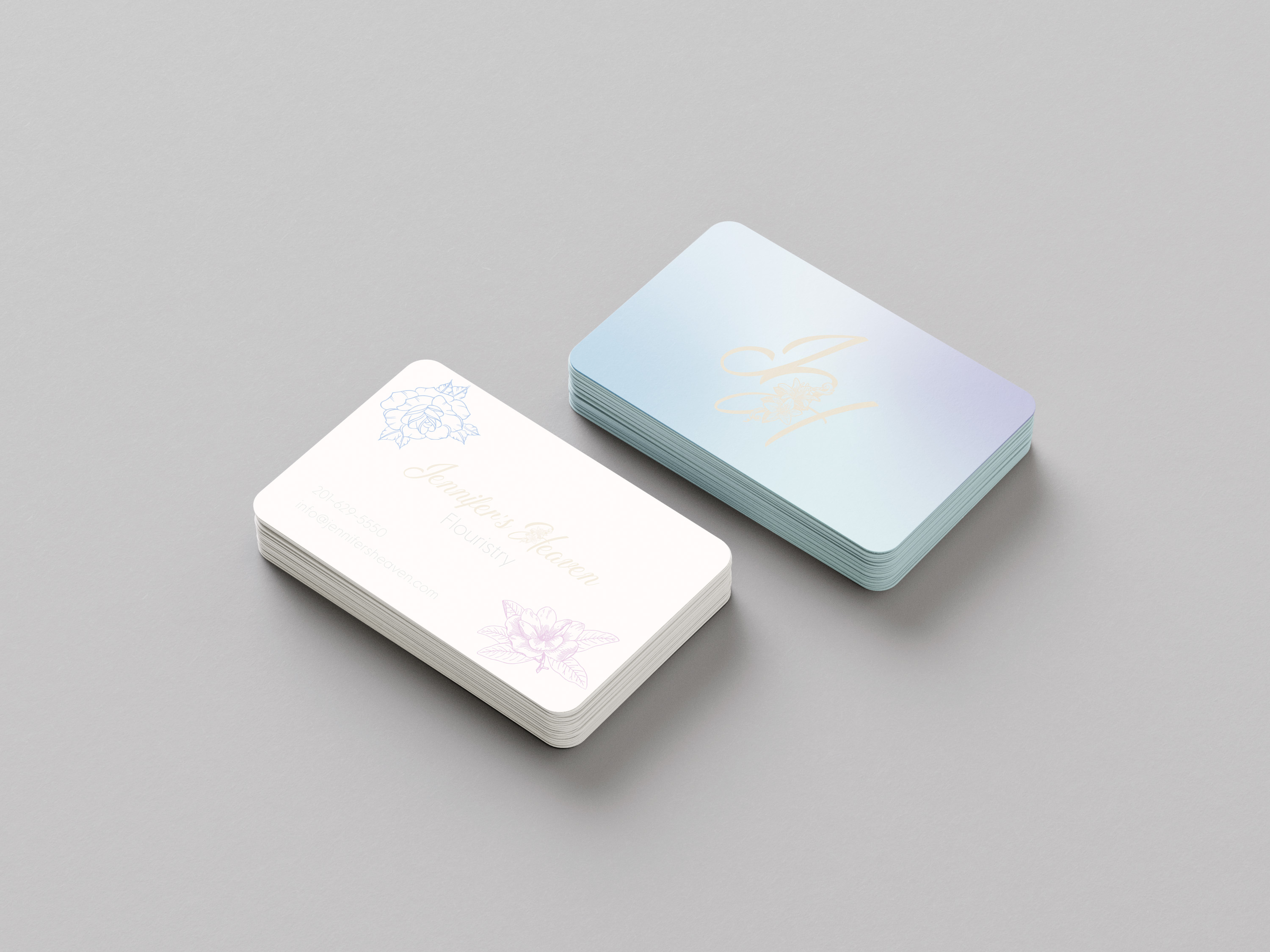
I think you captured the right style perfectly for this brief! The only thing is I think the 'about me' font is a little hard to read when it is that small

2 weeks ago by Amir
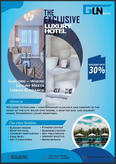
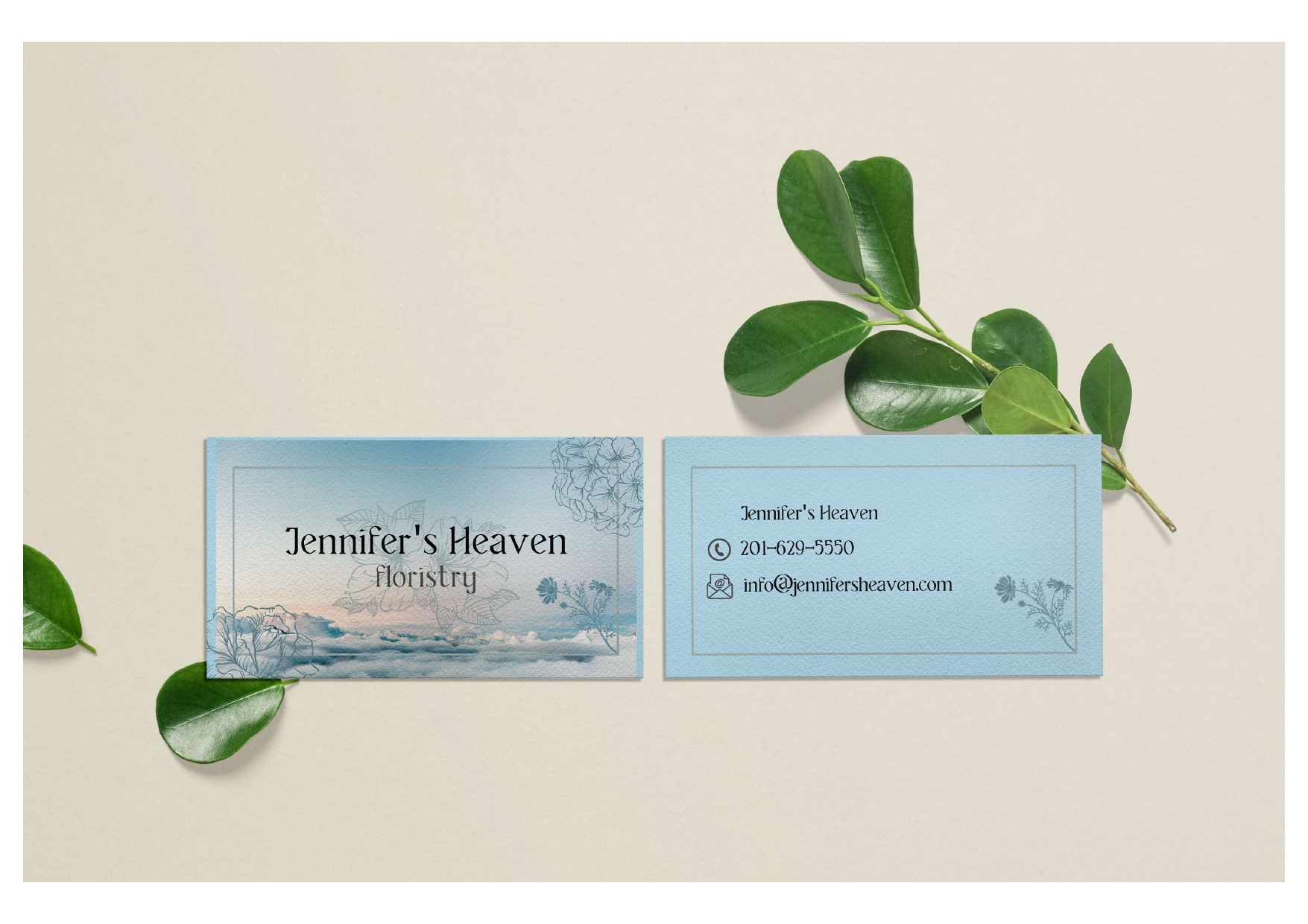
This looks very nice but I think it would look better with just a solid background color. Maybe a white page would look good with the burgundy used as an accent color
1 month ago by Amir
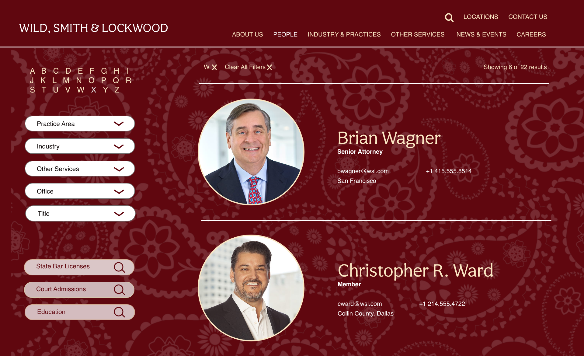
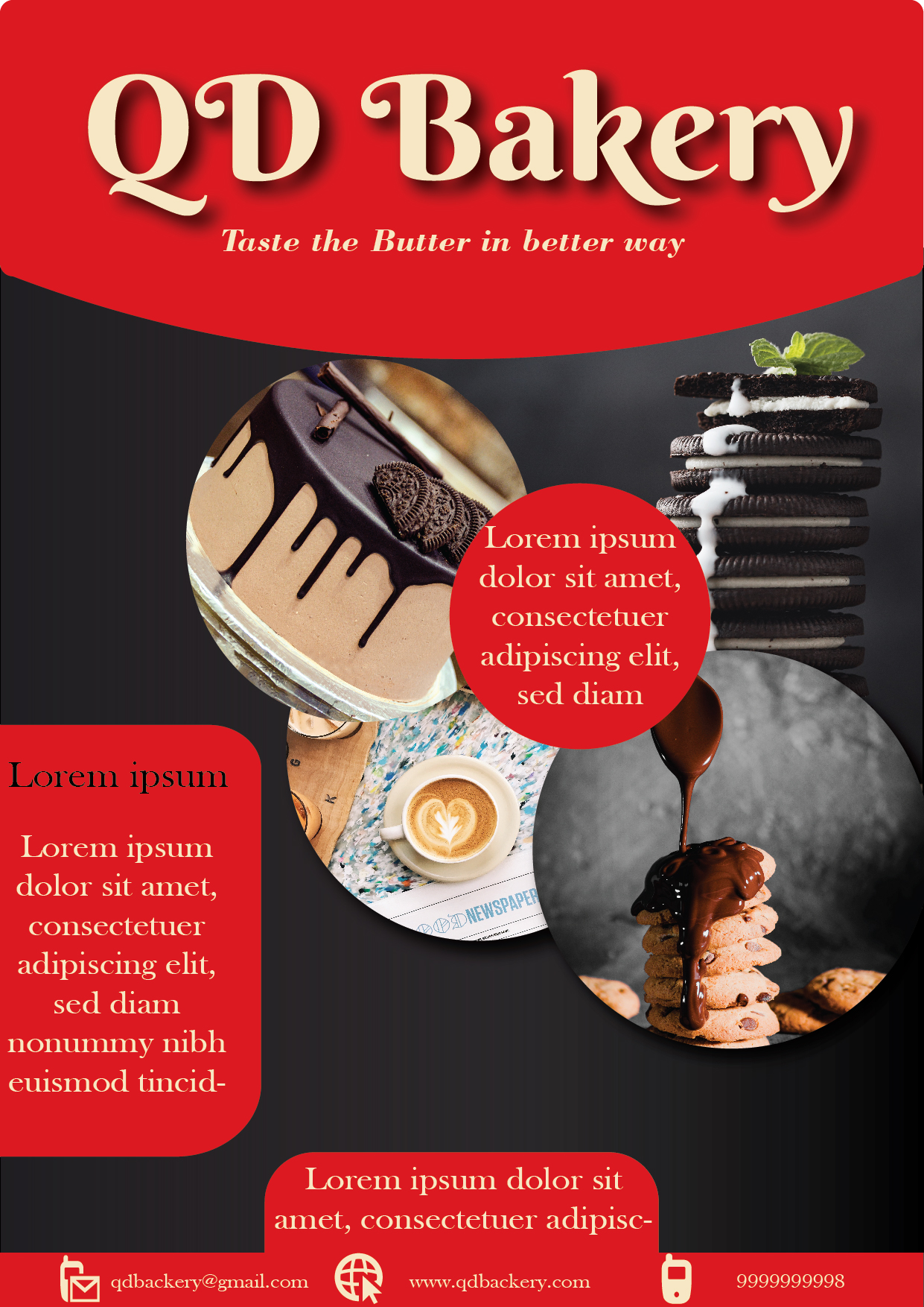
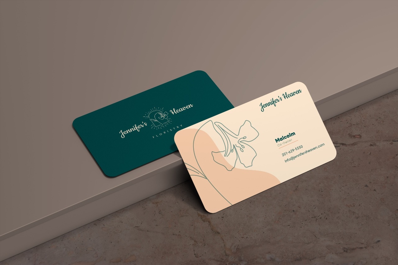
The colors and graphic are beautiful! Only thing is the different alignments of the text make it look a bit messy

1 month ago by Amir
The PDF was probably set in CMYK colors and when you export it it converts to RGB and will look different
1 month ago by Amir
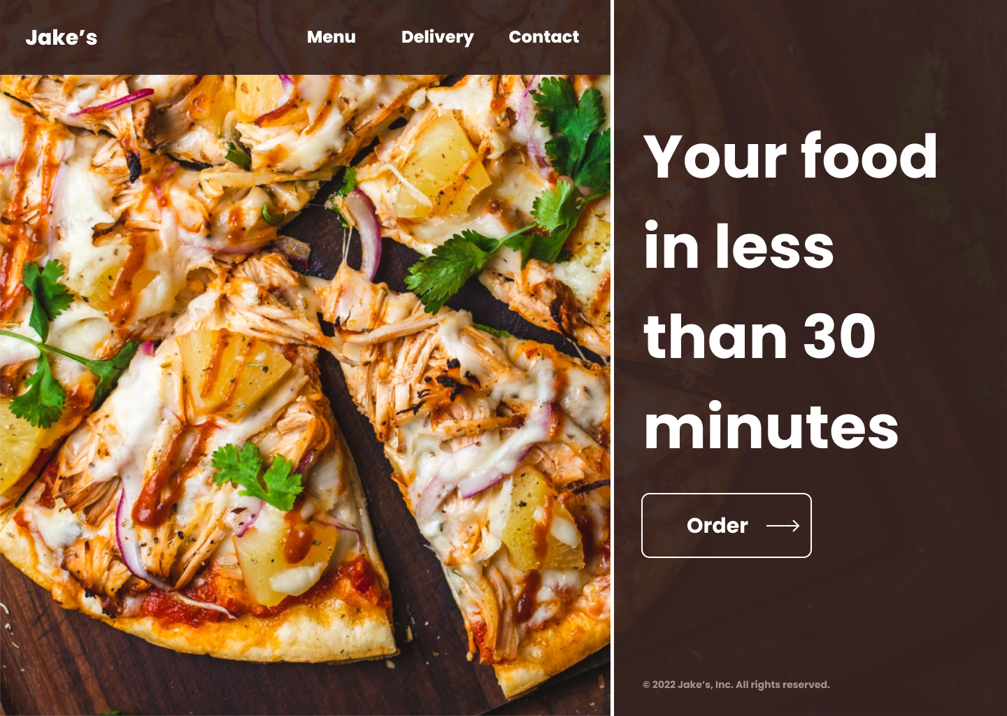
Looks great! I would increase the contrast of the text color a bit though to make it easier to read
1 month ago by Amir
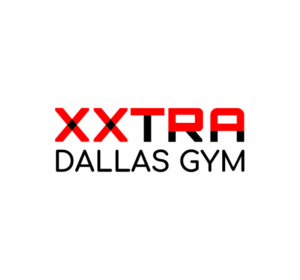
Amazing logo, it perfectly fits with a gym
2 years ago by Amir
Nice and simple
2 years ago by Amir
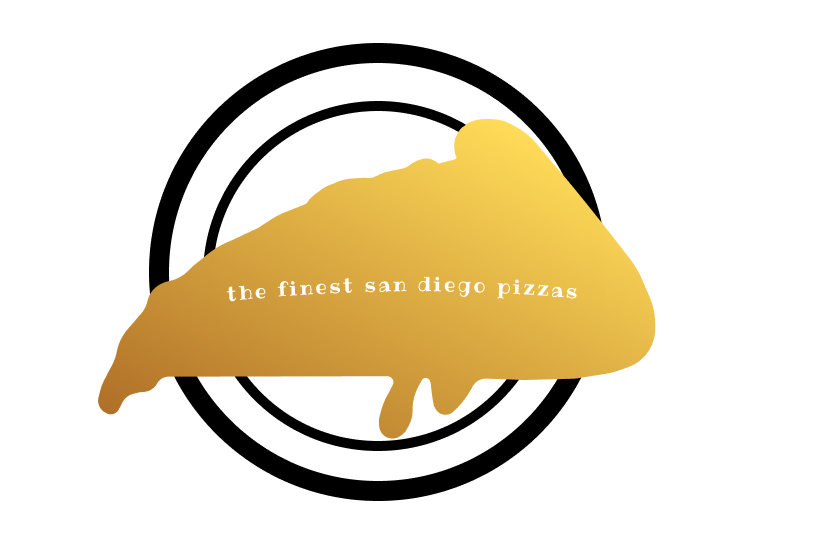
It's a nice idea but I would've made the text a bit bigger and made it a bit more clear that it is a piece of pizza
2 years ago by Amir
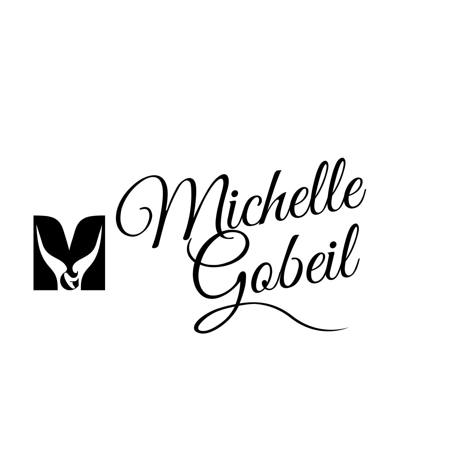
It took me some time to notice the "M" but it looks really good
2 years ago by Amir
Very creative
2 years ago by Amir
Nice but the text needs a bit more space I think
2 years ago by Amir
Beautiful but I think it would look a bit cleaner without the icons
2 years ago by Amir
Nice and simple
2 years ago by Amir
I like it but i think the basket needs a bit more space
2 years ago by Amir
Love it! especially the top one
2 years ago by Amir
perfect
2 years ago by Amir
I like it but I would've made the text a bit smaller I think
2 years ago by Amir
Nice and simple
2 years ago by Amir
Looks cool!!
2 years ago by Amir
Nice but maybe a bit too detailed
2 years ago by Amir
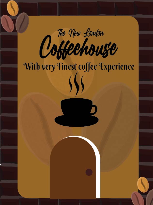
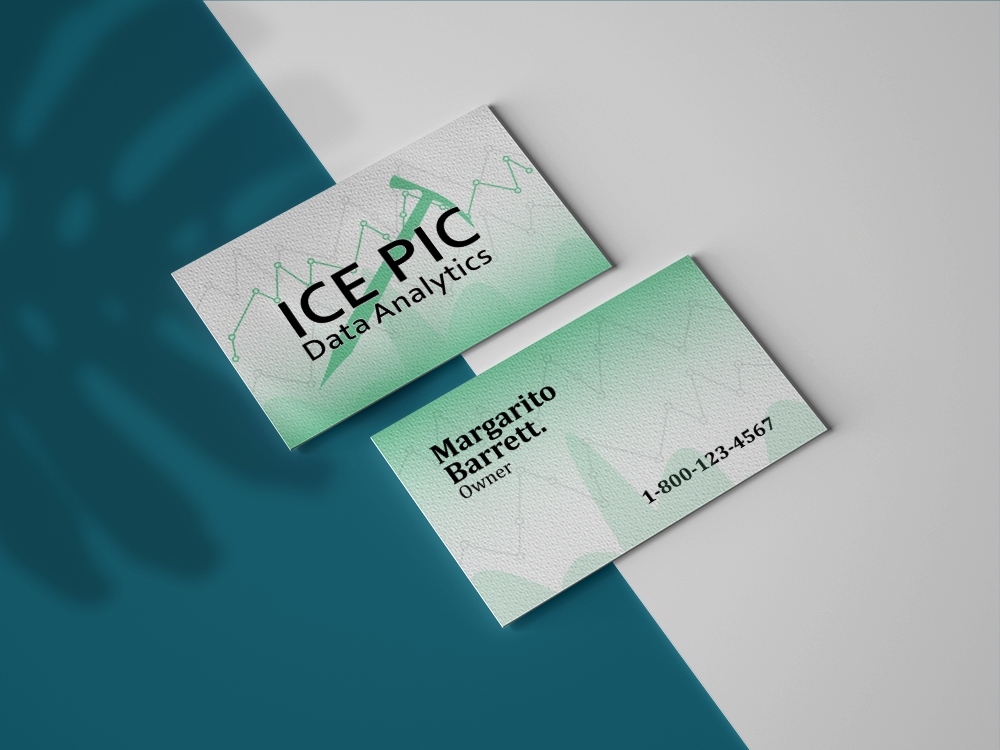
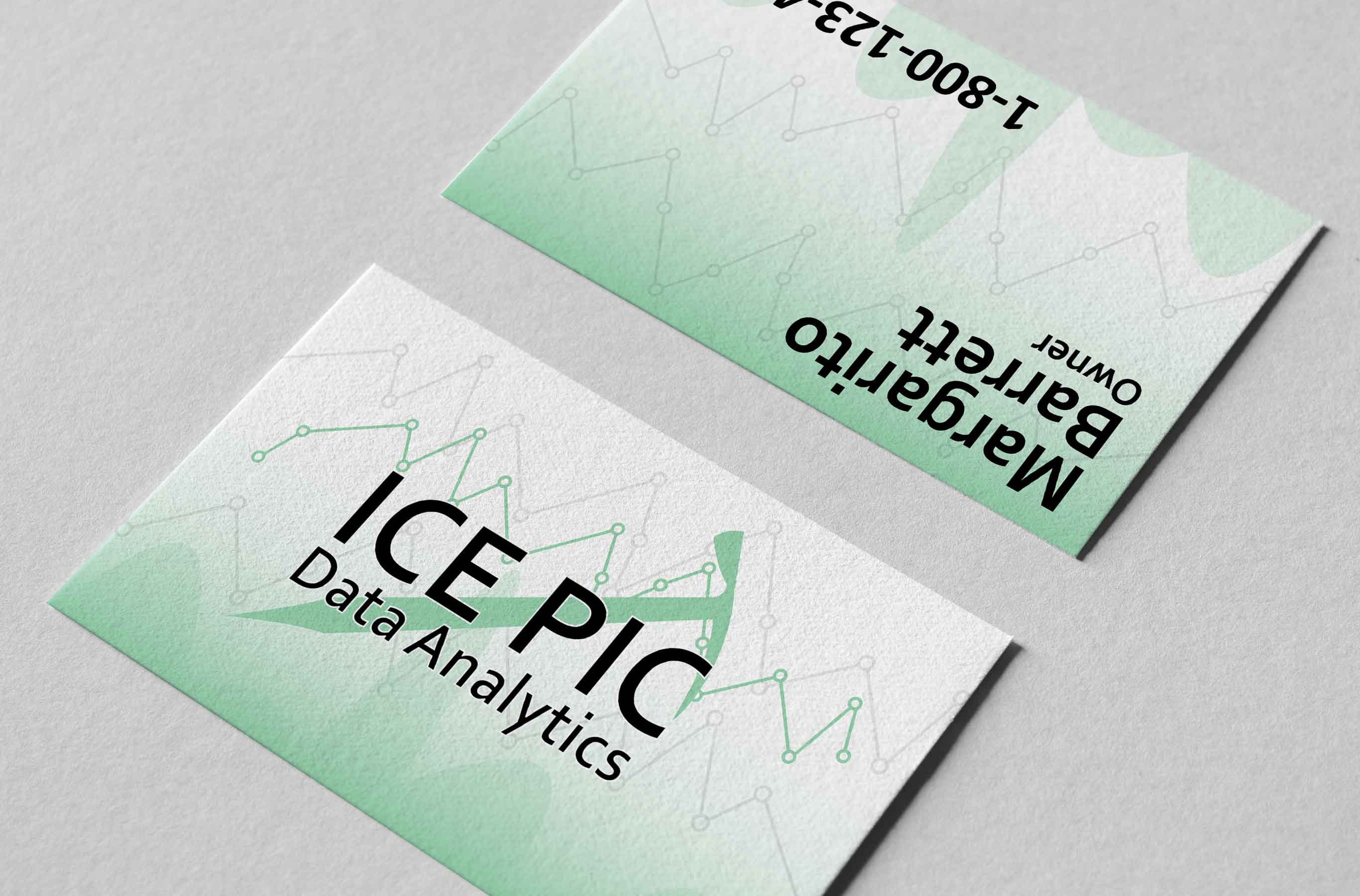
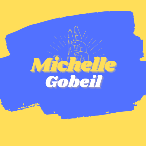
Looks cool but it is kinda unclear what the thing above the text is I think
2 years ago by Amir
Best logo I've seen for this brief
2 years ago by Amir
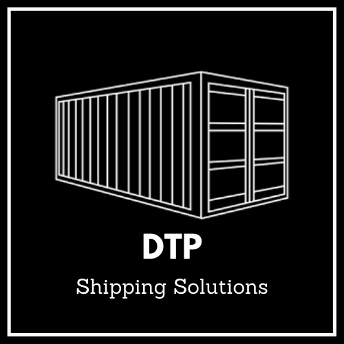
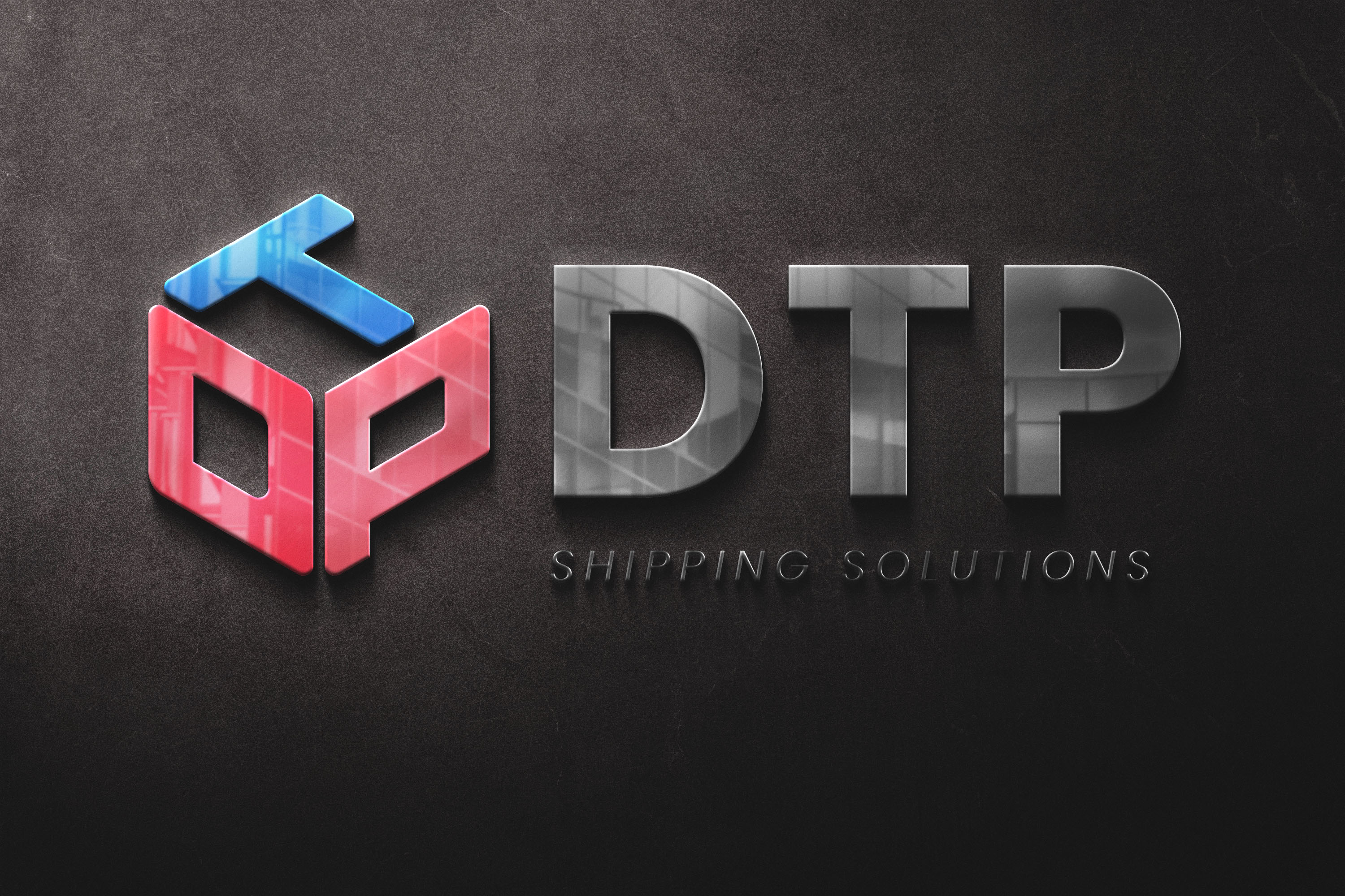
Great work but writing DTP twice is a bit unnecessary I think
2 years ago by Amir
Very clean and professional-looking, I like it
2 years ago by Amir
great choice of colors and fonts

2 years ago by Amir
great idea
2 years ago by Amir
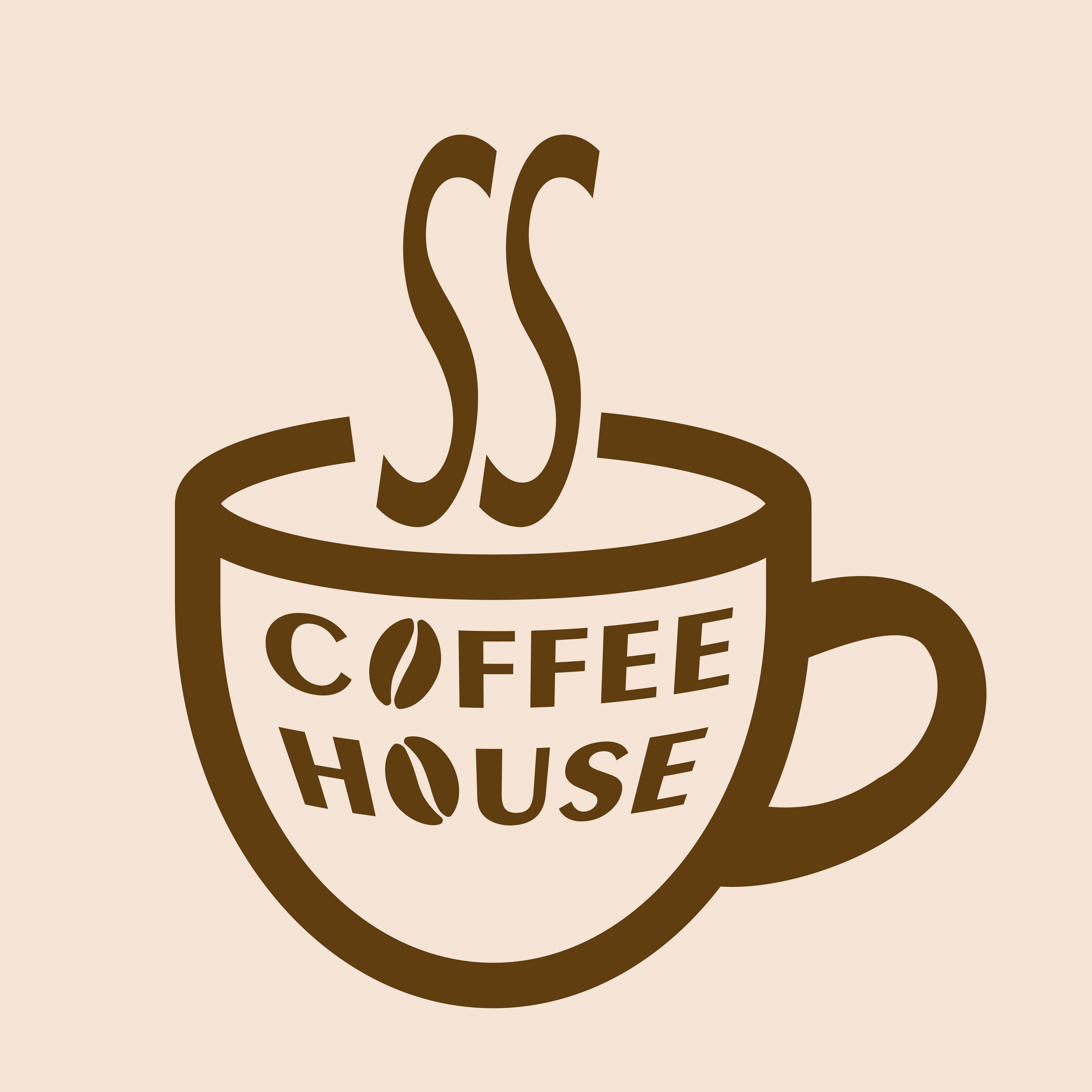
Looks good! What's the thing in the middle?
2 years ago by Amir
Love the colors
2 years ago by Amir
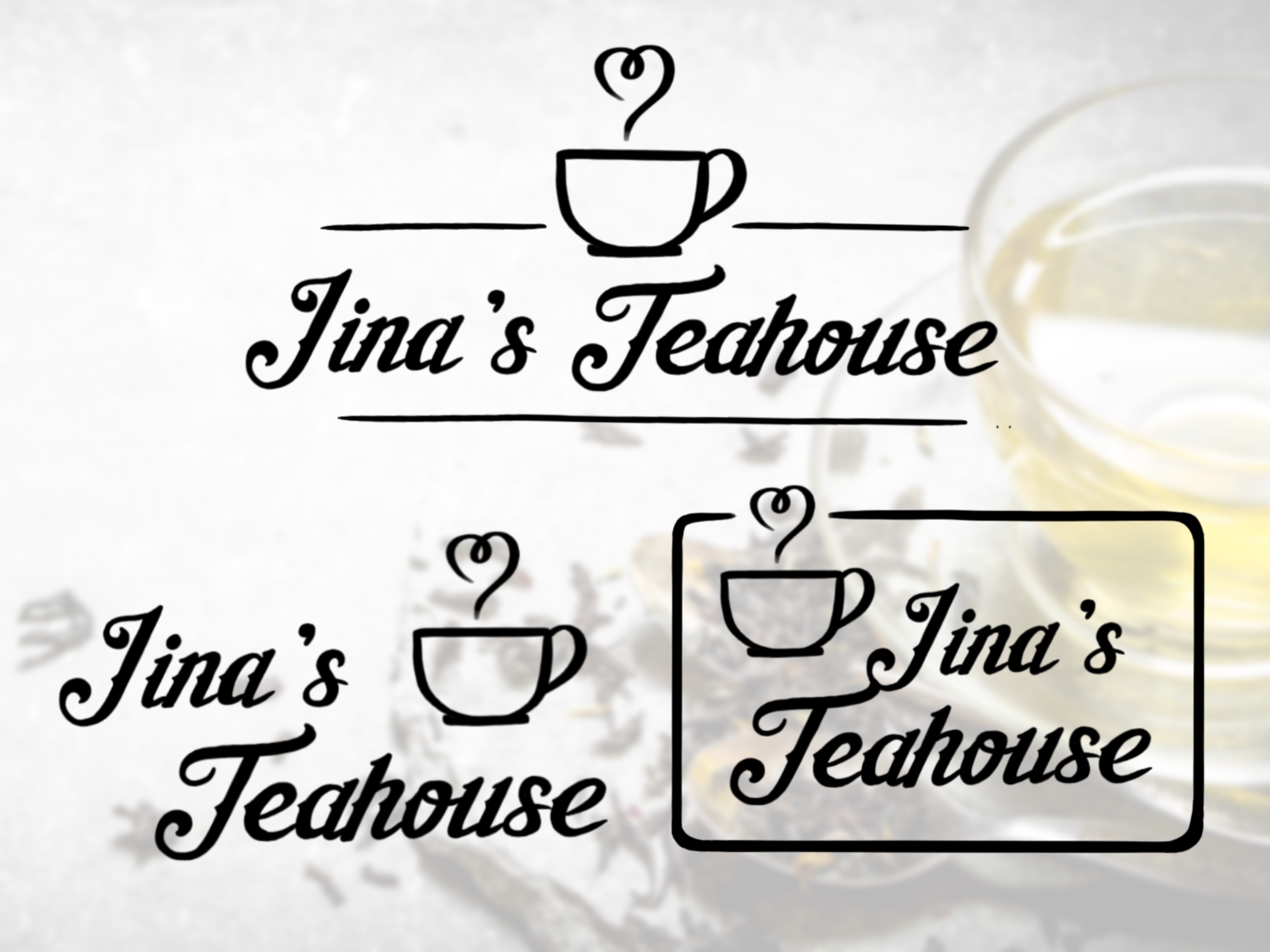
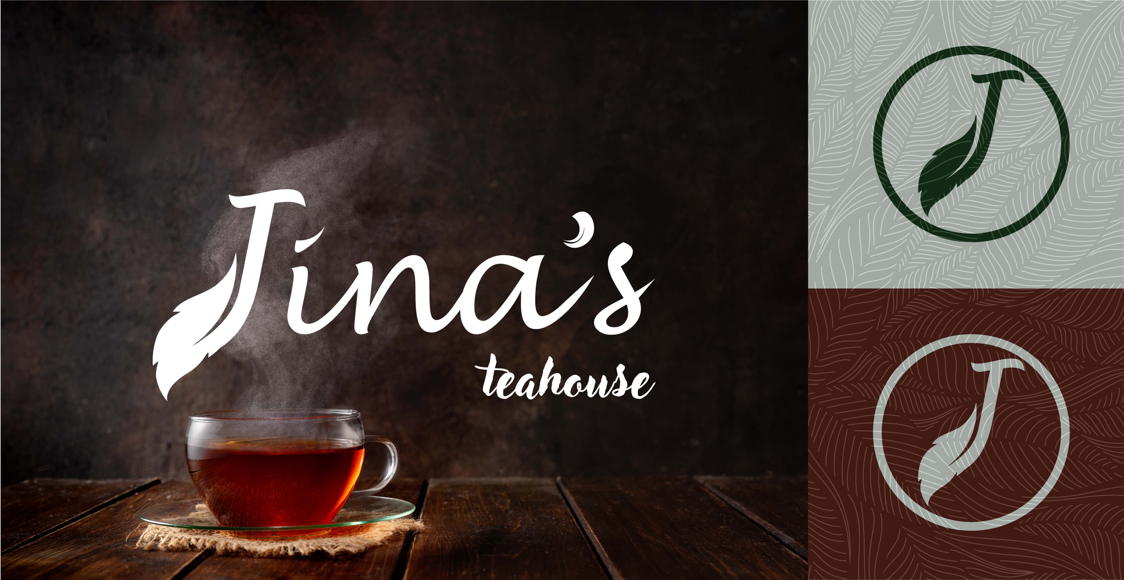
Looks great but I don't think it's clear enough if it is Tina's or Jina's
2 years ago by Amir