swetha
Posts
89
Likes
6
Liked Posts
62
Given Feedback
78
Feedback
simple and neat
2 months ago by swetha
good
2 months ago by swetha
colourful
1 year ago by swetha
simple and neat
1 year ago by swetha
nice
1 year ago by swetha
nice
1 year ago by swetha
Thank u
1 year ago by swetha
simple and nice
1 year ago by swetha
great
1 year ago by swetha
wow great
1 year ago by swetha
nice
1 year ago by swetha
Thank you
1 year ago by swetha
Thank u for ur feedback i will improve it

1 year ago by swetha
For chocolate companies i have used brown and font style for indicating chocolate companies

1 year ago by swetha
Sure thanku
1 year ago by swetha
nice
1 year ago by swetha
nice
1 year ago by swetha
Thank u for ur guide surely i will work it out
1 year ago by swetha
👍

1 year ago by swetha
Thank u

1 year ago by swetha
Thank u
2 years ago by swetha
Thank u
2 years ago by swetha
Thank u

2 years ago by swetha
superb
2 years ago by swetha
nice
2 years ago by swetha
Great 👏super I like the colours

2 years ago by swetha
Super
2 years ago by swetha
whats wrong with u ? i welcome genuine feedbacks ur feebacks are not genuine just dont give feedback for sake

2 years ago by swetha
3rd logo looks over shadow
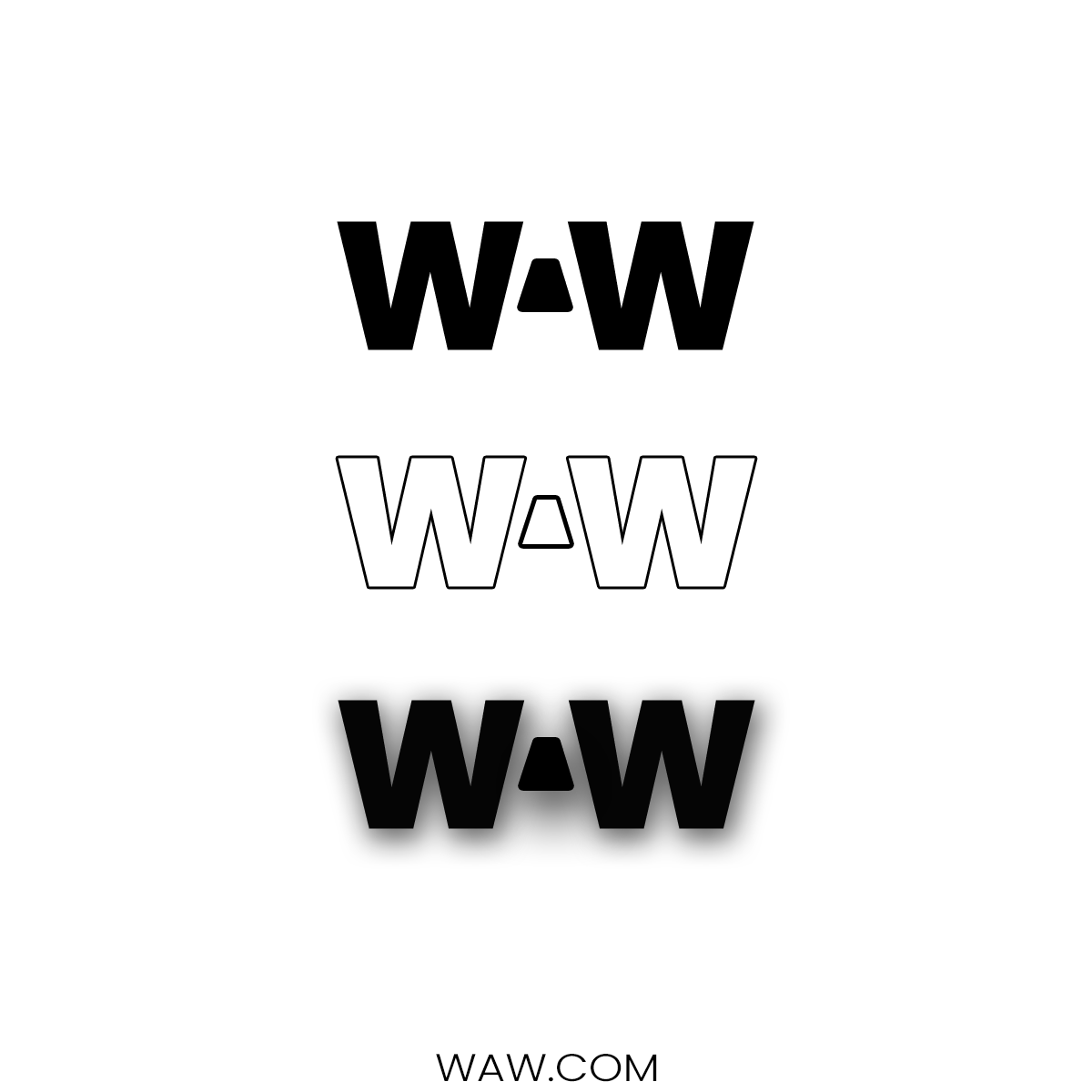
2 years ago by swetha
over shadow
2 years ago by swetha
this is my own design i am keeping seeing ur same feedback in many post please post ur works as well it is easy to criticise a work done by designers
2 years ago by swetha
nope i did it i took image as referal i didnt know this design available in canvas
2 years ago by swetha
ok let me try in next project

2 years ago by swetha
what do u mean?

2 years ago by swetha
thank u
2 years ago by swetha
Ok this is my try if it is not ok i will improve thank u for ur feedback
2 years ago by swetha
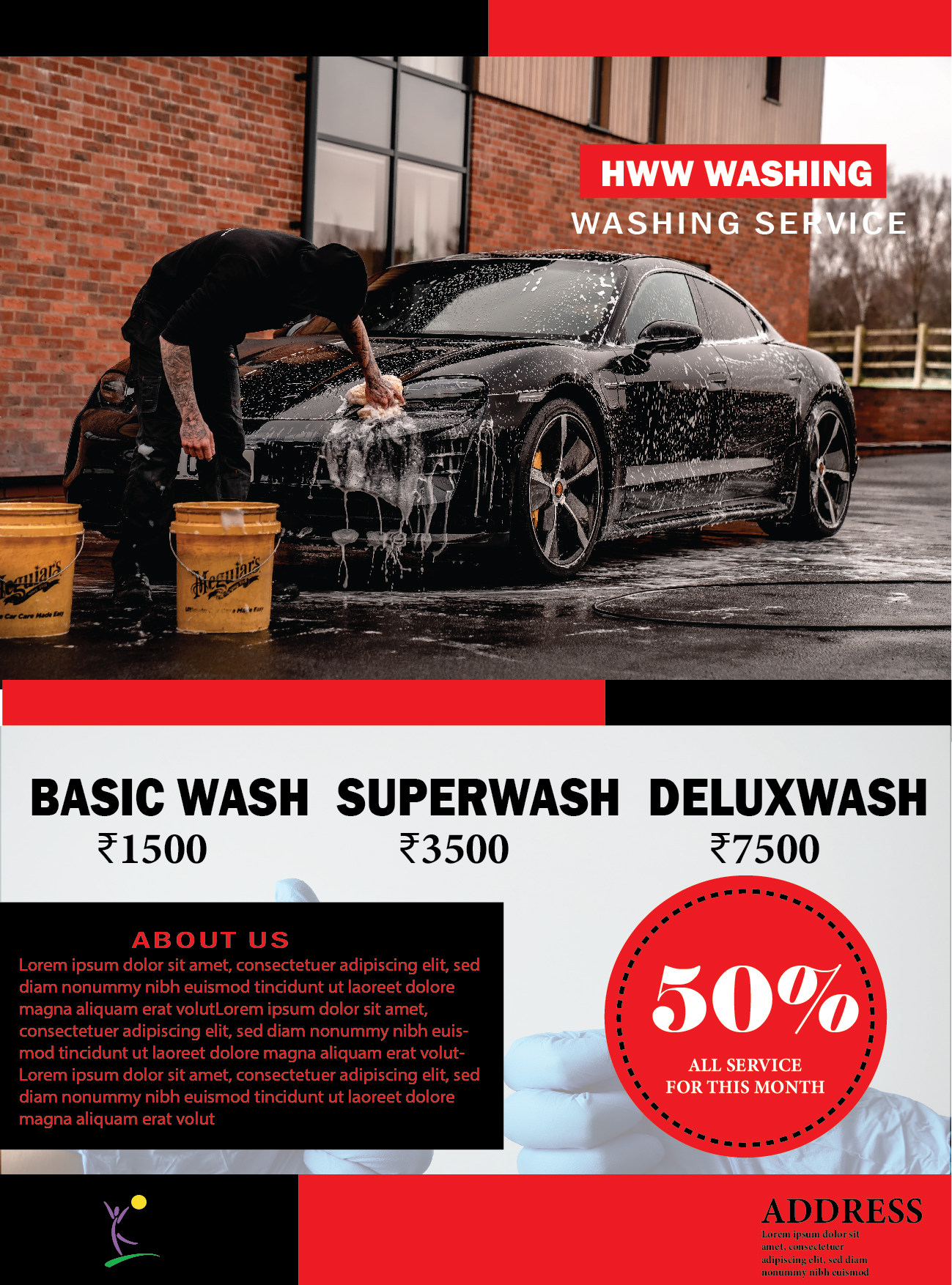
Size

2 years ago by swetha
Looks great
2 years ago by swetha
thank u i try to make bigger sixe logo next time
2 years ago by swetha
looking great beautiful
2 years ago by swetha
thank u

2 years ago by swetha
looking cool
2 years ago by swetha
Thank u
2 years ago by swetha
nice i got the same project i have also posted u can look at it

2 years ago by swetha
looking cool and superb
2 years ago by swetha
good
2 years ago by swetha
Thank u
2 years ago by swetha
Thank u
2 years ago by swetha
Thank u
2 years ago by swetha
nice and simple
2 years ago by swetha
superb
2 years ago by swetha
thank u
2 years ago by swetha
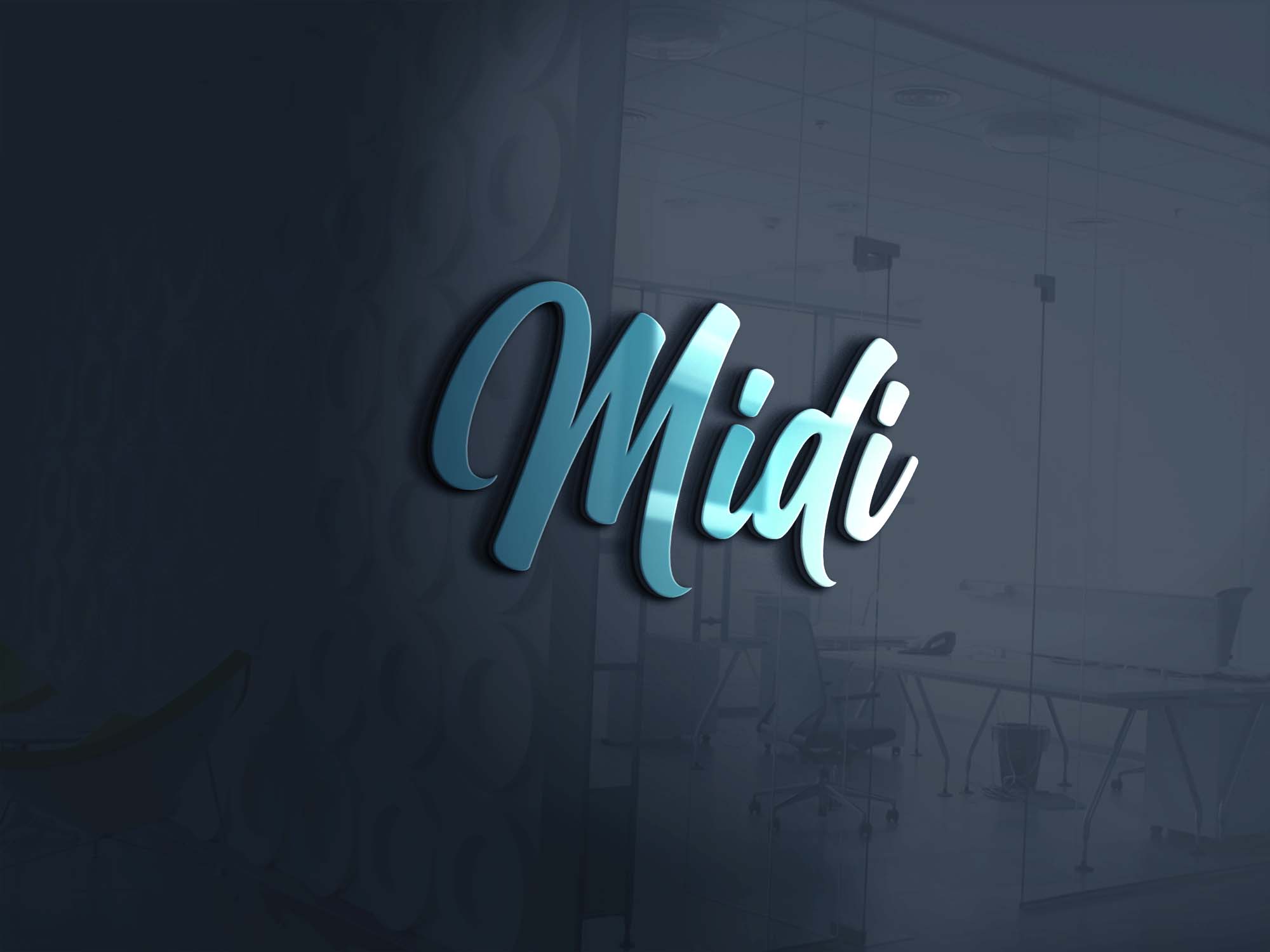
its letter mark logo you should have worked out with tws letters blue colour is good
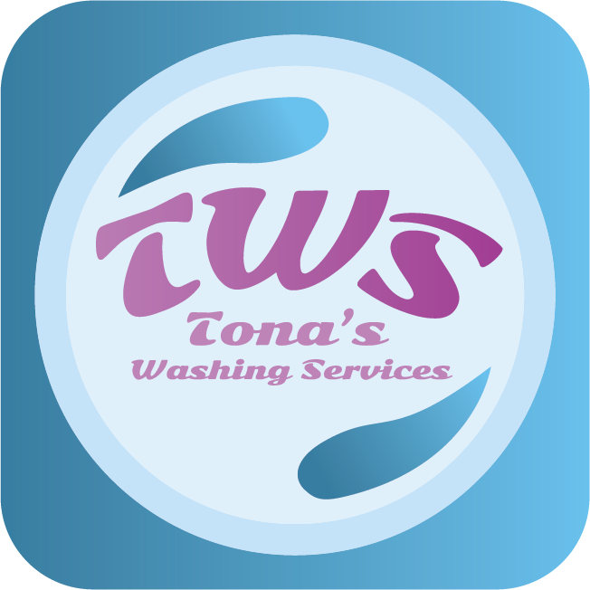
2 years ago by swetha
thank u sure
2 years ago by swetha
thank u
2 years ago by swetha
thank u for lovely feedback surely i will work it out next time
2 years ago by swetha
good
2 years ago by swetha
nice
2 years ago by swetha
Thank you
2 years ago by swetha
nice

2 years ago by swetha
looks superb

2 years ago by swetha
sure

2 years ago by swetha
thank u
2 years ago by swetha
thank u

2 years ago by swetha
thank u

2 years ago by swetha
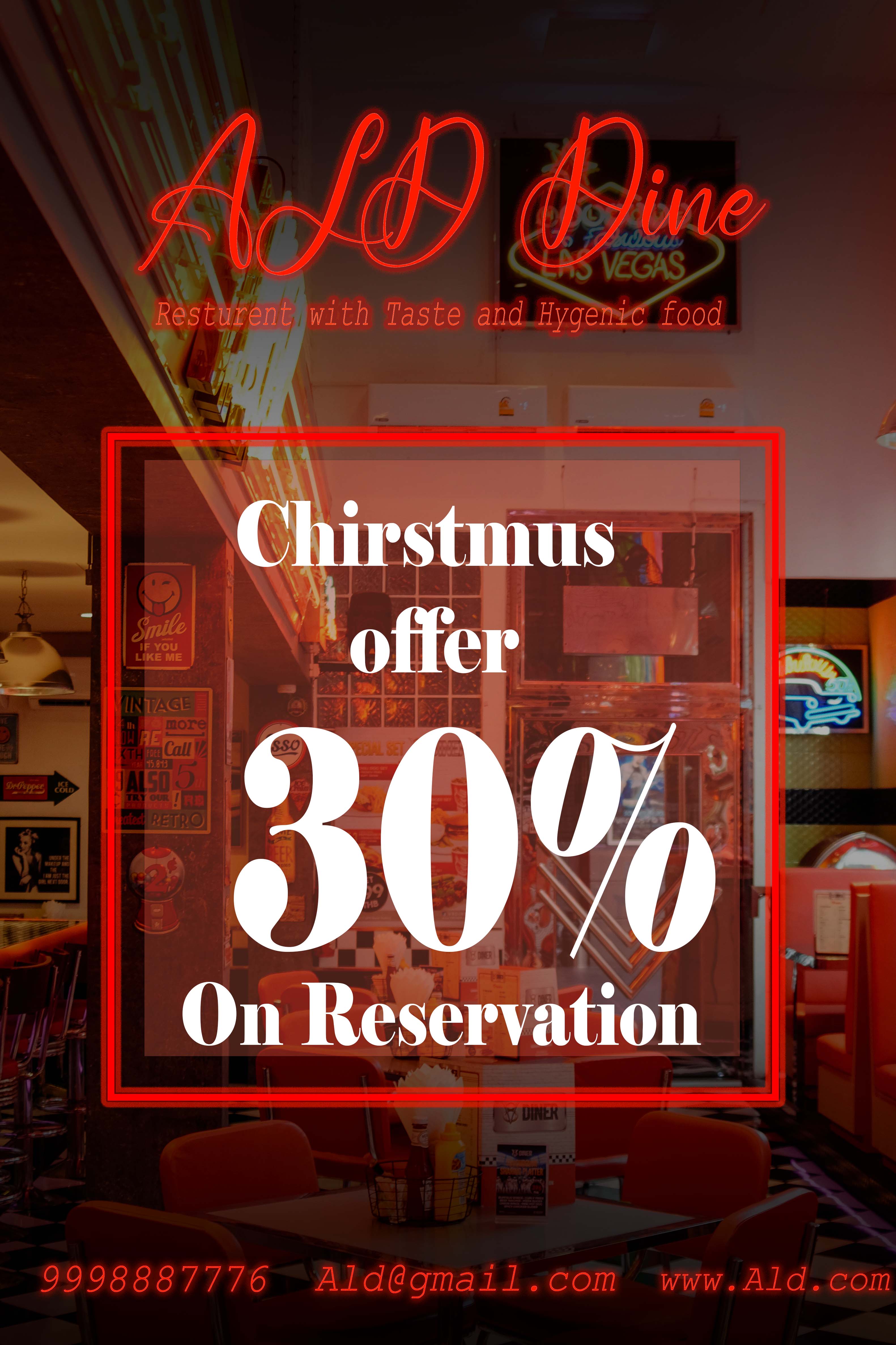
my concept was bringing green tea font in tea pot shape

2 years ago by swetha
hey waffle thank u for ur suggestions its mean lot to me in this logo i wanted to show both abstract and word mark logo since it is a coimbination logo yes i have givensome gradient to abstract logo to be atractive thank u for suggestions it will be more helpful to improve my skills
3 years ago by swetha
thank u
3 years ago by swetha
thank u
3 years ago by swetha
thank u
4 years ago by swetha
THANK YOU
4 years ago by swetha
WHAT IS BBN?

4 years ago by swetha
thank you
4 years ago by swetha
thank u
4 years ago by swetha
thank u
4 years ago by swetha
thank u
4 years ago by swetha
nice work
4 years ago by swetha
nice work
4 years ago by swetha
Posts
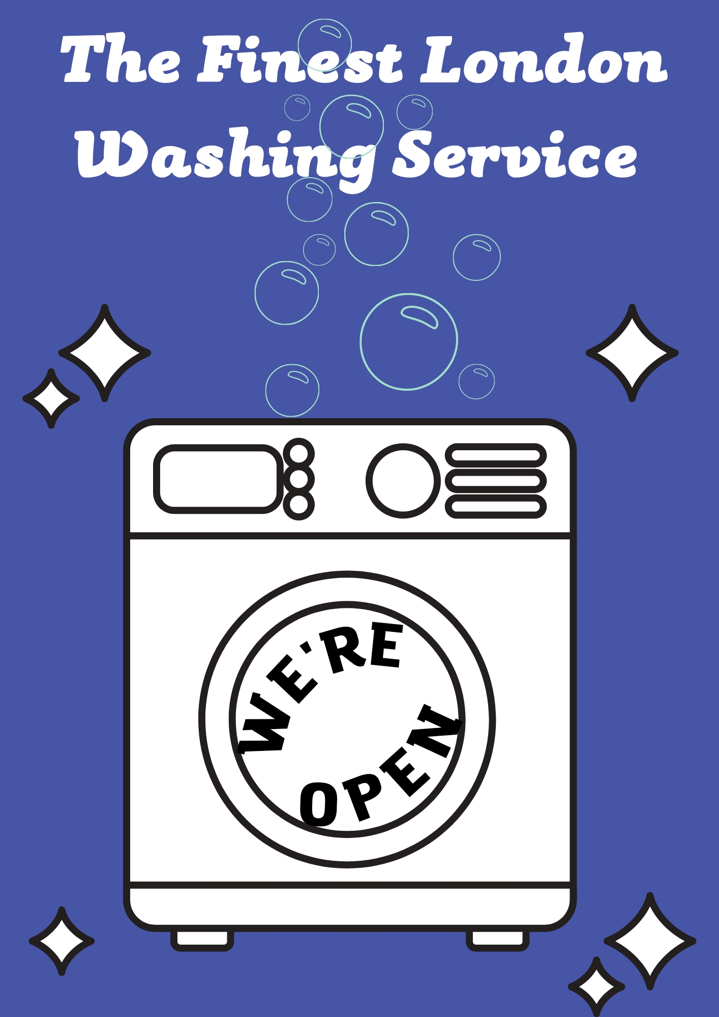
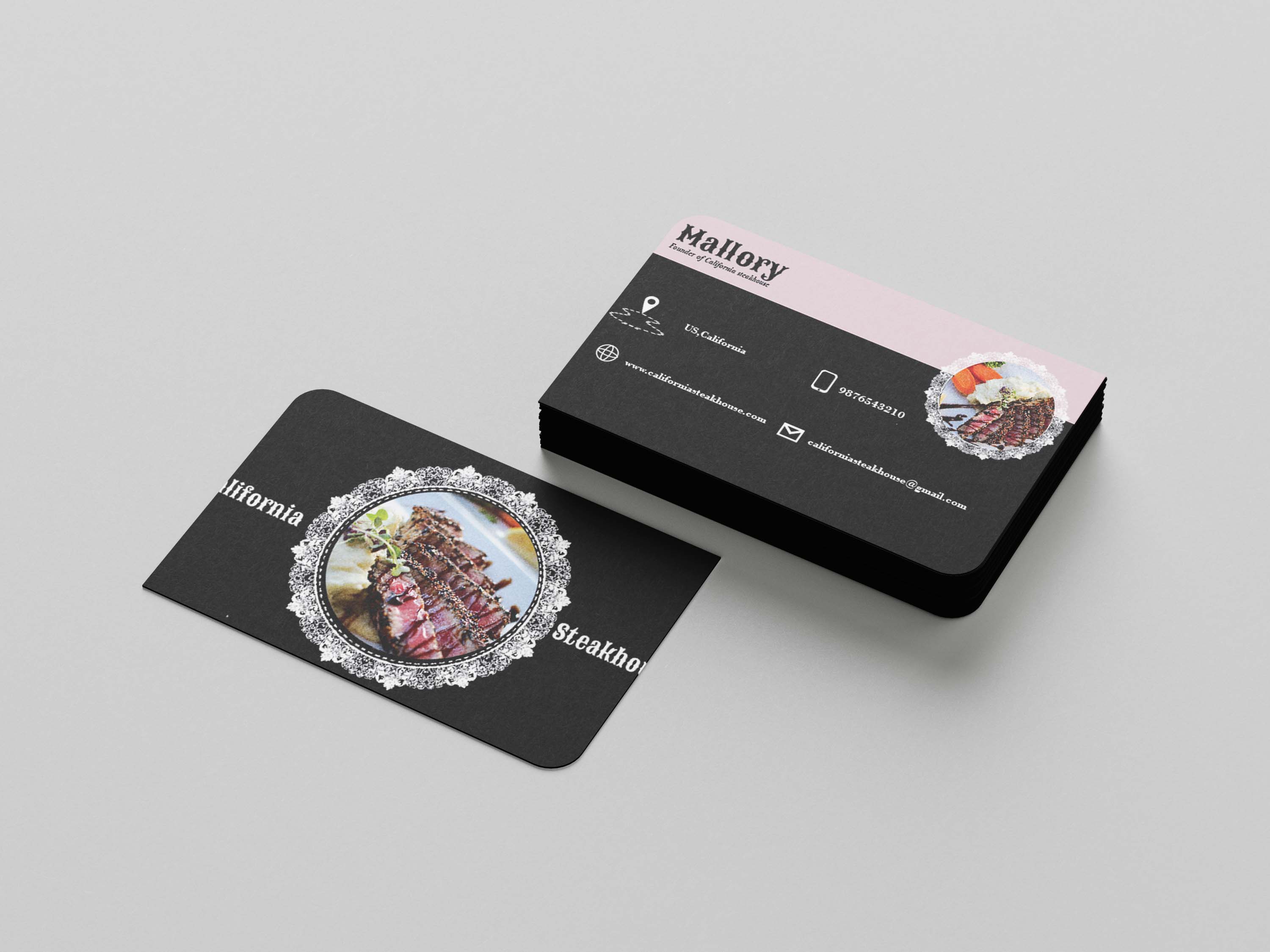
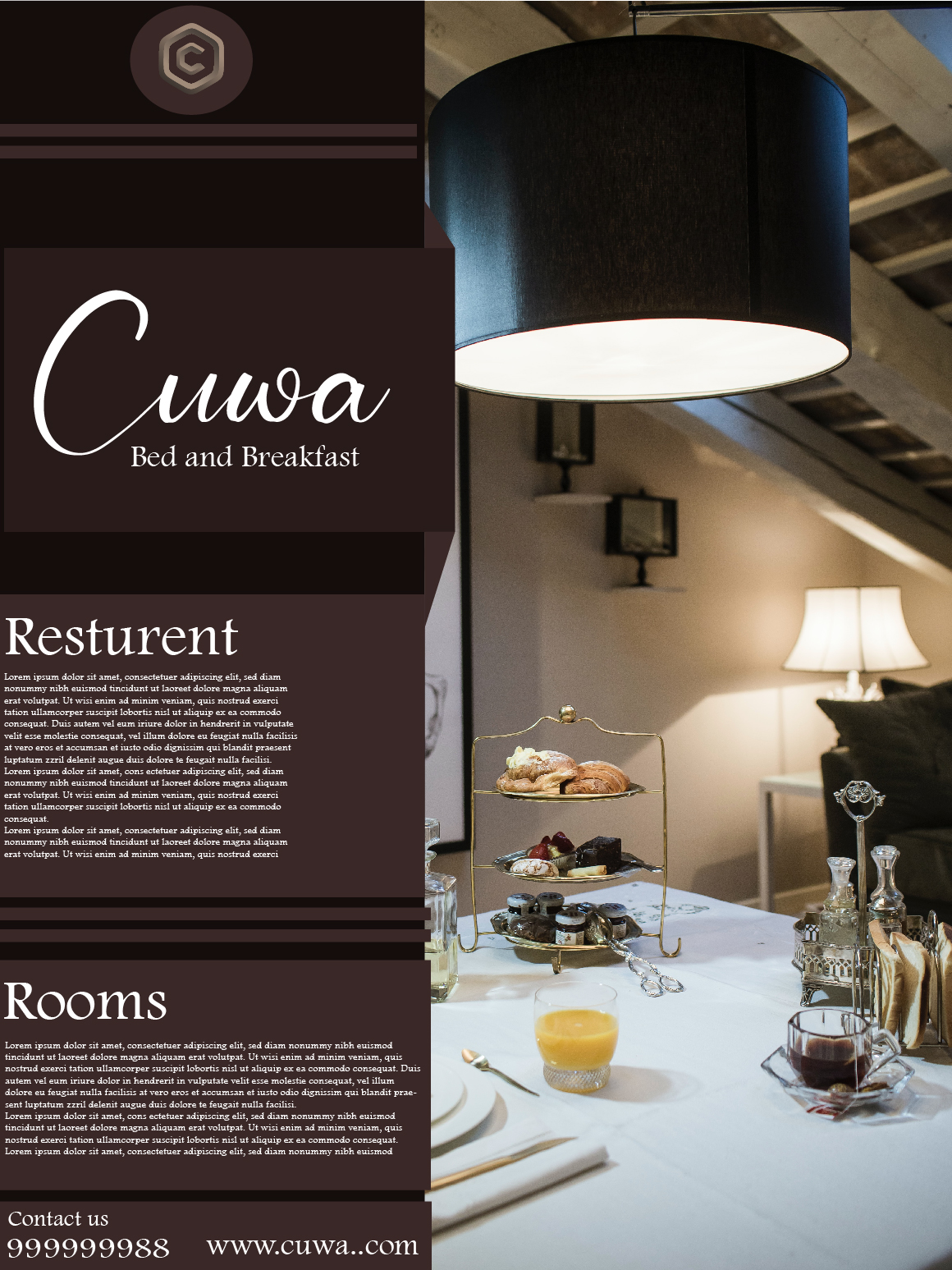
DOS Cafeteria logo
- Report
swetha • 2 months ago
Hello,
I am Wade, owner of DOS Cafeteria. For a while now, we've been looking for a good logo for our Cafeteria. I would like the logo to be an abstract mark. We would love to work with you!
I am Wade, owner of DOS Cafeteria. For a while now, we've been looking for a good logo for our Cafeteria. I would like the logo to be an abstract mark. We would love to work with you!
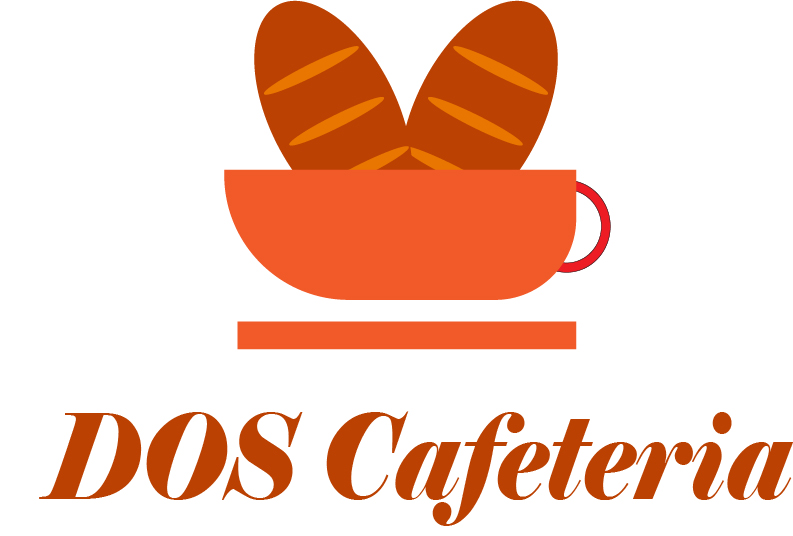
 Like
Like


looks pretty nice but i think you should work on more details like shadows and etc. You are doing a great job just keep working you can do it, keep going, i know you can do it)
2 months ago by Seva - Reply
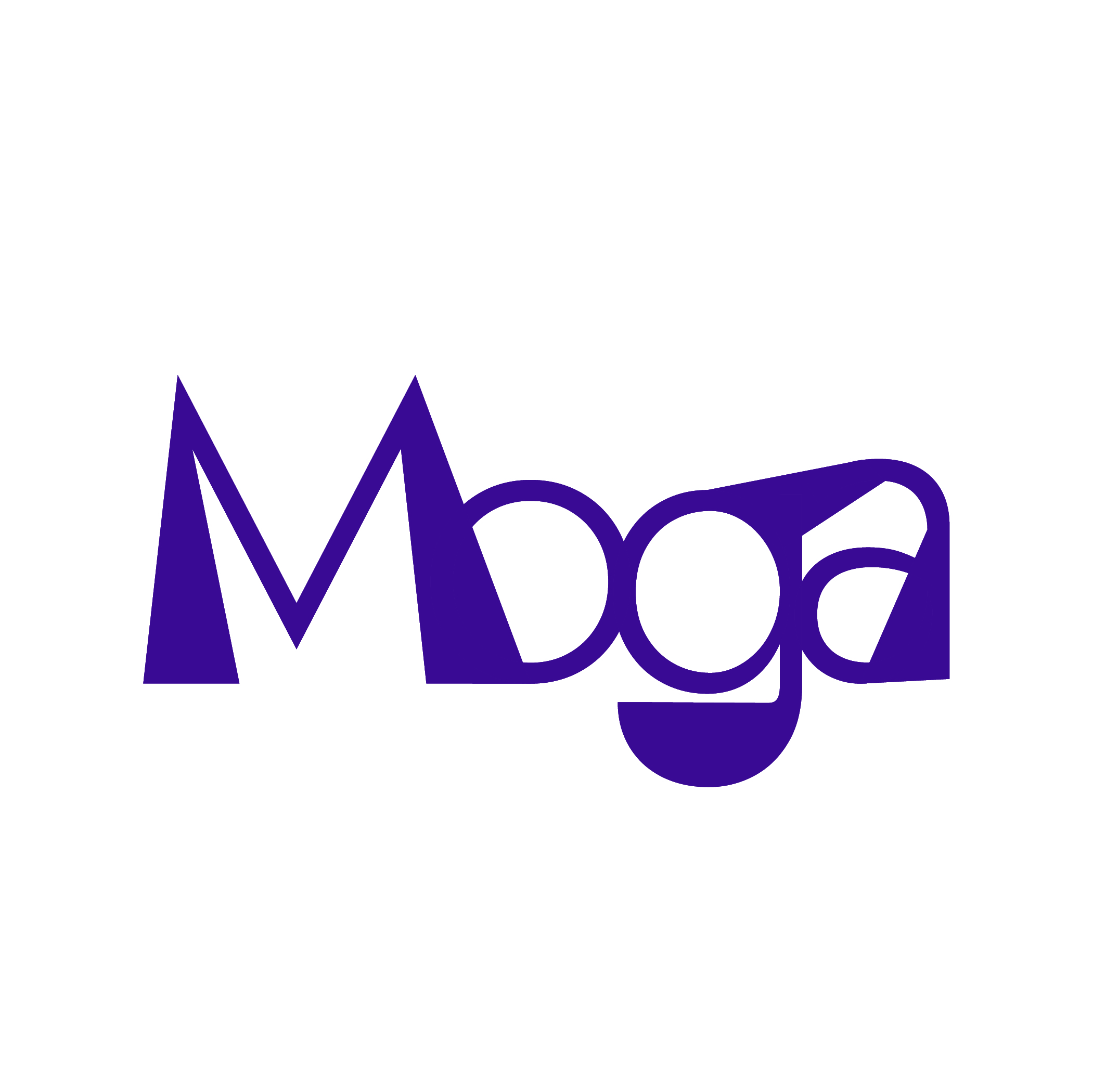
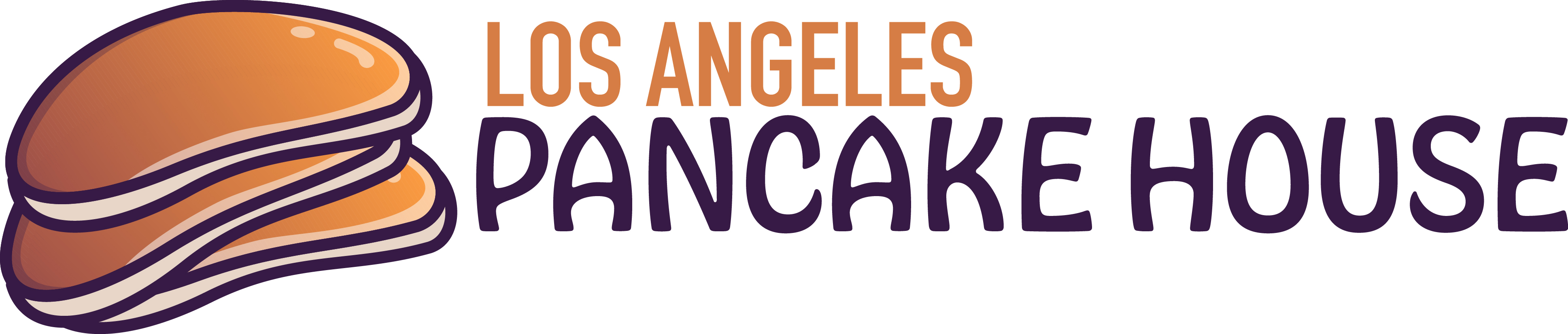
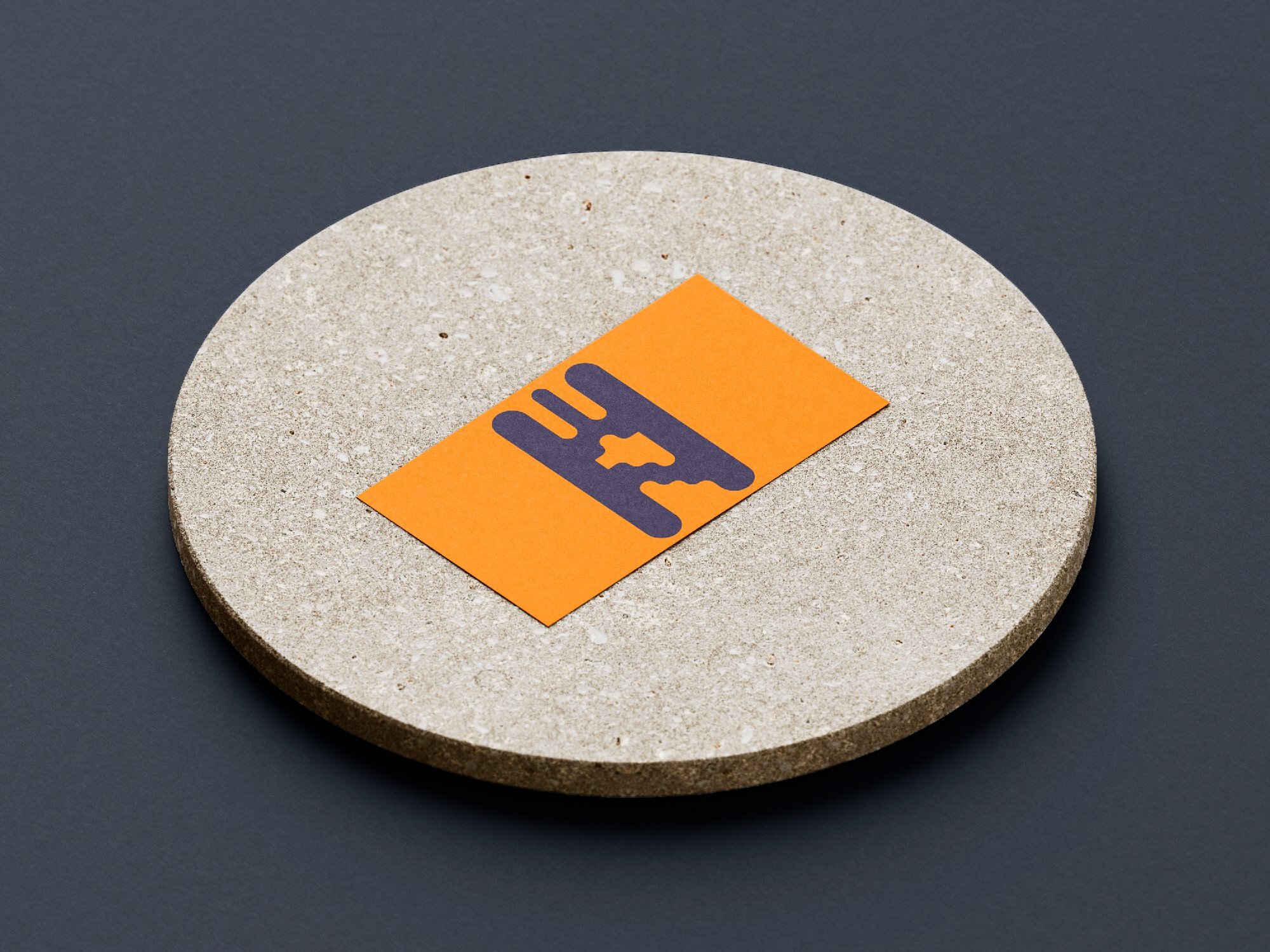
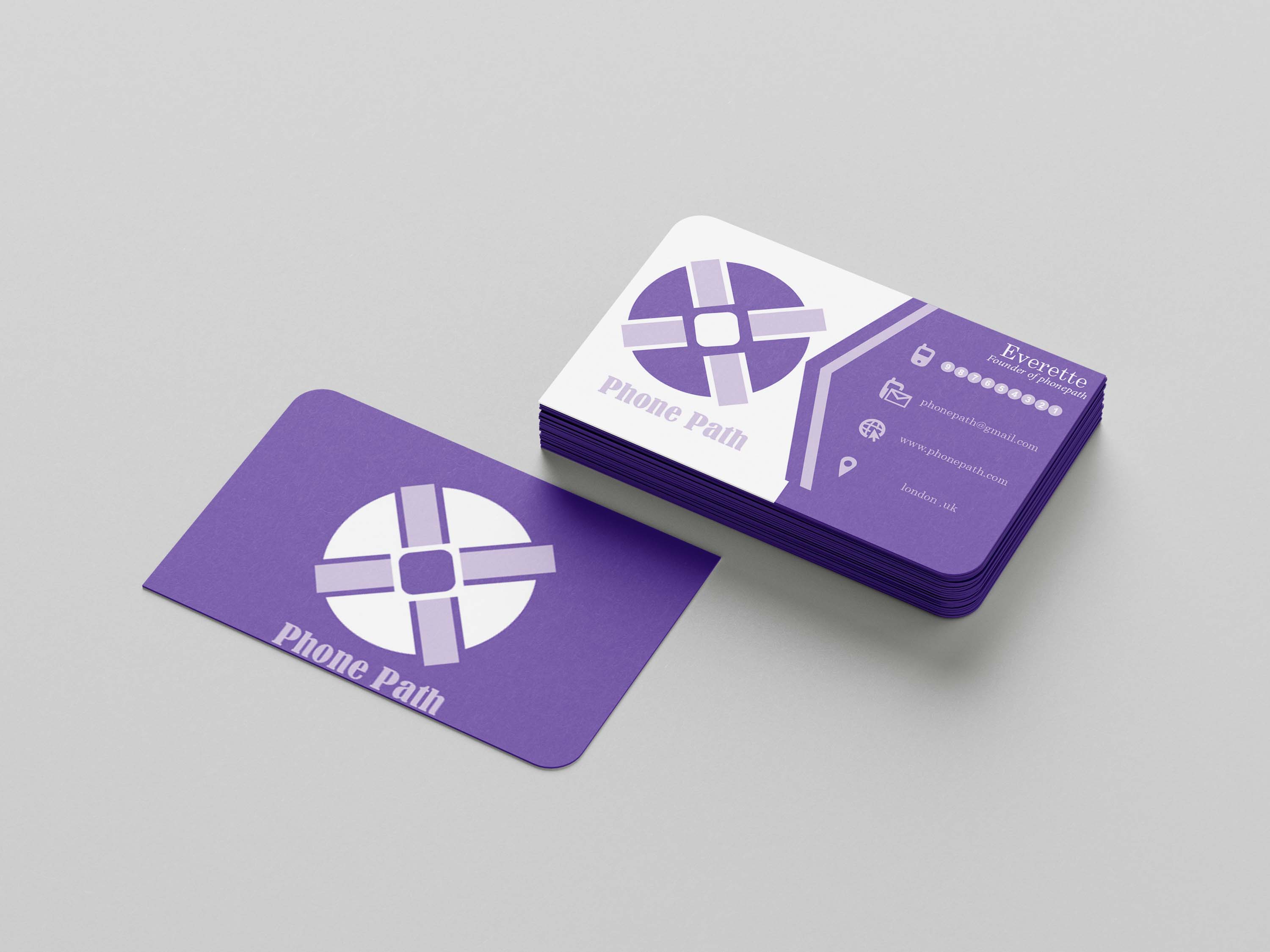
combine logo
- Report
swetha • 1 year ago
Hi,
I'm Brock, creator of CV Fish market. We're looking for someone that can make a good logo for our Fish market. I think a combination mark will fit best with the business. We would love to work with you!
I'm Brock, creator of CV Fish market. We're looking for someone that can make a good logo for our Fish market. I think a combination mark will fit best with the business. We would love to work with you!
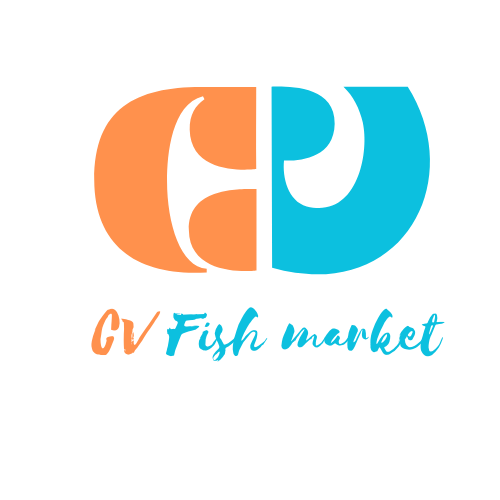

looks really good and professional for a logo!
1 year ago by chai - Reply
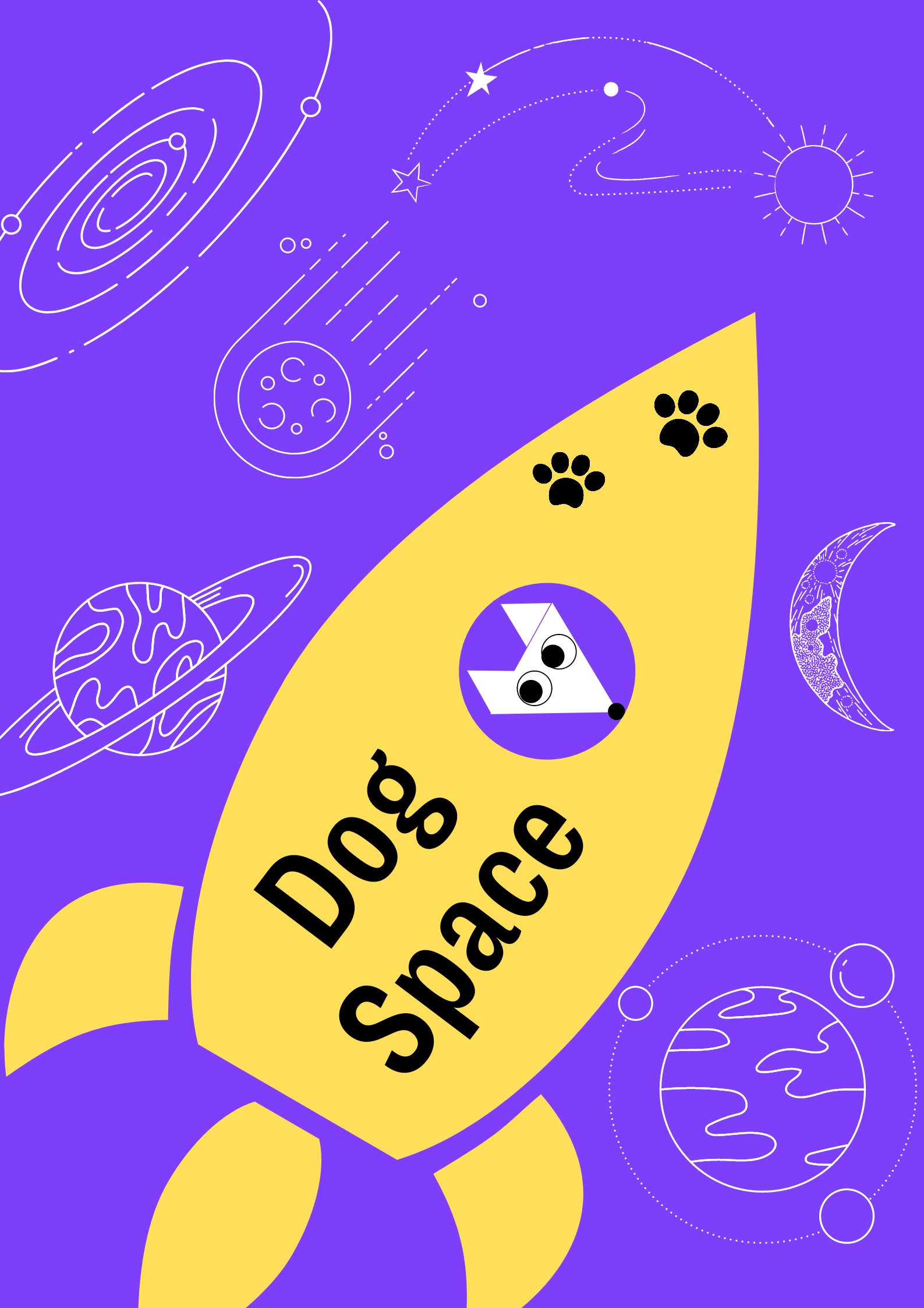
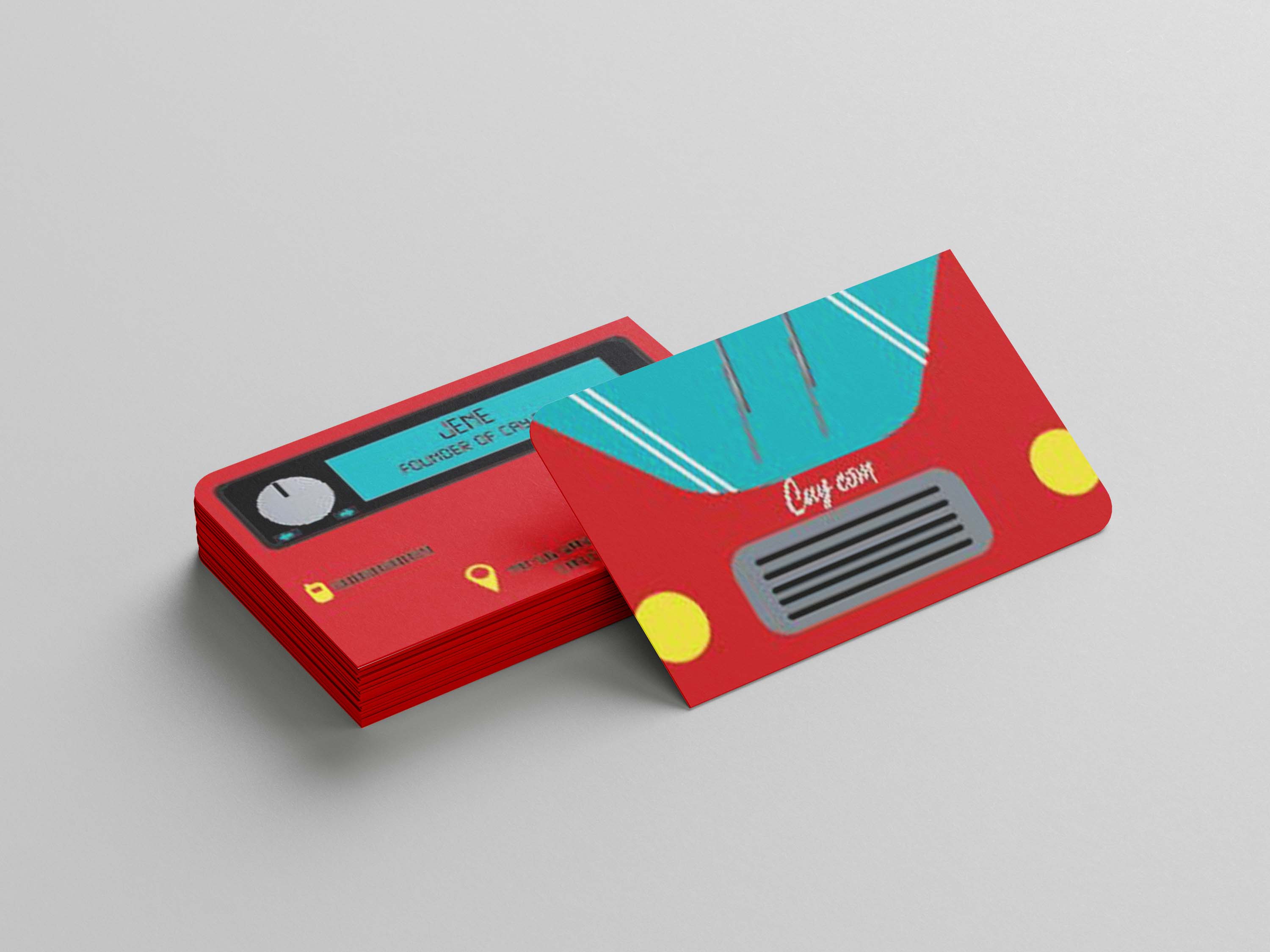
moscot logo
- Report
swetha • 1 year ago
Hey There,
I am Chester, I recently started a new business called ComputerTrace. I am looking for someone that can design a professional logo for my business. I love mascot logos. Can you do that?
I am Chester, I recently started a new business called ComputerTrace. I am looking for someone that can design a professional logo for my business. I love mascot logos. Can you do that?


nice illustration style
1 year ago by Ranny - Reply
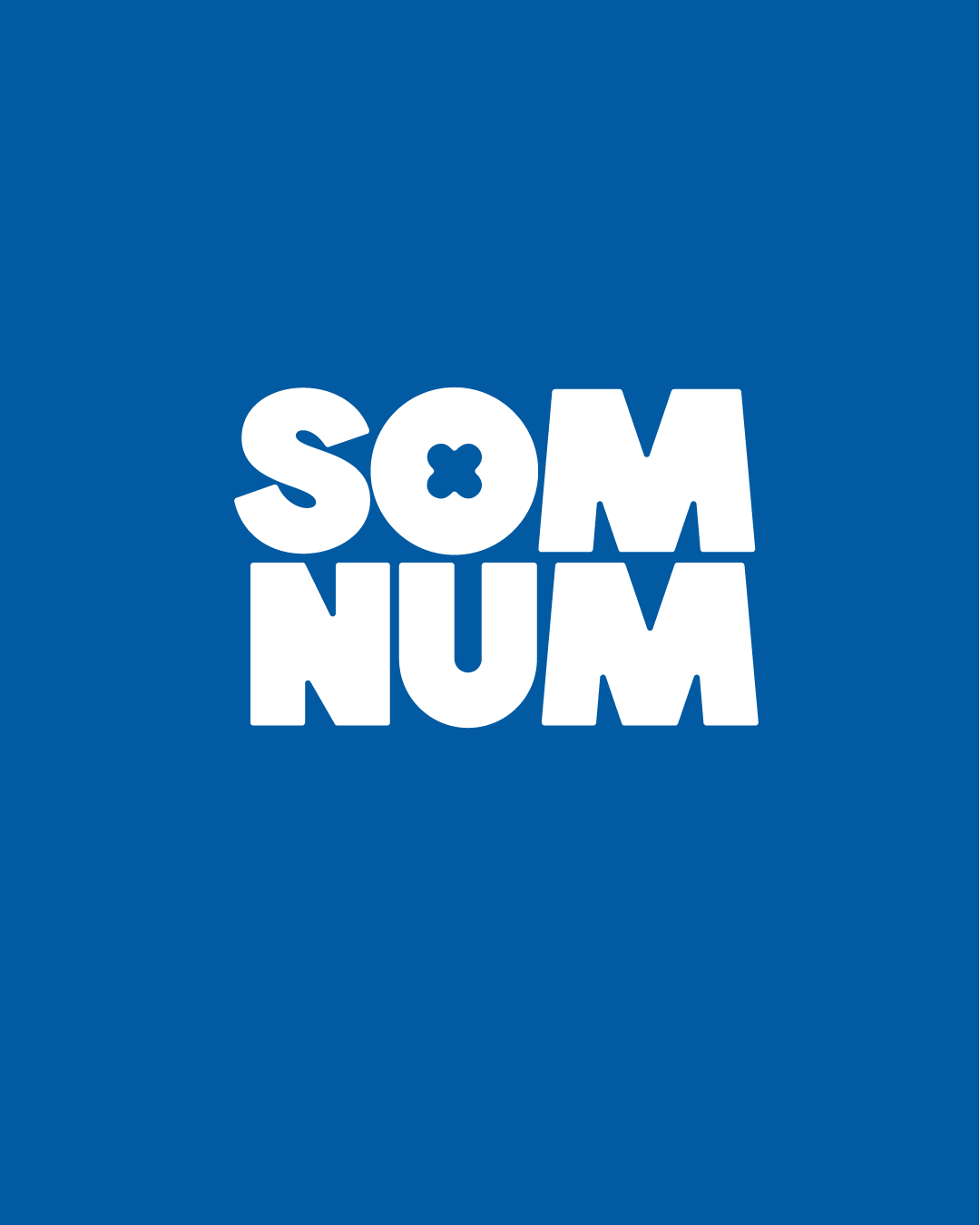
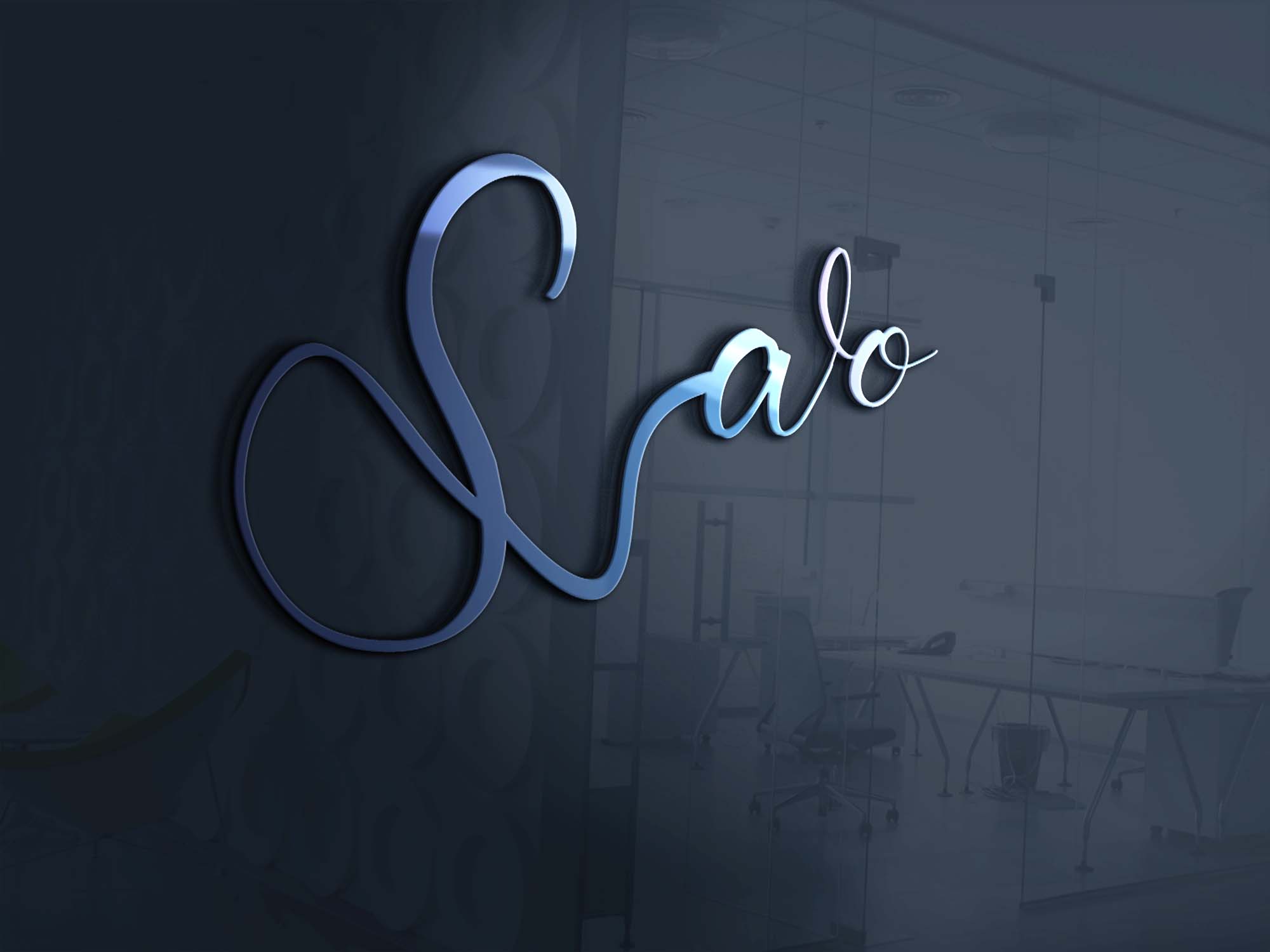
savo stylish logo
- Report
swetha • 1 year ago
Hello!
I'm Carmen, founder of Savo. For a while now, I've been looking for a good logo for my business. I think a wordmark would look cool. Can you help us out?
I'm Carmen, founder of Savo. For a while now, I've been looking for a good logo for my business. I think a wordmark would look cool. Can you help us out?

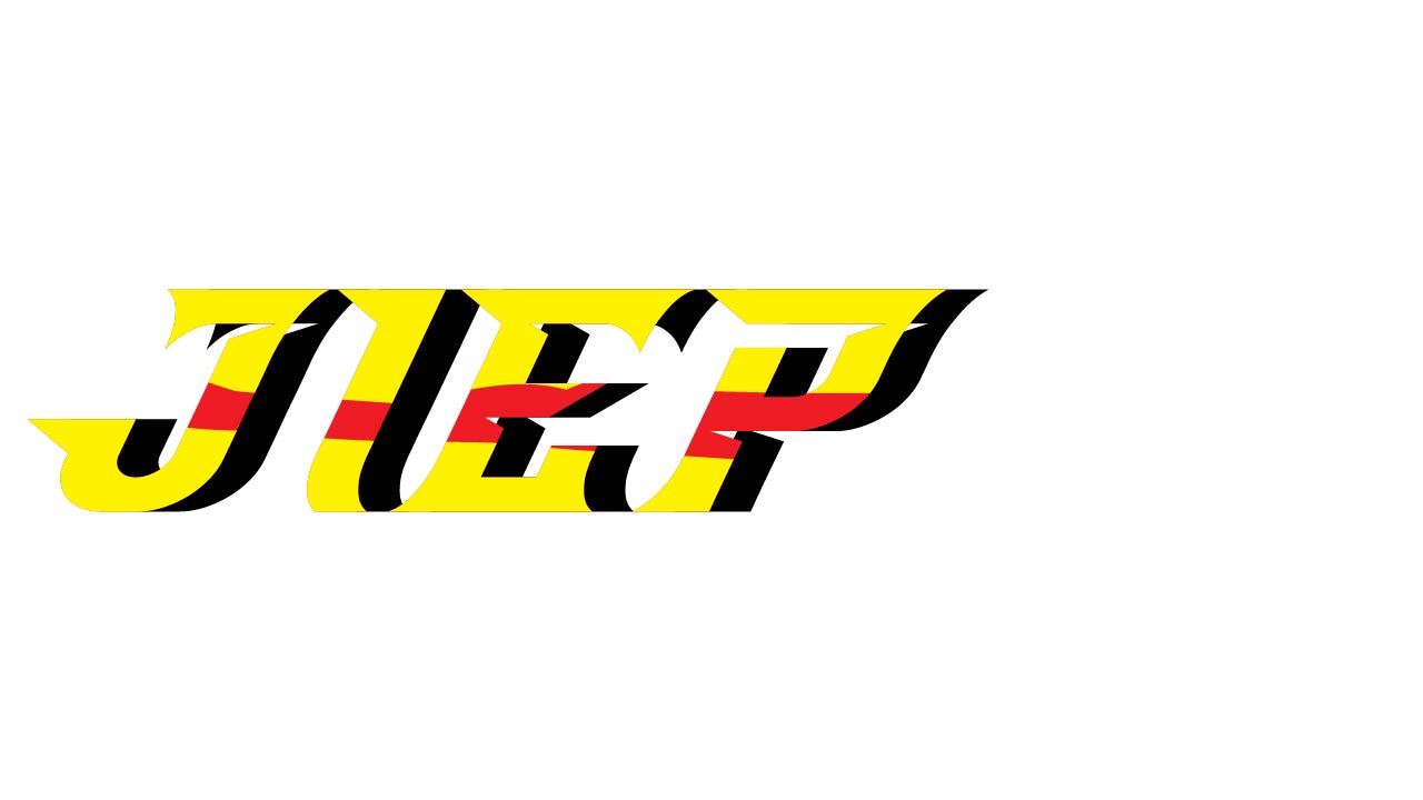
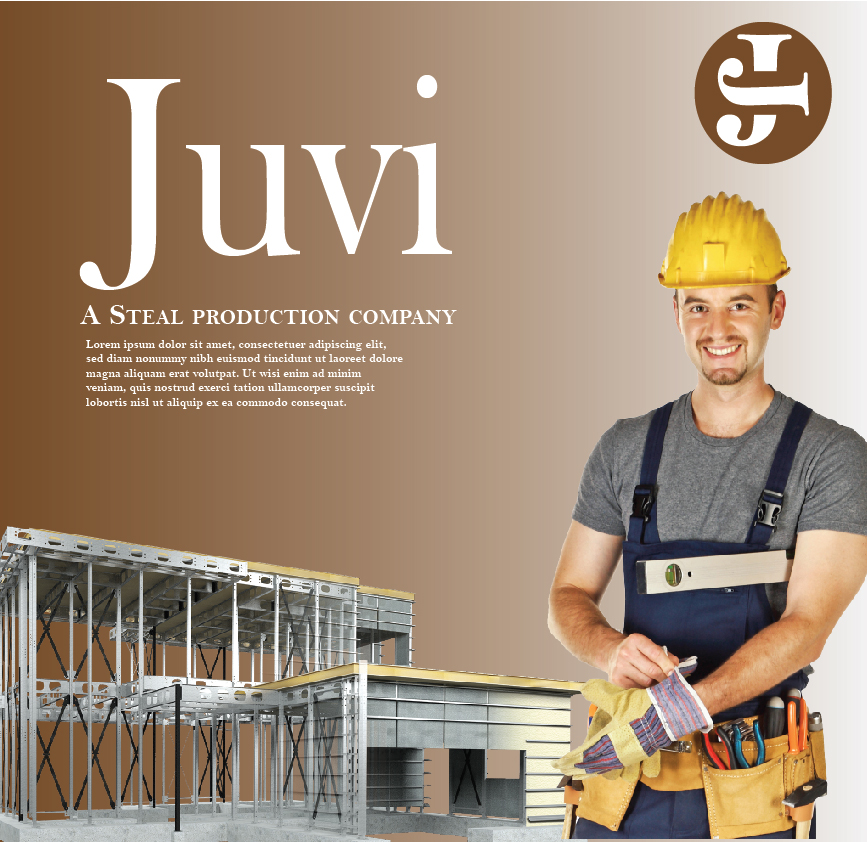
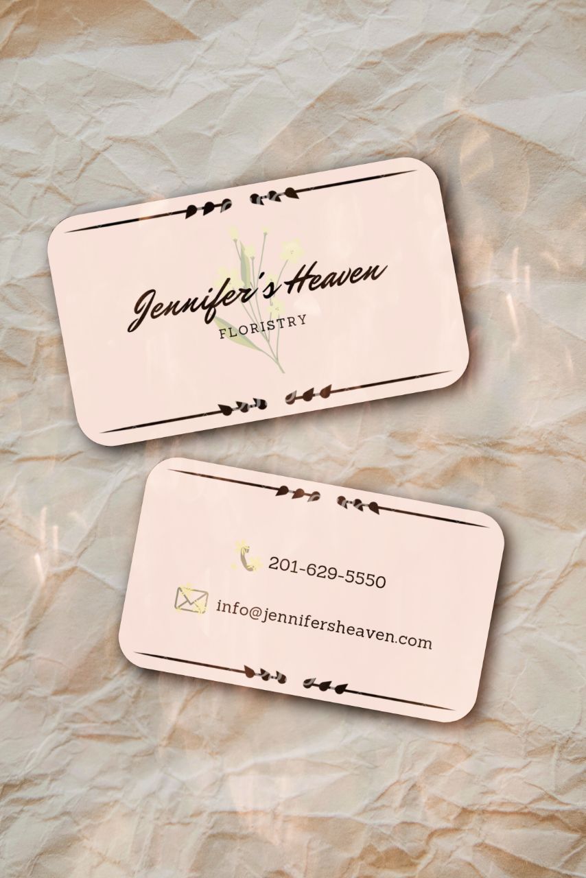
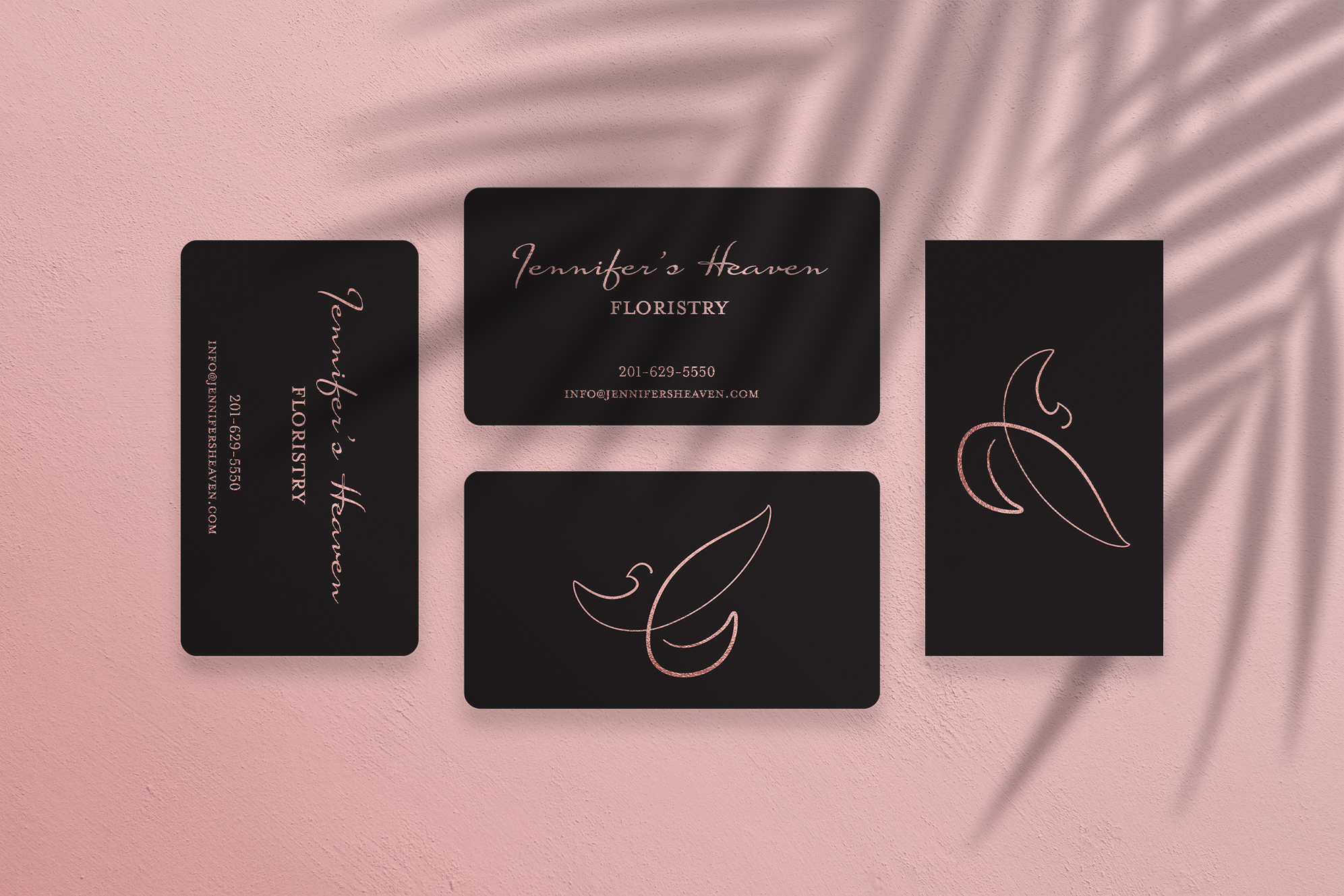
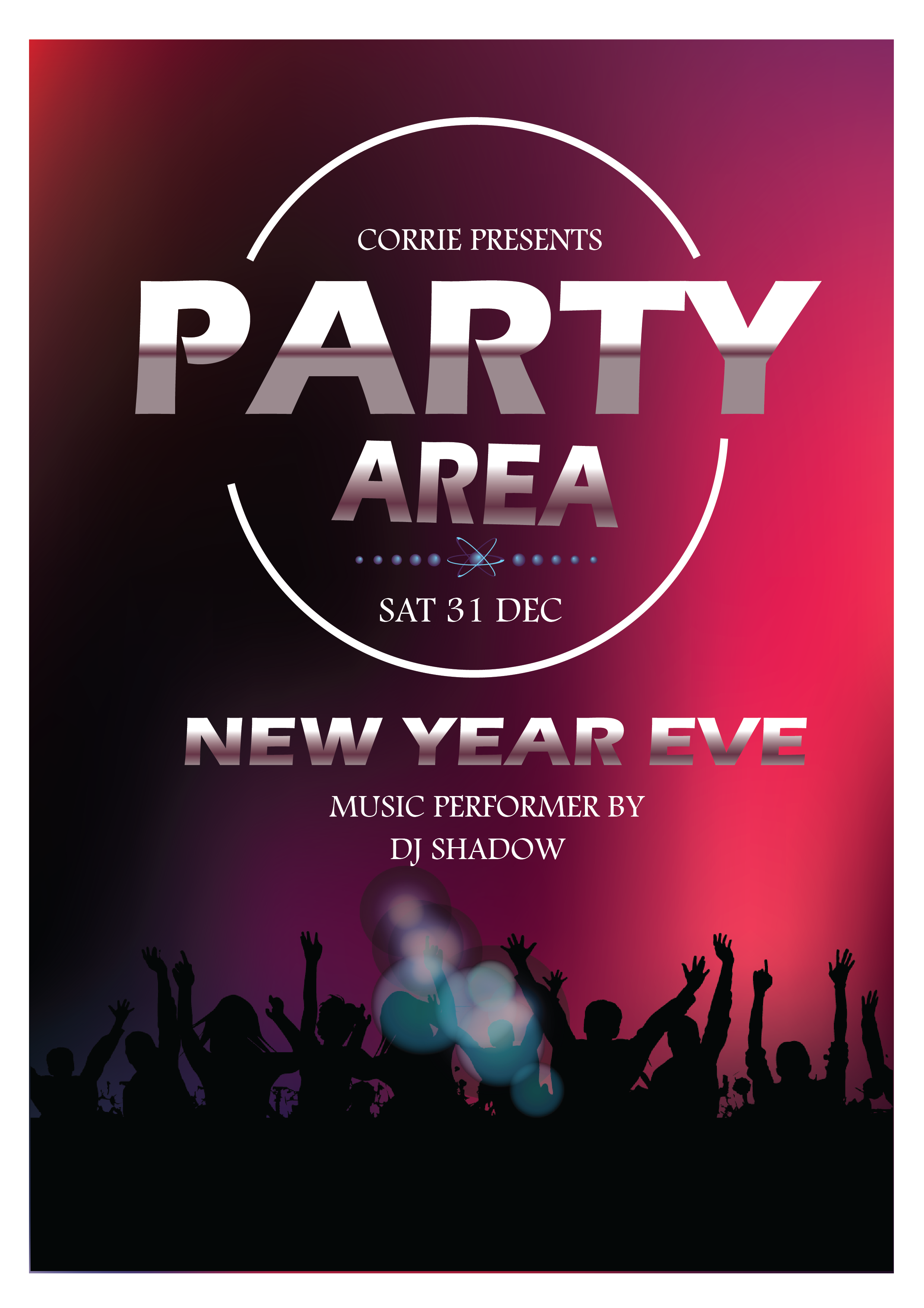
Juvi steal poster
- Report
swetha • 1 year ago
Hey,
I am Georgeann, I just founded a new business called Juvi. For a while now, I've been looking for a good designer for my steel production company. We will need a poster to advertise our business. Can you help us out?
I am Georgeann, I just founded a new business called Juvi. For a while now, I've been looking for a good designer for my steel production company. We will need a poster to advertise our business. Can you help us out?
