Isa
Posts
1
Likes
1
Liked Posts
13
Given Feedback
14
Feedback
I found that the price, maybe because of the gradient, disappear a little. Maybe, be sure it's all in a black background for it.

5 years ago by Isa
Like the idea of the title in transparency in background. But the contrast isn't enough when your in a pink zone. Like the ambiance you give.
5 years ago by Isa
Straight to the point! Good job!

5 years ago by Isa
Like the idea and the balance of it all. But, as it's a logo, what happens to the texture when it's as big as 1/4 po.

5 years ago by Isa
good idea to use the repetition!
5 years ago by Isa
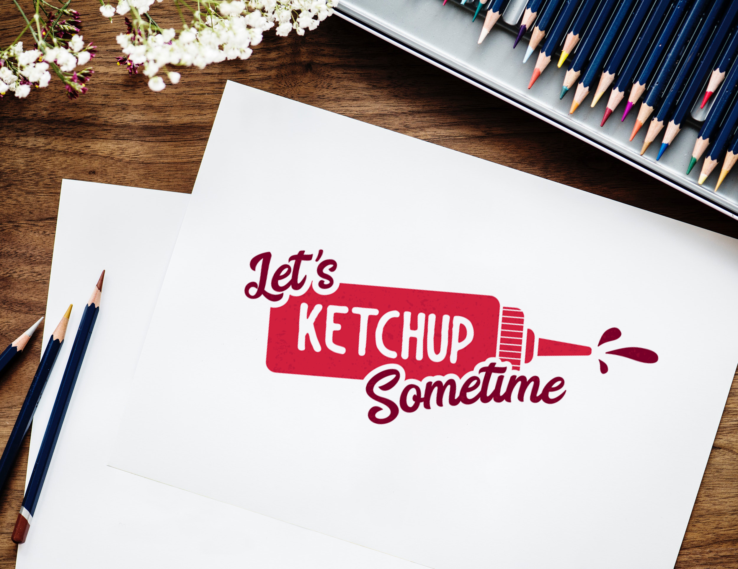
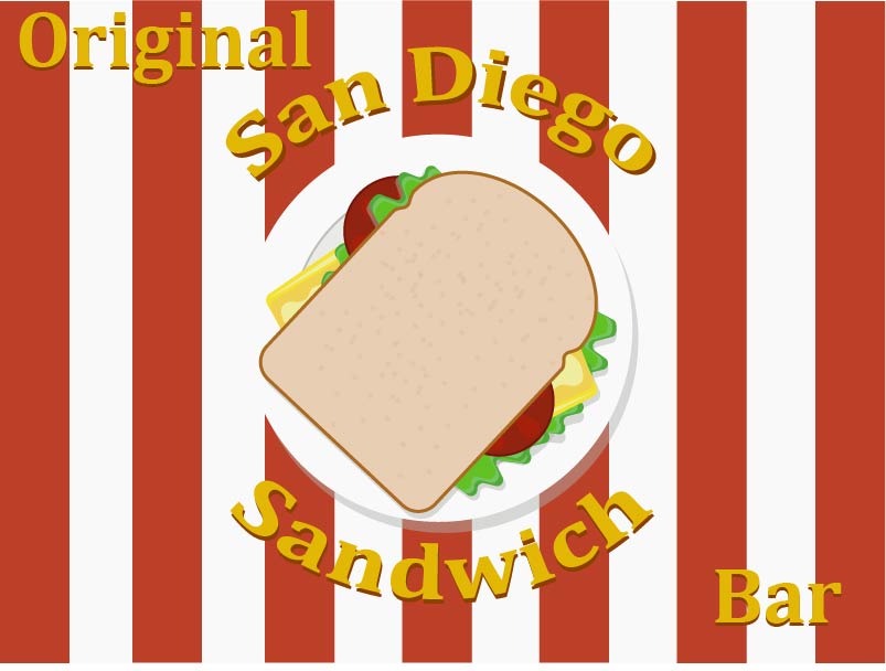
I'm from Quebec province, and even if there's no maple syrup, you get me hungry before going to bed! Miam, I want to go eat there!
5 years ago by Isa
Original. Don't think the lines are necessary. Good job!
5 years ago by Isa
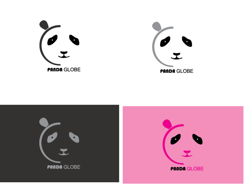
Like it. Like that the ear and line do the globe. Just not sure when it's smaller if the eyes won't disappear. Maybe do the circles bigger. Maybe the mouth too need raffinement.
5 years ago by Isa
Like the idea but just wonder if the curves of the s can be smoother like if they fusionate more in the middle?

5 years ago by Isa
simple, but it's work to catch my eyes. I just wonder if the logo was white?
5 years ago by Isa
Like it! I just wonder when print in small if the type is bold enough and if the lines of the leaves will disappear. Maybe the upper lines ain't necessary to avoid it.

5 years ago by Isa
Why using a different font for the s?
5 years ago by Isa
I found there's too much details for a logo. Too complicated for me.
5 years ago by Isa
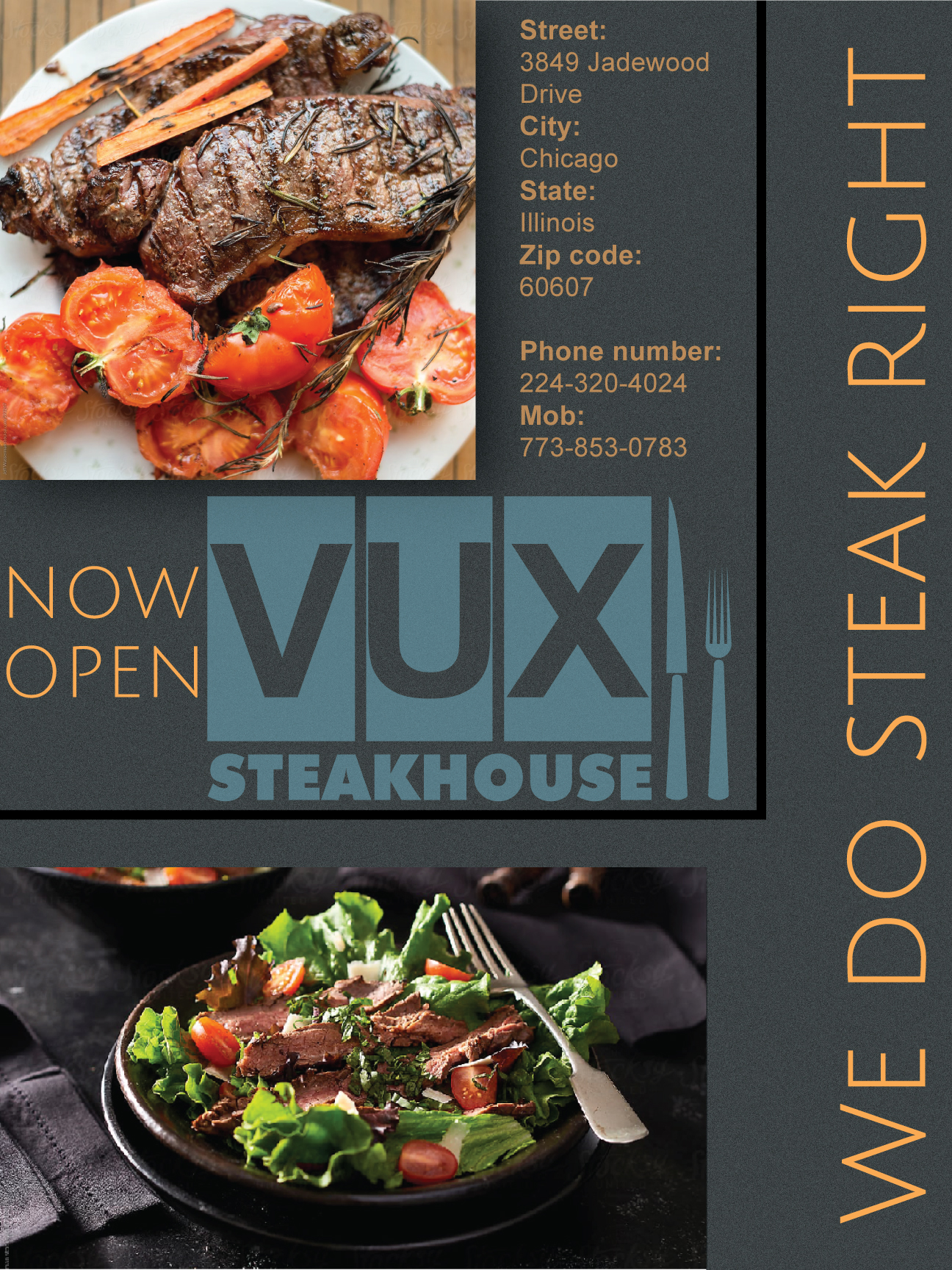
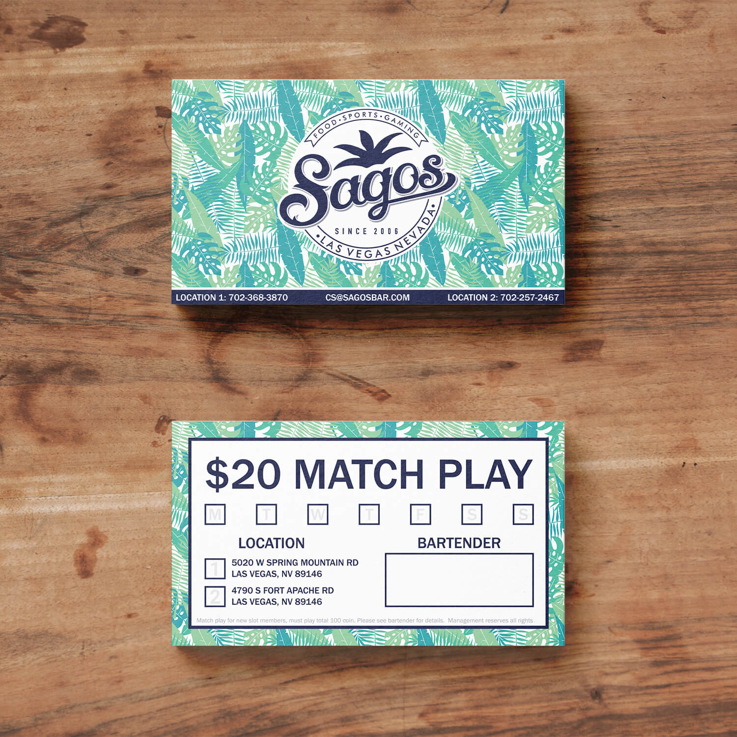
I think the informations about the business is too small for a business card. The back give me a feeling of more a ticket than a business card. But like the idea of the texture
5 years ago by Isa
Posts
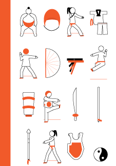
Martial Art icons
- Report
Isa • 5 years ago
I've had a fictive brief of making a set of 15 bold icons (16 px by 32 px) about martial art.
What do you think? Which advice can you give me to improve illustration skills?
Thanks for your feedback
(Sorry if it's publish 2 times, the first one doesn't appear. Maybe the file pdf ain't support, so i put a png this time)
What do you think? Which advice can you give me to improve illustration skills?
Thanks for your feedback
(Sorry if it's publish 2 times, the first one doesn't appear. Maybe the file pdf ain't support, so i put a png this time)