Luke
Posts
1
Likes
0
Liked Posts
5
Given Feedback
20
Feedback
Really like the simplicity of this design. Keep it up!
1 year ago by Luke
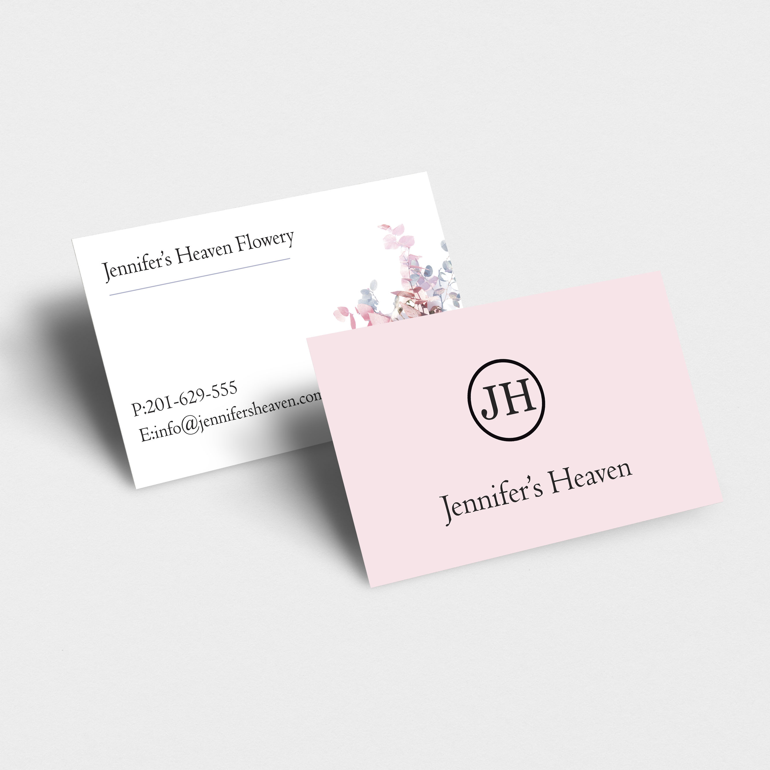
Very nice concept. Perhaps consider having the contact info in the same font as "Floristry" to increase legibility/readability? Otherwise, well done!
1 year ago by Luke
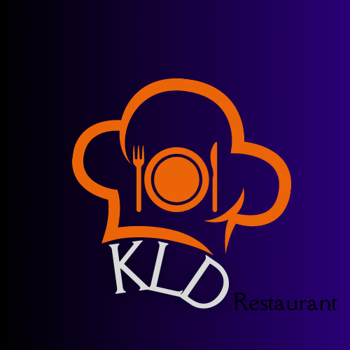
Overall it is a good concept. Perhaps move the word Restaurant below the logo and increase the contrast to the background. Can't really see it on the dark blue. Consider increasing the spacing between the KLD letters.
1 year ago by Luke
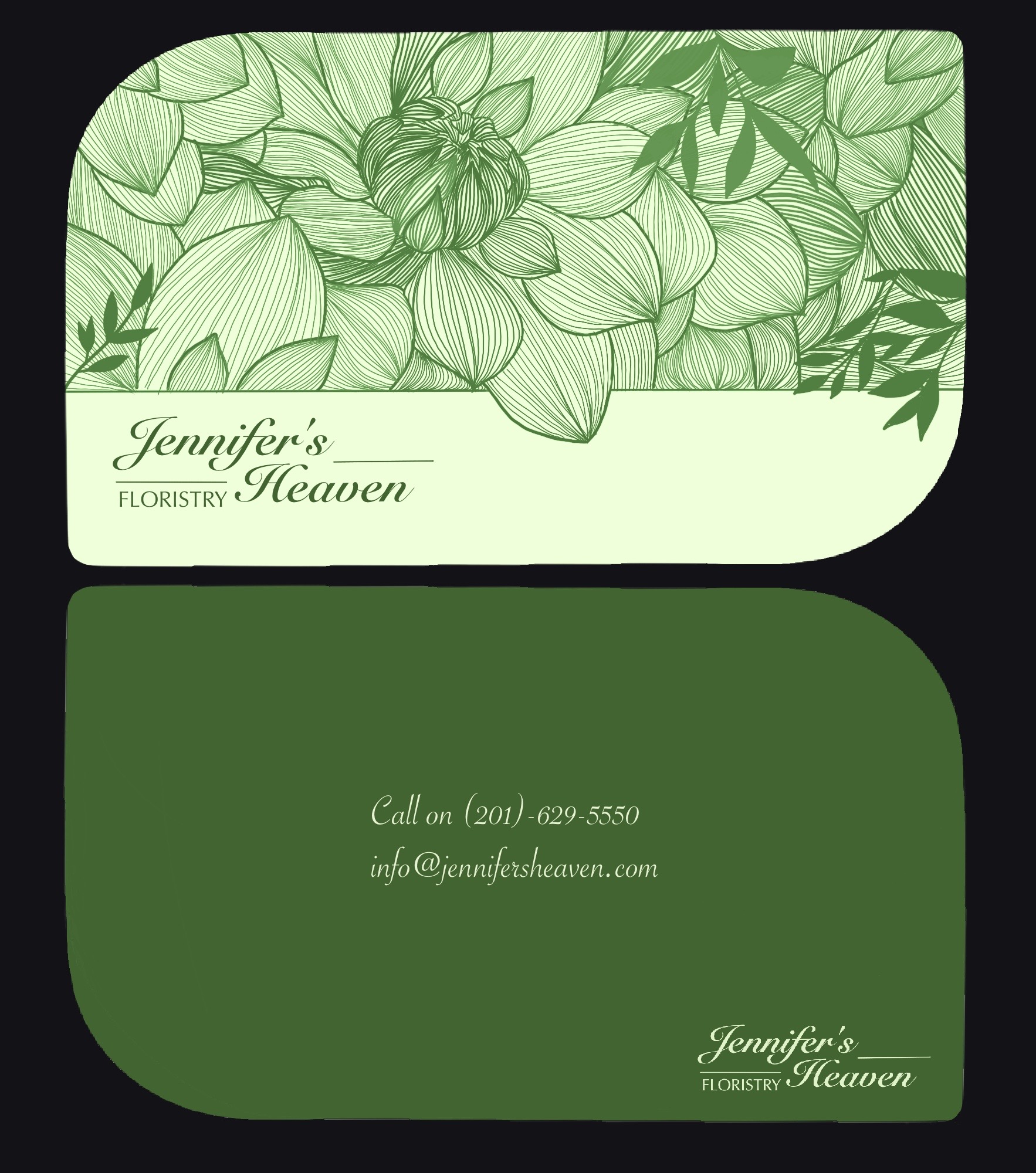
This is overall a good design. Fonts are legible, it is simple, perhaps just fit the picture correctly so it doesn’t tile and show the other side?
1 year ago by Luke
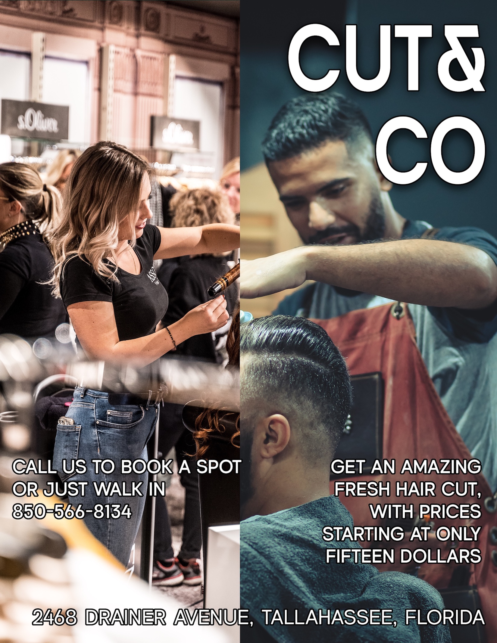
Perhaps move this image over so the hair is more visible? Also perhaps move the logo to the top left, and move the service to the top. The bottom looks a bit cluttered
1 year ago by Luke
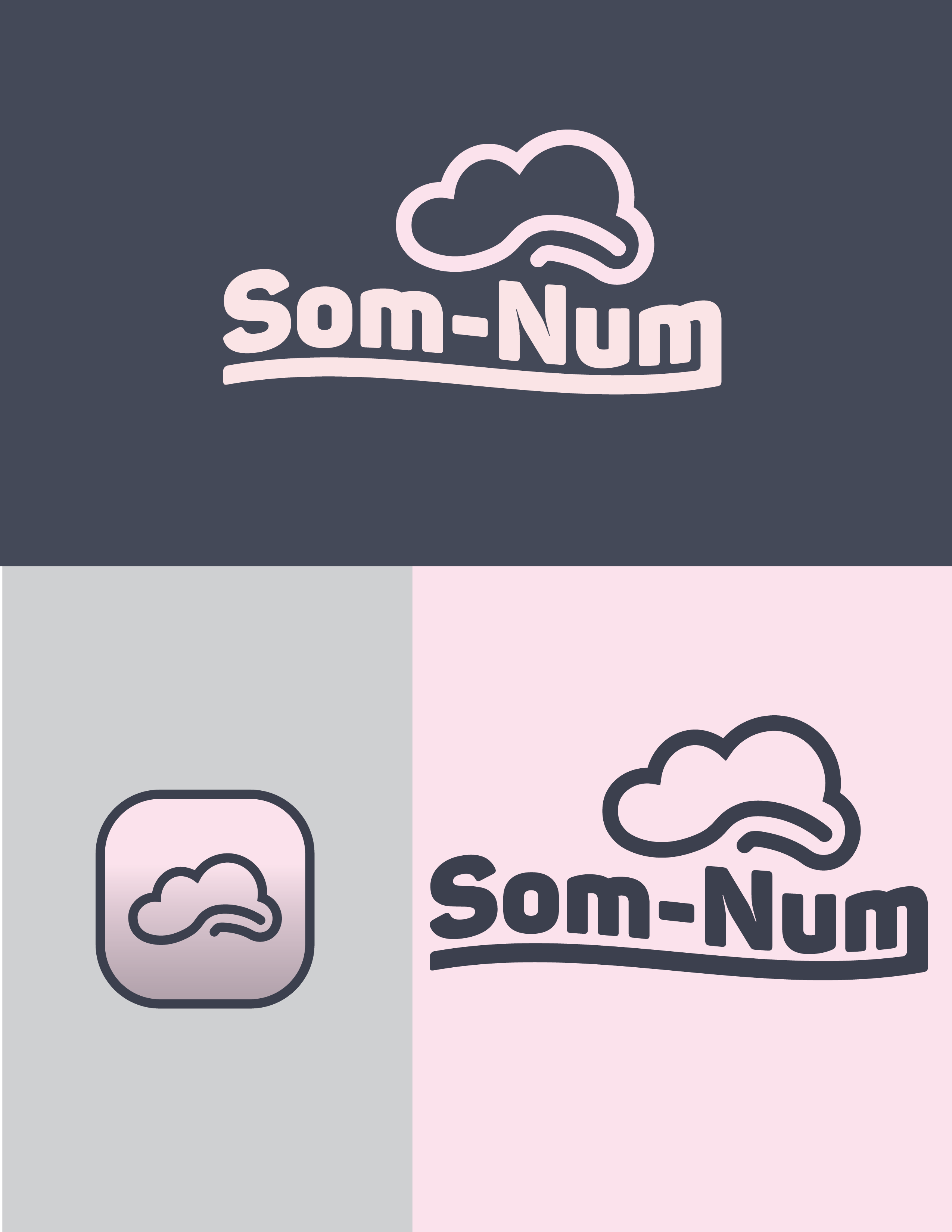
Overall idea is good. Perhaps create some more space between the logo and text?

1 year ago by Luke
My goodness this is art! Gorgeous logo

1 year ago by Luke
Had quite a lot of fun designing this minimal logo. Any feedback will be appreciated

1 year ago by Luke
Thank you for your comment on my design :) do you have any additional feedback?
1 year ago by Luke
clever use of elements

1 year ago by Luke
Very nice concept

1 year ago by Luke
I really like the simplicity. Could you try it with another font? Perhaps something more simple in caps, similar to how architects write?

1 year ago by Luke
These are some great illustrations. I especially like the style of the bottom left.
1 year ago by Luke
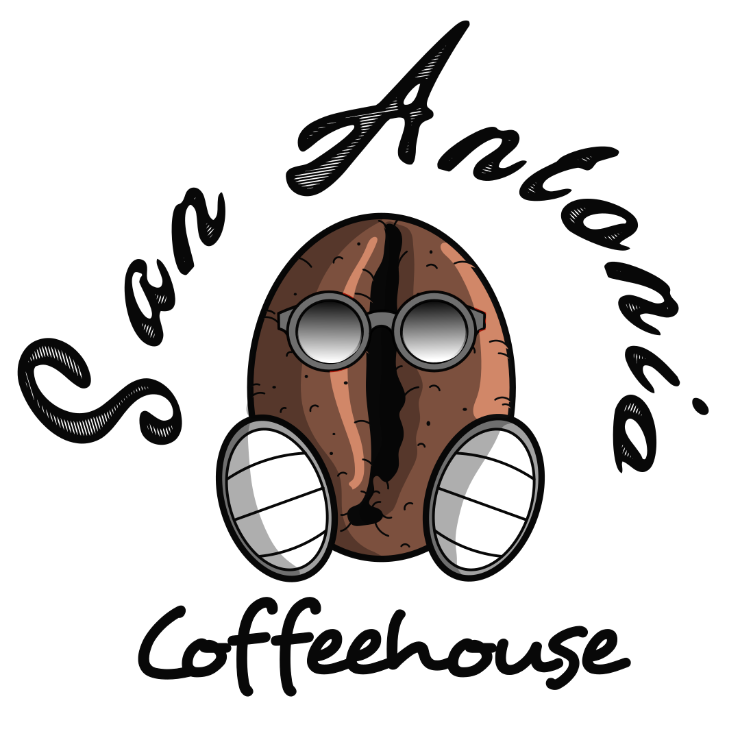
I really like the coffee bean illustration! Perhaps consider another font for the San Antonio?
1 year ago by Luke
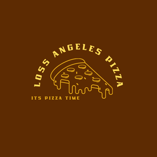
This is a good design! The pizza logo works well with the chosen font, perhaps just align the "it's pizza time" to the centre?
1 year ago by Luke
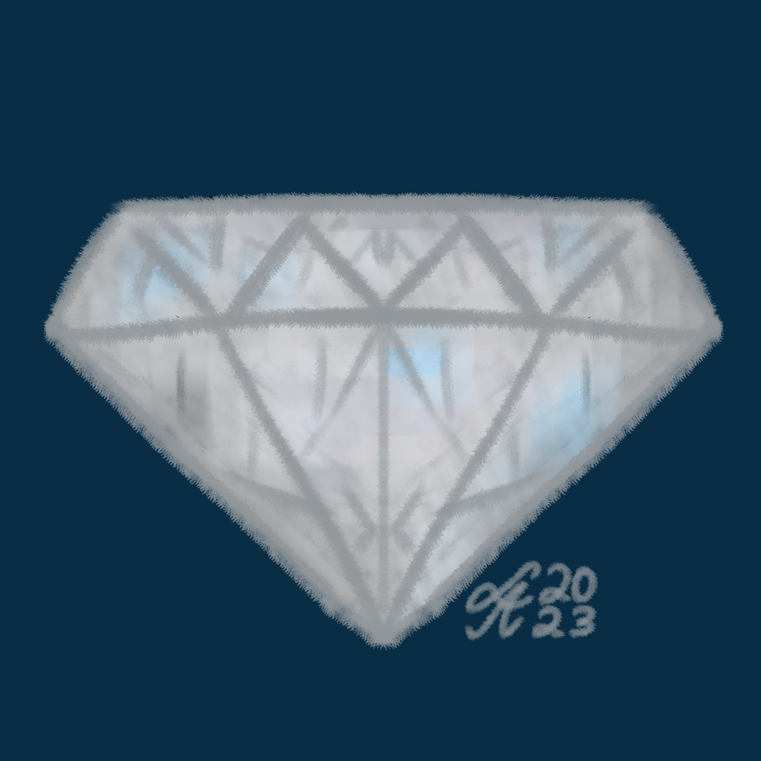
The diamond design and shape is there. Perhaps use more defined line work? And include some shadows and highlights :)
1 year ago by Luke
Very nice concept

1 year ago by Luke
Nice design, Perhaps change the colour of the black text. Otherwise, this is is very good
1 year ago by Luke
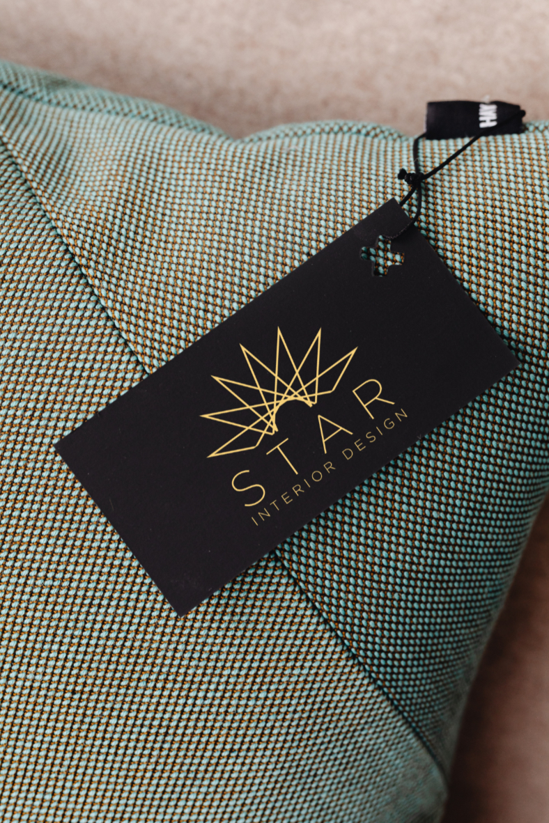
Great logo. Perhaps increase the "STAR" font's thickness? Not by much, just enough to stand out a little more :)
1 year ago by Luke
Good concept, may I suggest to perhaps work on the overall balance a bit. The logo is a bit heavy to the right. Keep up the good work! :)
1 year ago by Luke
Posts
Fresh Bites
- Report
Luke • 1 year ago
Brief: Fresh Bites is a new restaurant that specialises in healthy and organic food. The logo should be simple, modern and clean.
 Like
Like


Had quite a lot of fun designing this minimal logo. Any feedback will be appreciated
1 year ago by Luke - Reply
Hi here is the logo , i hope to love it
1 year ago by Ibrahim M Z - Reply
Thank you for your comment on my design :) do you have any additional feedback?
1 year ago by Luke - Reply