P
Posts
0
Likes
0
Liked Posts
1
Given Feedback
2
Feedback
I love the design. It's absolutely beautiful and well thought out. I'd love to know if you used the golden ratio at all. If not, I think it would really heighten the design overall. I'm also wondering what the green is meant to be. Is there some sort of connection to the brand? Is it meant to represent something specific?

1 year ago by P
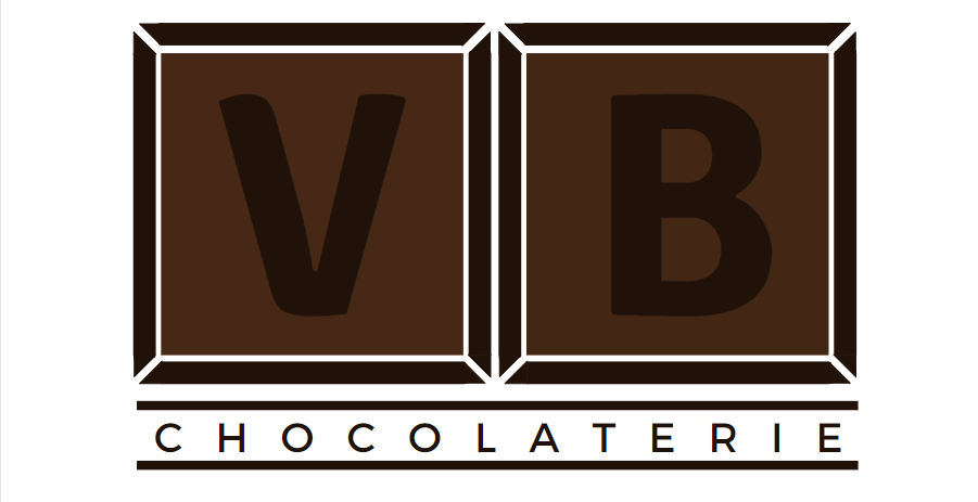
I'm into the concept of the chocolate divisions, but the contrast between the black and the dark brown is too low and I think you should either make the brown lighter, or the black of the "VB" should be changed to white.

1 year ago by P