Alisha
Posts
14
Likes
7
Liked Posts
3
Given Feedback
58
Feedback
This is awesome! The 'a' in 'tia' is a bit unclear. However, as @Krisbell said, the shadows are spot on.
1 year ago by Alisha
The arrow isn't very visible
1 year ago by Alisha
I like the blue color
1 year ago by Alisha
Nice poster!
1 year ago by Alisha
I can't see it very well
1 year ago by Alisha
I forgot to include the brief.
1 year ago by Alisha
The 1st and 2nd are my favorites
1 year ago by Alisha
Good color scheme
1 year ago by Alisha
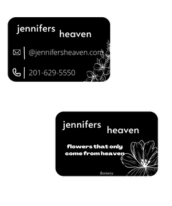
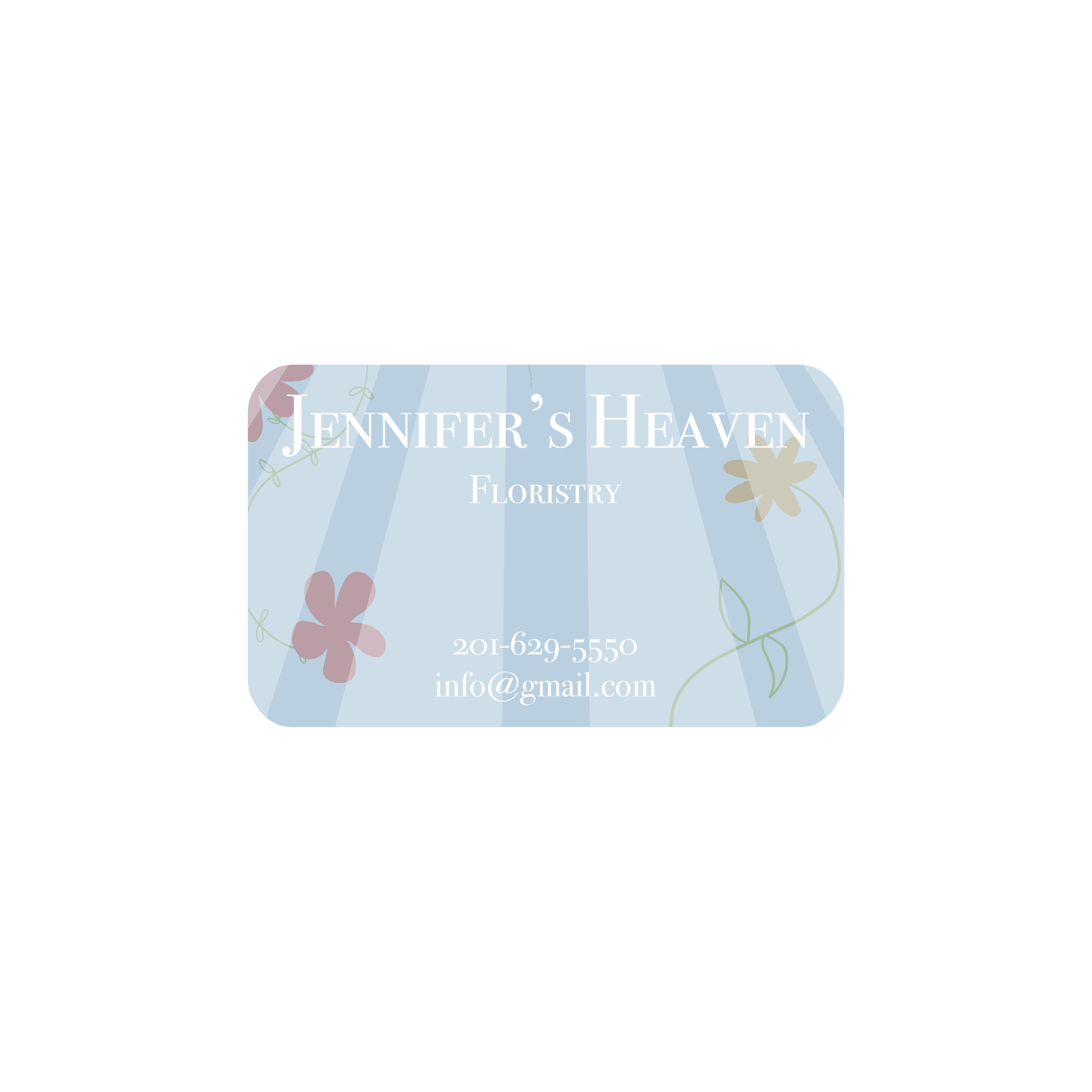
Lovely Floral desgins
1 year ago by Alisha
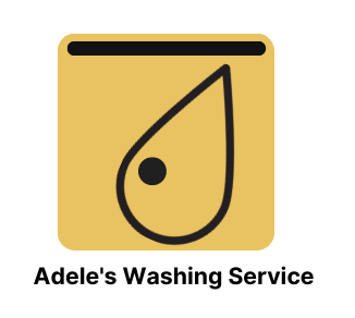
This is supposed to be a washing machine :)
1 year ago by Alisha
Thanks for the advice!
1 year ago by Alisha
Very clever desgin!

1 year ago by Alisha
I like the second one!
1 year ago by Alisha
I like the way the letters overlap
1 year ago by Alisha
Very cute!
1 year ago by Alisha
The shape you chose was very interesting. Does it represent something?
1 year ago by Alisha
It's a really creative logo, but the words need to stand out just a bit more. :)
1 year ago by Alisha
I really like the logo. The simple shapes are really nice. :)
1 year ago by Alisha
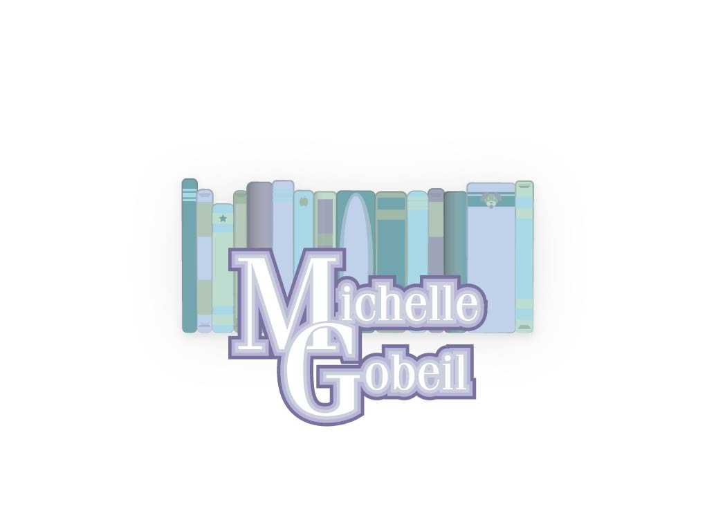
This is a great starting point. One thing I would recommend is making the background stand out more from the books. :)
1 year ago by Alisha
The simplicity is lovely in this design. One of the best ones I have seen with this brief. :)
1 year ago by Alisha
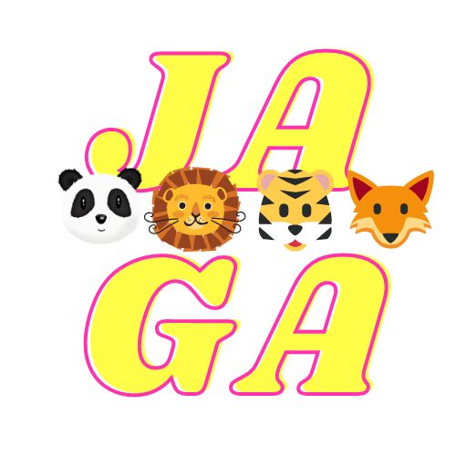
I like the font, but please match the styles of the animals in the foreground.
:)
1 year ago by Alisha
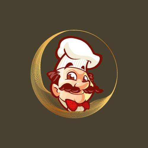
Good work, remember to match the background with the foreground. The gold is more luxe while the chef is a bit cartoony. Also if the chef isn't your art, try citing the original artist. Since this is a practice logo though, it's a good start to figure out where certain elements should go. :)
1 year ago by Alisha
I love the simplicity and symbolism!

1 year ago by Alisha
I love this so much!
1 year ago by Alisha
Nice ad, but too many fonts :)
1 year ago by Alisha
It’s good, but there’s a bit too much going on :)

1 year ago by Alisha
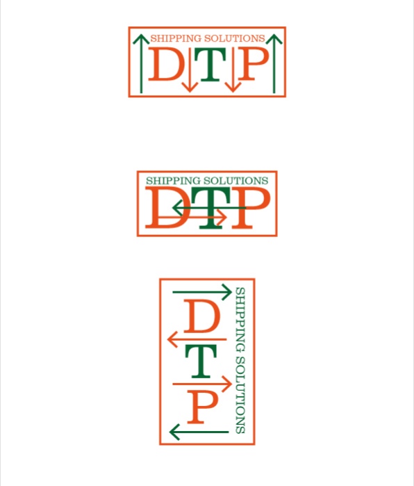
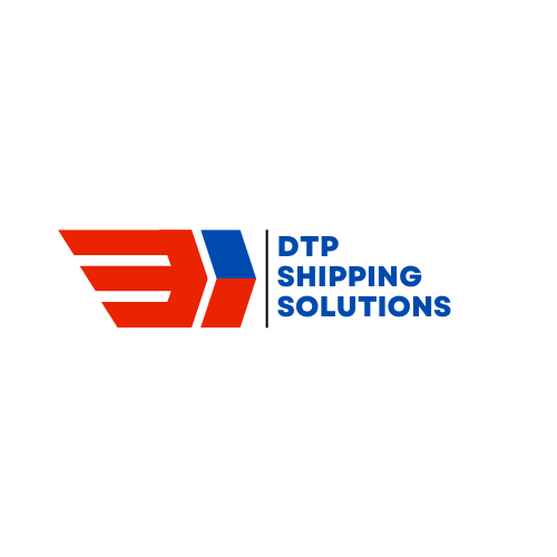
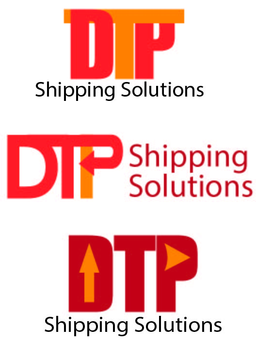
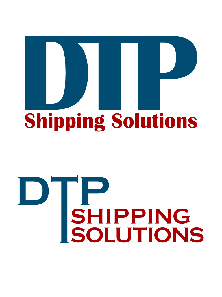
The colors are very good for a shipping company :)
1 year ago by Alisha
Very simple, but I don’t know what kind of company this is for :)
1 year ago by Alisha
The simplicity is great, but the colors may need changing :)

1 year ago by Alisha
You can make the pictures clearer :)
1 year ago by Alisha
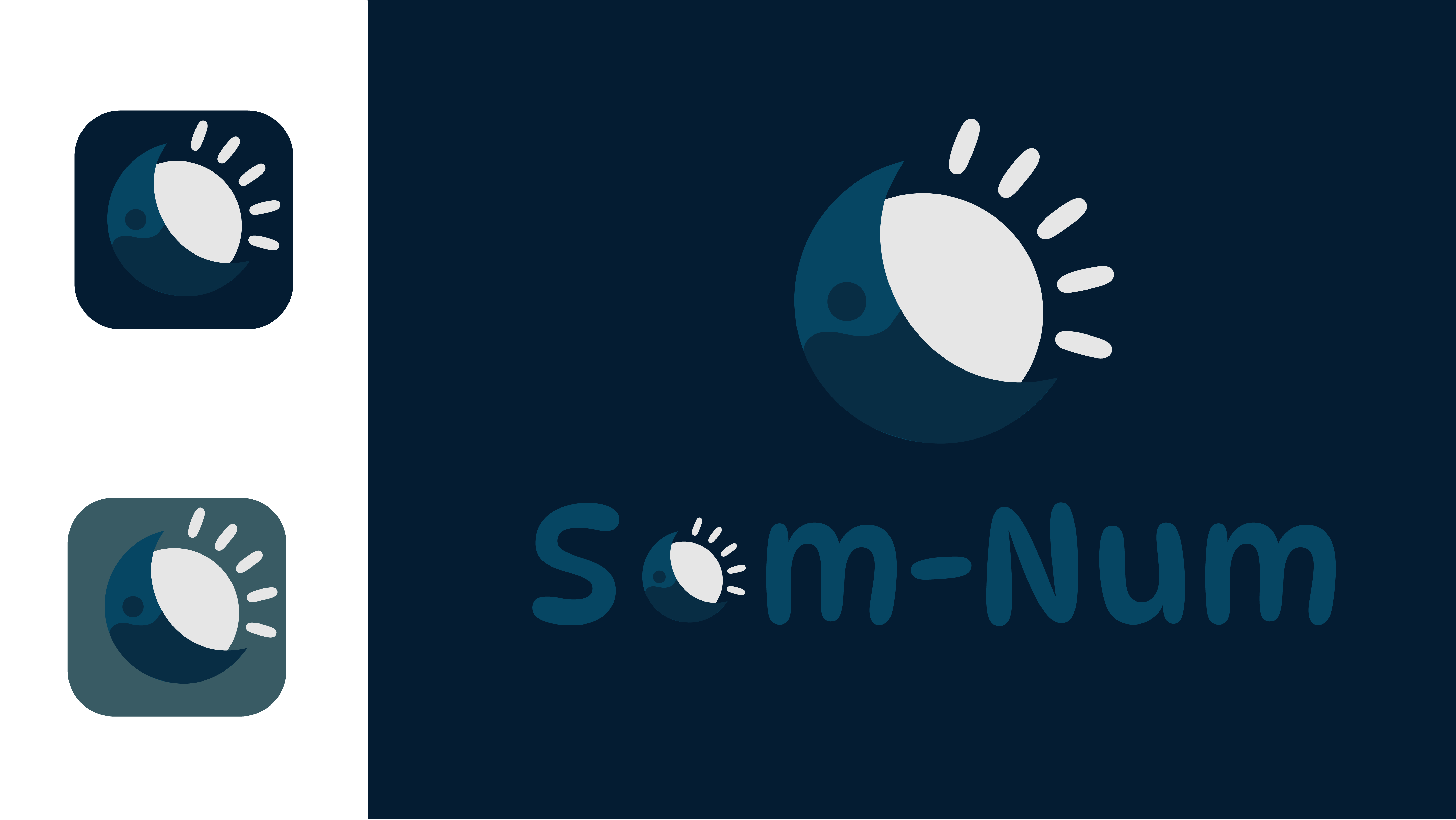
Very creative with the moon/sun!
1 year ago by Alisha
The colors go so well together!
1 year ago by Alisha
The second is my favorite
1 year ago by Alisha
Maybe take out the darker stripes? I think it looks pretty good!
1 year ago by Alisha
I love the simplicity!

1 year ago by Alisha
What should I change?
1 year ago by Alisha
The colors are very smart!
1 year ago by Alisha
Very simple and good colors
1 year ago by Alisha
Creative!
1 year ago by Alisha
I love the bright colors
1 year ago by Alisha
it's a bit too crowded
1 year ago by Alisha
I am very new to logo design, how could I check this?
1 year ago by Alisha
The gradients look nice here

1 year ago by Alisha
I agree that the gradients are a bit offputting

1 year ago by Alisha
The black and white is very modern
1 year ago by Alisha
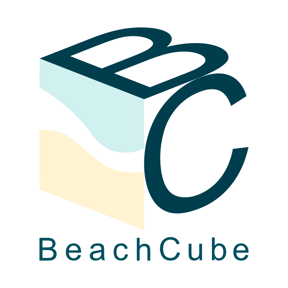
It looks exactly like a cube. good job
1 year ago by Alisha
Very modern design
1 year ago by Alisha
I should be able to tell it's a bedding company
1 year ago by Alisha
One of my first logos, made with canva
1 year ago by Alisha
This is one of my first logos, made with canva
1 year ago by Alisha
stunning job! Love it
1 year ago by Alisha
Make the fonts more uniform
1 year ago by Alisha
The colors clash too much
1 year ago by Alisha
Too cluttered
1 year ago by Alisha
I like that font, too many colors
1 year ago by Alisha
Good abstract logo
1 year ago by Alisha
Love the sleek design
1 year ago by Alisha
The second version is better
1 year ago by Alisha
Posts
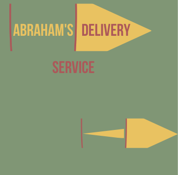
Abraham's Delivery
- Report
Alisha • 1 year ago


Personally i dont like the color you have used
1 year ago by Aditi - Reply
Nice👌
1 year ago by Mujeeb Amoo - Reply
I forgot to include the brief.
1 year ago by Alisha - Reply
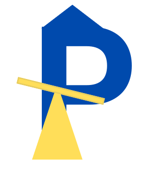
Park hut
- Report
Alisha • 1 year ago
I put a seesaw representing a park and the triangle on the p is a hut
Hello,
I am Corrie, I recently started a new business called ParkHut. We are looking for someone that can design a professional logo for our business. I love mascot logos. Can you do that?
I am Corrie, I recently started a new business called ParkHut. We are looking for someone that can design a professional logo for our business. I love mascot logos. Can you do that?

Do try more creativity, you can do it
1 year ago by Sindhu Praveen - Reply
E Tent
- Report
Alisha • 1 year ago
Which is best?
Hey There,
I am Cori, I just founded a new business called e-Tent. We're looking for someone that can make a good logo for our business. I think a lettermark will fit best. We would love to work with you!
I am Cori, I just founded a new business called e-Tent. We're looking for someone that can make a good logo for our business. I think a lettermark will fit best. We would love to work with you!


This looks great
1 year ago by kit - Reply
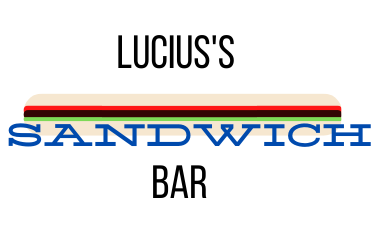
Sandwhich Bar
- Report
Alisha • 1 year ago
Hello,
I'm Lucius, founder of Lucius's Sandwich bar. I am looking for someone that can design a professional logo for my business. I love mascot logos. Would you be interested?
I'm Lucius, founder of Lucius's Sandwich bar. I am looking for someone that can design a professional logo for my business. I love mascot logos. Would you be interested?

try something else, you can !
1 year ago by Sindhu Praveen - Reply
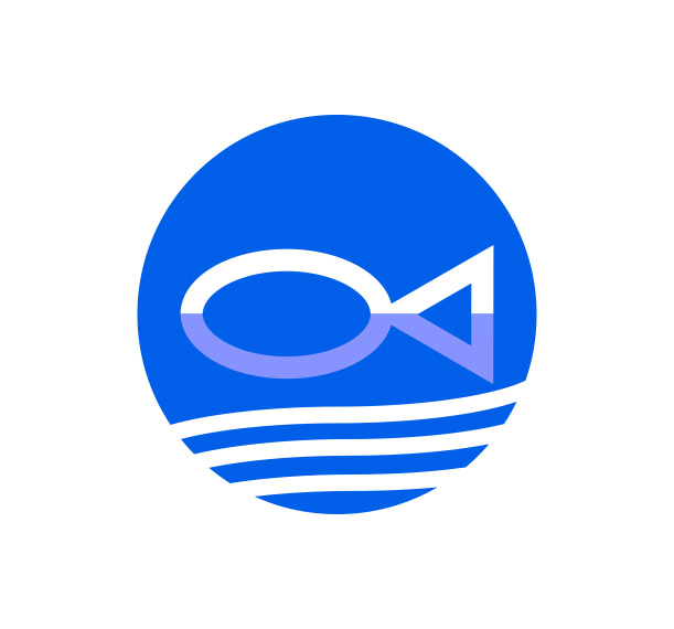
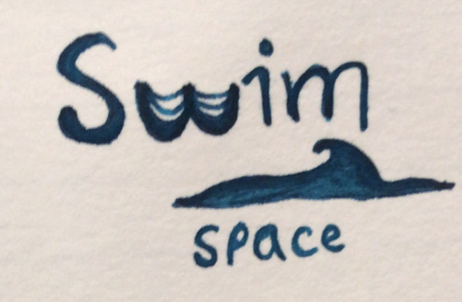
Swim space
- Report
Alisha • 1 year ago
Hi,
I am Van,I just founded a new business called SwimSpace. We're looking for someone that can make a good logo for our business. I would like the logo to be an abstract mark. Would you be interested?
I am Van,I just founded a new business called SwimSpace. We're looking for someone that can make a good logo for our business. I would like the logo to be an abstract mark. Would you be interested?

as an initial sketch, it's a good idea and unique
1 year ago by amina waheed - Reply