ANJALI SHAW
Posts
4
Likes
9
Liked Posts
11
Given Feedback
6
Feedback
looks goood
3 years ago by ANJALI SHAW
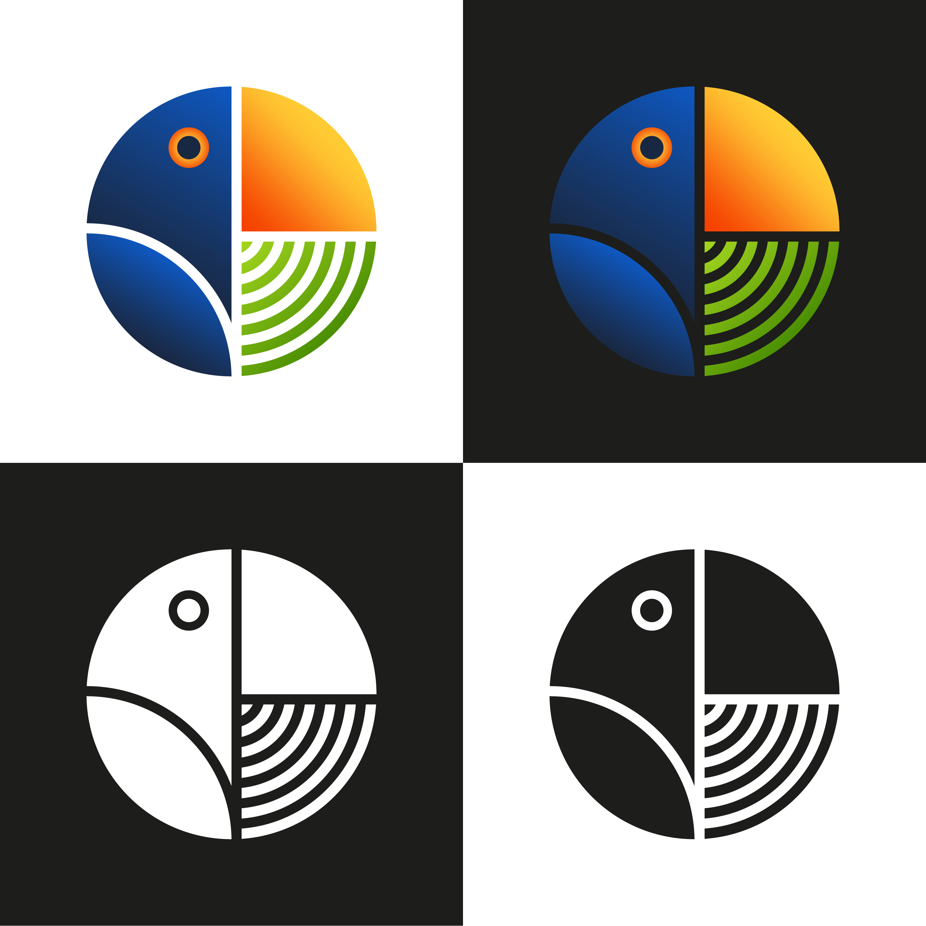
Colour gradient is not fit as letters are not clearly visible.

3 years ago by ANJALI SHAW
awesome ♥
3 years ago by ANJALI SHAW
Actually this one is my 1st graphic design as illustration.. My basic thought was to create a design comparing the two... And mistakenly I posted it in logo section

4 years ago by ANJALI SHAW
awesome design
4 years ago by ANJALI SHAW
unique idea ..I like it

4 years ago by ANJALI SHAW
Posts
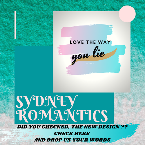
Social Media Post
- Report
ANJALI SHAW • 3 years ago
Social Media Post for the launch of the new design of a company
the colors are no good for the eyes
8 months ago by odd agency - Reply
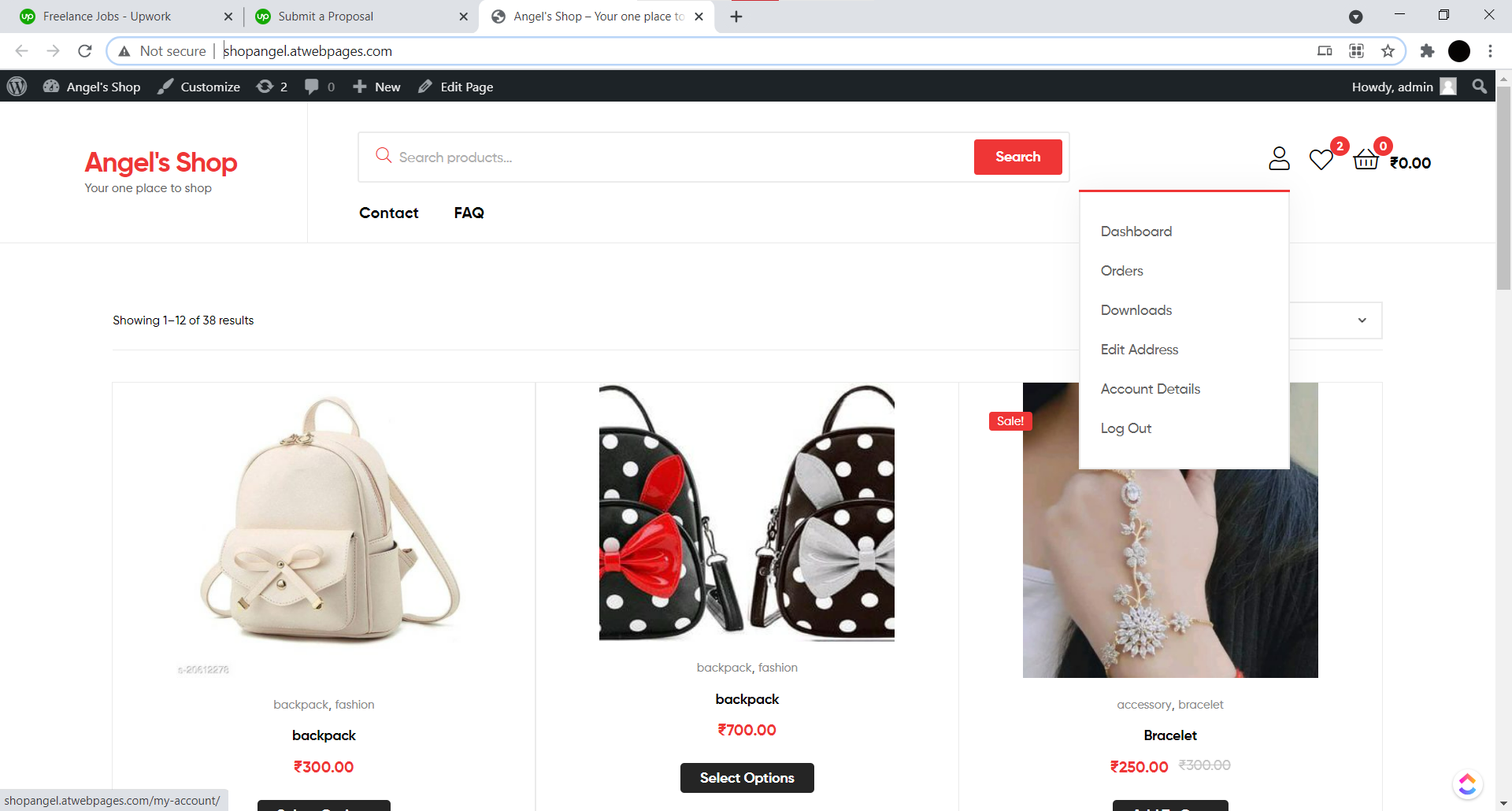
ecommerce website
- Report
ANJALI SHAW • 3 years ago
I produced this website please review
Hi,
I am Chester, I just founded a new business called GDA Jewellery. We're looking for someone that can make a good website for our Jewellery. We need a webshop product-page design. We primarily use the color green (#53c43b). We would love to work with you!
I am Chester, I just founded a new business called GDA Jewellery. We're looking for someone that can make a good website for our Jewellery. We need a webshop product-page design. We primarily use the color green (#53c43b). We would love to work with you!
good one
8 months ago by odd agency - Reply
bava logo
- Report
ANJALI SHAW • 4 years ago
HERE,I HAVE COME UP WITH SOME COOL AND AWESOME DESIGNS OF LOGO FOR A BUSINESS COMPANY CALLED BAVA .THEY SAID THEY NEED A WATERMARK ONLY..PLEASE RATE MY DESIGN AND GIVE YOUR VALUABLE ADVICE
Good color selection. Keep it up.
4 years ago by Abhilash Thekkel - Reply
mystery
- Report
ANJALI SHAW • 4 years ago
this is one illustration where a much misunderstood lady is compared with universe and asked which one is more mysterious
Hello! I feel like for an illustration, it lacks story or definite meaning as to what it is. If I were to see this illustration by itself without the prompt, I probably would have not understood it.
That being said, there are too many elements present, and presents a sensory overload to the viewer.
4 years ago by pndmx - Reply
Actually this one is my 1st graphic design as illustration.. My basic thought was to create a design comparing the two... And mistakenly I posted it in logo section
4 years ago by ANJALI SHAW - Reply
It's definitely mysterious but what is this design for?
4 years ago by Enzo - Reply
