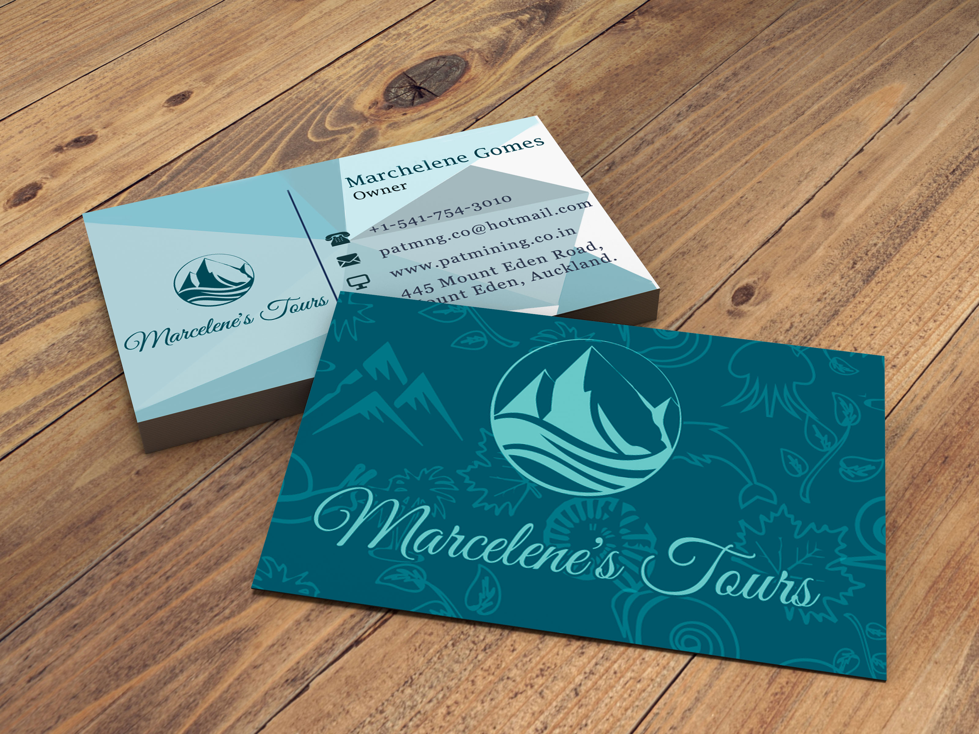
National Park Logo (Daily Logo Challenge - Day 20)
- Report
Alex Strøm • 5 years ago
Hi everyone!
So I recently finished the 50 days daily logo challenge, and while I could see myself improving from the beginning to the end, I would like feedback on a few select logos from the challenge. Thank you for anything you might have to say.
So I recently finished the 50 days daily logo challenge, and while I could see myself improving from the beginning to the end, I would like feedback on a few select logos from the challenge. Thank you for anything you might have to say.
Like it! I just wonder when print in small if the type is bold enough and if the lines of the leaves will disappear. Maybe the upper lines ain't necessary to avoid it.

5 years ago by Isa - Reply
Love these colors! The only thing is that the text seems a bit off-center or the curve the text is on is different than the other circles

5 years ago by August van de Ven - Reply


