Pancake house business card
- Report
8 months ago by Corinne
 1 Like
 3
3
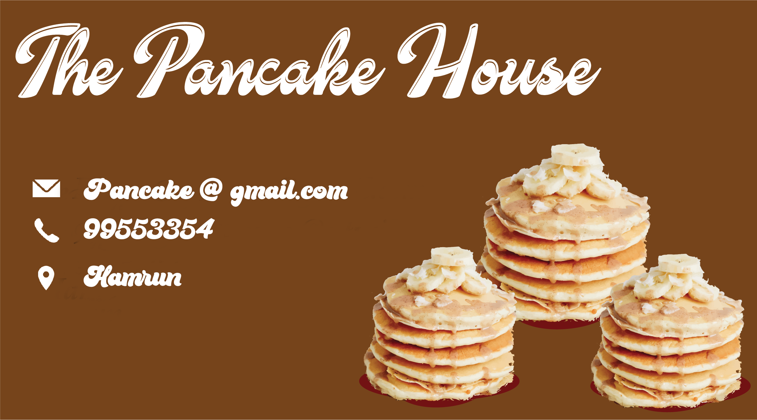
Try simplifying the design by using one enlarged stack since they're all the same image. Also, be mindful of your clipping. The cleaner the clipping the more polished your design will look. Good luck!
8 months ago by E. Rose - Reply
Nice font for the title of the business. For the contact details please try a simpler font and please check your alignment.
8 months ago by Deborah Inyang - Reply
Maybe you can leave more space between the letters on smaller texts, the font is lovely but hard to read when it is small. And maybe not using direct photos of pancakes but using vector illustrations or lineworks?1
8 months ago by Serra - Reply


