Serra
Posts
0
Likes
0
Liked Posts
0
Given Feedback
4
Feedback
Design looks cool, maybe the photos might be a little bit lower so the negative space looks more balanced. But i like this flyer

8 months ago by Serra
When using an object directly as a logo itself, we should atleast give it a unique touch. For a logo, this design is too thin lined so it might be hard to recognize when it is used in smaller sizes. Same for the lettering.

8 months ago by Serra
Lettering and spacing is great but when you design a logo it should work for every size and color so i can't see this logo being readable on a smaller size, but still it is cute

8 months ago by Serra
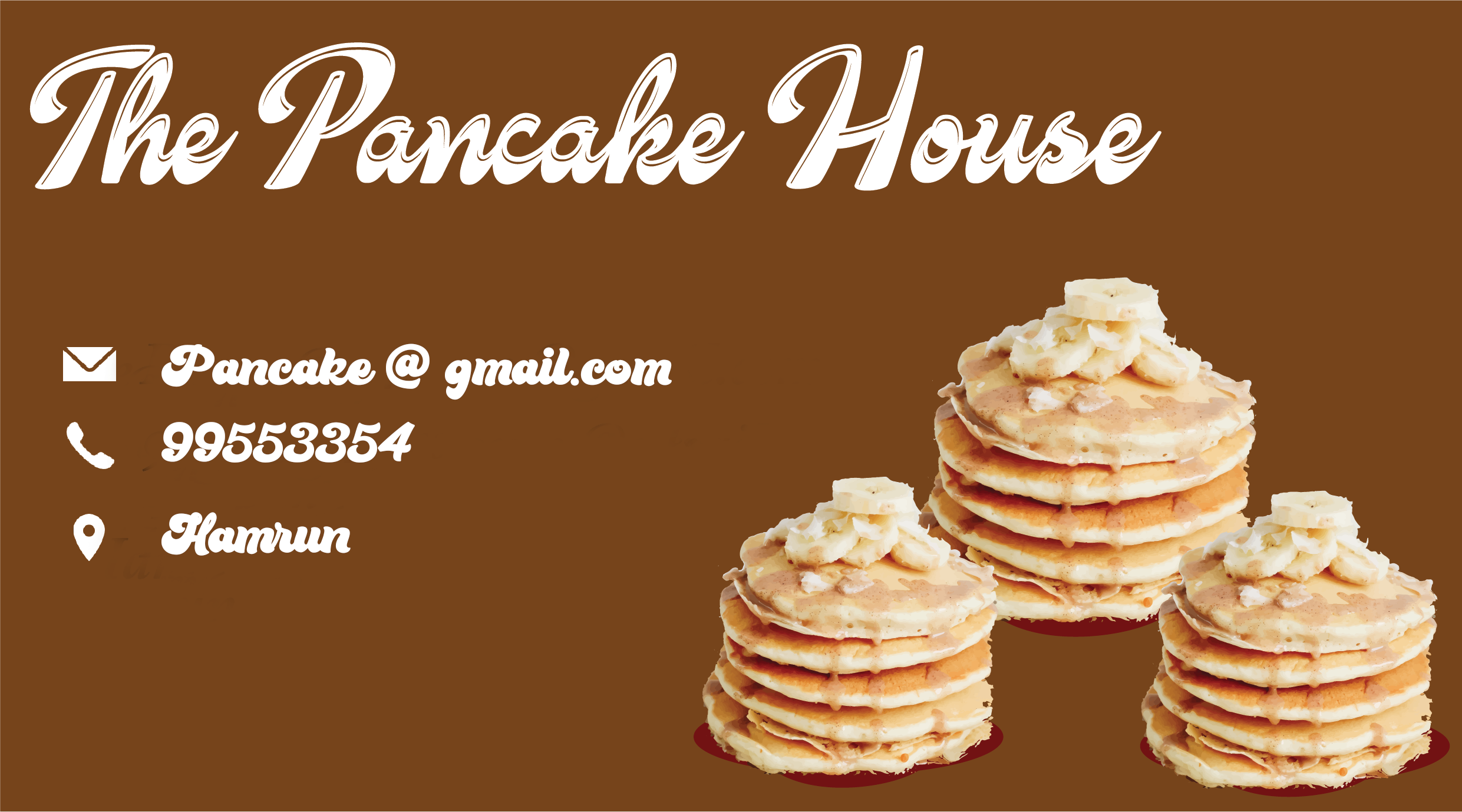
Maybe you can leave more space between the letters on smaller texts, the font is lovely but hard to read when it is small. And maybe not using direct photos of pancakes but using vector illustrations or lineworks?1

8 months ago by Serra