E. Rose
Posts
0
Likes
0
Liked Posts
0
Given Feedback
4
Feedback
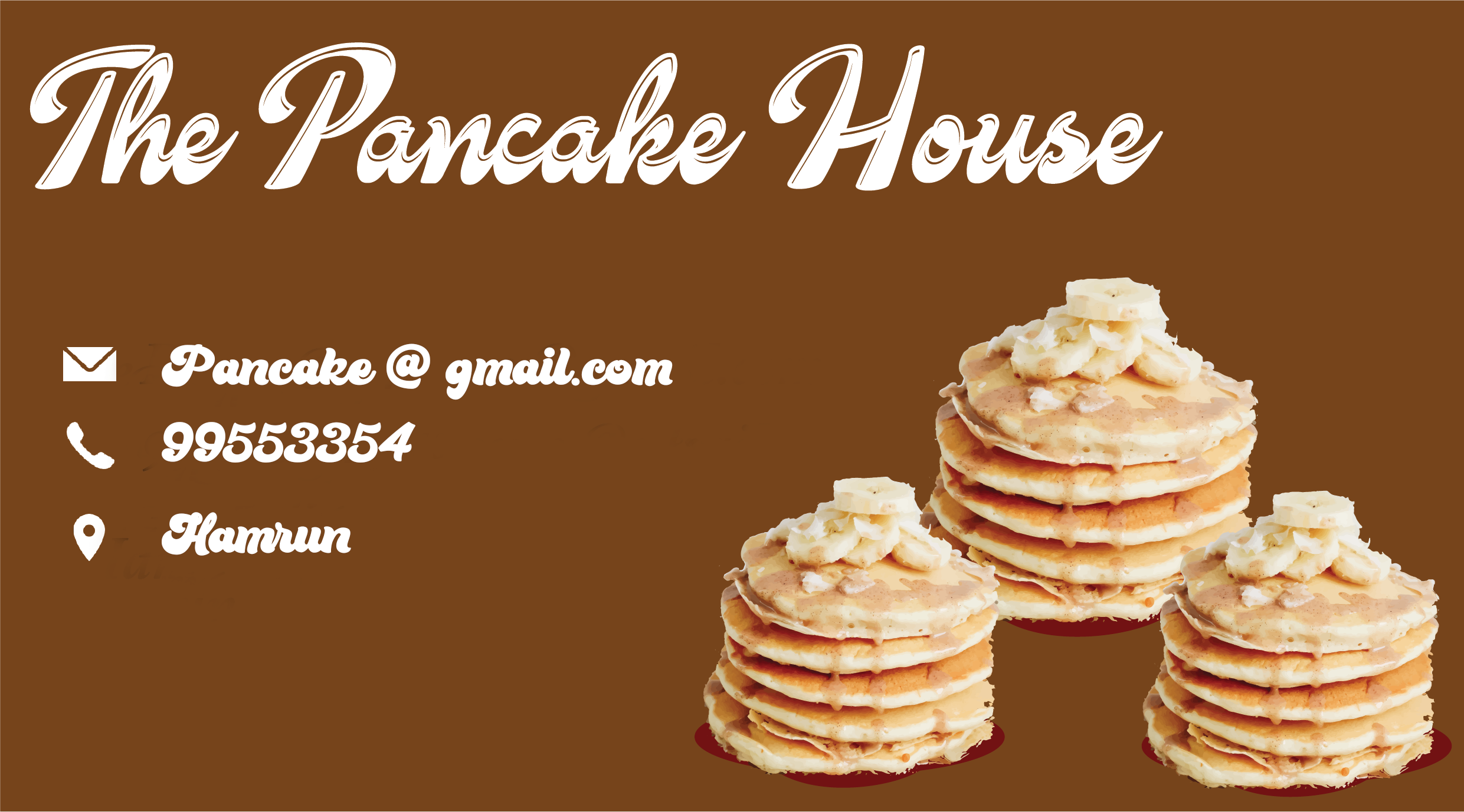
Try simplifying the design by using one enlarged stack since they're all the same image. Also, be mindful of your clipping. The cleaner the clipping the more polished your design will look. Good luck!
8 months ago by E. Rose
I'd suggest using a more modern font. Maybe in the slab serif range and then use iconography as stand-alone above the logo. Right now because the "S" is enlarged in front the the logo it reads as "swashing"

8 months ago by E. Rose
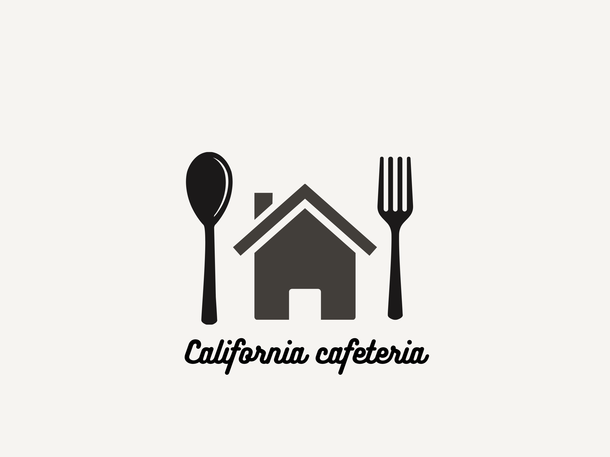
Try a more customized illustration. The house looks too much like a stock mobile icon. Also, make sure your colors are consistent.
For the text, make sure your design is intentional and makes sense to the audience. E.g., What's the reasoning behind a lowercase "c" in cafeteria? Also, consider what you want people to see first the icon or the name. Good luck!
8 months ago by E. Rose
Simple is always great. Try using a more stylized font for the logo. Maybe a san serif with rounded features for a modern look. For the tag, try sentence case or title case. Small caps can come across as formal.

8 months ago by E. Rose