Corinne
I'm a graphic designer and a website designer but I'm still learning
Posts
83
Likes
4
Liked Posts
1
Given Feedback
69
Feedback
good
7 months ago by Corinne
good

7 months ago by Corinne
good
7 months ago by Corinne
good
8 months ago by Corinne
good
8 months ago by Corinne
no

8 months ago by Corinne
good
8 months ago by Corinne
good
8 months ago by Corinne
good but simple
8 months ago by Corinne
nope
8 months ago by Corinne
good
8 months ago by Corinne
good
8 months ago by Corinne
nope
8 months ago by Corinne
good
8 months ago by Corinne
good
8 months ago by Corinne
good
8 months ago by Corinne
good
8 months ago by Corinne
good
8 months ago by Corinne
good
8 months ago by Corinne
good but to simple
8 months ago by Corinne
nice
8 months ago by Corinne
good

8 months ago by Corinne
good
8 months ago by Corinne
nah
8 months ago by Corinne
nope too mush images and messy
8 months ago by Corinne
nope
8 months ago by Corinne
good
8 months ago by Corinne
good
8 months ago by Corinne
nope
8 months ago by Corinne
good but needs improvement

8 months ago by Corinne
good
8 months ago by Corinne
goos
8 months ago by Corinne
nope the font is not readable and the design is simple
8 months ago by Corinne
good
8 months ago by Corinne
too simple
9 months ago by Corinne
good

9 months ago by Corinne
too simple
9 months ago by Corinne
good
9 months ago by Corinne
nah

9 months ago by Corinne
good

9 months ago by Corinne
nope

9 months ago by Corinne
good
9 months ago by Corinne
no

9 months ago by Corinne
good

9 months ago by Corinne
good

9 months ago by Corinne
no
9 months ago by Corinne
good
9 months ago by Corinne
good

9 months ago by Corinne
good

9 months ago by Corinne
nah
9 months ago by Corinne
good
9 months ago by Corinne
It needs more improvement
9 months ago by Corinne
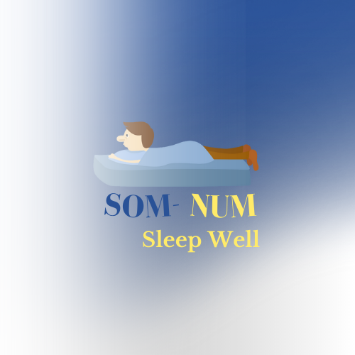
Good but color is very dark

9 months ago by Corinne
needs some improvment
9 months ago by Corinne
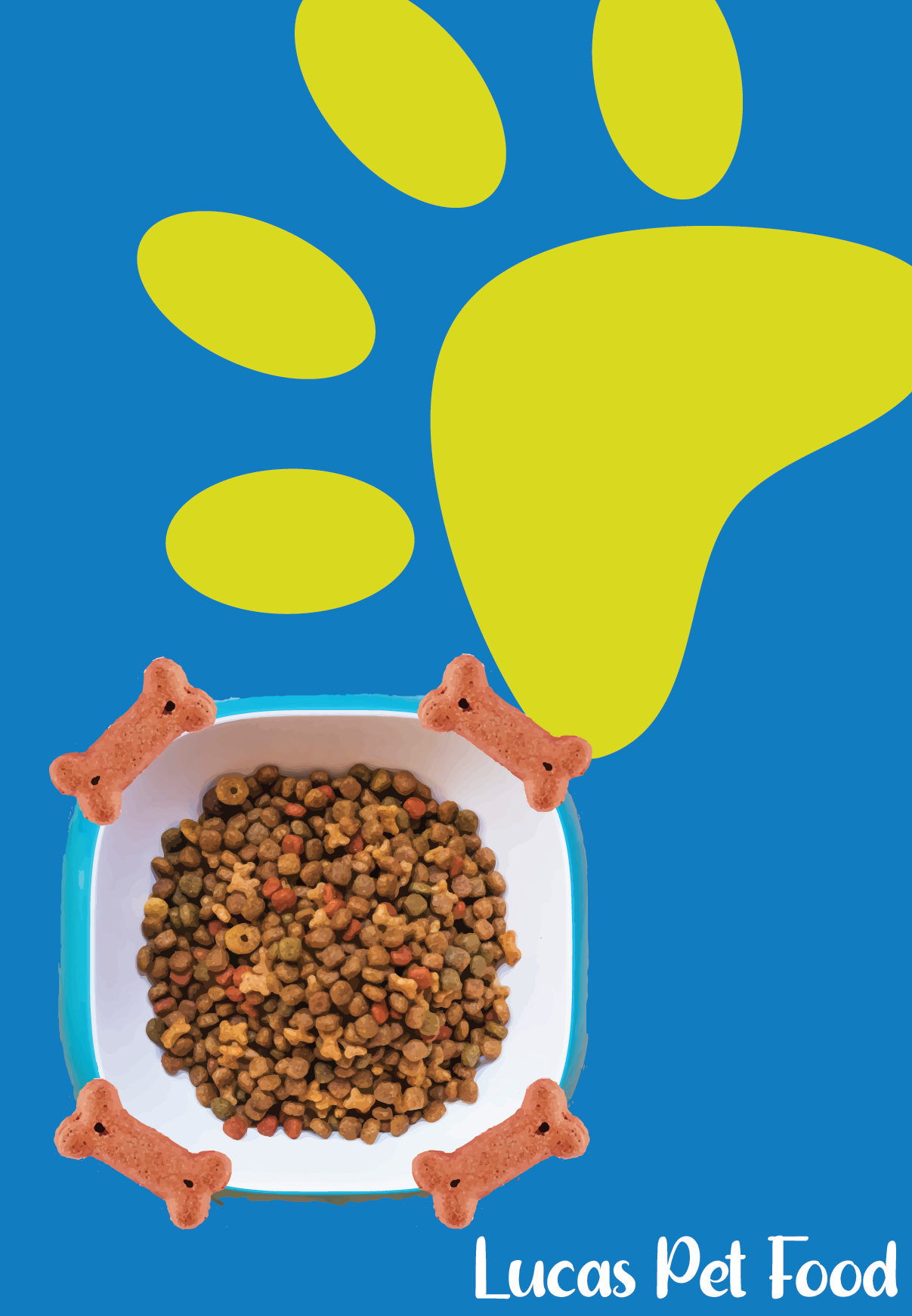
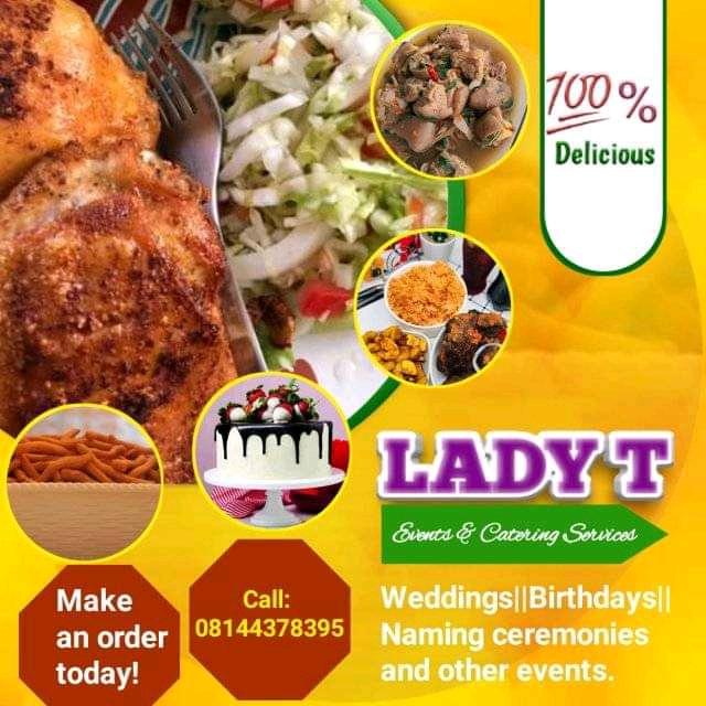
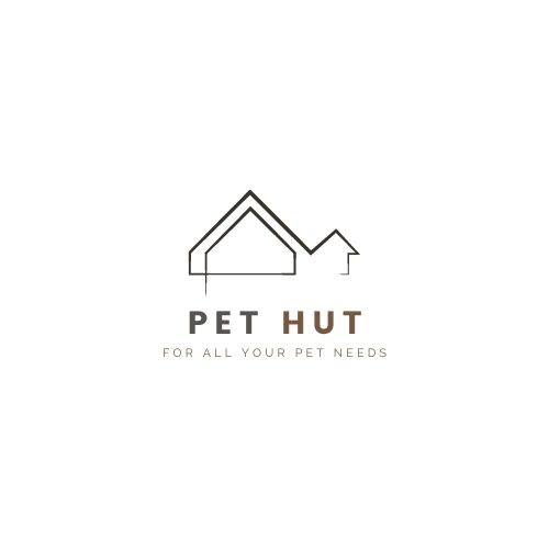
The logo is good but I suggest to insert a pet because the text represents a pet
9 months ago by Corinne
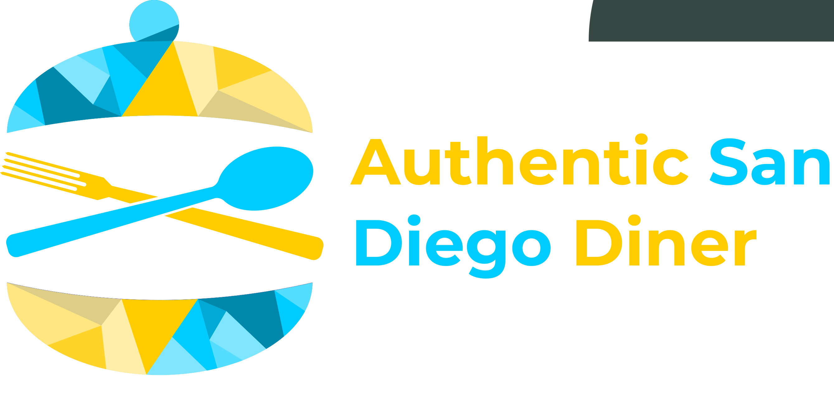
Too many bright colors but the banner is good
9 months ago by Corinne
Need more improvement but objective is there
9 months ago by Corinne
I don't like the idea
9 months ago by Corinne
Good but needs improvement
9 months ago by Corinne
Needs a better font
9 months ago by Corinne
Good
9 months ago by Corinne
Good
9 months ago by Corinne
good
9 months ago by Corinne
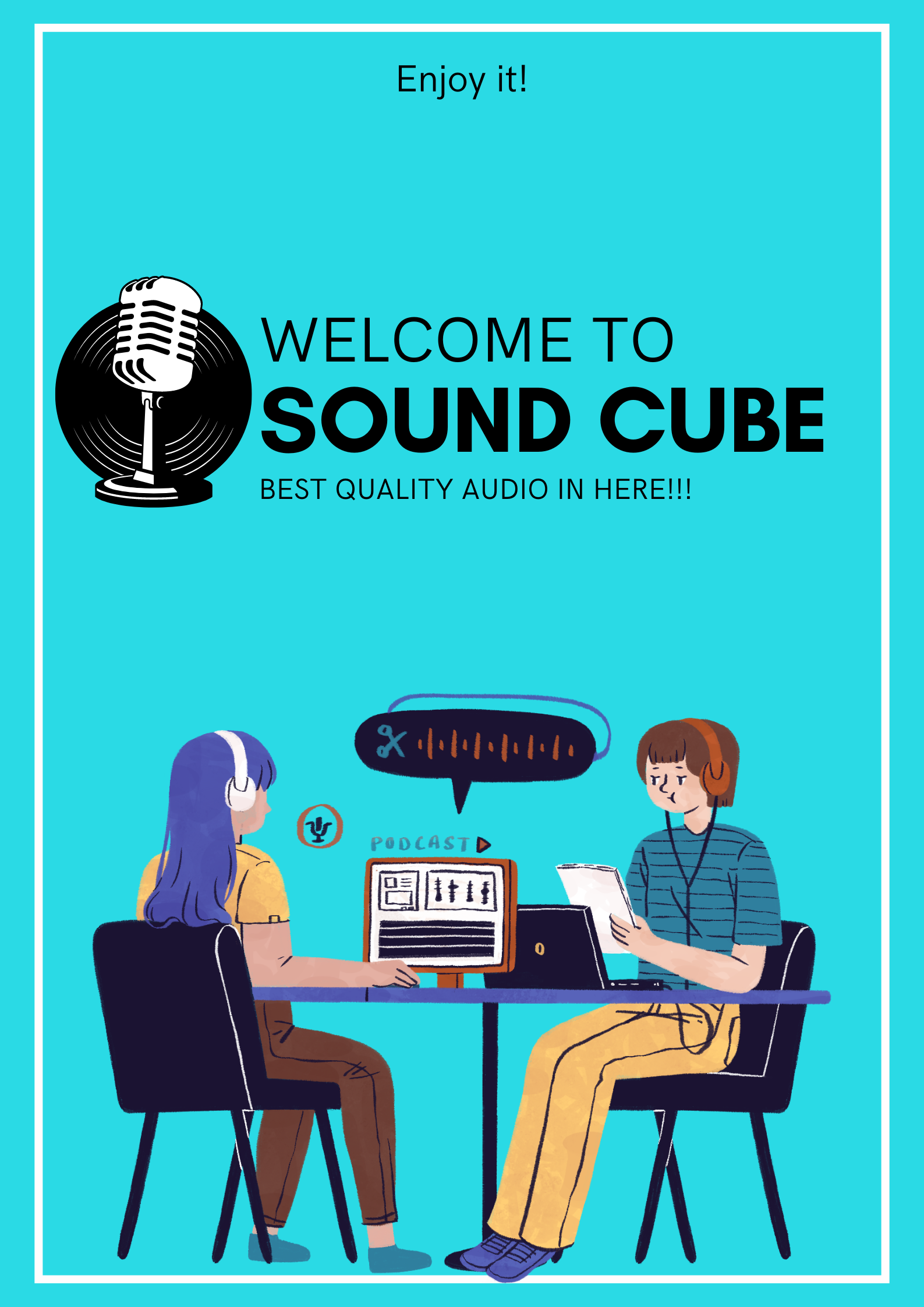
To much confusion with colors and keep the banner simple as possible but over all the concept is there
9 months ago by Corinne
Nice

9 months ago by Corinne
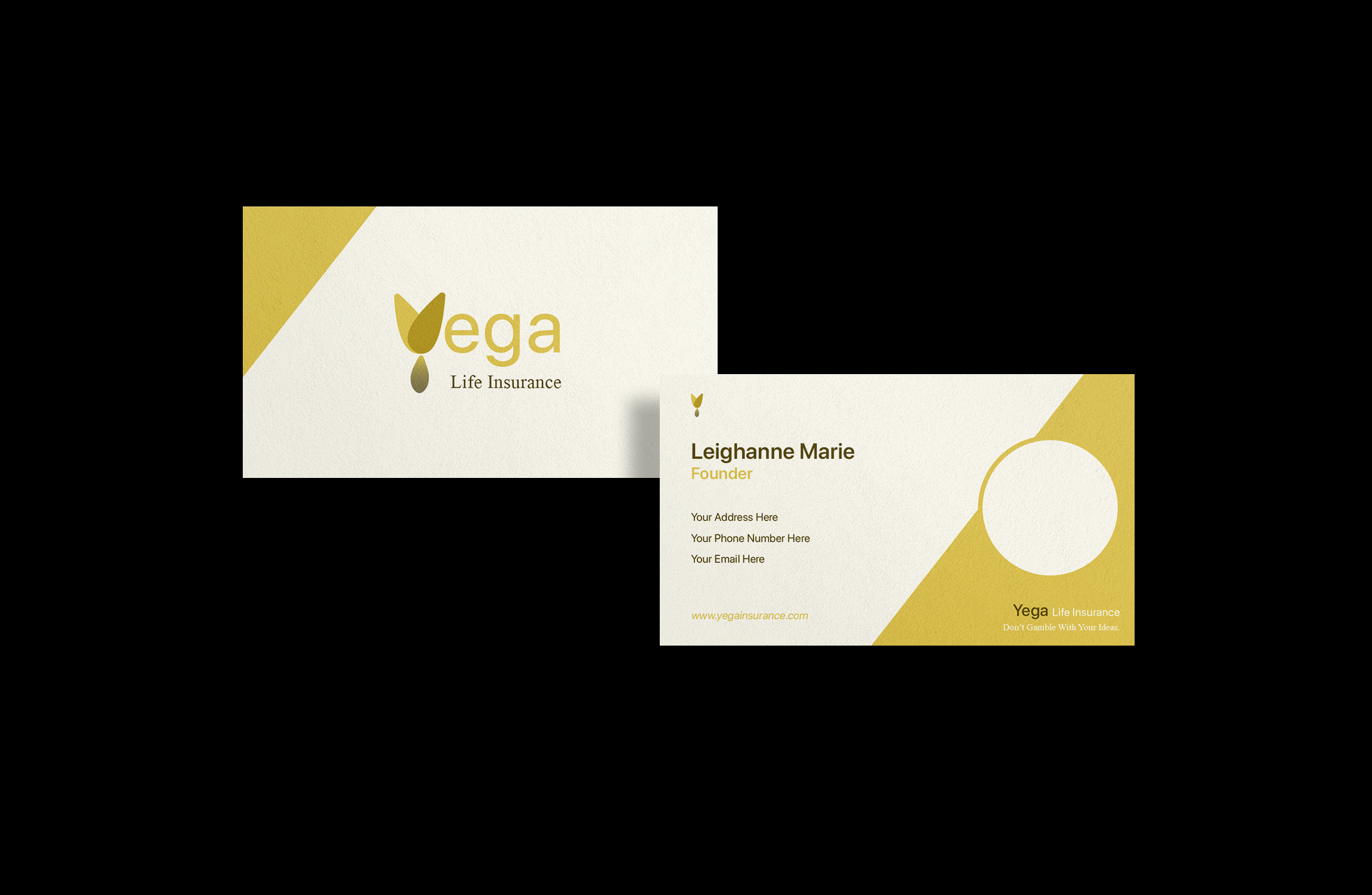
The logo needs some improvement but the chosen font for the text is good
9 months ago by Corinne
It needs some improvement but the concept is there
9 months ago by Corinne
Thanks
9 months ago by Corinne
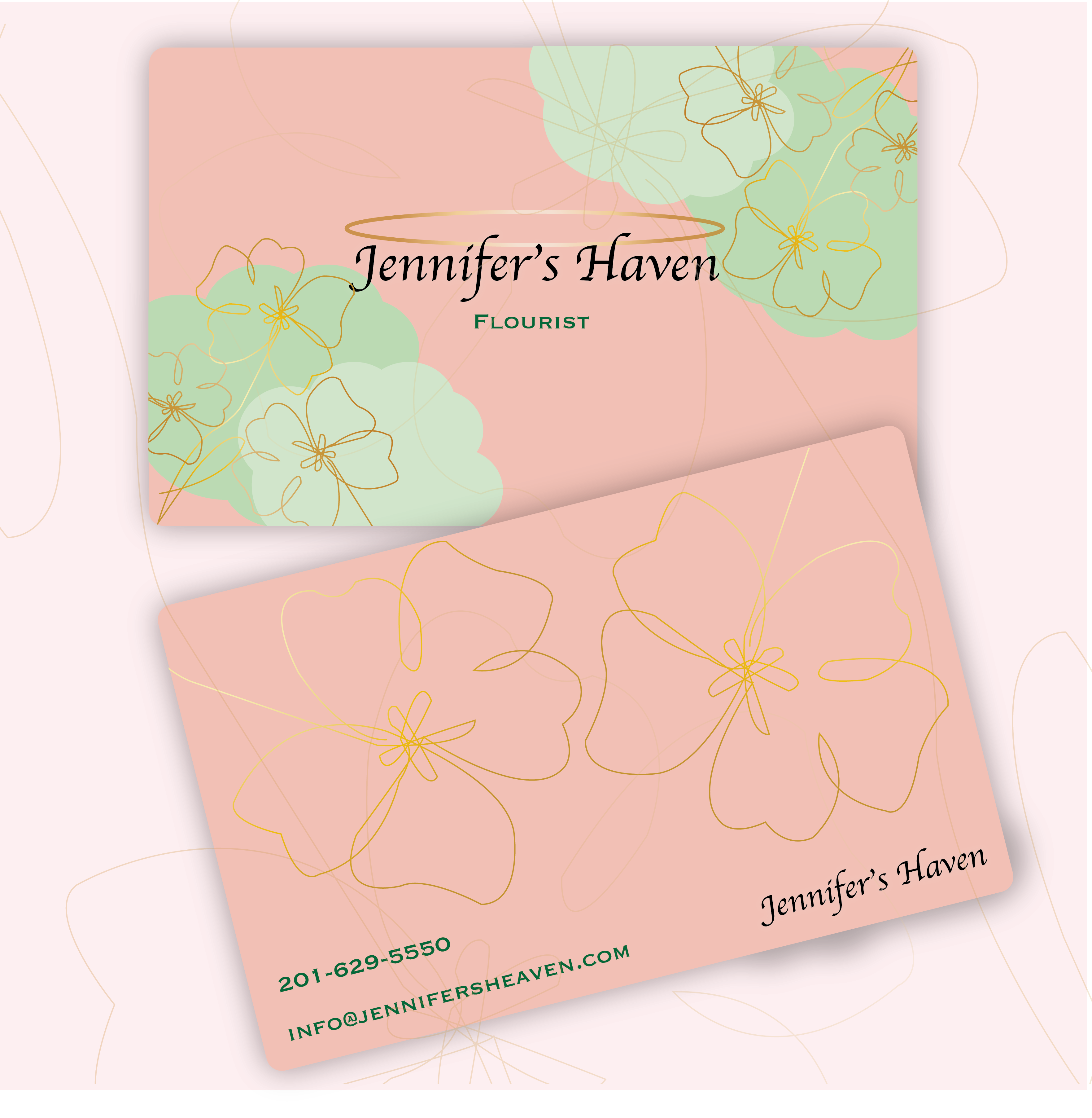
I think you should find another font because from my end the text isn't readable but the choice of color is good and find a font that is serif and it is readable but keep it with a little bit of design
9 months ago by Corinne
Posts
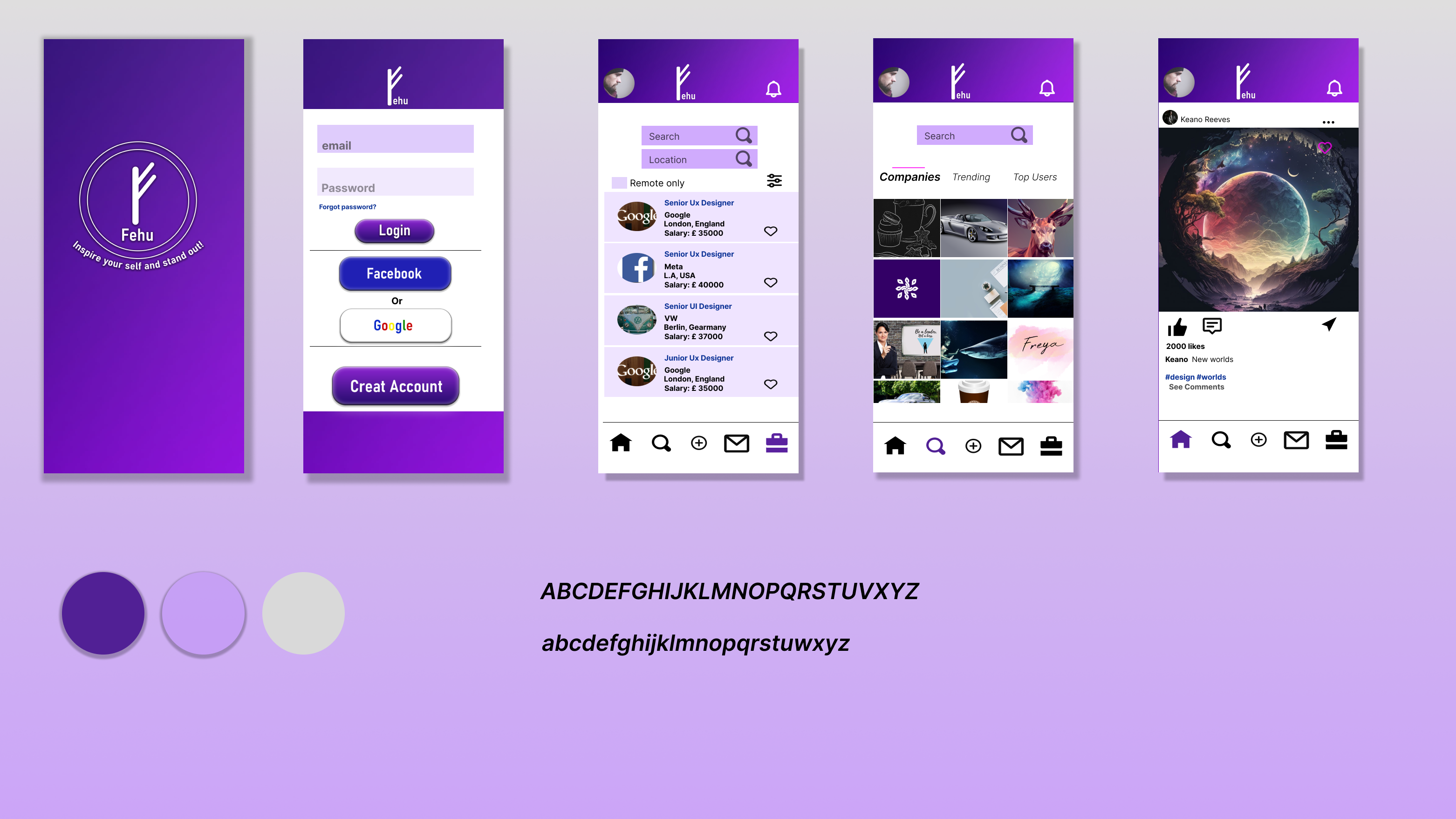
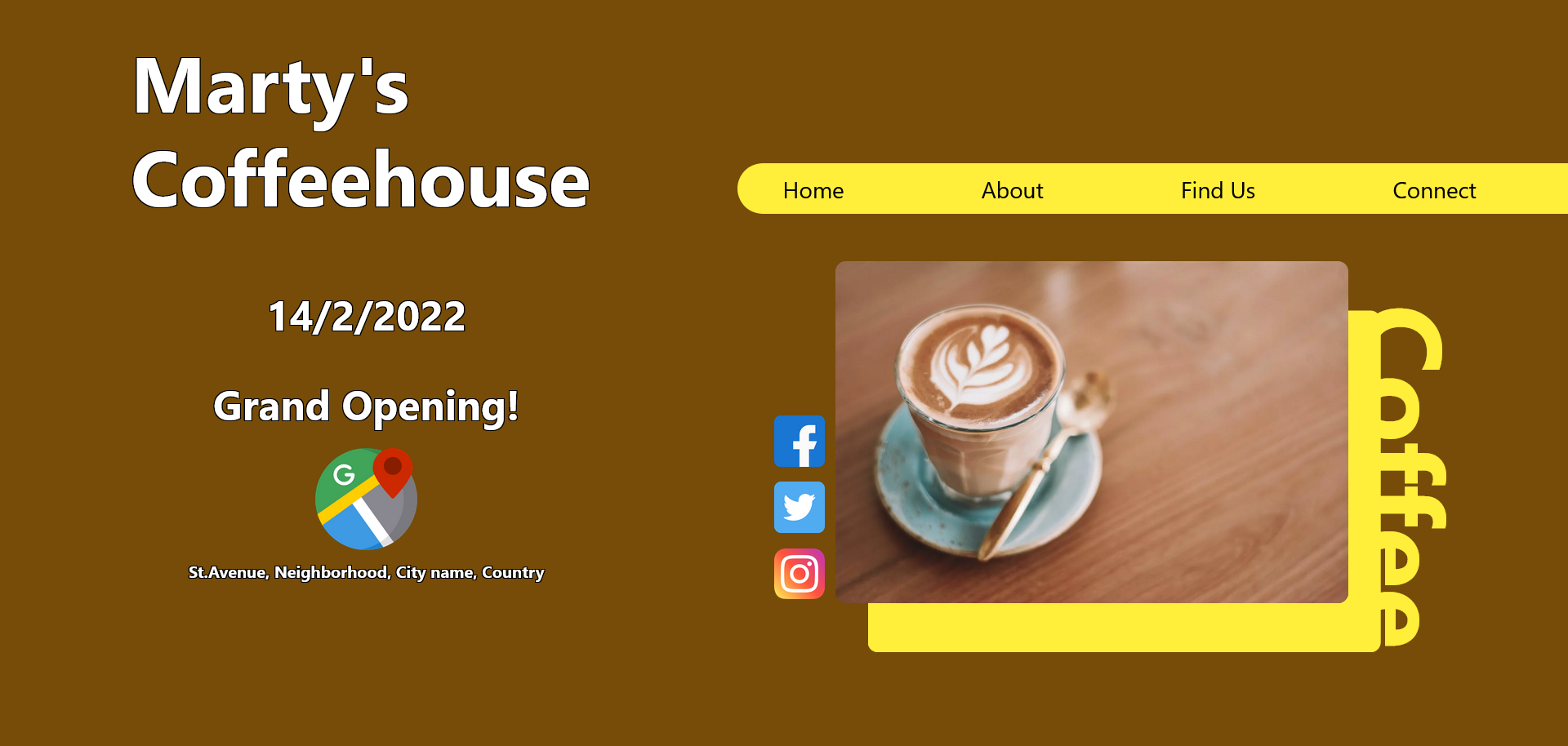
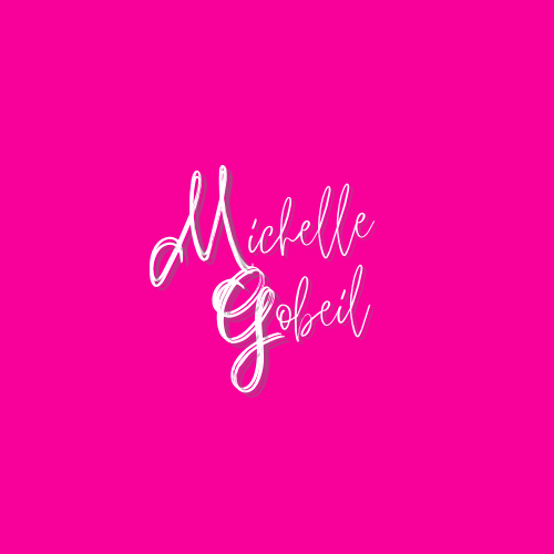
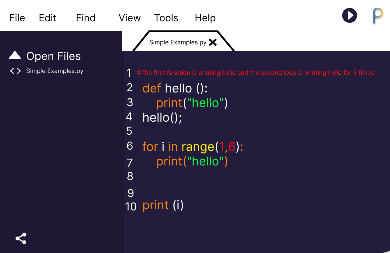
Code python software ui my version
- Report
7 months ago by Corinne
 2 Likes
 1
1
wow that soo cool
7 months ago by Moane - Reply
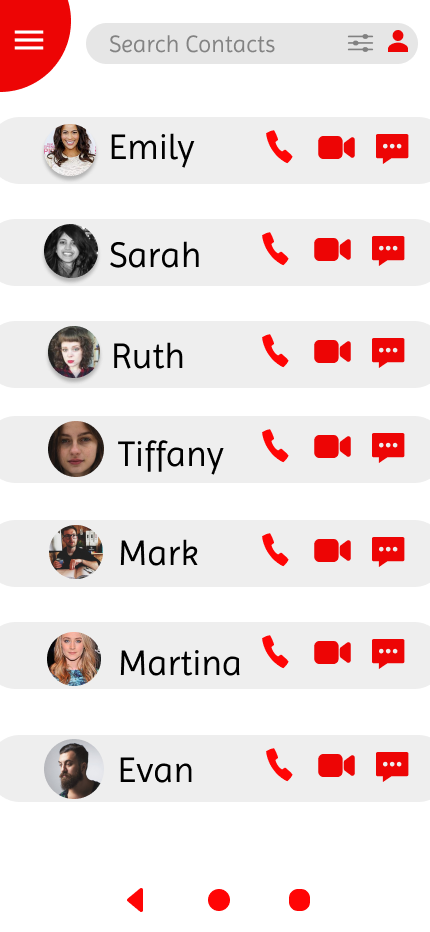
Hi, My name is Odelia. I'm looking for a user interface designer. I need an interface design of a contact list. We would love to work with you!
- Report
7 months ago by Corinne
 Like
0
Like
0
Hi, I am Vincent, I just founded a new business called HotSpace. We are looking for someone that can design a professional logo for our business. I think a wordmark would look cool. Can you help us out?
- Report
7 months ago by Corinne
 Like
0
Like
0
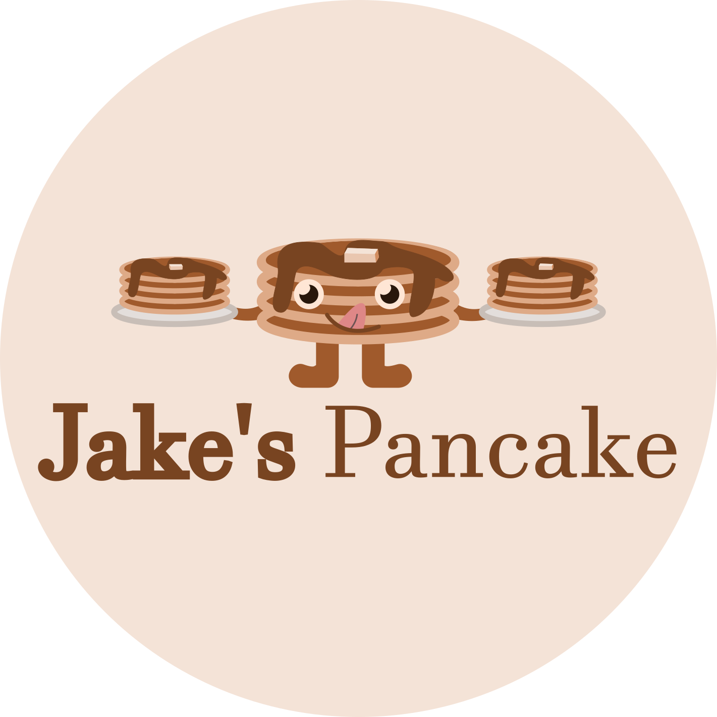
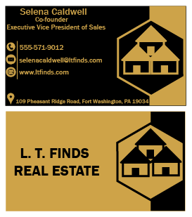
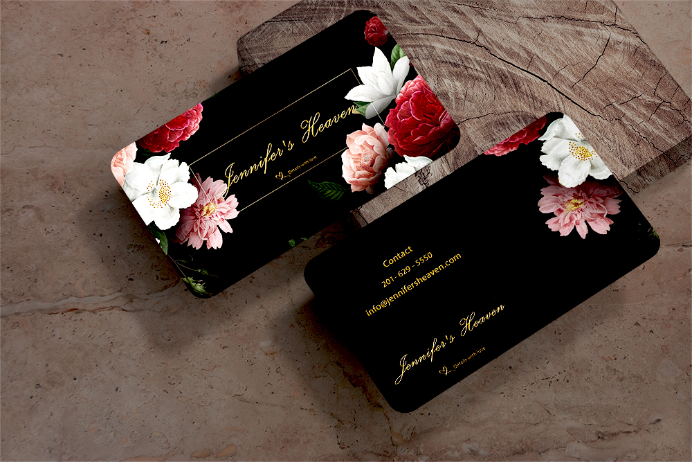
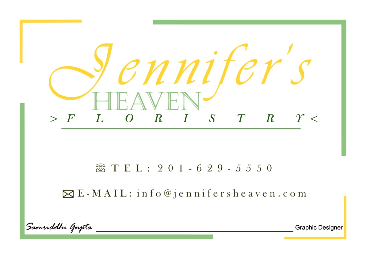
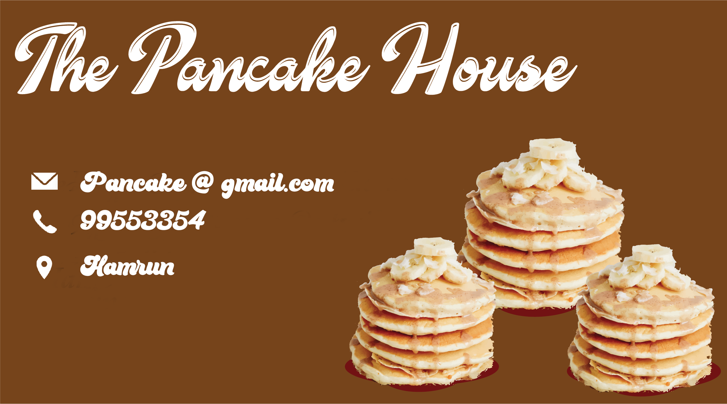
Pancake house business card
- Report
7 months ago by Corinne
 1 Like
3
1 Like
3
Try simplifying the design by using one enlarged stack since they're all the same image. Also, be mindful of your clipping. The cleaner the clipping the more polished your design will look. Good luck!
7 months ago by E. Rose - Reply
Nice font for the title of the business. For the contact details please try a simpler font and please check your alignment.
7 months ago by Deborah Inyang - Reply
Maybe you can leave more space between the letters on smaller texts, the font is lovely but hard to read when it is small. And maybe not using direct photos of pancakes but using vector illustrations or lineworks?1
7 months ago by Serra - Reply