Deborah Inyang
Posts
0
Likes
0
Liked Posts
5
Given Feedback
4
Feedback
Nice font for the title of the business. For the contact details please try a simpler font and please check your alignment.
8 months ago by Deborah Inyang
I like your font and colors. Your logo has 2 identifiable markers which can get confusing. Consider normalizing the S so that the special G becomes the identifiable logo marker.

8 months ago by Deborah Inyang
Please consider taking the "Restaurant" a bit closer to the logo so that it can be viewed as a unit (UX law of proximity)

8 months ago by Deborah Inyang
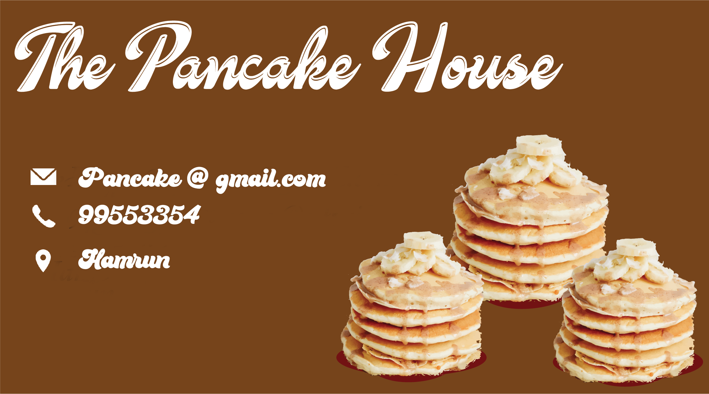
Hi, Really good color and font cloice. Please consider using icons for the contact markers (Email, Phone, etc). Also check the alignment.

8 months ago by Deborah Inyang