All Feedback Posts
![]()
Som-Num
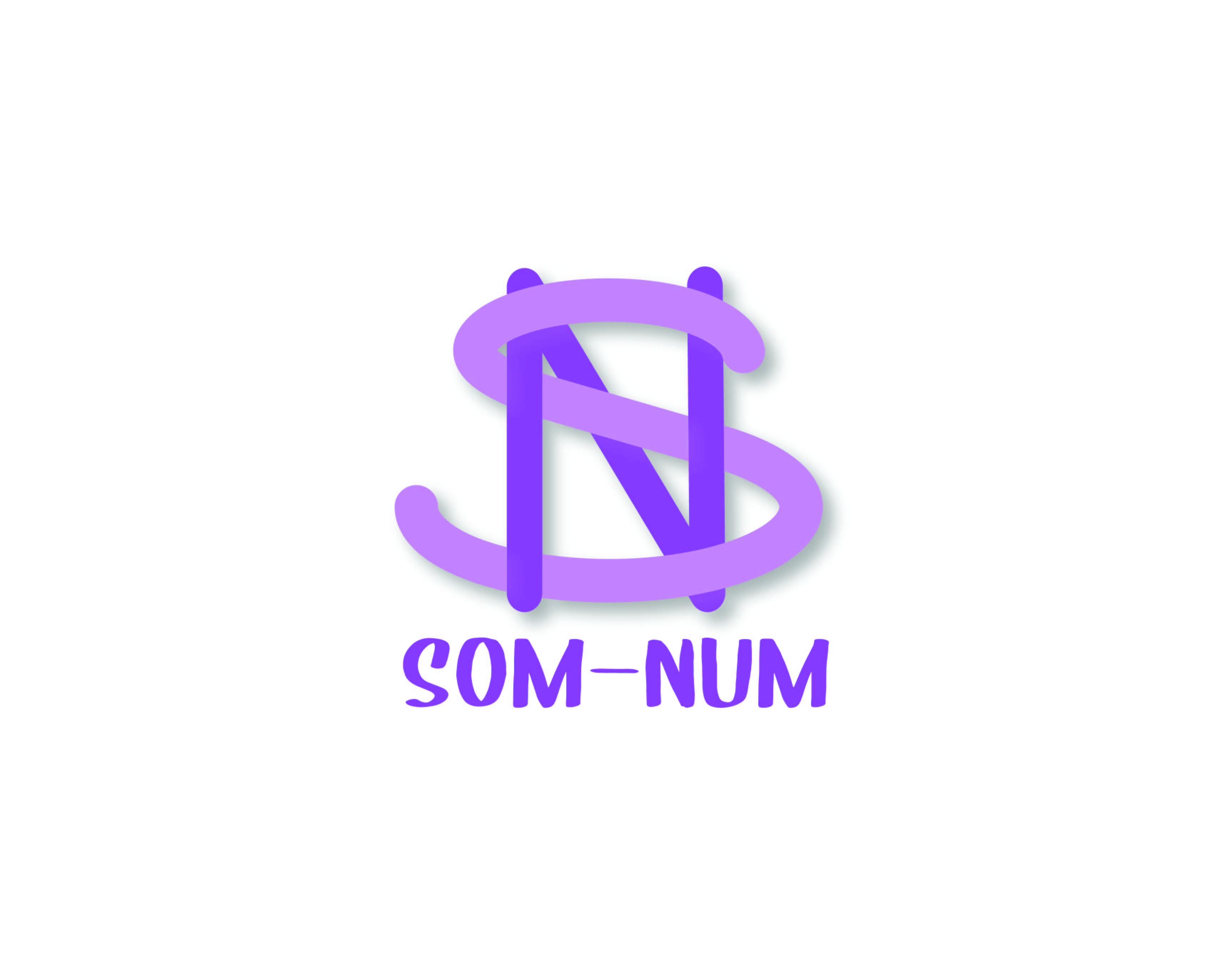
its so nice and beautiful, the color combination was great.
3 days ago by Rosalie Valencia - Reply
very nice! I like the way the s and N are wrapping around eachother. Nice use of drop shadow-it helps to make the logo pop. I like the curved edges of the letters.
5 days ago by sam - Reply
I would change the bottom font so it matches the top font better
5 days ago by Amir - Reply
This is awesome! I find it simple and not so busy, fit to what I like!
6 days ago by Krystel - Reply
View Other Posts
Dallas Steakhouse
Chollene • 5 years ago
Toucan Logo Mark
Alex Strøm • 4 years ago
MUJO Brief Logo design
Elena • 4 years ago
Business Card Design
kunal das • 5 years ago
Fitfits promo flyer design
Helen Idongesit • 3 days ago
Michelle Gobeil
Alex • 4 days ago
