


Luiz G Lacerda
Posts
5
Likes
5
Liked Posts
1
Given Feedback
1
Feedback
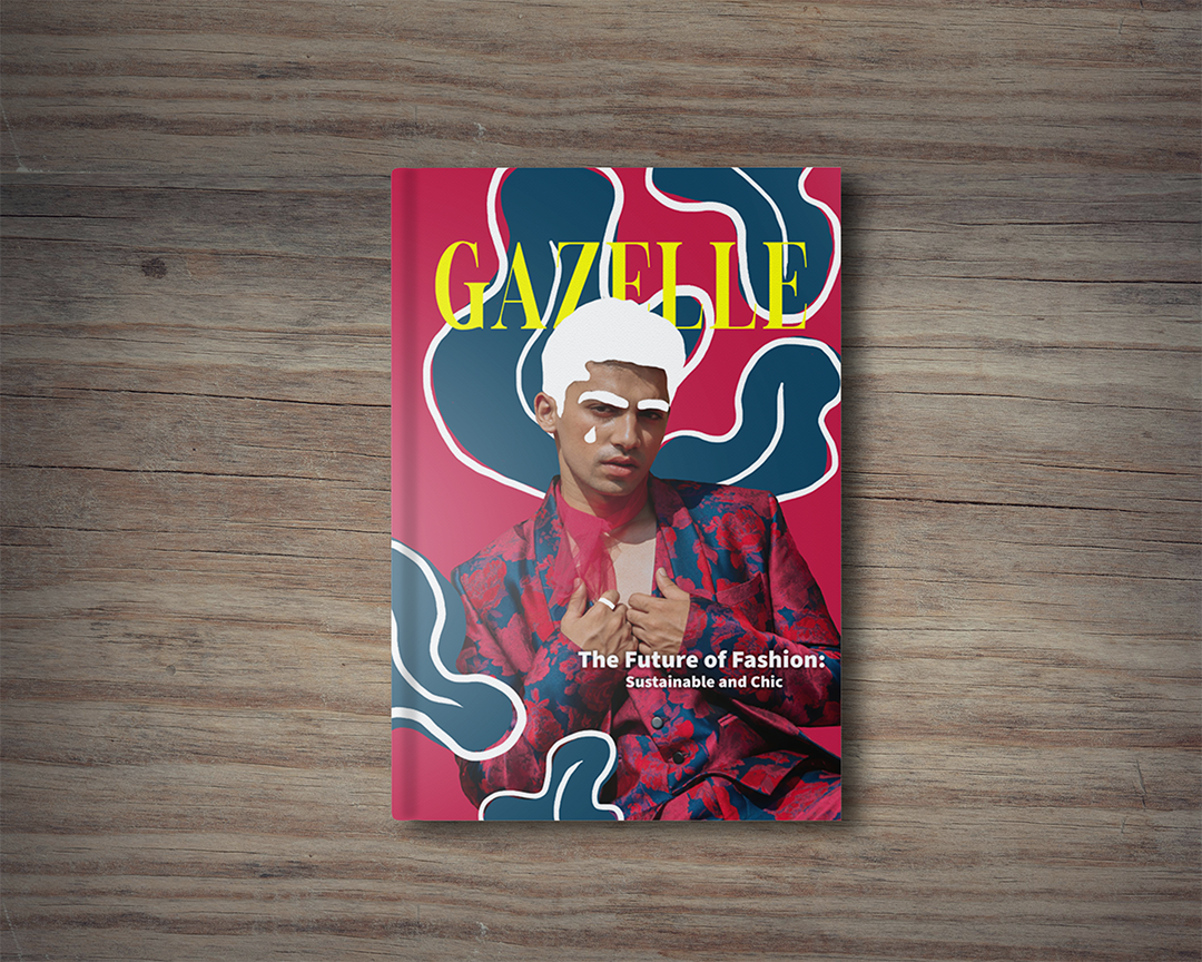
I really like the color palette of this design and the white hair and eyebrows make it pop out more. I also like the format and positions of your design. but the only thing that maybe needs to be fixed is the title in yellow, it blends in with the design and its really hard to see it, but that it. overall is really good.
1 month ago by Luiz G Lacerda
Posts


its so nice and beautiful, the color combination was great.
3 days ago by Rosalie Valencia - Reply
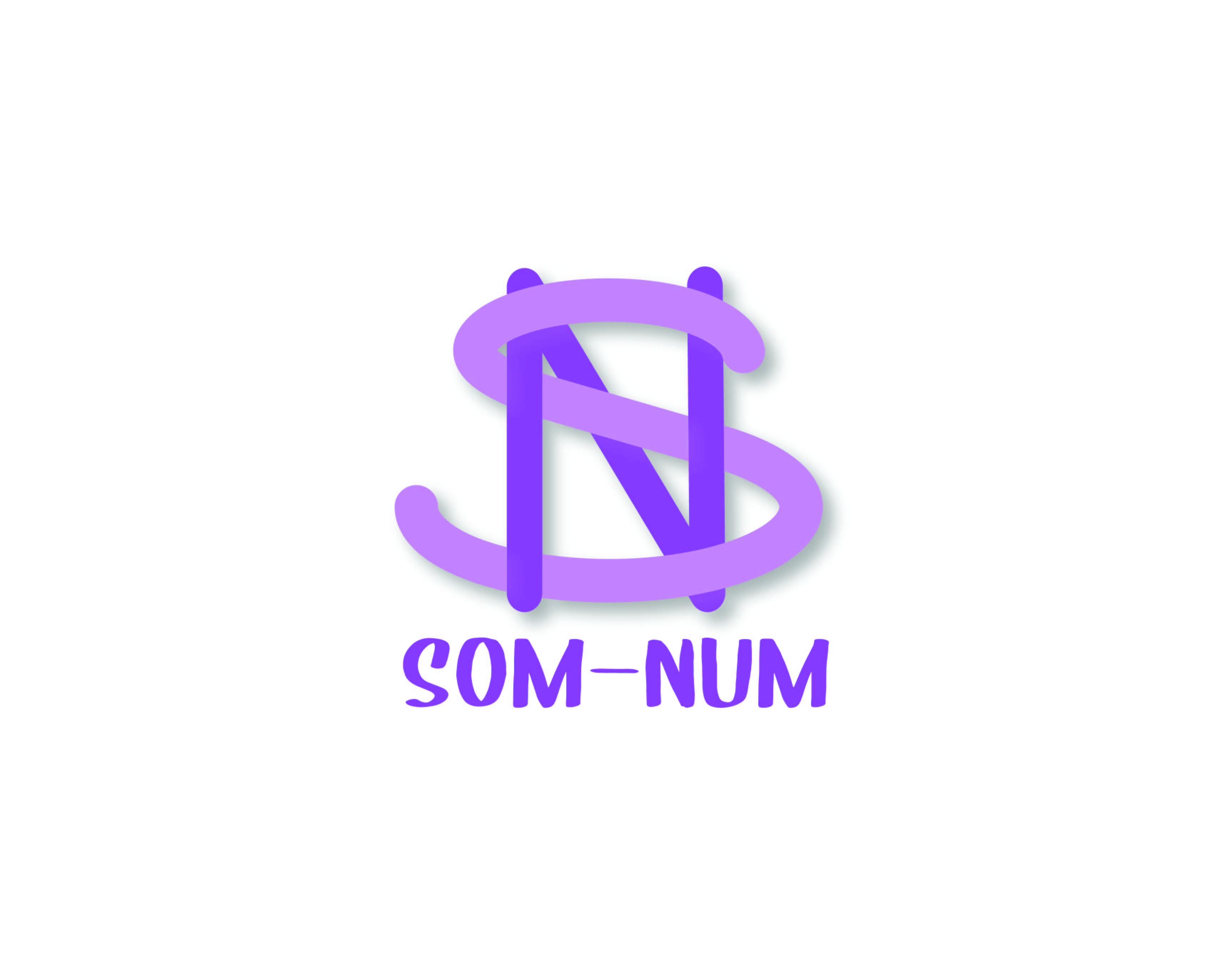
very nice! I like the way the s and N are wrapping around eachother. Nice use of drop shadow-it helps to make the logo pop. I like the curved edges of the letters.
4 days ago by sam - Reply
I would change the bottom font so it matches the top font better
5 days ago by Amir - Reply
This is awesome! I find it simple and not so busy, fit to what I like!
6 days ago by Krystel - Reply

You've done well Luiz
3 days ago by Helen Idongesit - Reply
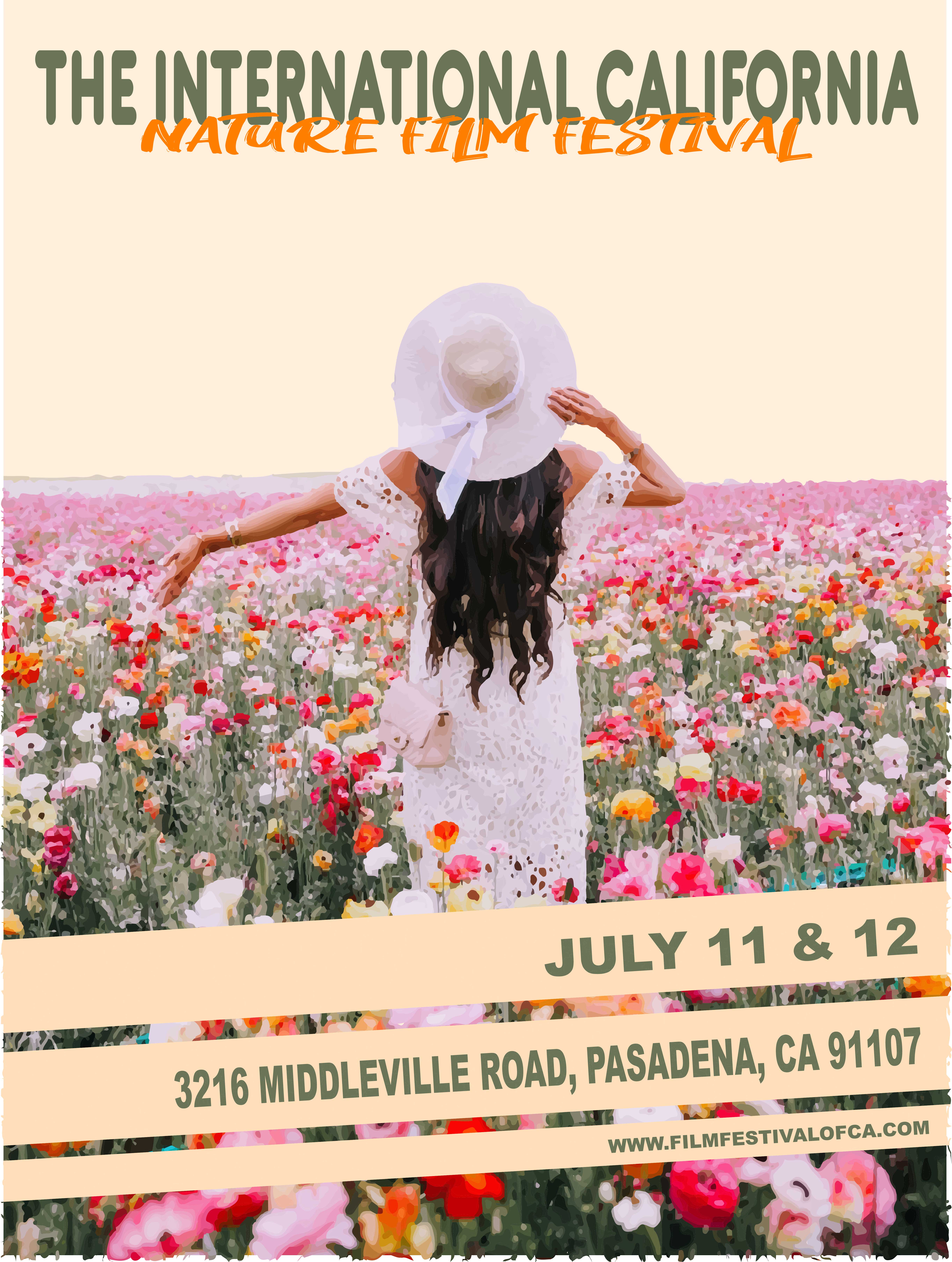
Very nice! I think you could have made the sky into something it sort of looks unfinished because shes not looking at anything. Also love the nature aspects but give some ideas of what may be at a film festival-food trucks, actor panels, merch, etc.
4 days ago by sam - Reply
Thank you
1 week ago by Jedeah Bravo - Reply
Love the graphics used, I feel that the font for “nature film festival” can be bigger and more spaced out from “the international California”. If there was intention in the choice, I’m sorry I wasn’t able to see it.
2 weeks ago by Natasha - Reply

The design is already great, but maybe you can make the description text more easy to read because in your design the text is small and have shadow so it makes me a bit hard to read it properly.
2 weeks ago by nova - Reply
Nice template. But the fonts needs to be bold to be eye catching.
2 weeks ago by Oyindamola Afolabi - Reply
Nice
3 weeks ago by Muhammad Ayyan - Reply
General outlook is great. Maybe work on the typography so it doesn't hurt the eye while trying to read
3 weeks ago by Rachael Abani - Reply

Too informal for a business card, and the text is kinda hard to read
3 weeks ago by Pradipta Falisha Hirsam - Reply
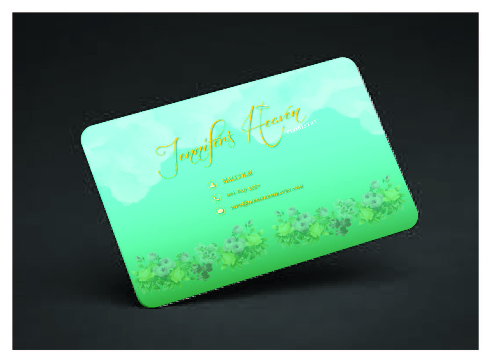
nice one. i like the background, but it's hard to read when the text is yellow
1 month ago by husen - Reply
good work but I find the colors too flashy
1 month ago by Ned - Reply
love the colors
1 month ago by FELICITY - Reply


too plain, and the product doesn't stand out
3 weeks ago by Pradipta Falisha Hirsam - Reply
cool design, it looks professional
1 month ago by husen - Reply
nice
1 month ago by ikichha - Reply
This is definitely something
1 month ago by Aleksandr - Reply