Natasha
Posts
3
Likes
6
Liked Posts
2
Given Feedback
5
Feedback
I love the colour and the shine of the card, very pretty! Maybe for the “Jennifer’s Heaven” part it could be good if the “J” was fully visible as well since it seemed to be cut from the card.
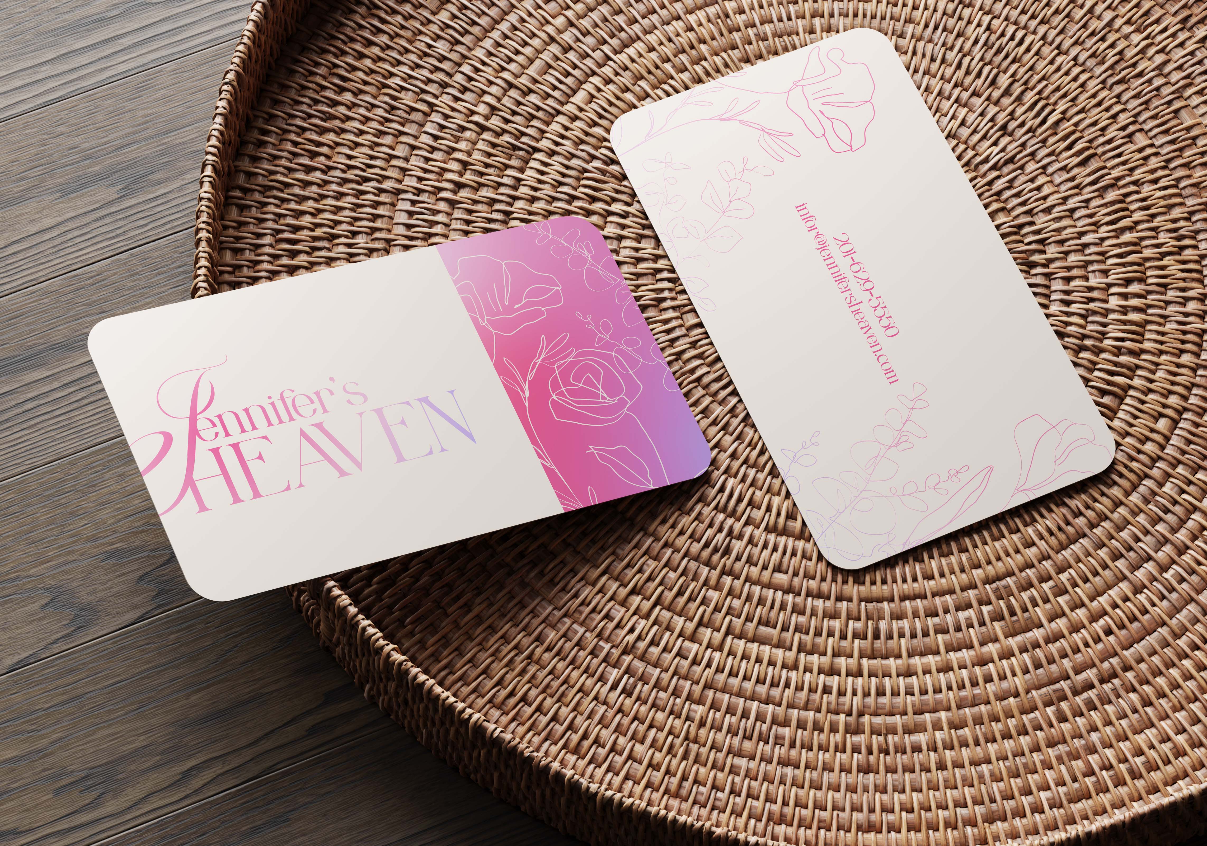
2 weeks ago by Natasha
Posts

Michelle Gobeil
- Report
Natasha • 2 weeks ago
Hi, feedback is appreciated. I know the brief said to use a unique handwriting logo rather than a font but I decided to opt for a lettermark logo using MG to make a palette and brush and added the name to get their brand out and known.
Great
1 week ago by Jeyakandhan - Reply
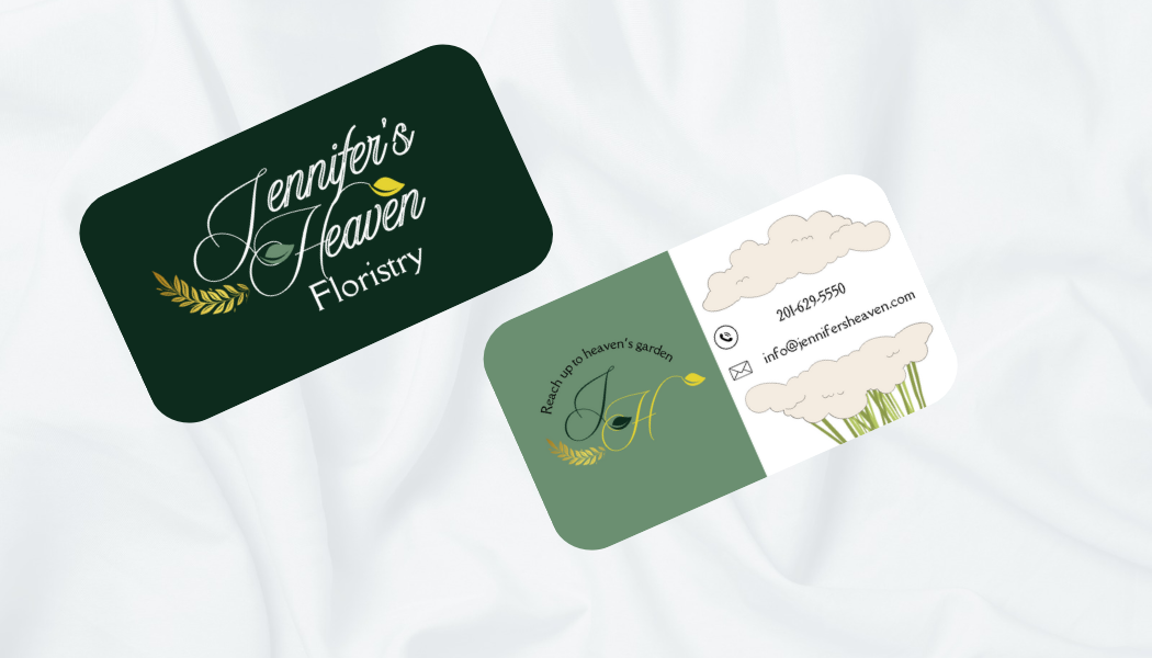
Jennifer’s heaven business card
- Report
Natasha • 2 weeks ago
Jennifer's Heavengraphic
Hi, feedback much appreciated. Can anyone advise on how I could make it seem more “high-end” and luxurious?
In my opinion, the front is already looking really nice, but at the back, there's too much going on; try to reduce detail as much as possible. And try to change the frame to the same color.
2 weeks ago by Lois - Reply
Thank you for the feedback!
2 weeks ago by Natasha - Reply
