Lois
Posts
1
Likes
2
Liked Posts
10
Given Feedback
4
Feedback
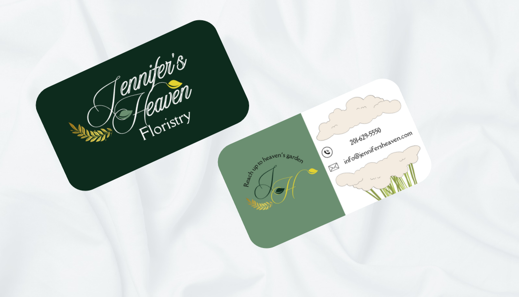
In my opinion, the front is already looking really nice, but at the back, there's too much going on; try to reduce detail as much as possible. And try to change the frame to the same color.

1 week ago by Lois
Thank you <3
1 week ago by Lois
Posts

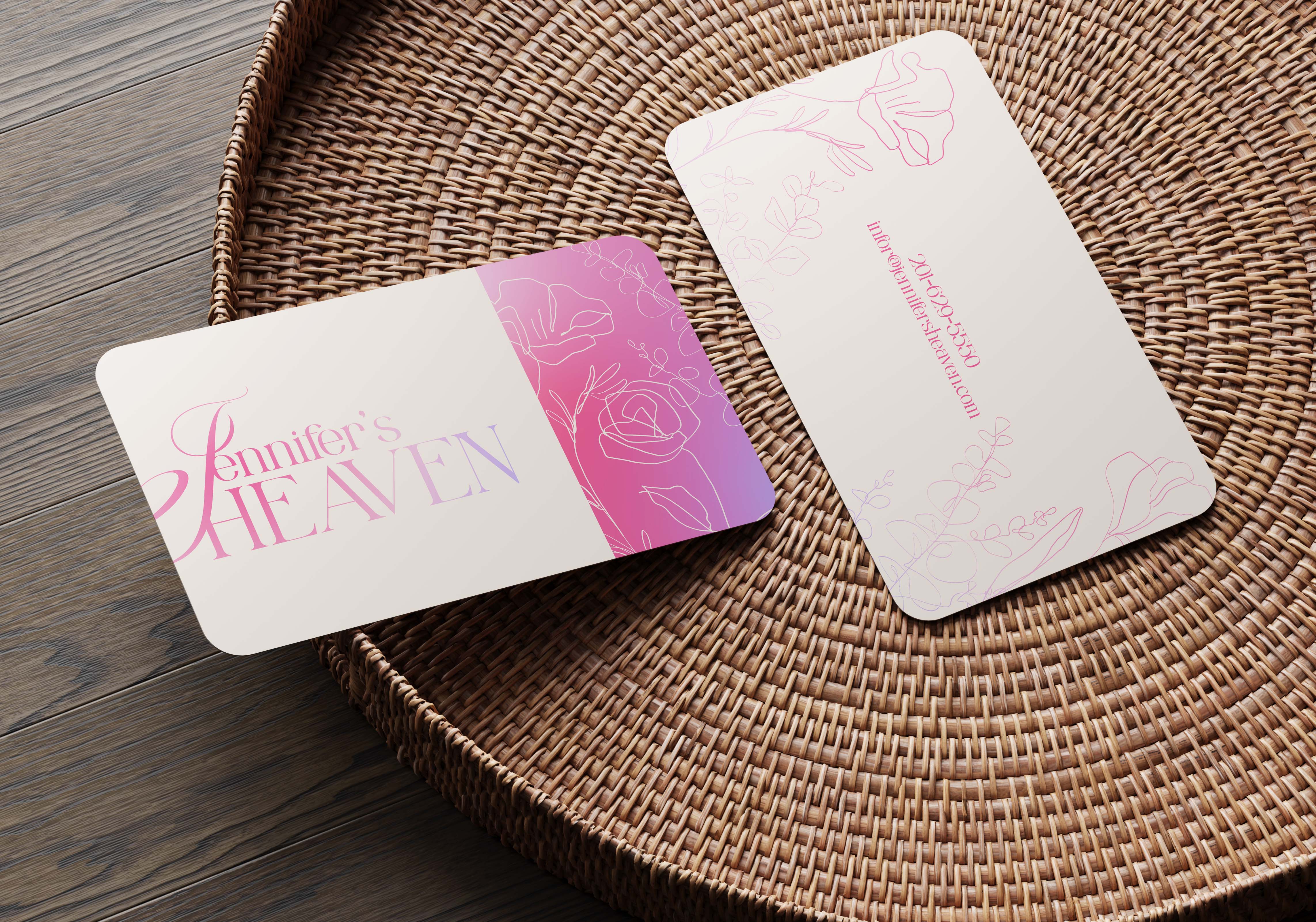
Jennifer’s heaven business card
- Report
Lois • 1 week ago
Jennifer's Heavengraphic
By the time I was done, I realized I had forgotten the "floristry". Anyway, feedback is much appreciated and I would love to do much more :)
I love the colour and the shine of the card, very pretty! Maybe for the “Jennifer’s Heaven” part it could be good if the “J” was fully visible as well since it seemed to be cut from the card.
1 week ago by Natasha - Reply

