Som-Num
- Report
2 years ago by Muhammad khalid
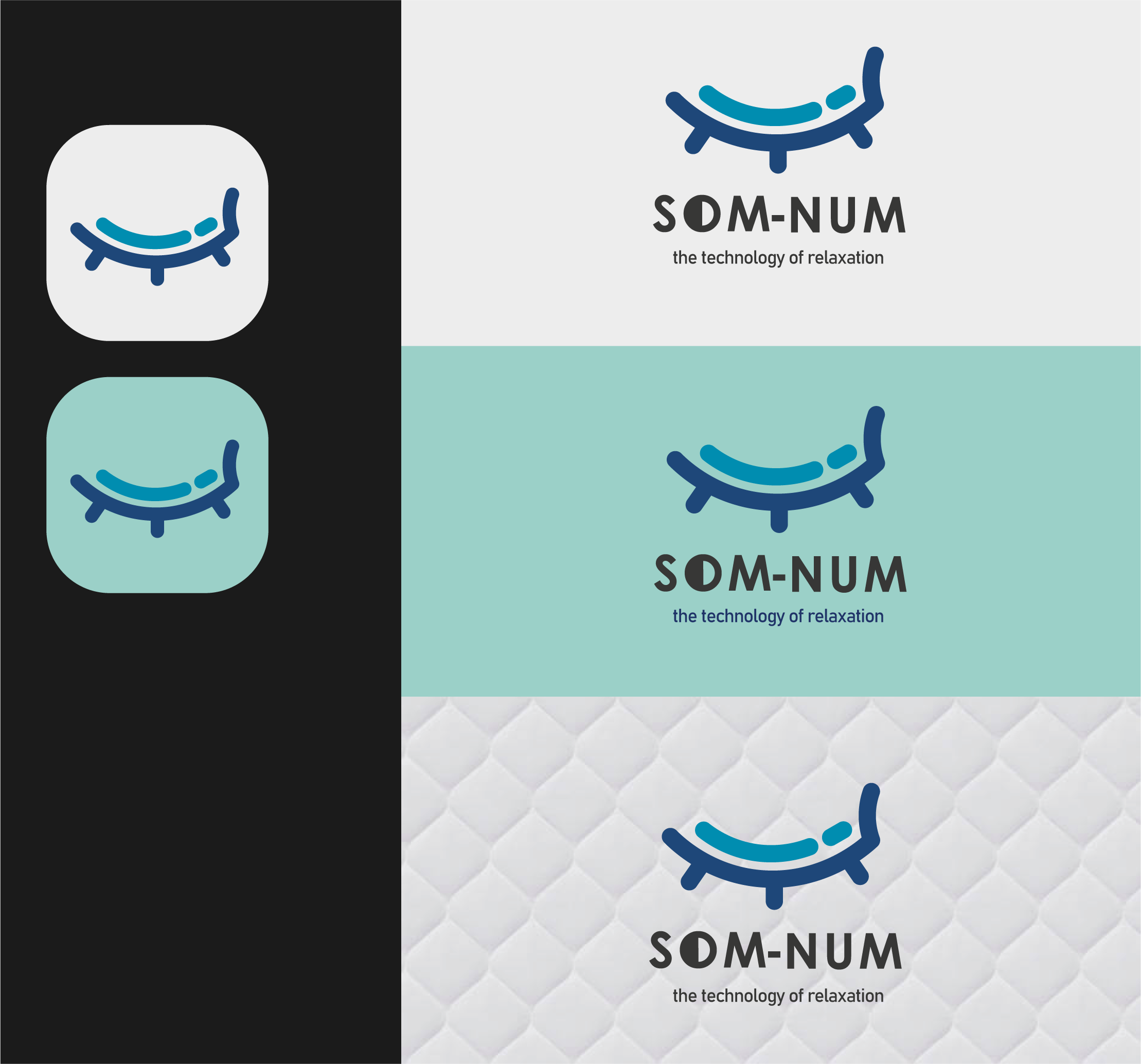
Som-Numlogo
 1 Like
 1
1
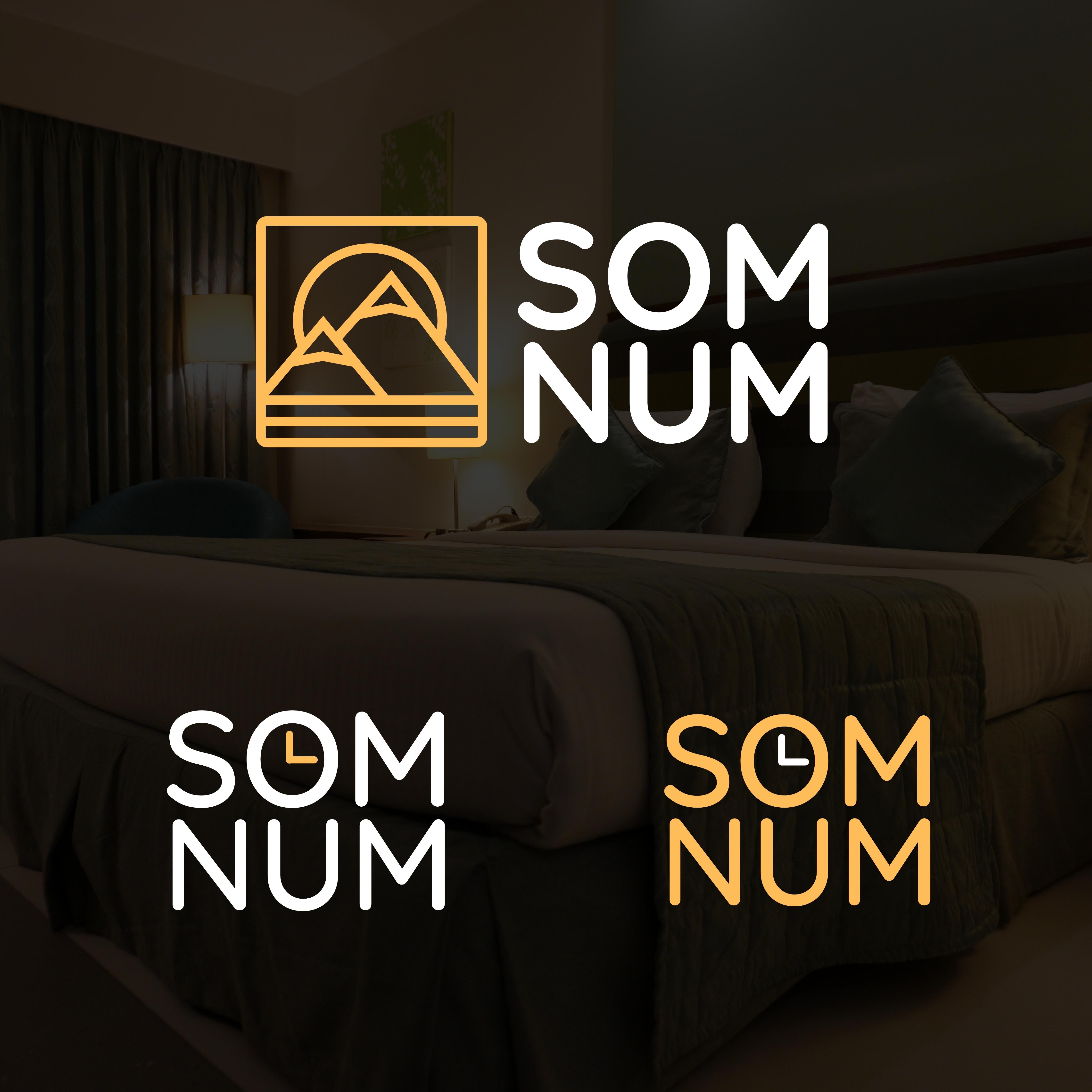
My only criticism is that I needed to read the brief to know what the subject matter was. I love the simplicity but they did not really imply "sleep" or nighttime exactly. While that may not be an issue once these are embroidered on tags on a mattress, it's just a thought for standalone use. I really like the clock versions, And I love the mountain graphic, but I would maybe consider trying to use a crescent moon - as more of a "sleep" style icon.
2 years ago by Megan Leleniewski - Reply