Jennivah delos Santos
Posts
11
Likes
54
Liked Posts
29
Given Feedback
15
Feedback
thank you! :)

1 year ago by Jennivah delos Santos
thank you
2 years ago by Jennivah delos Santos
thank you! :)
2 years ago by Jennivah delos Santos
i like it
2 years ago by Jennivah delos Santos
I tried to be a little different from other entry
2 years ago by Jennivah delos Santos
I like the simplicity and clean look
2 years ago by Jennivah delos Santos
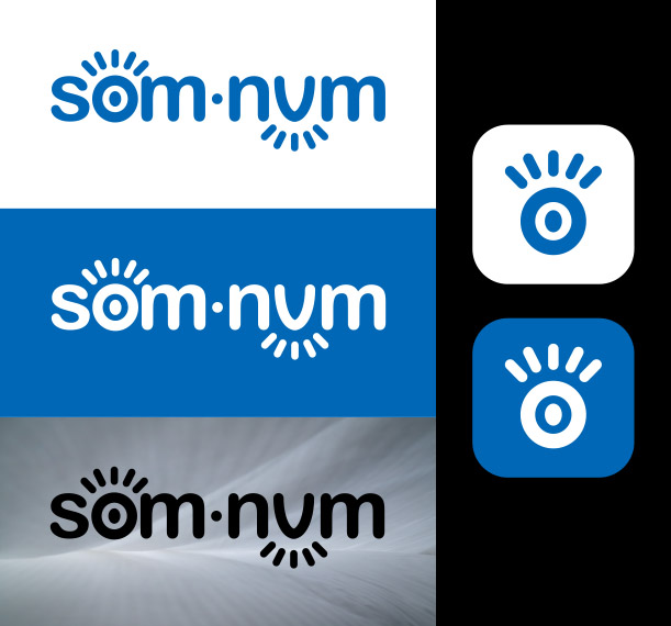
The icon is really good, I like it so much but the brand name is off i may say that use a san serif font and dont warp it above the icon and place it below the icon to make it feel cleaner.
2 years ago by Jennivah delos Santos
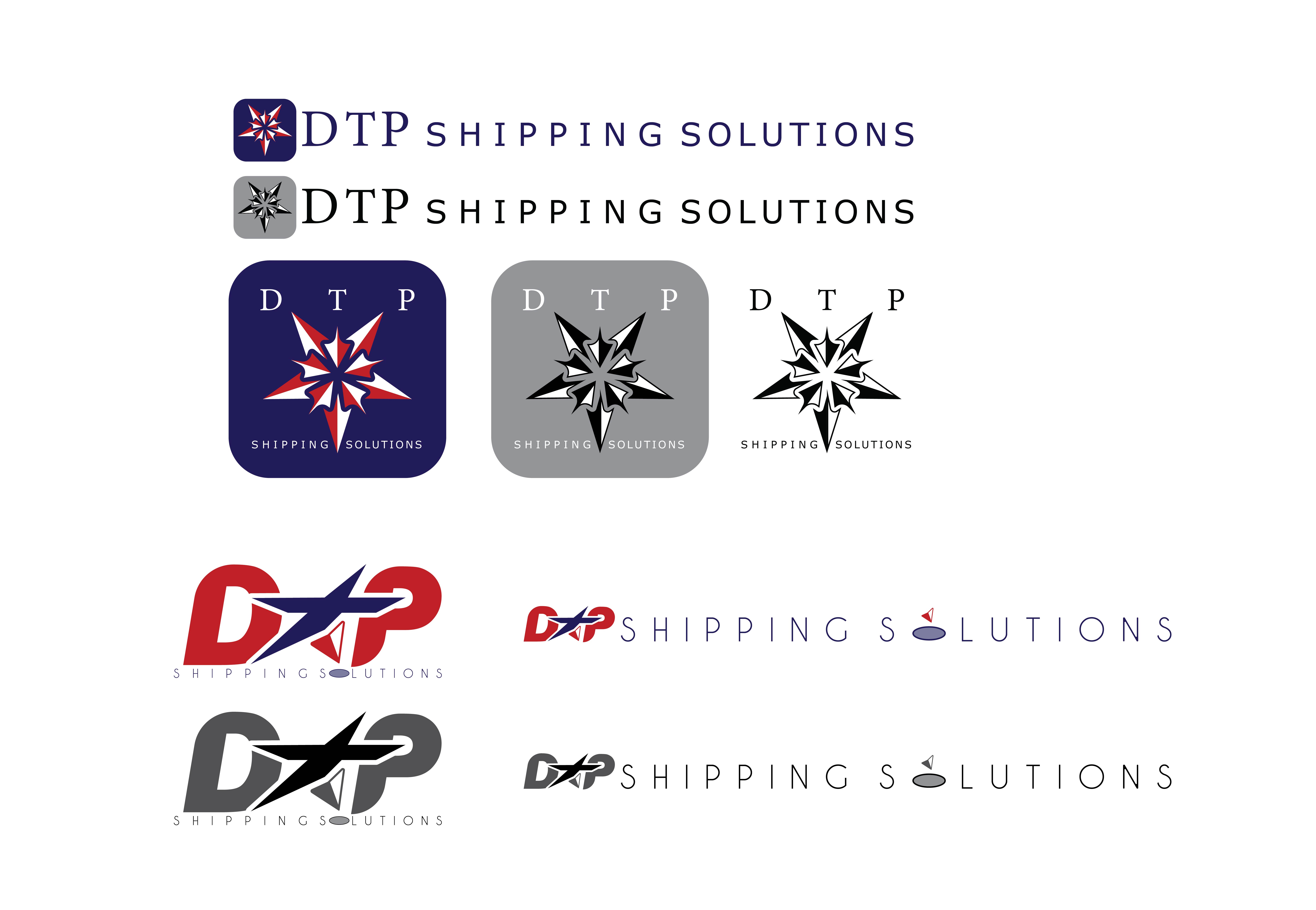
Really clever idea so simple and effective, for me i may suggest to make the corners or edges a little bit rounded to suggest playful and gentle touch. But over all it is really nice

2 years ago by Jennivah delos Santos
Nice job. I love it

2 years ago by Jennivah delos Santos
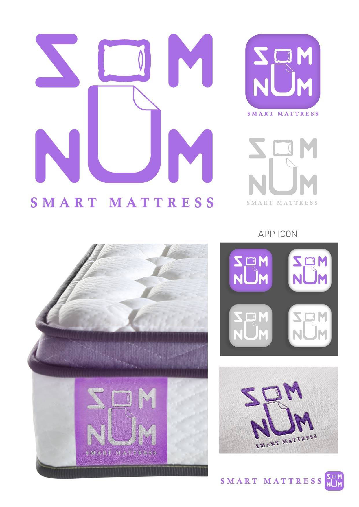
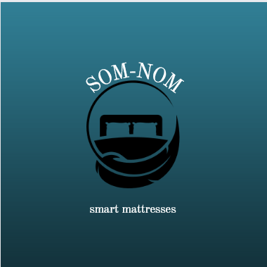
I love the idea of the mixed visual and the man inside the "o" and "u", it is really good but for me something tells me that its a hammock rather than a mattress

2 years ago by Jennivah delos Santos
Thank you

2 years ago by Jennivah delos Santos
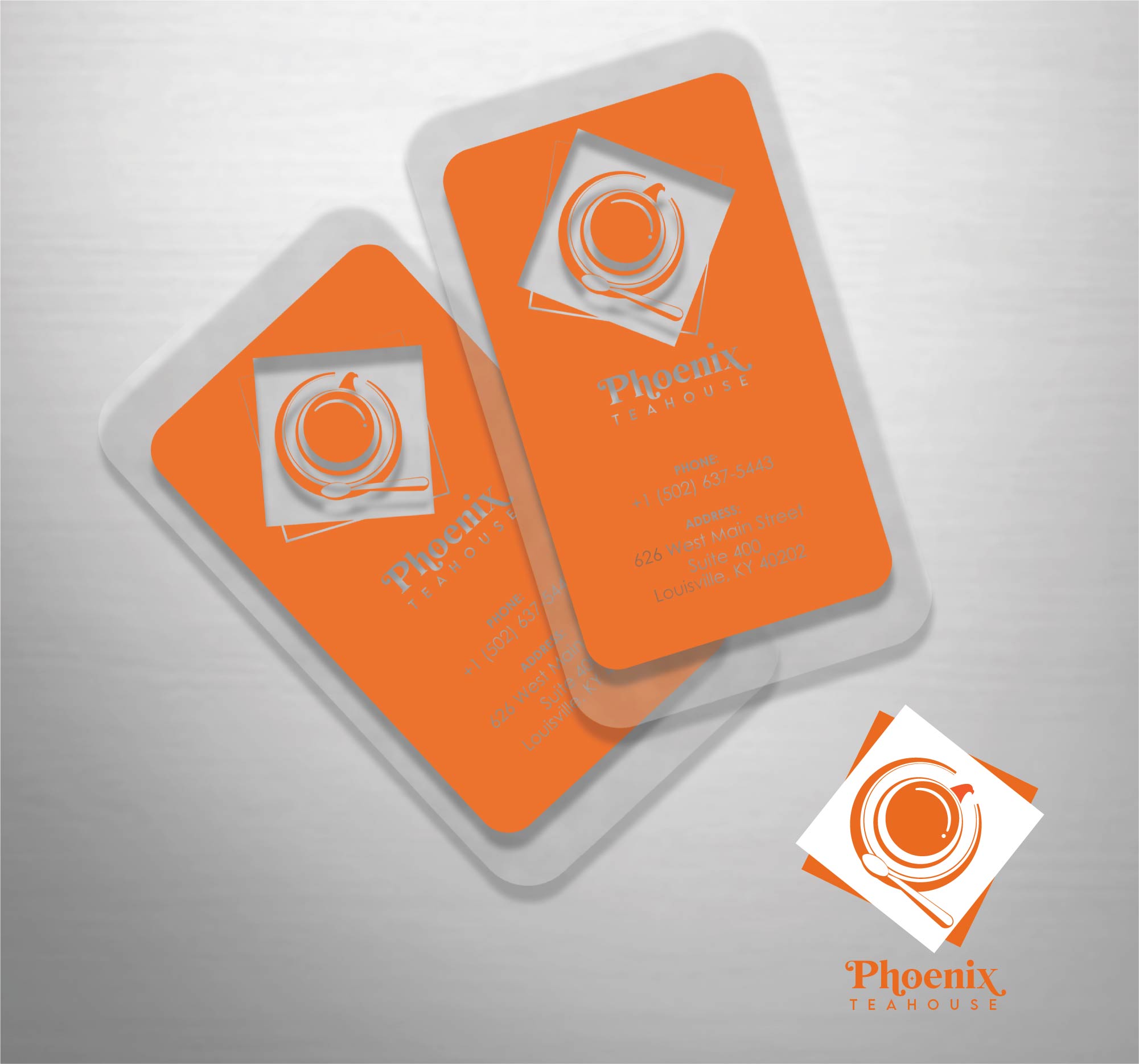
I made the the logo looks like a top view of a cup and saucer with a teaspoon. If you look closer the handle of the cup is actually a head of the phoenix. The teaspoon and the cup will make a letter "P". I also made the calling card transparent to make it elegant and sleek.
2 years ago by Jennivah delos Santos
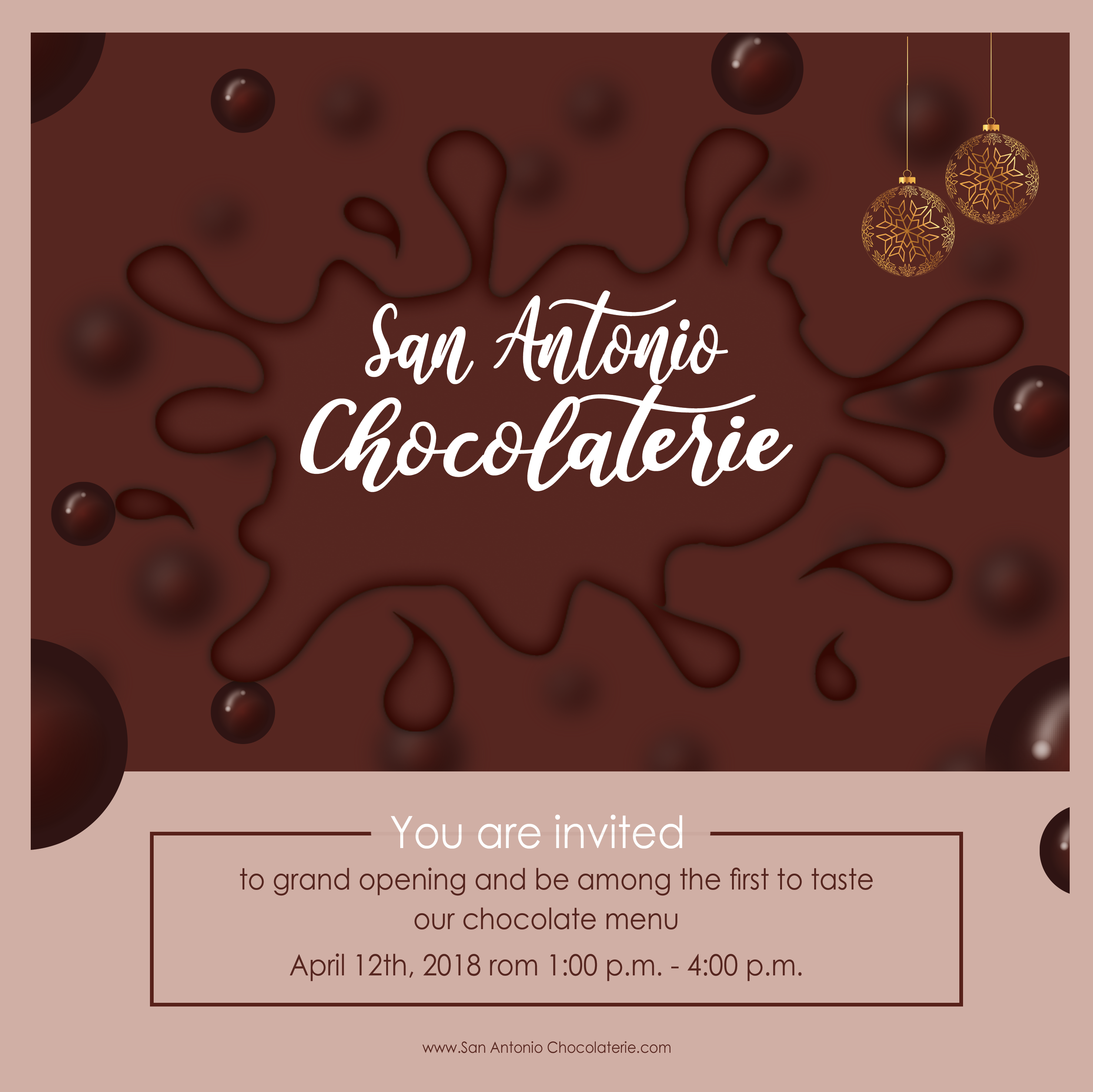
Nice color scheme. The background and the chocolate splat are almost the same color that is why it loses the emboss effect of the chocolate and the brand is a bit off center to the splat
2 years ago by Jennivah delos Santos
It seems like an eyewear logo for me. I love the simplicity yet playful look
2 years ago by Jennivah delos Santos
Thank you
2 years ago by Jennivah delos Santos
Posts
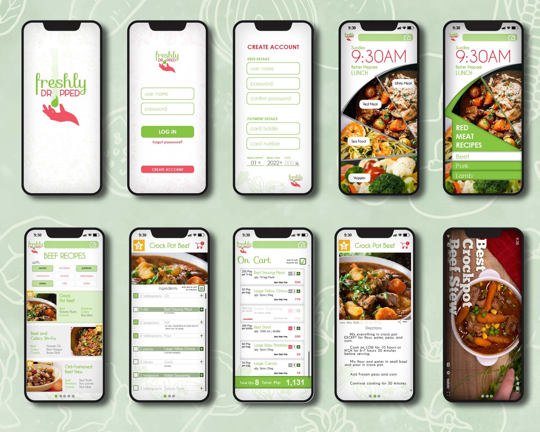
Freshly Dropped
- Report
Jennivah delos Santos • 2 years ago
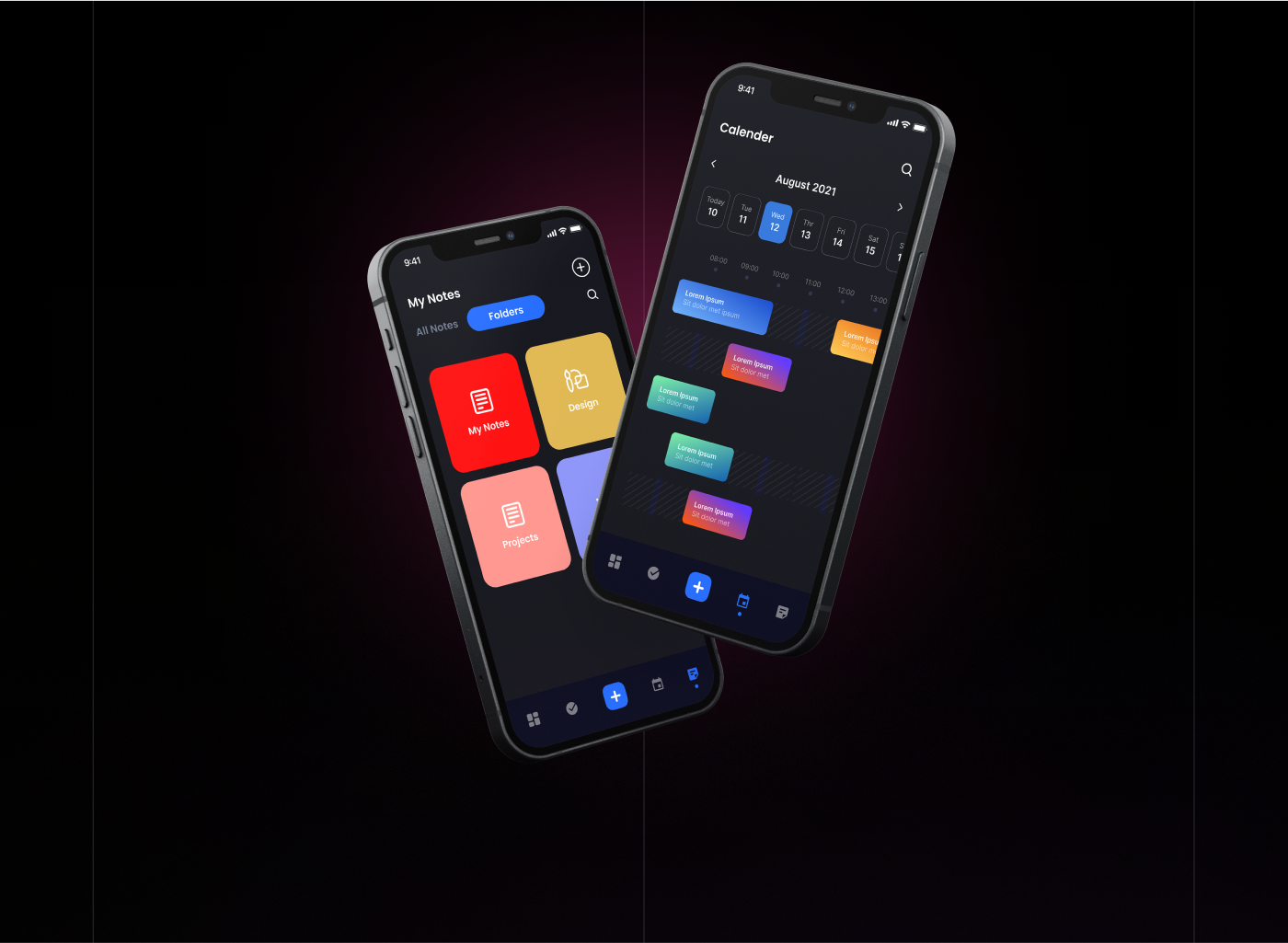
First ever Ui I have made, Hoping for constructive criticism


Shoptacle
- Report
Jennivah delos Santos • 2 years ago
I'm trying to create ux for the 1st time. Hopefully to get some feedback.

wow, this look like the real luxury web
1 year ago by dojin - Reply
this is a very lovely design.
1 year ago by MOFOLUWASO OPEYEMI ATOLAGBE - Reply
I love this so much
1 year ago by Anita Petrovic - Reply
nice
1 year ago by abhishek rajput - Reply
thank you! :)
1 year ago by Jennivah delos Santos - Reply
set the mood
- Report
Jennivah delos Santos • 2 years ago
Documentary Self-Portraitillustration


colorful
1 year ago by Johanna Paula Bangoy - Reply
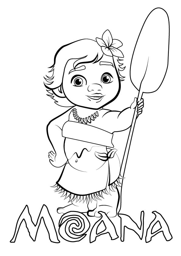
Kinder Moana
- Report
Jennivah delos Santos • 2 years ago
Kindergarten Coloring Plateillustration

nice
1 year ago by Ranny - Reply
I tried to be a little different from other entry
2 years ago by Jennivah delos Santos - Reply
Phoenix Teahouse
- Report
Jennivah delos Santos • 2 years ago
Hey,
I'm Georgeann, I just founded a new business called Phoenix Teahouse. I'm looking for someone that can design something for my Teahouse. I want to have a business card for myself. Would you be interested?
I'm Georgeann, I just founded a new business called Phoenix Teahouse. I'm looking for someone that can design something for my Teahouse. I want to have a business card for myself. Would you be interested?

it is a really beautiful design
2 years ago by goree - Reply
I made the the logo looks like a top view of a cup and saucer with a teaspoon. If you look closer the handle of the cup is actually a head of the phoenix. The teaspoon and the cup will make a letter "P". I also made the calling card transparent to make it elegant and sleek.
2 years ago by Jennivah delos Santos - Reply