All Feedback Posts
![]()
Jina's Teahouse
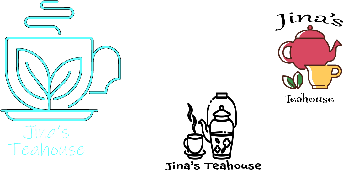
the font is barely visible, the idea is lovely but the application can be improves
1 month ago by Noor Alhaj Yousef - Reply
the first one seems cool, but the black border on the aqua color made it strange, it feels like a radioactive cafe. the others look pretty generic, so you could use them as inspiration at the beginning, but make sure to mix, cut, mold them, etc. also, try studying more about typography, I also struggle with that
1 month ago by Luiza - Reply
Great
1 month ago by Morgan joy - Reply
Thank you, Mr. Mersades Bergmann, for the three logo designs for my teahouse brand. Each design beautifully captures the essence of what I'm looking for, and I appreciate the creativity and thoughtfulness you've put into them. I especially like the colors you've chosen, as they perfectly represent my brand's identity. I'd love to discuss further and finalize the perfect logo for the brand.
1 month ago by Navillera - Reply
View Other Posts
Dallas Steakhouse
Chollene • 5 years ago
Toucan Logo Mark
Alex Strøm • 4 years ago
MUJO Brief Logo design
Elena • 4 years ago
Business Card Design
kunal das • 5 years ago
Fitfits promo flyer design
Helen Idongesit • 2 days ago
Michelle Gobeil
Alex • 4 days ago
