


Luiza
Posts
1
Likes
0
Liked Posts
0
Given Feedback
1
Feedback
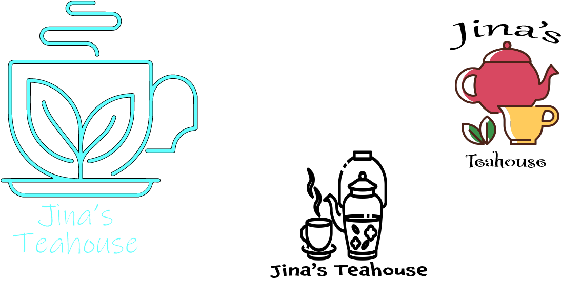
the first one seems cool, but the black border on the aqua color made it strange, it feels like a radioactive cafe. the others look pretty generic, so you could use them as inspiration at the beginning, but make sure to mix, cut, mold them, etc. also, try studying more about typography, I also struggle with that
1 month ago by Luiza
Posts


I am sorry but this logo look a bit messy... so much info here I don't even know what to look, maybe you can make it more simple, more easy to understand and more coherent, good luck and keep trying
1 month ago by Diarry - Reply