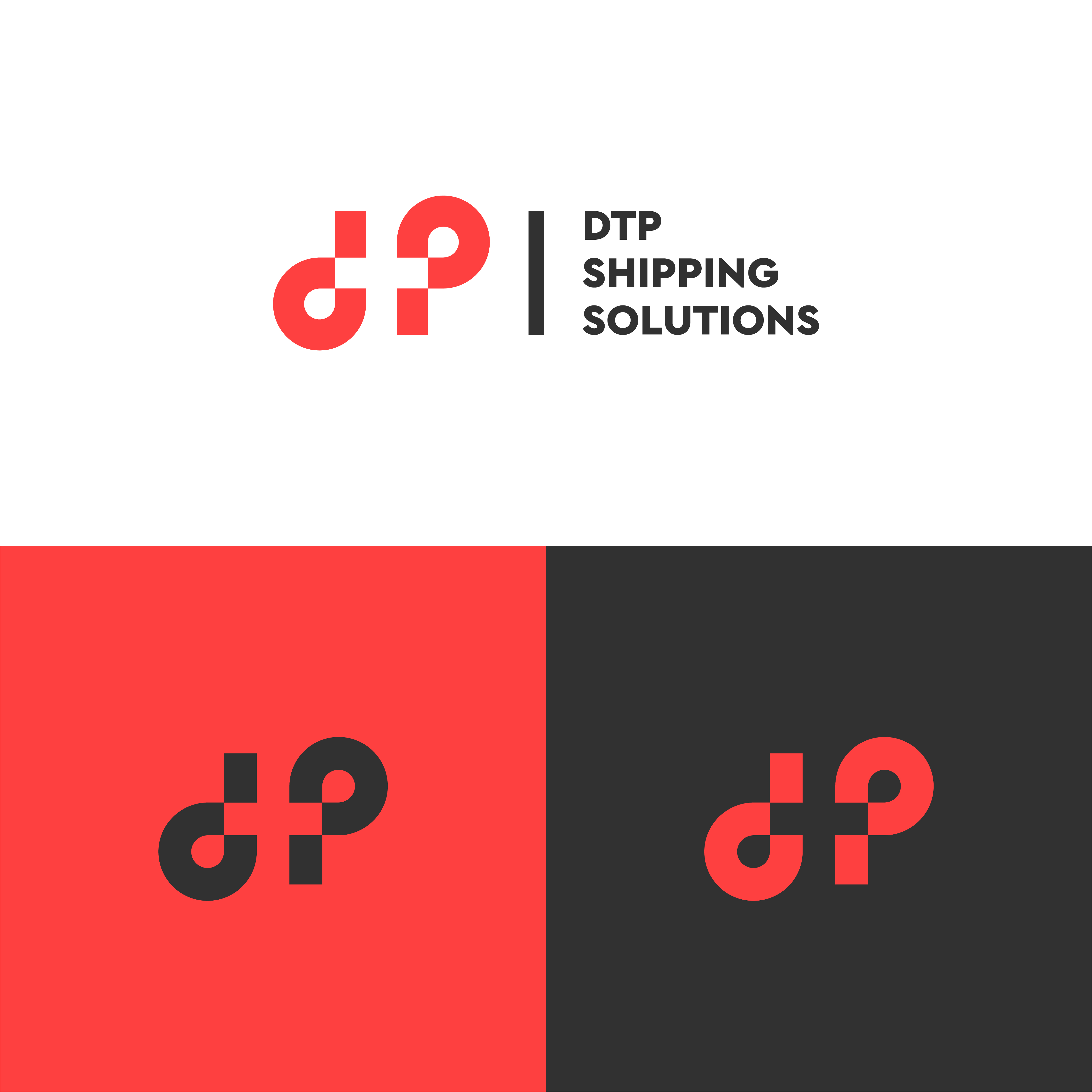
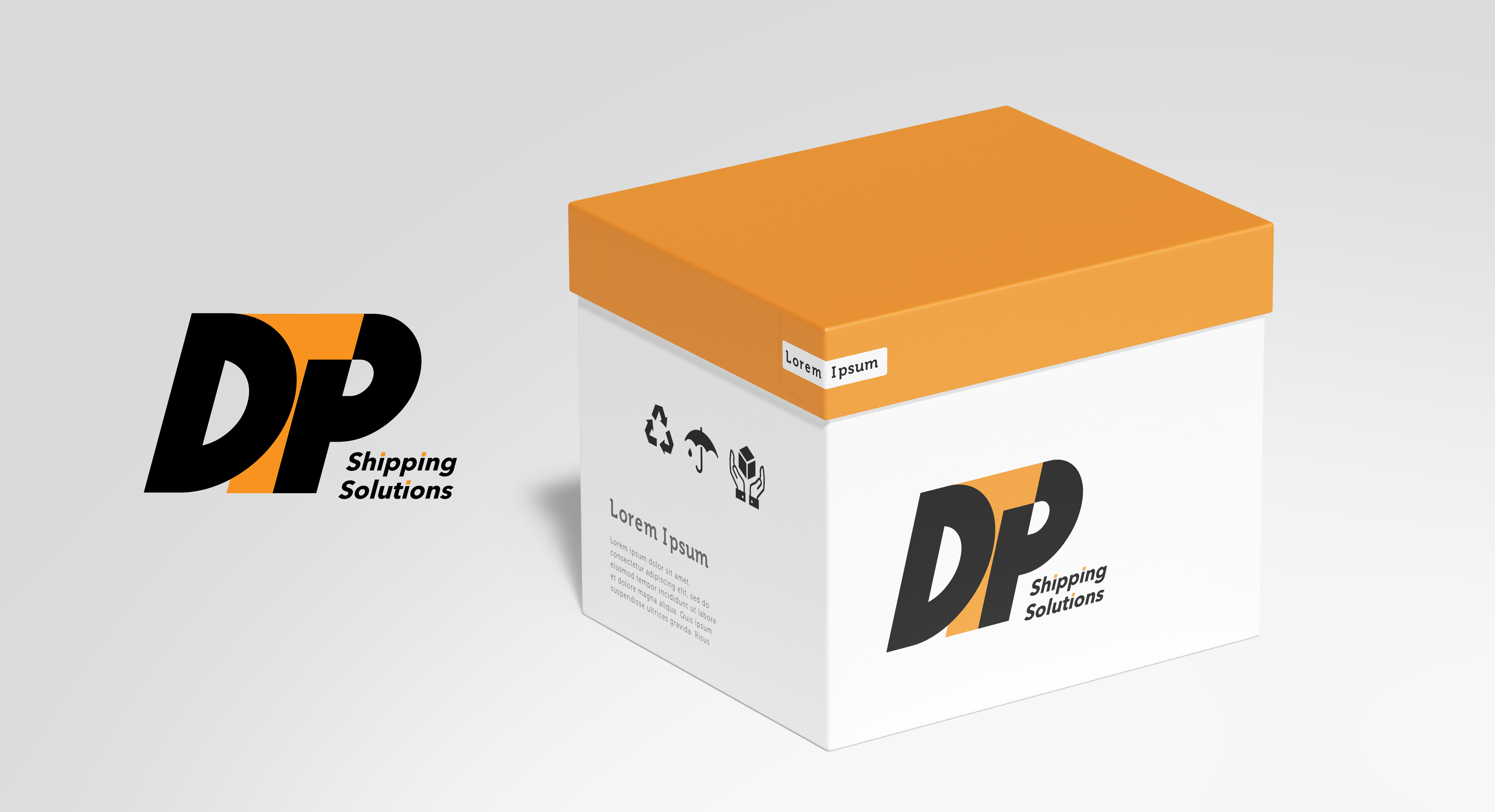
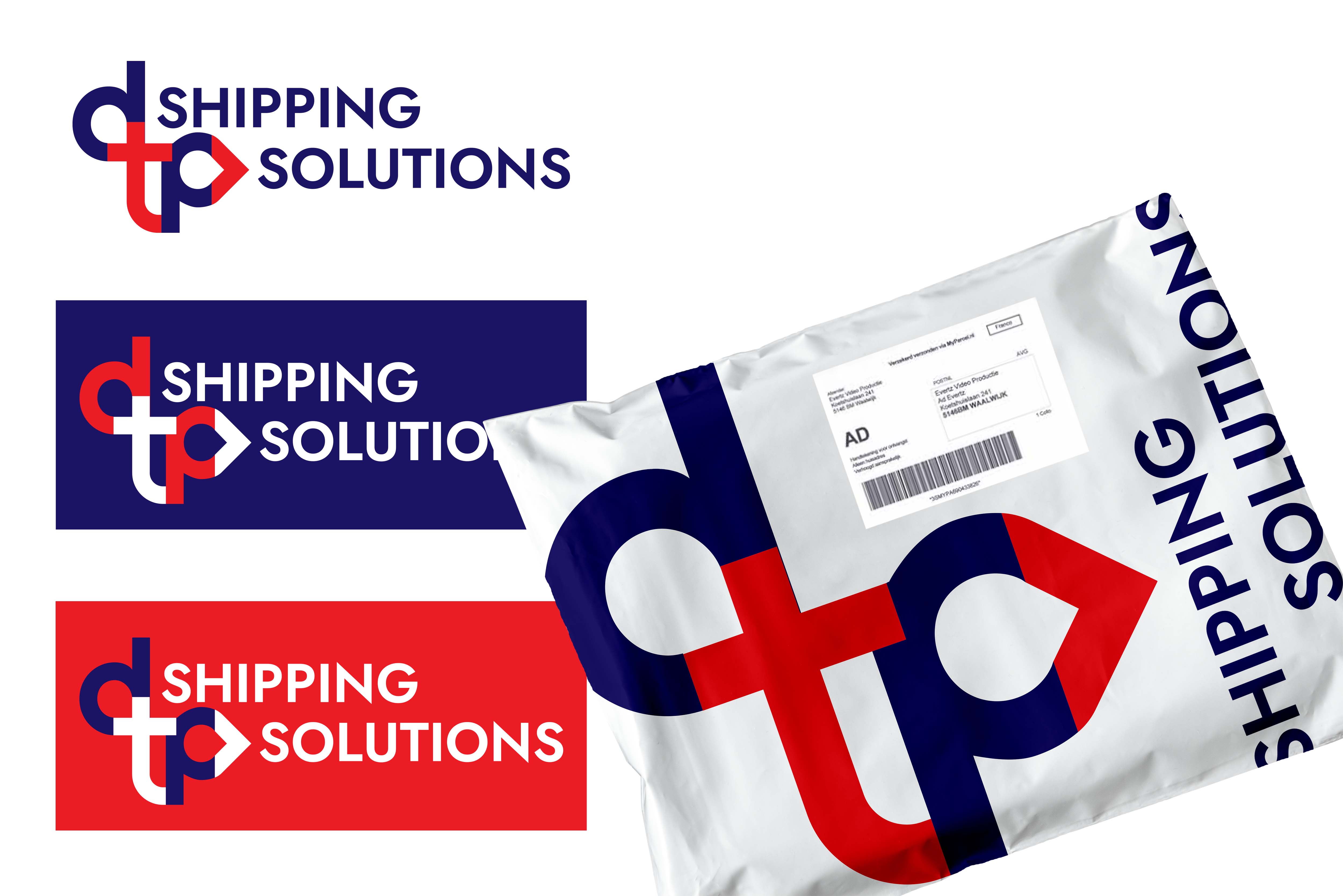
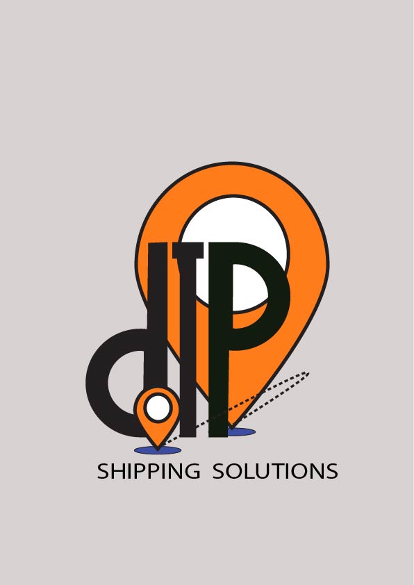
shipping solution logo design
- Report
2 months ago by Sandeep
let me know where should i improve...
 2 Likes
 2
2
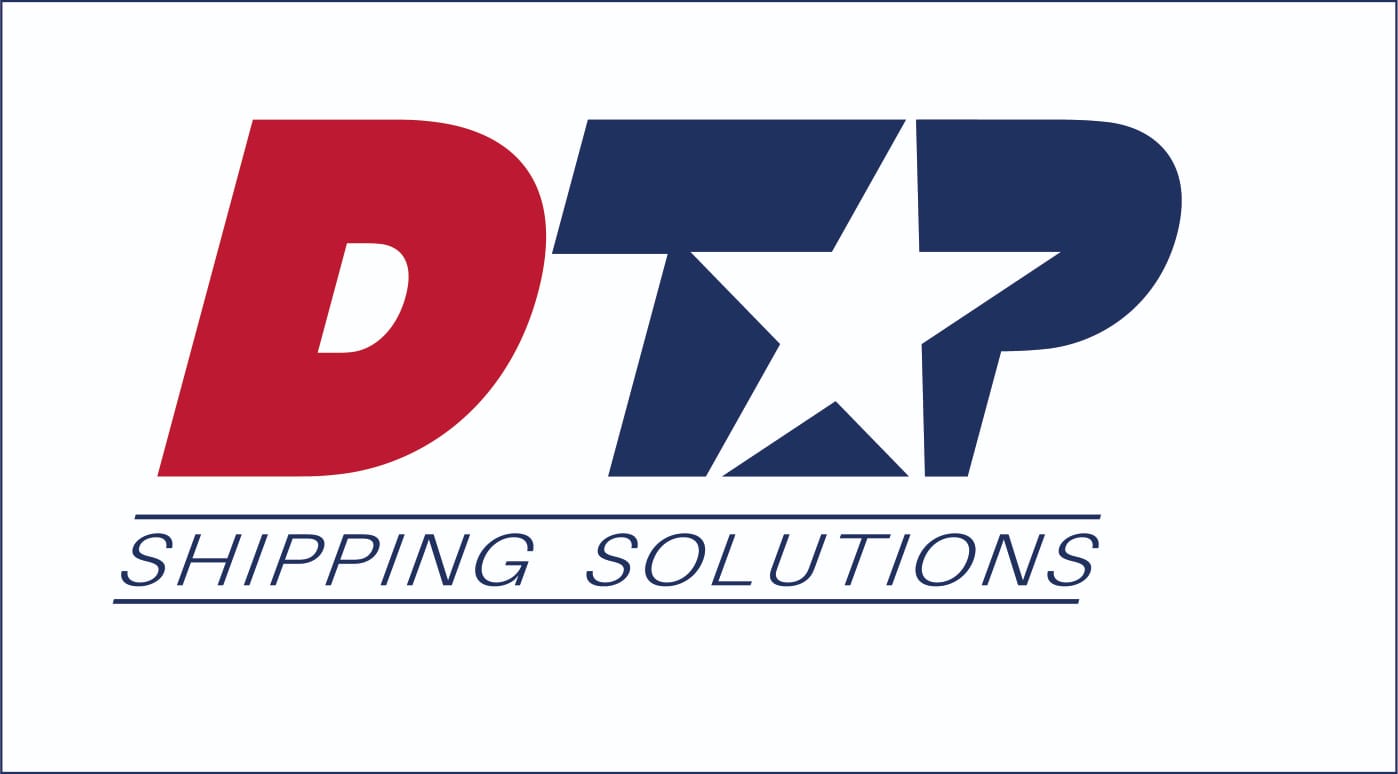
The black outline of the circle and the I are conflicting here. Be conscious of where your lines intersect and cross! Repeating that logo element twice is also a bold choice to make, finding a good visual balance in the logo using those symbols is another thing to look at! Otherwise, great work.
2 months ago by Caden - Reply
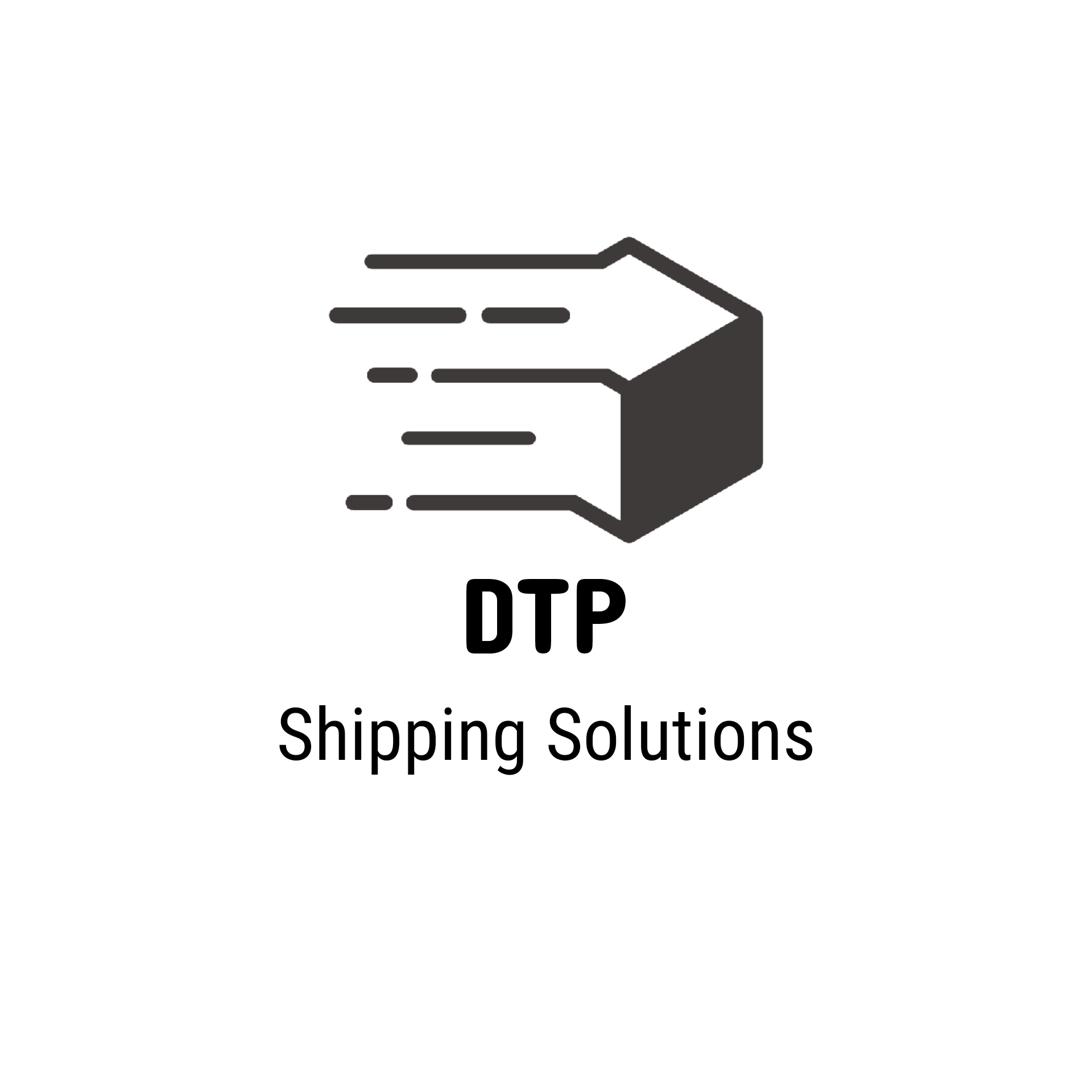
Great job! The logo design is really cool and creative. I think there is too much white space, the logo could be bigger perhaps. Maybe you could try another color scheme? Also the text Shipping solutions is not in the center but close to being center so it disturbs the a bit eye.
2 months ago by Mall Haas - Reply