Omar Alrawi
Posts
3
Likes
44
Liked Posts
7
Given Feedback
2
Feedback
I'm sure you can do better

2 years ago by Omar Alrawi
The best one I guess
2 years ago by Omar Alrawi
Posts
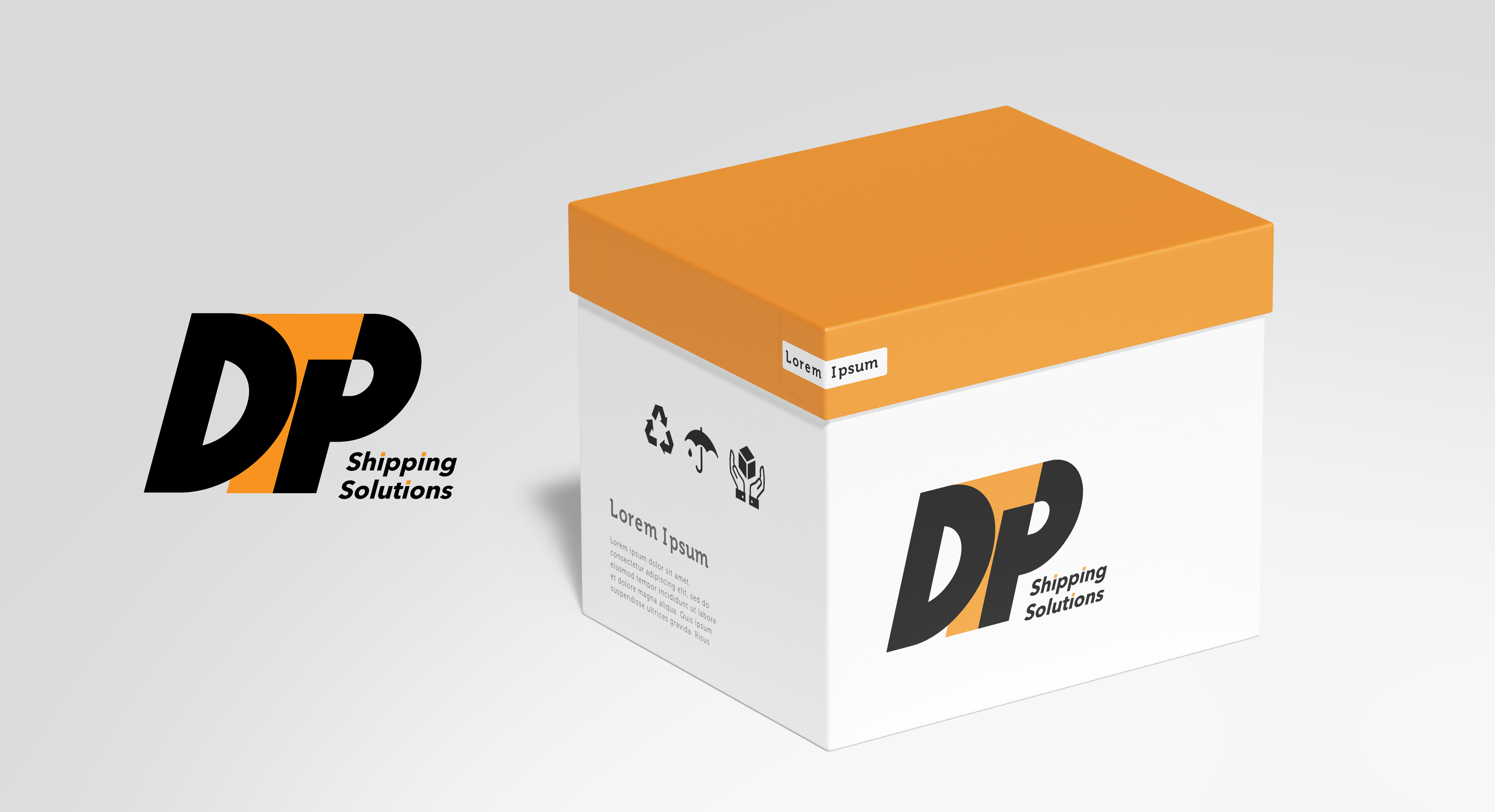
DTP Shipping Solutions
- Report
Omar Alrawi • 2 years ago
The logo is designed in a bold form giving the sense of a solid, reliable company. also, the logo is sheared forward to represent the speed of delivery.
This is my second Logo Design attempt, so what do you think?
This is my second Logo Design attempt, so what do you think?


Love the logo and colors and packaging!
1 year ago by Hanan - Reply
If this truly is just your second attempt at logo design, stick with it because YOU’RE DOING IT RIGHT! This is a great logo and you’re certainly on the right track. As a suggestion, consider a common baseline for both your logo and your logotype. That’s not to say that every logo and corresponding logotype should have a common baseline… just in this case (I think) it would streamline the design. Your “D”, “T”, and “P” ought to be on the same baseline (your “D” is a touch above your “TP”). As well, (in this case) your logotype ought to be on that same baseline. Maybe even consider putting “Shipping Solutions” on the same line in a larger font size with a light weight to contrast with the logo itself. Lastly, I love how you’ve dotted your i’s with orange, nice touch! Looking forward to seeing more of your work!
2 years ago by A.T. Norman - Reply
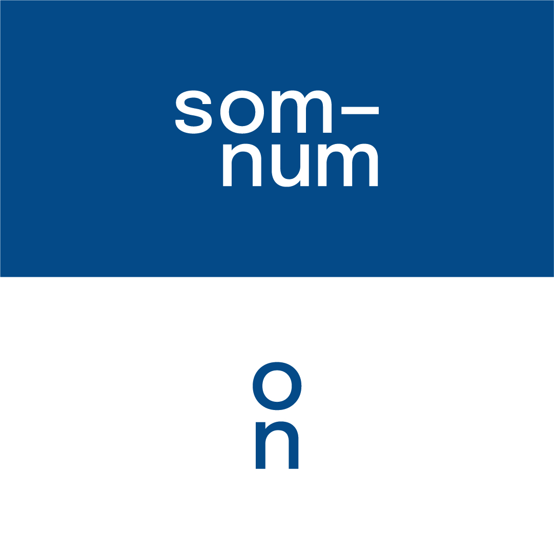
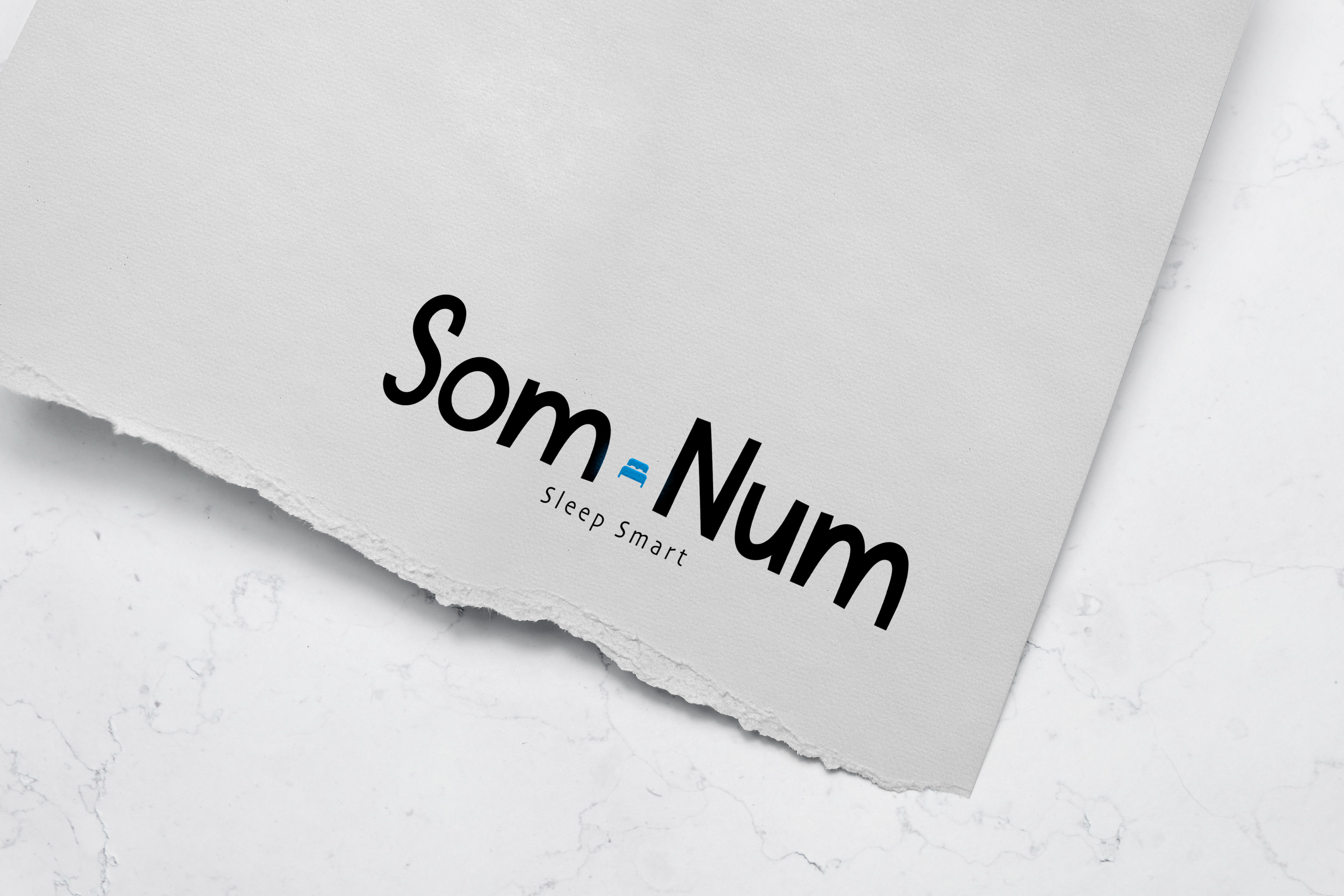
Som-Num Logo
- Report
Omar Alrawi • 2 years ago
I tried to keep it as simple as possible, as the client ordered. What I did was replace the dash ( - ) with a bed and wrap the words Som and Num toward each other to give it a bit of fun. I colored the bed in this light blue color, which is a calming color, I guess. This is my first logo design so I would be glad if you give me feedback.
Som-Numlogo

Nicely done!
2 years ago by A.T. Norman - Reply
Jennifer's Heaven Business Card
- Report
Omar Alrawi • 2 years ago
I tried to stick with as minimal colours as possible since the client ordered not overly colourful designs with a more professional touch. The card has rounded borders, also as the client ordered with a more heavenly touch.
Jennifer's Heavengraphic
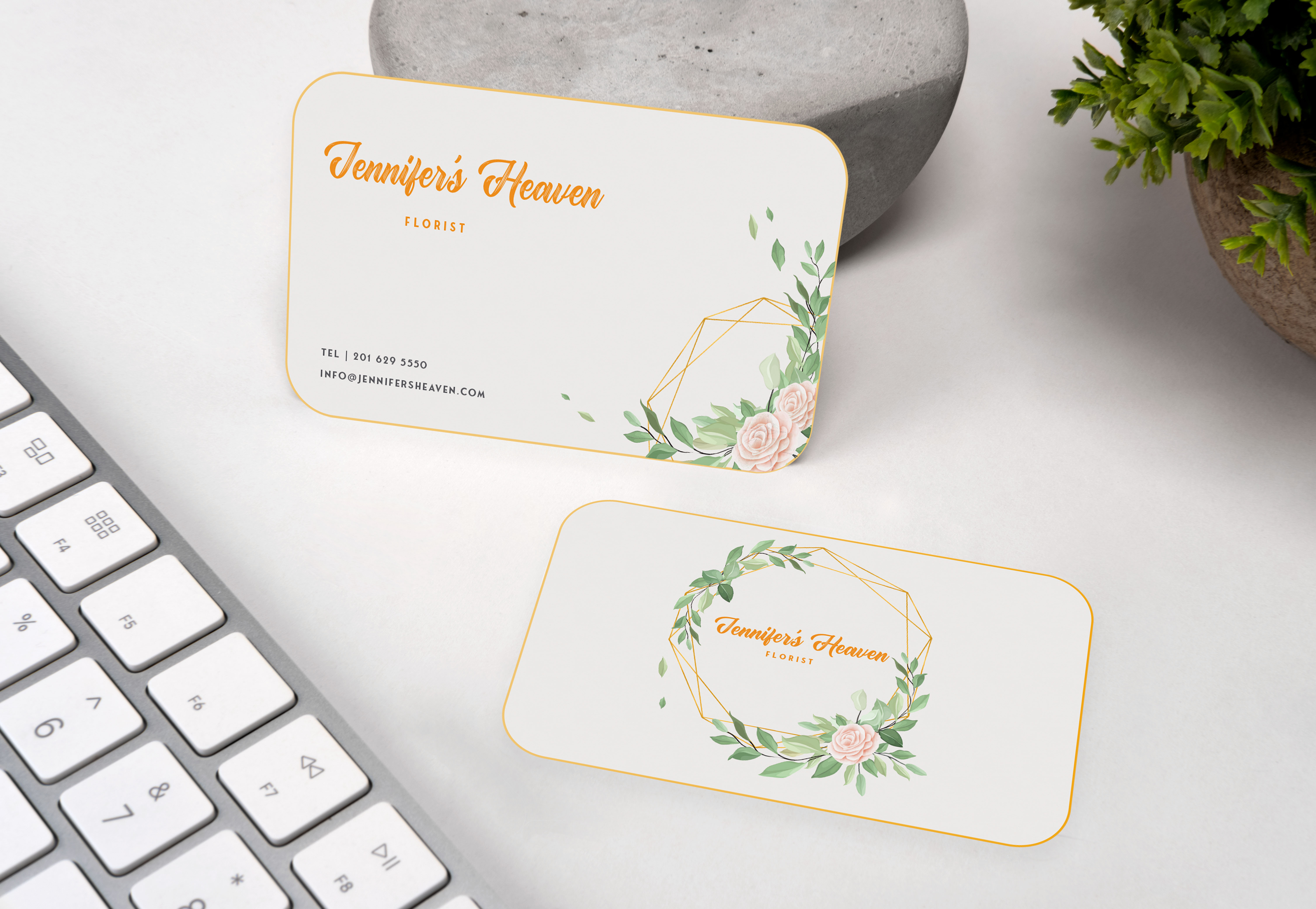

Love the colors you use for the business cards as well as the whitespace. Very elegant.
2 years ago by Meagan Austin - Reply