Mall Haas
Posts
6
Likes
7
Liked Posts
6
Given Feedback
9
Feedback
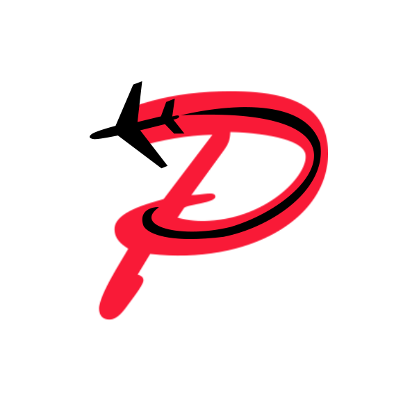
really cool logo, maybe change colors, to blue/green, more relaxing or chill colors (if its travel company then red is kind of alarming color - for fighter jets sure :D)
2 months ago by Mall Haas
maybe you could try the font to be in sans serif category?

2 months ago by Mall Haas
the font could be a bit darker color to make it a bit pop out more
2 months ago by Mall Haas
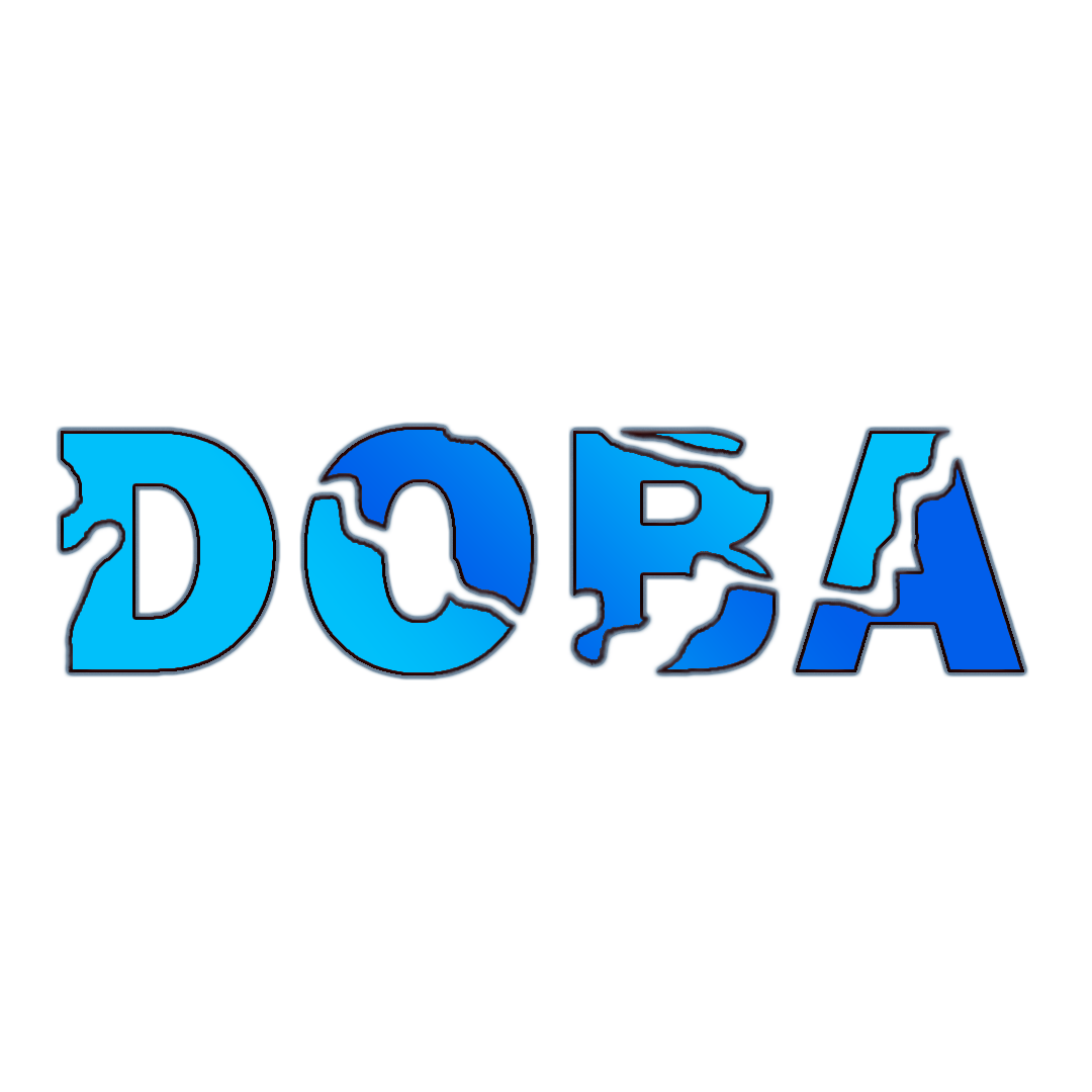
Really awesome, maybe the B could have more outlines. it takes a millisec longer to figure out what the letter B is
2 months ago by Mall Haas
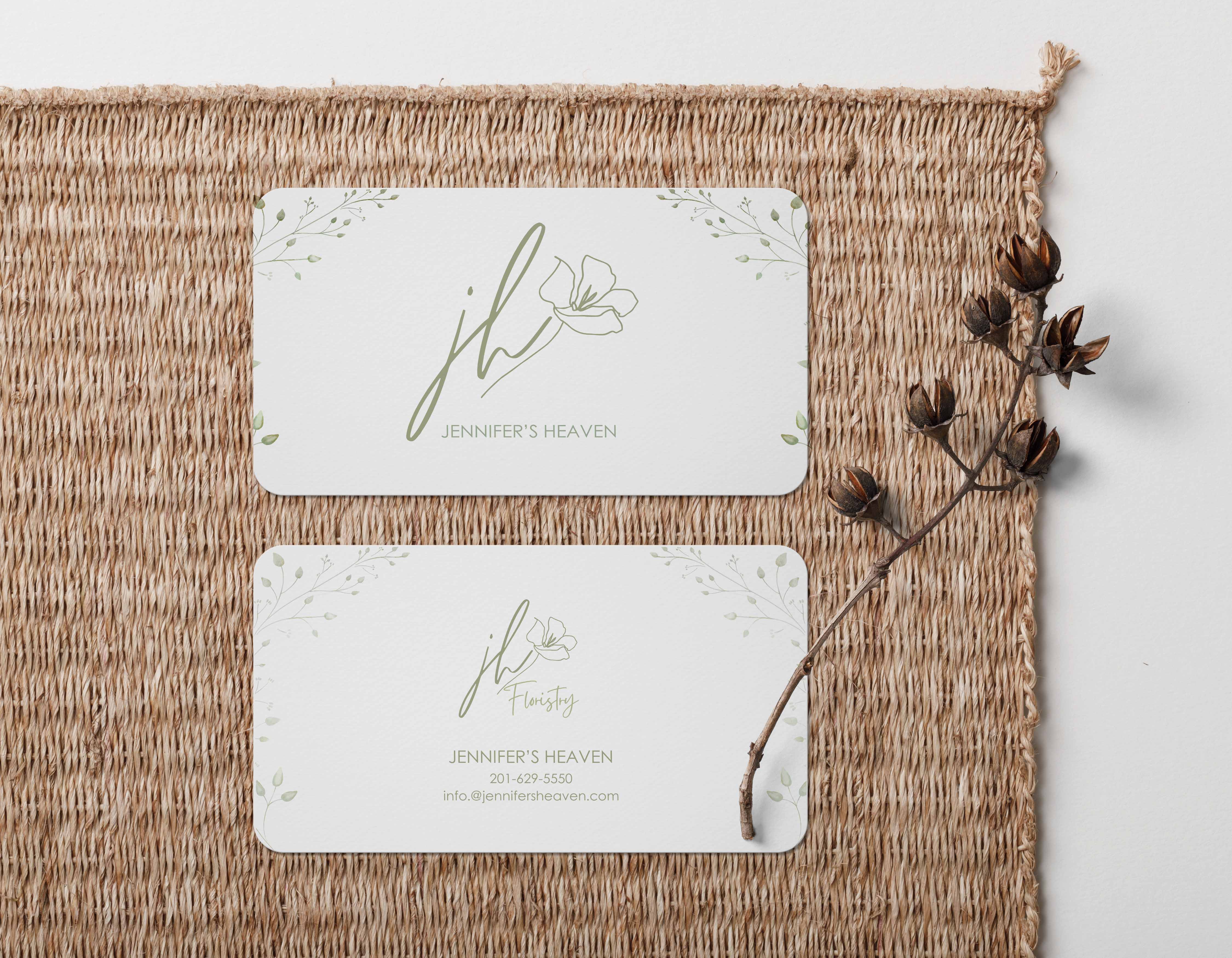
awesome design. nice fronts. the name can be a bit hard to read but it still fits well with the theme

2 months ago by Mall Haas
it might be basic but i can smell the coffee from this design :) goodjob

2 months ago by Mall Haas
great work, i would maybe try to either make the company name more pop or be more subtle if should be pictorial mark. The logo should be more catching than the name as i understand what pictorial mark should be like (not 100% sure :D ) right now the eye catcher is the text

2 months ago by Mall Haas
i like the black one more. But maybe more fur on the ''e'' at the end of care. Also maybe try another color, black is great but i think it would add more character if for example the tip of ''E'' at the end of care would be white

2 months ago by Mall Haas
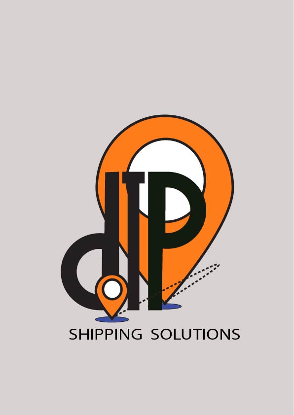
Great job! The logo design is really cool and creative. I think there is too much white space, the logo could be bigger perhaps. Maybe you could try another color scheme? Also the text Shipping solutions is not in the center but close to being center so it disturbs the a bit eye.
2 months ago by Mall Haas
Posts
subscribe part on the website for event or game company
- Report
2 months ago by Mall Haas
Hey!
I am Mallory. I am looking for a UI designer. I need a design of a subscribe form. Would you be interested?
I am Mallory. I am looking for a UI designer. I need a design of a subscribe form. Would you be interested?

 1 Like
 1
1
muy buen diseño, cuidar tipografia y el tamño de la misma, pero en general se ve muy padre, y atractivo para los usuarios.
2 months ago by alberto rafael - Reply
bouquet girl
- Report
2 months ago by Mall Haas
Hi!
I am Abraham. I need a painter as soon as possible, for a project I'm working on. I need an oil painting of a person holding a bouquet. Can you help me out?
I am Abraham. I need a painter as soon as possible, for a project I'm working on. I need an oil painting of a person holding a bouquet. Can you help me out?
 3 Likes
1
3 Likes
1
Hey! I think if her dress wasn't green it would contrast the stems a little more. Maybe a lavender or orange/peach would look great!
2 months ago by Lydia - Reply
FEIK insurance company
- Report
2 months ago by Mall Haas
Hello!
I'm Julius, I recently started a new business called Feik. I'm looking for someone that can design something for my insurance company. We will need a poster to advertise our business. We primarily use the color red (#ff7171). Can you help me out?
I'm Julius, I recently started a new business called Feik. I'm looking for someone that can design something for my insurance company. We will need a poster to advertise our business. We primarily use the color red (#ff7171). Can you help me out?
 1 Like
1
1 Like
1
Concept is good, but typography needs to be improved. :)
2 months ago by Jermae Rayco - Reply
ZAV music production, DAS NOTE concert
- Report
2 months ago by Mall Haas
Hi,
I'm Nickie, I recently started a new business called Zav. For a while now, I've been looking for a good designer for my music production business. I would like a simple flyer for an event. We primarily use the color blue. Can you do that?
I'm Nickie, I recently started a new business called Zav. For a while now, I've been looking for a good designer for my music production business. I would like a simple flyer for an event. We primarily use the color blue. Can you do that?
 Like
1
Like
1
so excelent! this is so perfect. thank you for your talent.
2 months ago by sam - Reply
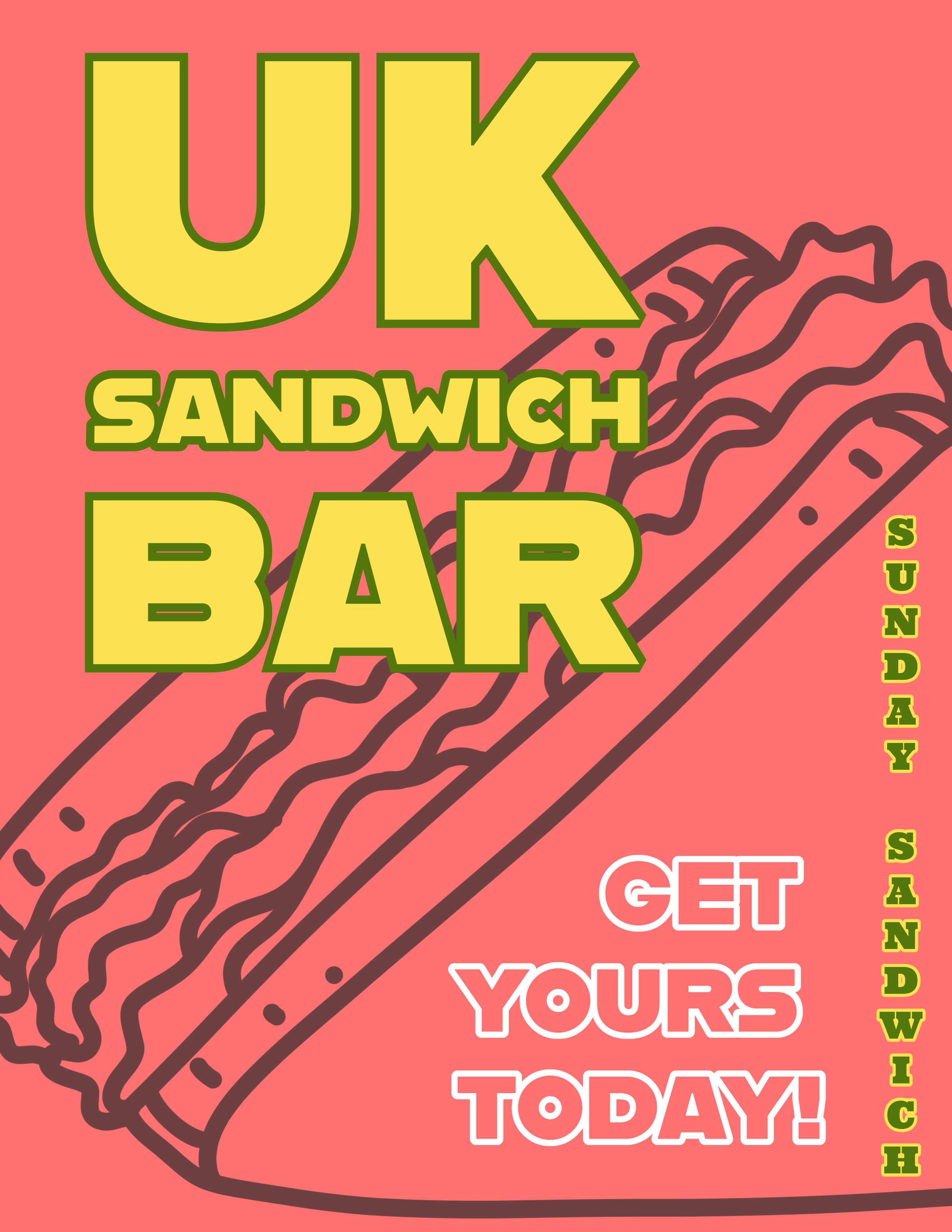
UK sandwich bar
- Report
2 months ago by Mall Haas
Hello,
I am Omar, creator of UK Sandwich bar. For a while now, I've been looking for a good designer for my Sandwich bar. I would like a simple flyer for an event. We primarily use the color red (#ff7171). Can you help me out?
I am Omar, creator of UK Sandwich bar. For a while now, I've been looking for a good designer for my Sandwich bar. I would like a simple flyer for an event. We primarily use the color red (#ff7171). Can you help me out?
 2 Likes
3
2 Likes
3
Hello, I am Gvantsa, I help you and I want share my flyer.
https://files.fm/u/yqptbkr6k9
2 months ago by gvantsa - Reply
Fun color pallet and the main two texts are a good font. The font on the right I feel like could use some improvement to better compliment the other one. Also maybe try adding some texture ( halftones?)
2 months ago by Mariia - Reply