Ice cream shop's logo
- Report
1 year ago by Erika
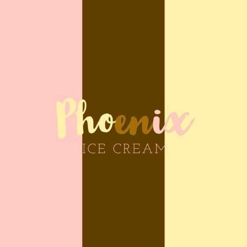
The owner wanted a Wordmark logo for his ice cream shop's
The colors are inspired by the neapolitan ice cream. Doubtful if I should have just leave the background white.
The colors are inspired by the neapolitan ice cream. Doubtful if I should have just leave the background white.
Hello!
I'm Alec, founder of Phoenix Ice creams. We're looking for someone that can make a good logo for our Ice creams. I think a wordmark would look cool. We would love to work with you!
I'm Alec, founder of Phoenix Ice creams. We're looking for someone that can make a good logo for our Ice creams. I think a wordmark would look cool. We would love to work with you!
 1 Like
 3
3
The pink on cream and cream on pink looks a bit clashy, not very distinctive, it kind of blends in with the other. Fun idea too, but the sans serif font you used doesn’t pair well with the serif font IN MY OPINION. Overall, very cute
1 year ago by Aubrey - Reply
Like the colours
1 year ago by Callum Jay Hector Doyley - Reply
don't know how to feel about the sans typeface, but the font of the big name nicely conveys the playfulness of ice cream and the mix-matching of the background and big name is nice.
1 year ago by Sebastian - Reply


