Aubrey
Posts
0
Likes
0
Liked Posts
0
Given Feedback
6
Feedback
Minimalism is good, but this is too easy, it looks like a ( and a L. Doesn't give you any idea of what the business is about. Even if the prompt doesn't say, improv it.
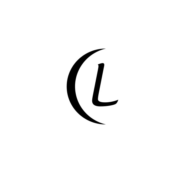
1 year ago by Aubrey
I think this combination mark is too crowded, I can see the idea but the execution needs work. This looks like easy clip art. You should either take out the microphone, or the sound waves around the N. And if you take out the Microphone, then you could take out the notes for the M too because it would looked lined up and for this design I don’t think it’d look nice like that. Lack of color too.
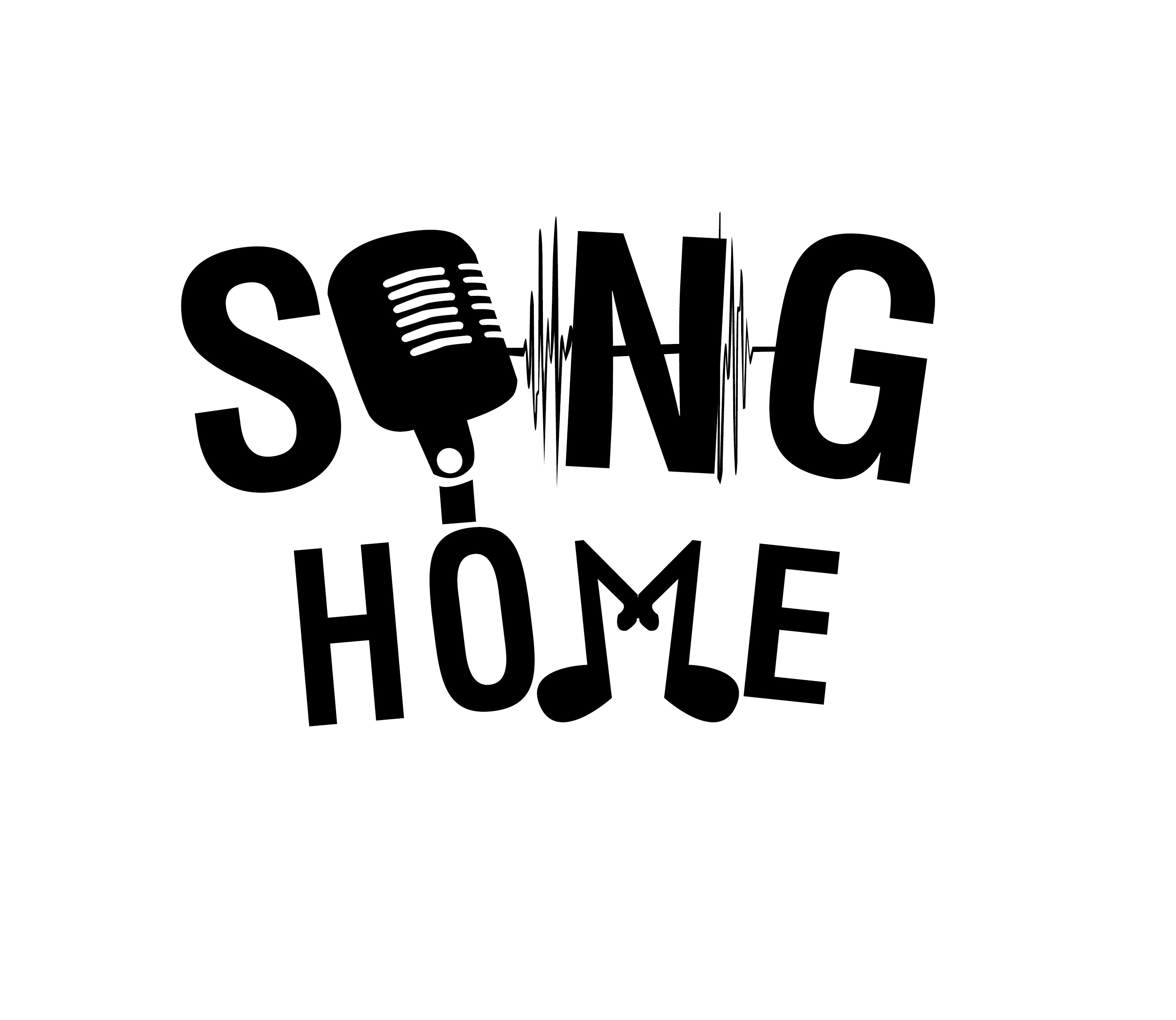
1 year ago by Aubrey
I very much enjoy the simple look, by simple I don’t mean that it looks like clip art. It looks easy to print, which is smart, but not like something you’d find off of google copy. An easy going logo and smart sans serif font.
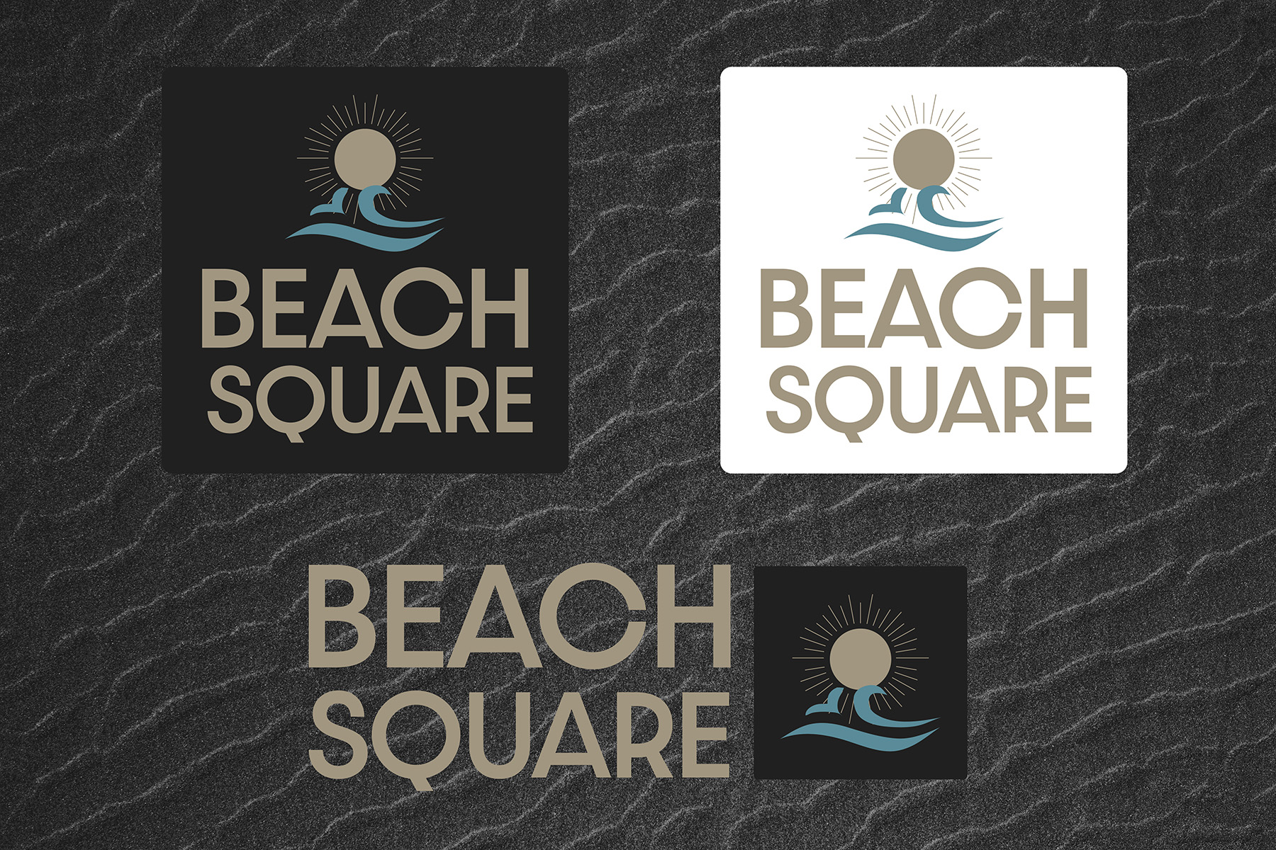
1 year ago by Aubrey
The pink on cream and cream on pink looks a bit clashy, not very distinctive, it kind of blends in with the other. Fun idea too, but the sans serif font you used doesn’t pair well with the serif font IN MY OPINION. Overall, very cute
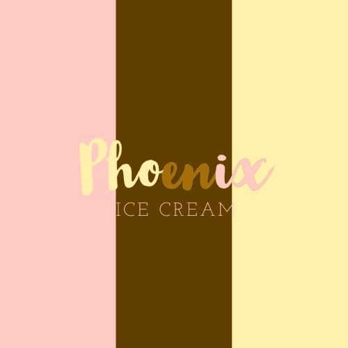
1 year ago by Aubrey
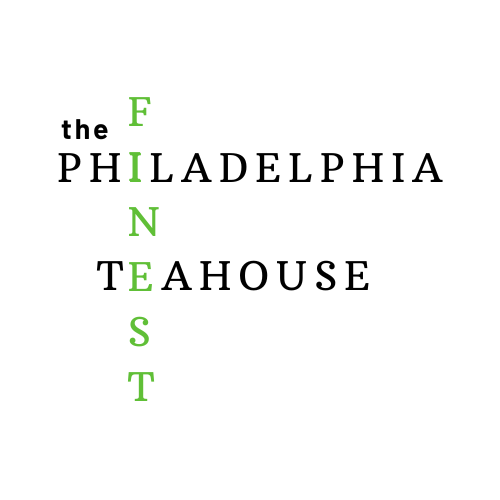
This has a lot of characters and if you’re going to go for a crossword kind of feel, you should do different fonts. The “the” looks very out of place. Maybe an easy piece of art for this one since it’s a TeaHouse? The font is just very clashy together in the crossword style.
1 year ago by Aubrey
I enjoy the overall feel of this design, but the photo looks TOO edited in a way and the font seems slightly tricky to read. Might I suggest a serif font to go with for the extra bits of information? Overall, I do like this!!!

1 year ago by Aubrey