Sebastian
Posts
2
Likes
2
Liked Posts
4
Given Feedback
12
Feedback
the back of the card is good, it nicely displays the wordmark and the info. the from of the card looks like there is more than one point of focus maybe an outline would work well to blend in with the logo
1 year ago by Sebastian
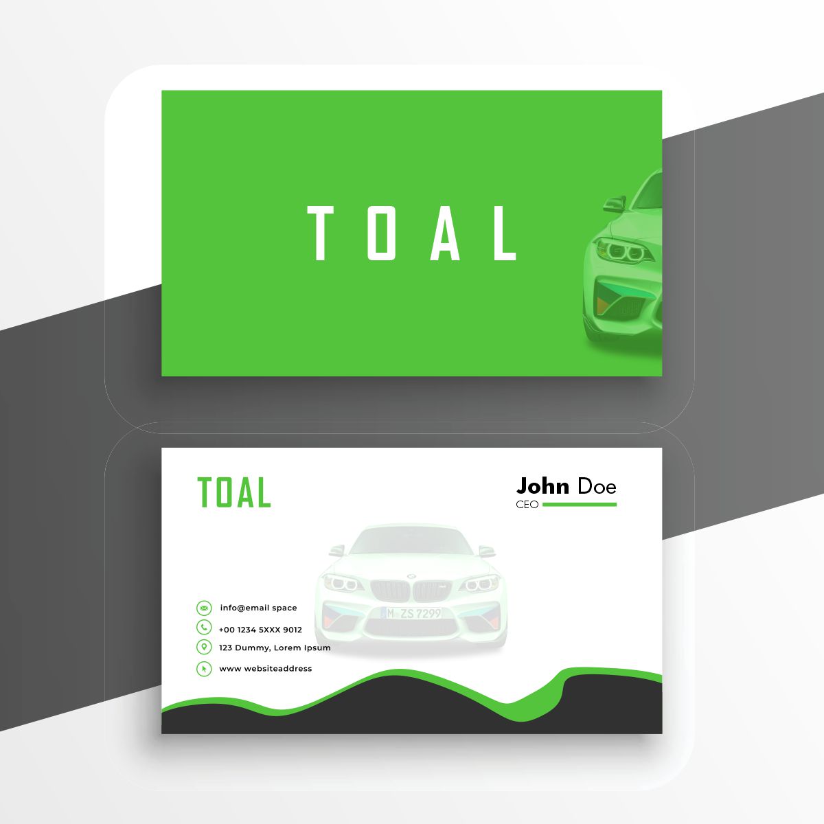
good use of green, it doesn't overpower the whole look. i think a darker shad of green would look better, and making an outline of the vehicle would do well for contrast and looks. good typeface, it goes well for the transport theme
1 year ago by Sebastian
it was a good attempt, but it does not meet the clients needs, the type of logo created here is a combination logo and you were asked to provide a wordmark, things like Virgin Active, Samsung, Balenciaga or Google.
what i would suggest is to find a font that feels/looks tough or active and to use a color linked to the feeling like purple and black, a dark shade of red, or dark green and brown.
try using some of the elements of design, like giving some "space" in the logo, make use of "lines" other than horizontal and etc. although i'm giving this feedback like i know what i am doing, i do struggle make good design too.
you may even give me feedack and feed me my own advice
1 year ago by Sebastian
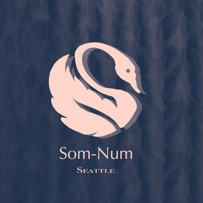
this was executed well, the idea with the feather and swam merged is excellent, I think if the drop shadow were done away with it would look clearer
1 year ago by Sebastian
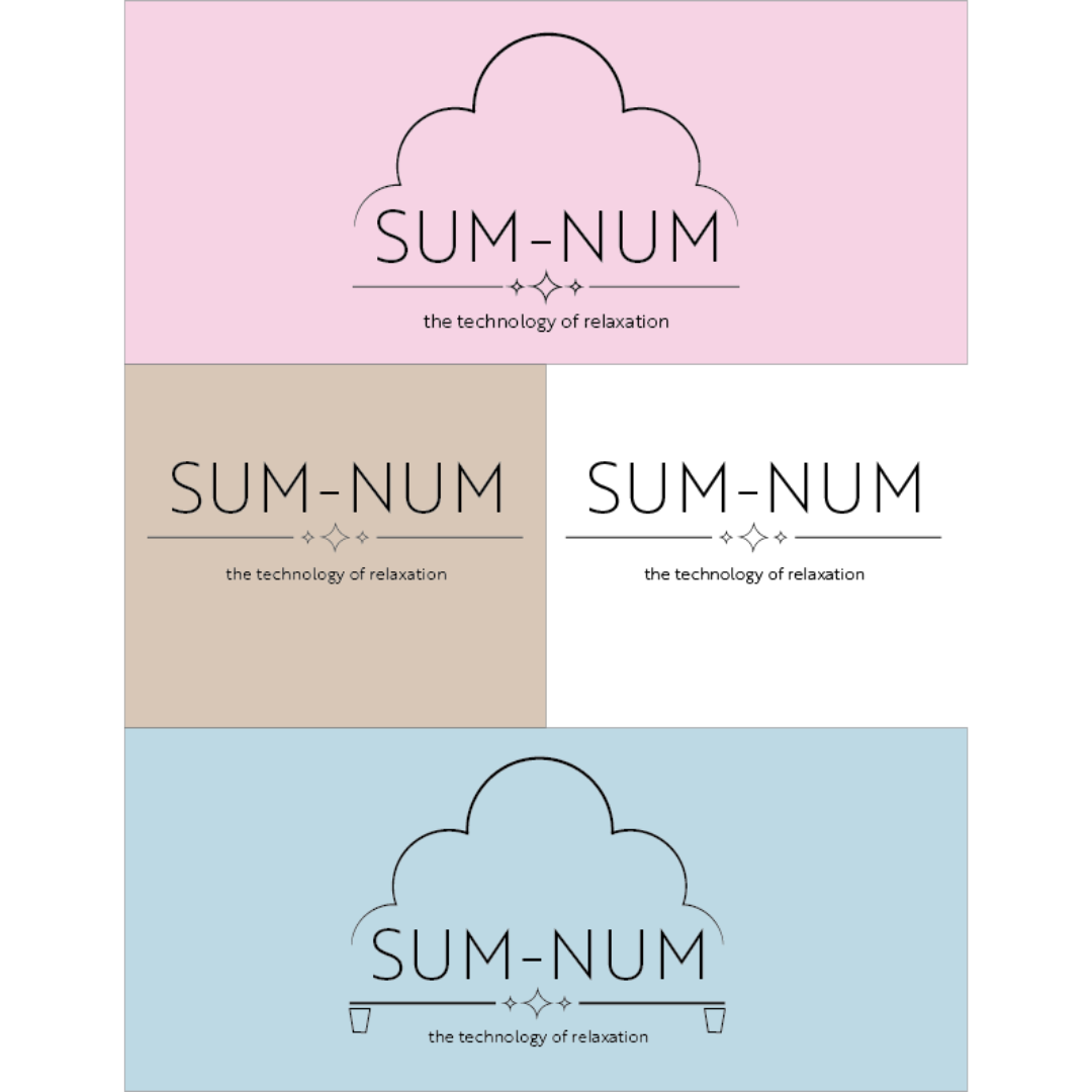
the use of lines to create the cloud figure is a great idea, and it's nice you supplied different versions, personally the white one first then the blue one.
1 year ago by Sebastian
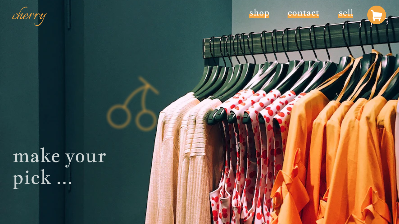
the whole composition of the website is nice, the blurred cherry works well, and the serif typeface goes with the clothing website
1 year ago by Sebastian
so sorry, i forgot to mention that the logo must be a wordmark
1 year ago by Sebastian
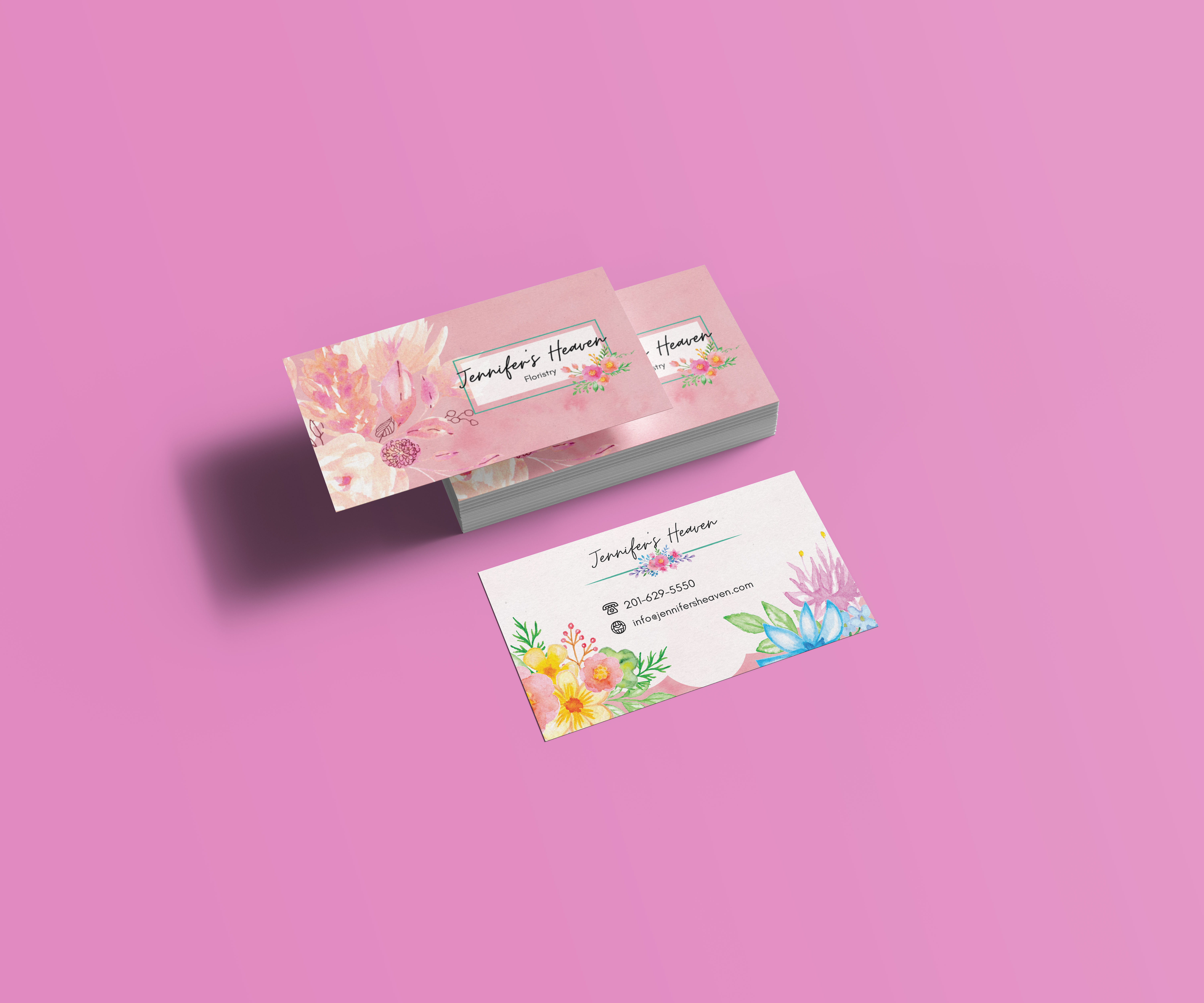
wow, this is good. i feel like that font size and icon/pics should be sized down a bit to make it feel a little more organised and maybe make use of the icon logo on the top corner so that it has a more modern look.
1 year ago by Sebastian
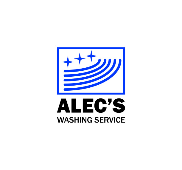
the whole design is awesome, making the owner's name big and bold to show exactly what kind of washing service this is, and using that refreshing blue color for the icon.
as a suggestion, I think that if the lines that show the water streaks were to be something like waves, it would be more easy to identify.
if didn't understand what the lines were but I did get used to them being water streaks. i think also by adding color to the wordmark instead of leaving it in default, would make the brand more consistent.
well I think this is a good logo overall.
1 year ago by Sebastian
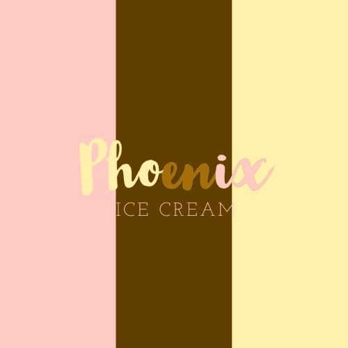
don't know how to feel about the sans typeface, but the font of the big name nicely conveys the playfulness of ice cream and the mix-matching of the background and big name is nice.
1 year ago by Sebastian
great
1 year ago by Sebastian
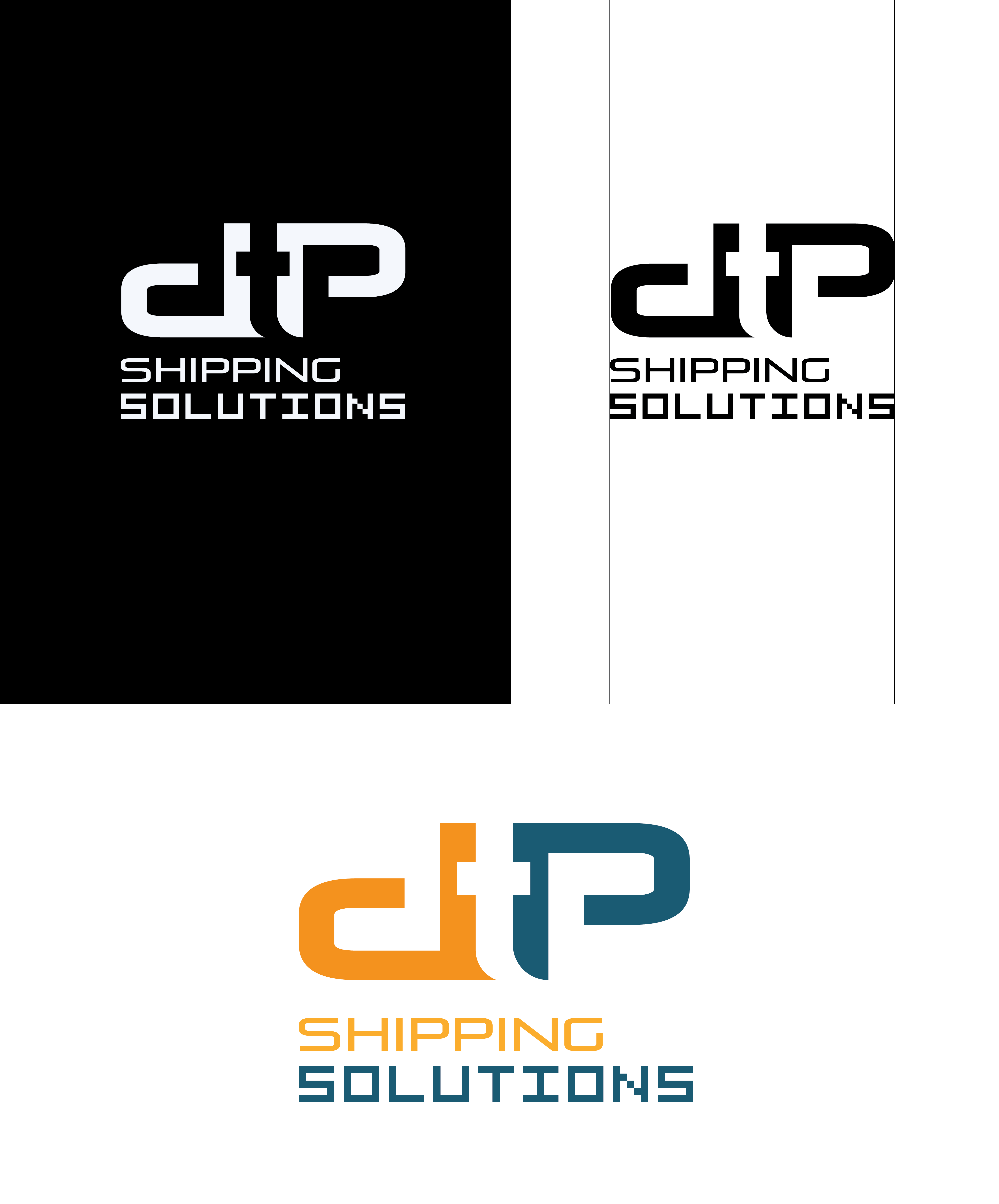
good combination logo, and the lettermarks typeface feels like it carries force behind it.
1 year ago by Sebastian
Posts
creating a wordmark
- Report
1 year ago by Sebastian
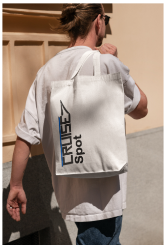
the word "CRUISE" was created personally and the front part that reps. the front of the cruise ship was added to give the logo personality
Hi,
I am Lucius, founder of CruiseSpot. For a while now, I've been looking for a good logo for my business. I think a wordmark would look cool. Would you be interested?
I am Lucius, founder of CruiseSpot. For a while now, I've been looking for a good logo for my business. I think a wordmark would look cool. Would you be interested?
 2 Likes
 1
1
It looks really nice!
1 year ago by Alexis Vasquez - Reply
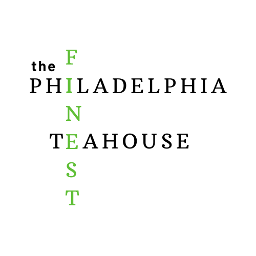
teahouse logo
- Report
1 year ago by Sebastian
an all caps and sans typeface was used because it enforces the excellence and fine aspect of the name. the work, finest, is typed in all caps to enforce the quality of being fine
Like
4
so sorry, i forgot to mention that the logo must be a wordmark
1 year ago by Sebastian - Reply
This has a lot of characters and if you’re going to go for a crossword kind of feel, you should do different fonts. The “the” looks very out of place. Maybe an easy piece of art for this one since it’s a TeaHouse? The font is just very clashy together in the crossword style.
1 year ago by Aubrey - Reply
Nice try, but the logo seems to have a lot of characters. Maybe you should explore using symbols and abbreviations.
1 year ago by Adeyemi Testimony - Reply
need improvement
1 year ago by Ritika Kapoor - Reply