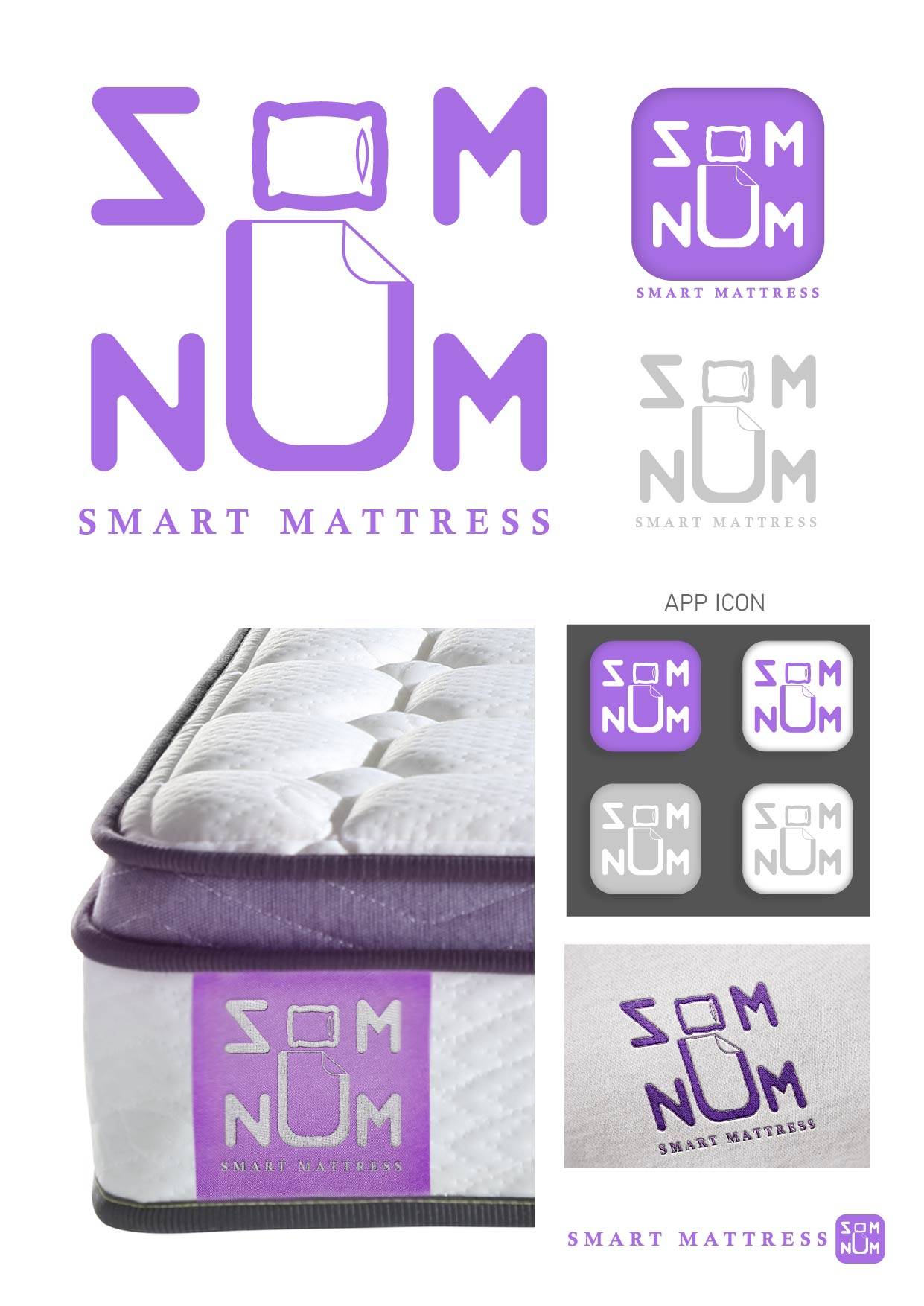
Sign in

Create an account

By signing up, you agree to the Terms and conditions and the Privacy policy

Sign In

Forgot your password? Reset Password

Som-Num

1 year ago by Tee
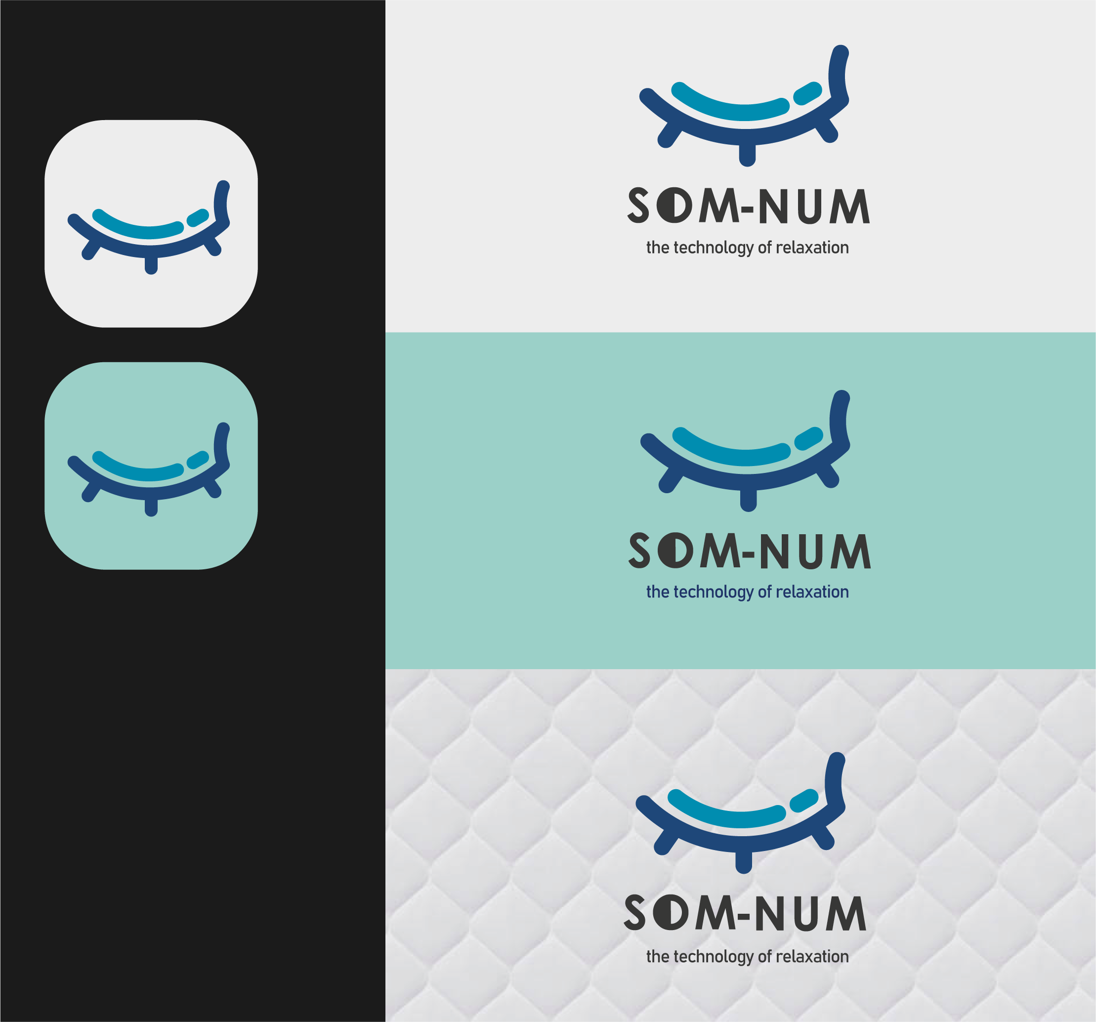
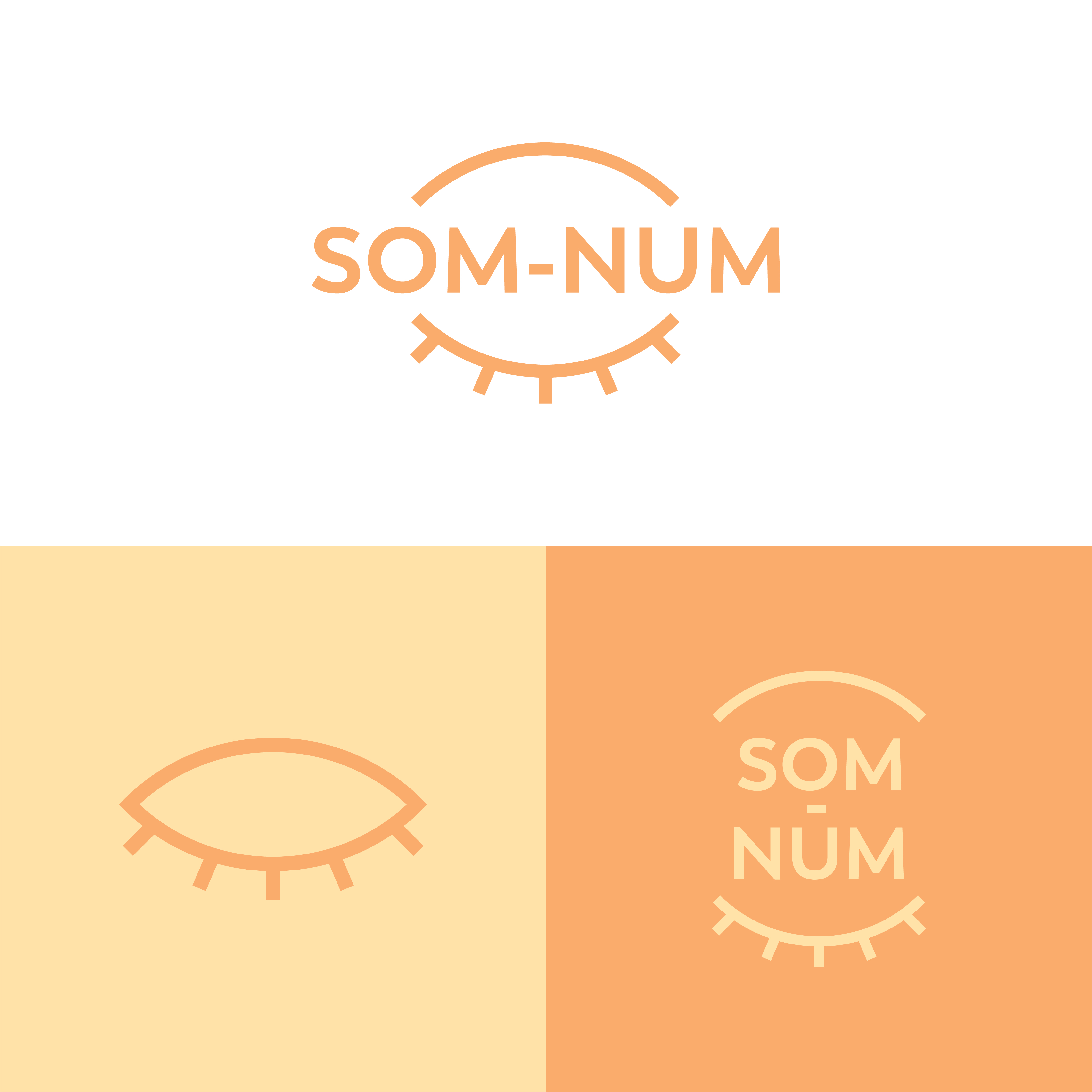
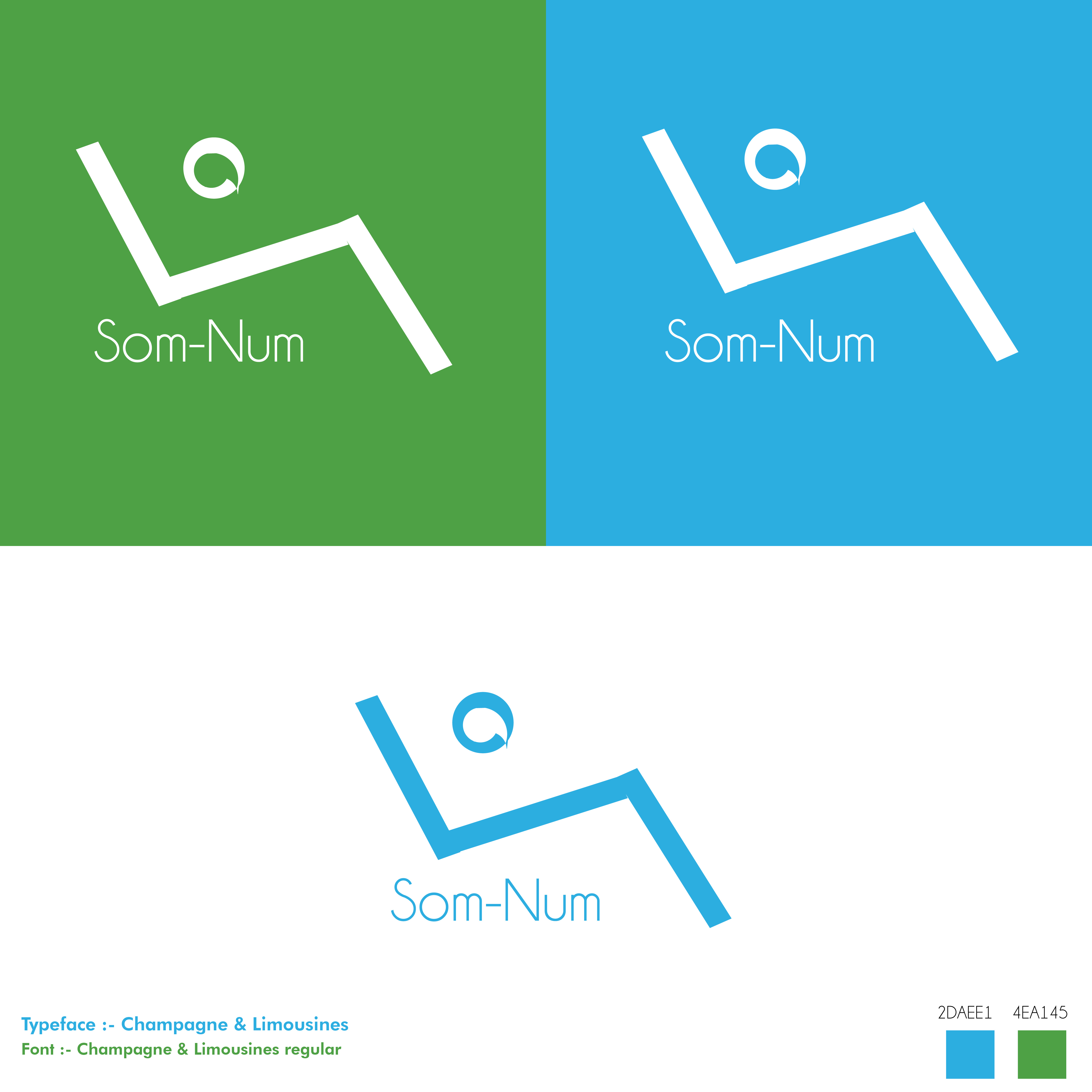
In the quest to ensure simplicity and minimalism, I used the first letter of the two words to construct slants that form a letter "S" and can be seen as letter N when flipped horizontally. The Letter carries an eclipse looking "comma" which helps the coalition of both the S and the eclipse to depict a sleepy eye.
comment1

Sign in or create an account to comment on this post

Sign in Create an account
I appreciate the thought put into the linear design. your work is well presented
1 year ago by Merissa Hucul - Reply

Similar Posts

SOM - NUM: The technology of relaxation

3 years ago by alejandr0000
comment14

SOM NUM Logo Design

4 years ago by Tiffany
comment1

Som-Num Logo

4 years ago by Enzo
comment4

Som-Num

4 years ago by Rob Sollom
comment0

Son-Num Logo

2 years ago by Jennivah delos Santos
comment3

Som-Num Logo

2 years ago by Digital
comment3