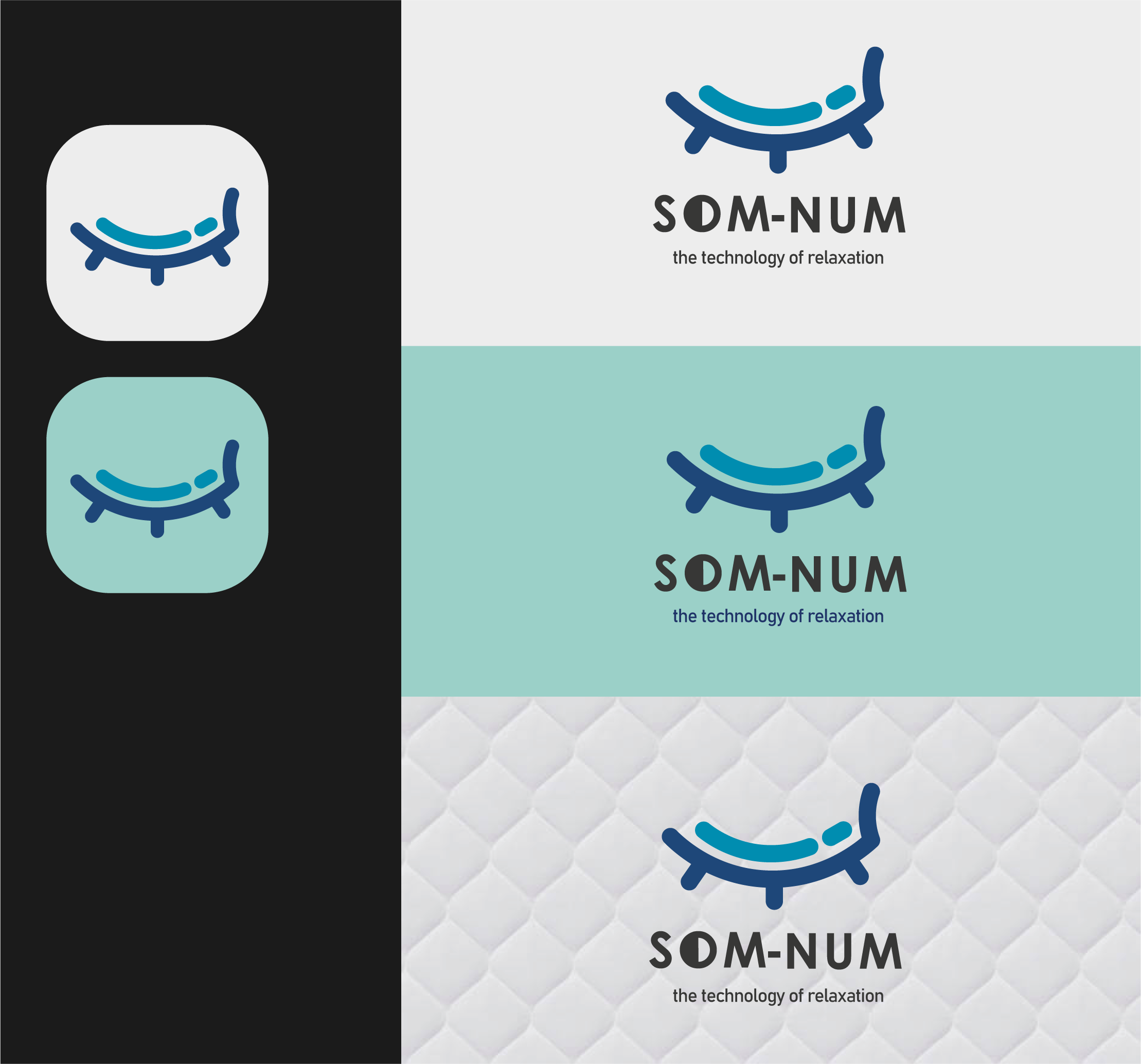
Som-Num Logo.
- Report
1 year ago by Liam Jennings
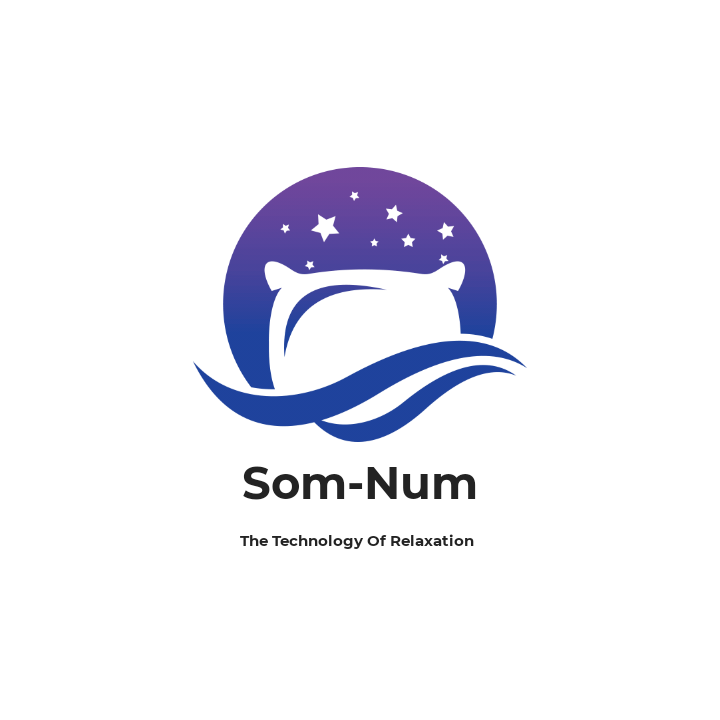
I created this logo as a minimalist take on a person sleeping. The 3 lines above the head represent bluetooth waves for the bluetooth mattress, and the colours signify the calmness of sleep and also the bluetooth capability. The App icon is in the right hand side, just simplifying the logo and changing it to become a less dense version of the main logo. I based the type to be similar to the other competitors mentioned and the type matches the logo loom with flowing lines and no sharp edges.
Som-Numlogo

 3 Likes
 1
1
It's minimalist for sure and the colors are nice, however the bluetooth waves kind of reminds me of hearing aid instead of sleep somehow idk why.
1 year ago by Erica Marie C. Paulo - Reply