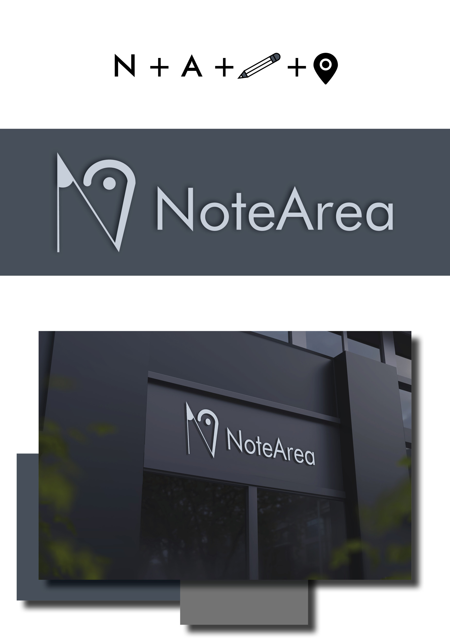
NoteArea Logo Mock Up
- Report
2 years ago by alexa91
Not sure, if this good enough and simple :|
Give me your thought, guys :)
Thanks!
PS: credit to wirestock
Give me your thought, guys :)
Thanks!
PS: credit to wirestock
Hey There,
I'm Susie, I just founded a new business called NoteArea. For a while now, I've been looking for a good logo for my business. I would like the logo to be an abstract mark. Can you do that?
I'm Susie, I just founded a new business called NoteArea. For a while now, I've been looking for a good logo for my business. I would like the logo to be an abstract mark. Can you do that?
 2 Likes
 2
2
I was not sure what was it at first. When i understood, i didn't find the conection between the "map point" and "the pencil edge". Then i read the brief. It says that is needed to be an "abstract mark"..well is too abstract.) The edges are looking in the oposite sides, wich automaticly devide them as individual elements (if your goal was to combine them). Speaking of abstract.. if that was "the will" of client, then maybe the logo must be a pure symbol, without words. I mean nice try but, it could be better. Keep it up. You got this!
2 years ago by Aurel - Reply


