alexa91
i'm a freelance designer, still lack of confident in branding but I'll try my best :D
Posts
3
Likes
6
Liked Posts
11
Given Feedback
5
Feedback
and why I didn't think that... ofcourse! Thank you!!
6 months ago by alexa91
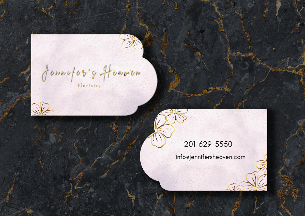
GOOD JOB! Anw, this is just my opinion, but maybe since they're on budget, you can still use something more simple, try to use the food photography that make you hungry and want to eat it A.S.A.P, also if you use this kind of background maybe you can choose the food icon which use handdrawn? Maybee... And you can play with the picture and the background in the circle one, maybe you can make it a bit pop up from the circle, make it a bit bigger. You can change the circle to square or anything. Also make it more dynamic. You try other font type too, make it more... tasty but still not to fancy when people see. You can do it better! I'm still on my way get back to my track :) GO GO!!

6 months ago by alexa91
this is so pretty.... Love it!
6 months ago by alexa91
ah yess... ofcourse... Thank you! :)
2 years ago by alexa91
yeah... i'm really bad at making logos,,, Thank you for the feedback :)
2 years ago by alexa91
Posts
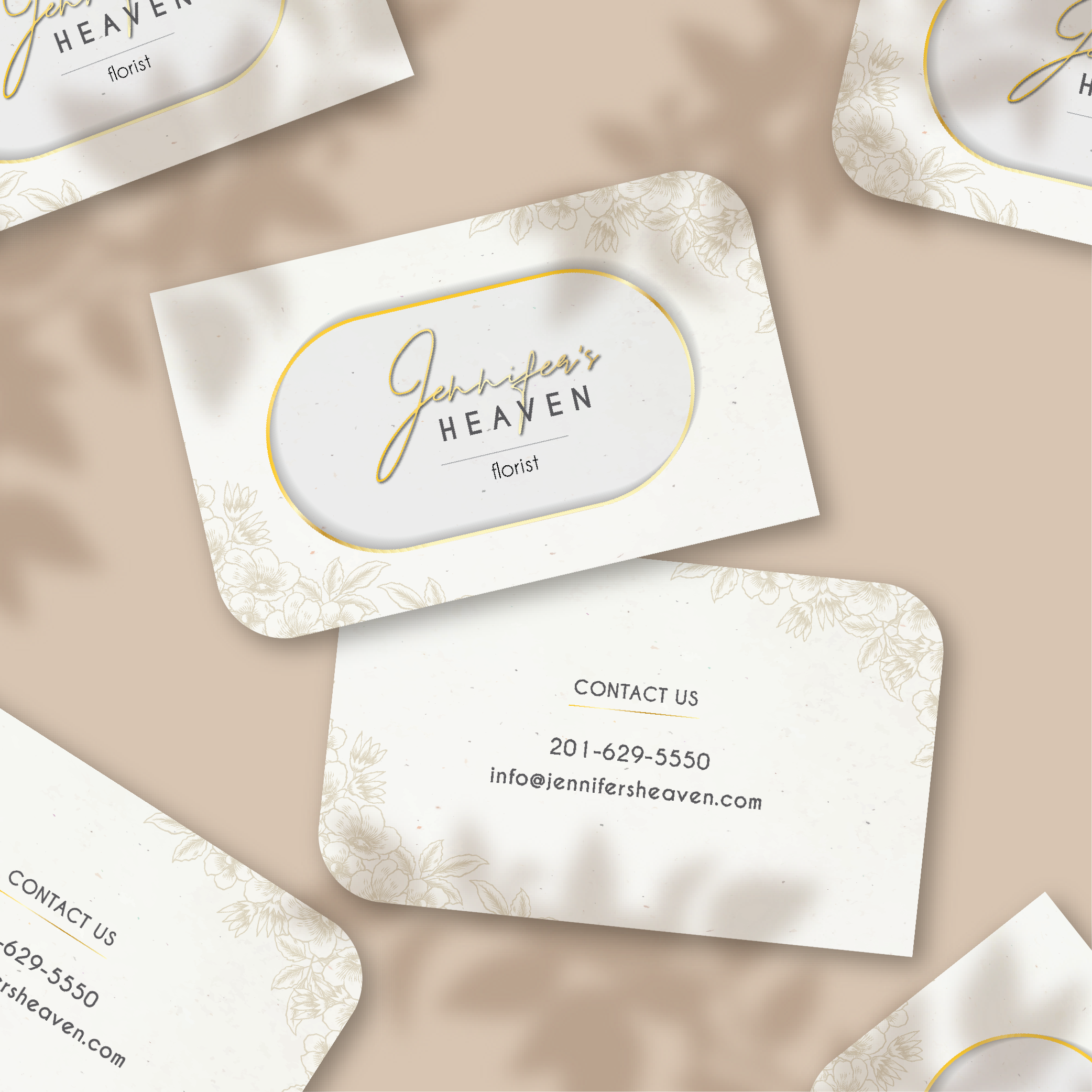
JENNIFER'S HEAVEN FLORIST - BUSINESS CARD
- Report
alexa91 • 6 months ago
Trying to get back on my feet again. Before I became to rusty here. So please give me a feedback :) Thank you!!!
Jennifer's Heavengraphic


It's to simple adding some colours would make it awesome
6 months ago by Rockstar - Reply
and why I didn't think that... ofcourse! Thank you!!
6 months ago by alexa91 - Reply
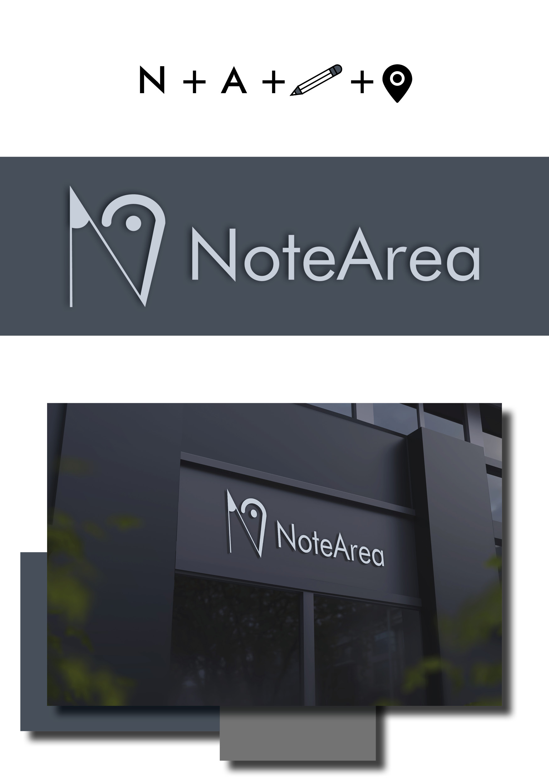
NoteArea Logo Mock Up
- Report
alexa91 • 2 years ago
Not sure, if this good enough and simple :|
Give me your thought, guys :)
Thanks!
PS: credit to wirestock
Give me your thought, guys :)
Thanks!
PS: credit to wirestock
Hey There,
I'm Susie, I just founded a new business called NoteArea. For a while now, I've been looking for a good logo for my business. I would like the logo to be an abstract mark. Can you do that?
I'm Susie, I just founded a new business called NoteArea. For a while now, I've been looking for a good logo for my business. I would like the logo to be an abstract mark. Can you do that?

I was not sure what was it at first. When i understood, i didn't find the conection between the "map point" and "the pencil edge". Then i read the brief. It says that is needed to be an "abstract mark"..well is too abstract.) The edges are looking in the oposite sides, wich automaticly devide them as individual elements (if your goal was to combine them). Speaking of abstract.. if that was "the will" of client, then maybe the logo must be a pure symbol, without words. I mean nice try but, it could be better. Keep it up. You got this!
2 years ago by Aurel - Reply
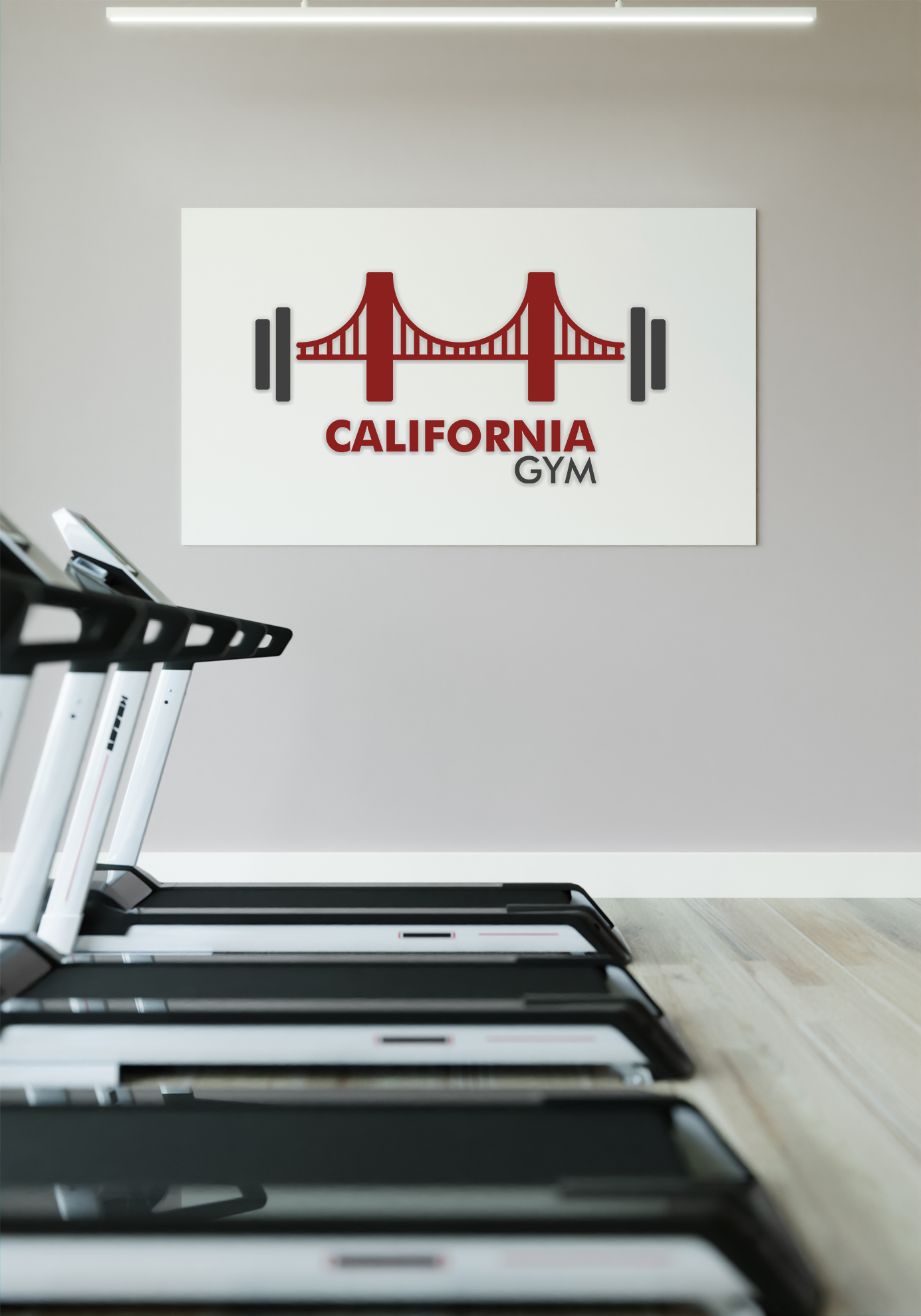
California Gym
- Report
alexa91 • 2 years ago
hi, just a quick logo. still new in this logo field :)
hope i can grow each time to be better :)
PS: source BG jcomp (freepik)
hope i can grow each time to be better :)
PS: source BG jcomp (freepik)
Hey There,
I'm Jack, creator of California Gym. For a while now, we've been looking for a good logo for our Gym. I would like the logo to be an abstract mark. Would you be interested?
I'm Jack, creator of California Gym. For a while now, we've been looking for a good logo for our Gym. I would like the logo to be an abstract mark. Would you be interested?

I understand that the bridge is a simbol, but i still see a "bra" there sustaining the weights.))(just joking) I know is kinda odd.) But the weights are still not combining with that bridge. Maybe if you could do opposite focal point: to make weights red and bigger maybe, and bridge smaller and grey. The same thing with the words. Because is about Gym afterall, not about California.
2 years ago by Aurel - Reply
ah yess... ofcourse... Thank you! :)
2 years ago by alexa91 - Reply