Home
Generators
Generators
Logo Design
Web Design
Graphic Design
Illustration
Painting
UX Design
UI Design
Dynamic Poses
Writing
Pro Generators
Logo Design
Web Design
Graphic Design
UX Design
UI Design
Daily Brief
Briefs
Written Briefs
Logo Design
Web Design
Graphic Design
Illustration
UX Design
UI Design
Writing
Daily Brief
Feedback
Blog
More
More
Exercises
Inspiration
Guides
Sign in
Home
Feedback
Briefs
Blog
Profile
Create an account
Name
Email
Password
By signing up, you agree to the
Terms and conditions
and the
Privacy policy
Sign In
Email
Password
Stay signed in
Forgot your password?
Reset Password
Chocolat
Report
5 years ago by
AIMEE SAMMARCELLI
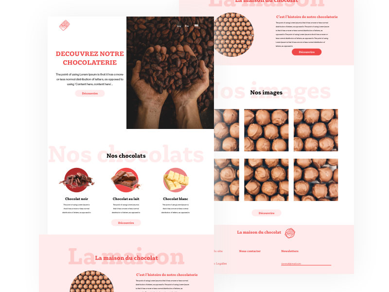
Today I created an interface for a chocolate factory.
I hope you will like it.
4
Likes
3
Sign in or create an account to comment on this post
Sign in
Create an account
Like the idea of the title in transparency in background. But the contrast isn't enough when your in a pink zone. Like the ambiance you give.
4 years ago by
Isa
-
Reply
89/5000 I totally agree. I will rework it taking into account your feedback.
5 years ago by
AIMEE SAMMARCELLI
-
Reply
I like it a lot ! but I think the text is a little bit too close to the image on the top left and maybe the light pink letters in the background should be a different font, or bigger, or in all caps ?
5 years ago by
Anna
-
Reply
View Other Posts
Dallas Steakhouse
5 years ago by
Chollene
40
Likes
5
Toucan Logo Mark
4 years ago by
Alex Strøm
40
Likes
10
MUJO Brief Logo design
4 years ago by
Elena
26
Likes
6
Business Card Design
4 years ago by
kunal das
19
Likes
5
logo yasu.com
2 years ago by
Zethz
14
Likes
2
COJ
4 years ago by
Ella
13
Likes
0
Close