All Feedback Posts
![]()
Jennifer's Heaven

Jennifer's Heaven
- Report
Jikku Thomas • 3 months ago
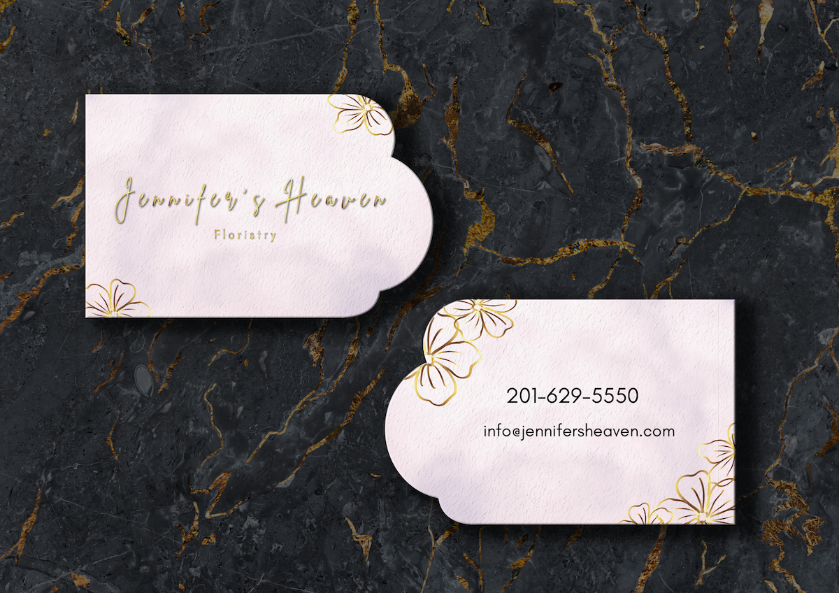
Jennifer's Heavengraphic
Jennifer's Heaven Back View


Nice. I like the colors. It's a lot different from the blues and grays that we're seeing in a lot of the submissions.
3 months ago by Bobbie Hall - Reply
It's beautiful! I love the color scheme, but I would make the background more transparent and possibly use a script or calligraphy font.
3 months ago by Jen - Reply
I think there is to much negative space. Consider moving "Jennifers Heaven" across the top with "florist centered underneath. then the phone number and email across the bottom. This would move the negative space into the middle while still maintaining the rule of 3.
3 months ago by Matthew Thomas Raffe - Reply
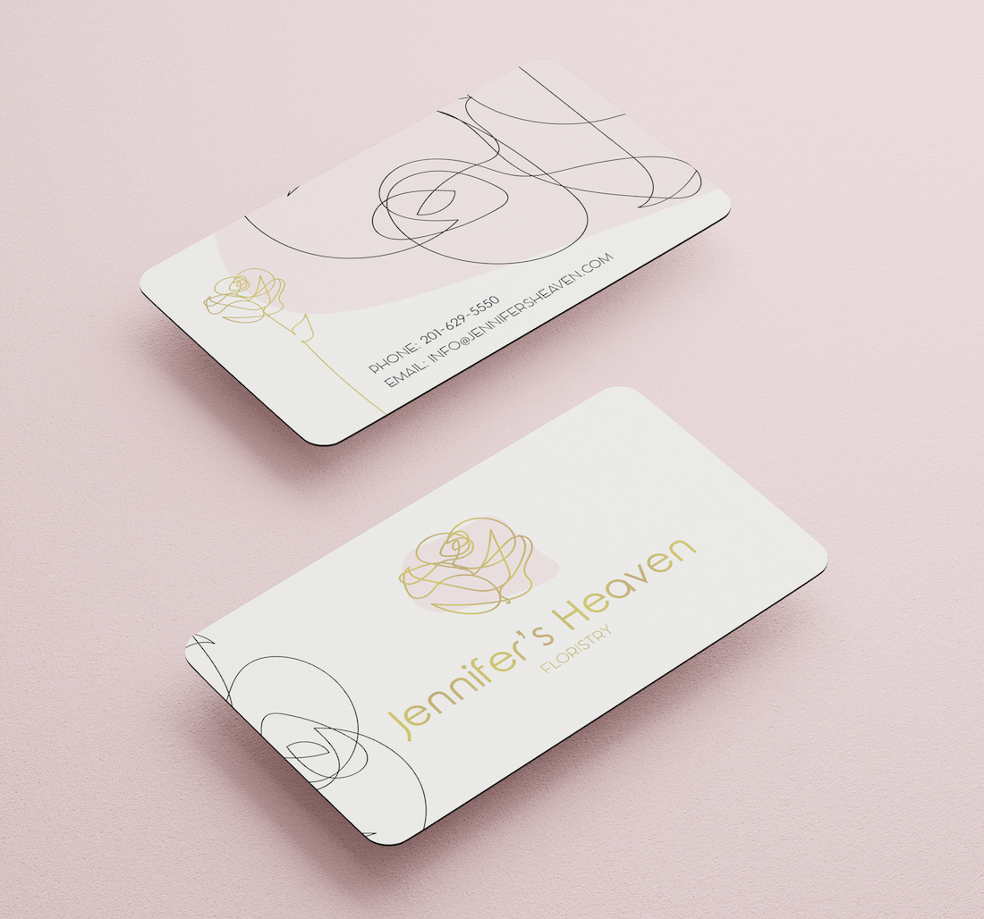
I couldn't even do this in my wildest dreams I love it!
3 months ago by Lehavah Nachalah - Reply
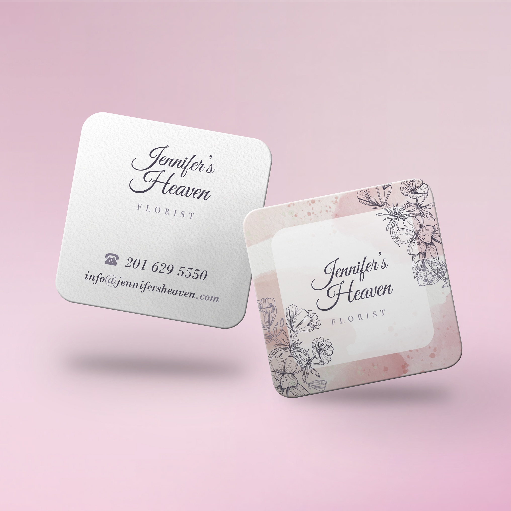
hard to read
3 months ago by Elad - Reply