Andrea
Posts
2
Likes
1
Liked Posts
2
Given Feedback
2
Feedback
Posts

Good start. You could be better off placing the text for DTB shipping around the ship icon. Doing this can help you understand the icon in the back clearer. My by placing "shipping solutions" in the waves under the ship and placing "DTB" about the ship you want have the word mark and the design clash so much- Happy Designing
1 week ago by Daryl - Reply
simple disign, nothing spesial
2 weeks ago by indraario - Reply
i like it
2 weeks ago by Winda Risna - Reply
Light colored and the main word more clear
1 week ago by Kibet duncan - Reply
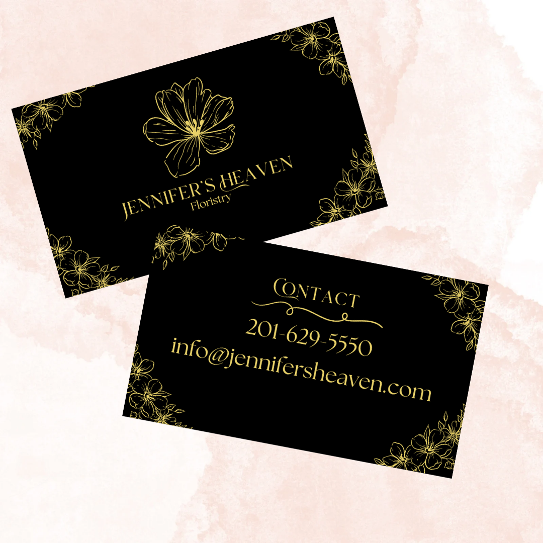
its dark, I think for a florist, the choice of bright colors should be
2 weeks ago by indraario - Reply
To be honest, we don't like the business card. It's just boring. The Message seems to be lost somewhere and we can't make anything out of it.
2 weeks ago by Pen and Pixels Graphics Incorported - Reply