Feedback
I love it!

3 years ago by Esther Aluya
Posts
magazine design
- Report
Esther Aluya • 3 years ago
Following my previous post, I decided to try out some more styles.
CruiseSpot Business Card
- Report
Esther Aluya • 3 years ago
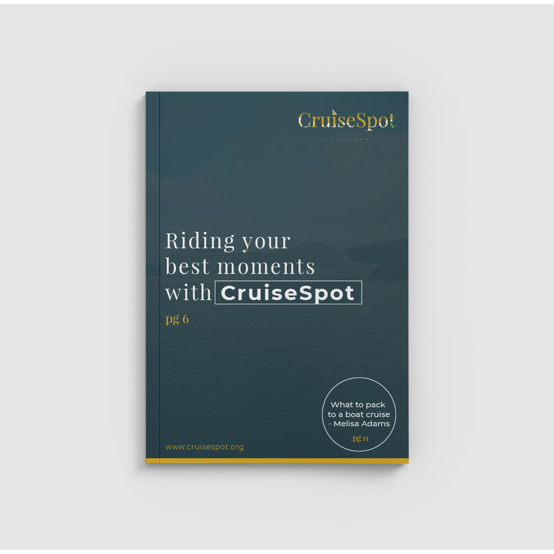
Business card made for CruiseSpot company. Colours were specifically chosen to represent Nature, the in-depth sea, and sand. The triangular looking dot to represent sailing and was specifically placed in the middle to represent the lovely experience a person would get when cruising the deep blue sea. I absolutely loved working on this!
I like fonts
6 months ago by dk - Reply
florist business card
- Report
Esther Aluya • 3 years ago
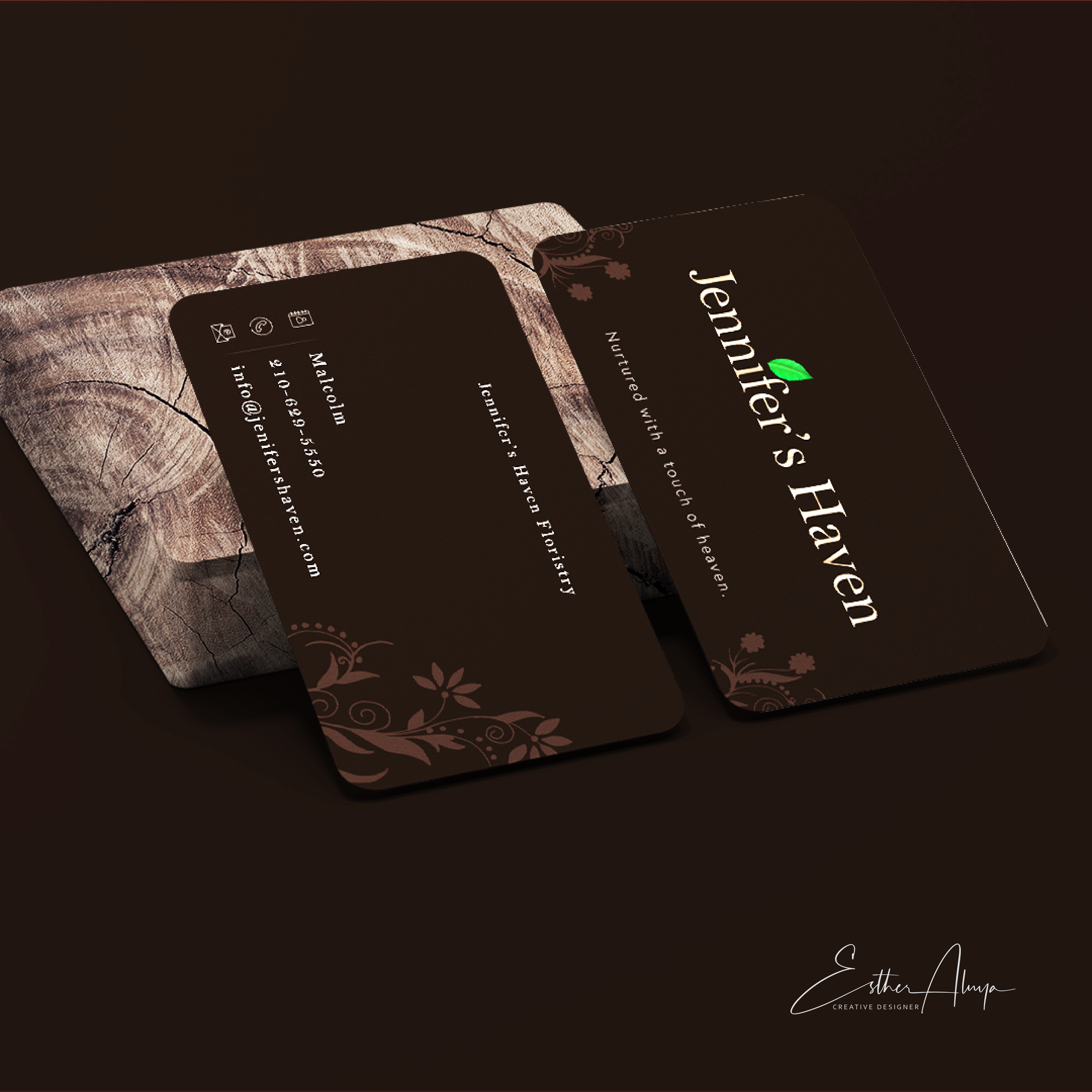
This is a business card made for a florist business with an added touch of style to make it look classy, modern and less colourful. I went for the background colour to represent soil and it also gives the unique classy feel. I decided to put the leaf on the name to show that Jennifer's Haven nurtures the plant. Added the full name behind the card to show it's a florist company and the tag line to add curiosity to see what's at the back of the card. The other colours on the card to have the earth and close to nature feel and made the card rounded edges as the client requested.
Jennifer's Heavengraphic
Amazing
1 year ago by Antara Anisha - Reply
I love the design and use of colour. Just that there isn't any cloud. Regardless, it's a superb graphic design
1 year ago by Victor - Reply
So so classy! Great job, Esther 🚀
3 years ago by Oluwadamilare Olusakin - Reply


