


Matthew Thomas Raffe
Posts
1
Likes
2
Liked Posts
0
Given Feedback
4
Feedback
great letter mark. Only thing i would do is capitalize the first letters
3 months ago by Matthew Thomas Raffe
Love the blue color. The layout is very good.
3 months ago by Matthew Thomas Raffe
I think there is to much negative space. Consider moving "Jennifers Heaven" across the top with "florist centered underneath. then the phone number and email across the bottom. This would move the negative space into the middle while still maintaining the rule of 3.

3 months ago by Matthew Thomas Raffe
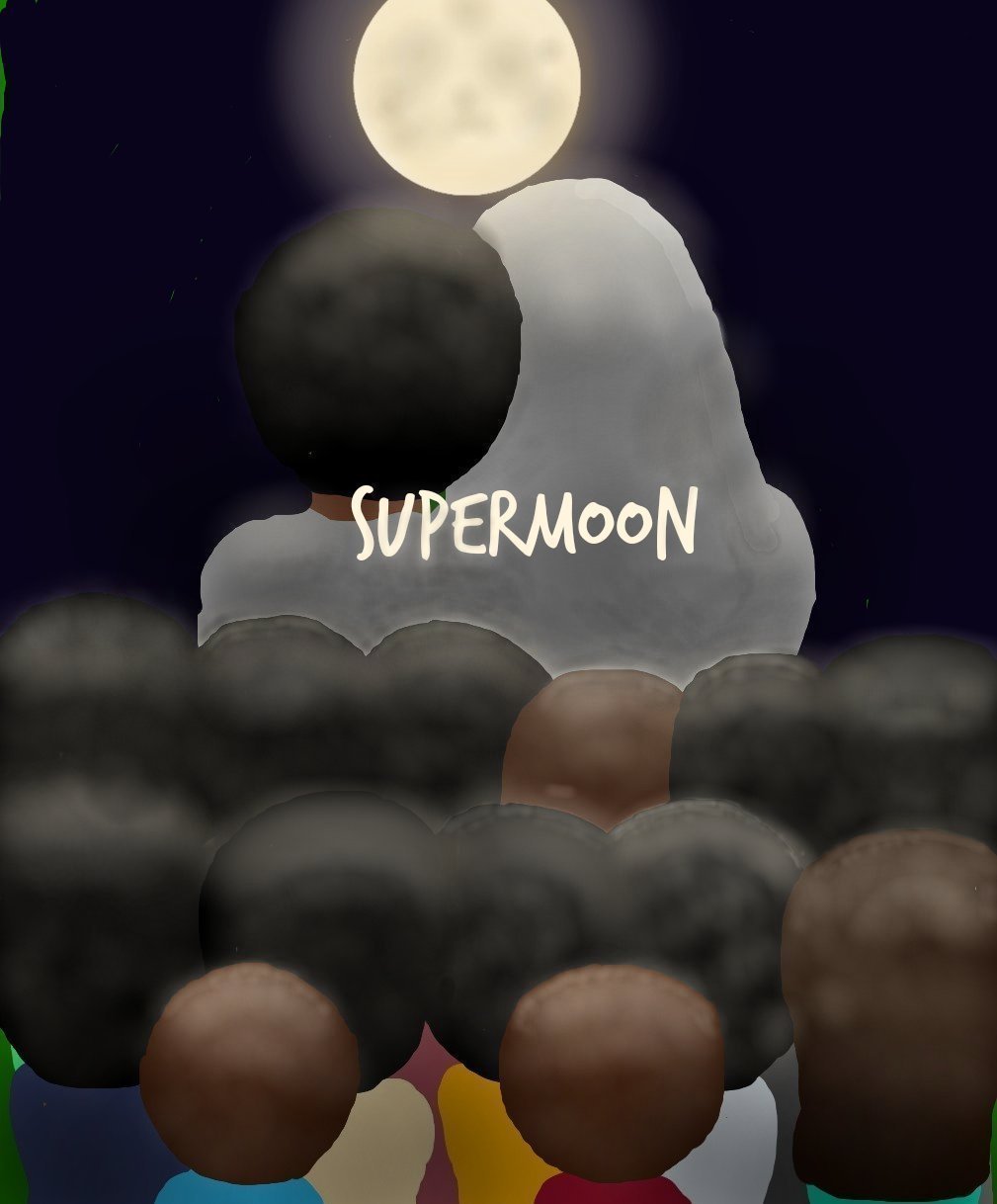
I would change the colors of the hair so there is more contrast between the heads.
3 months ago by Matthew Thomas Raffe
Posts
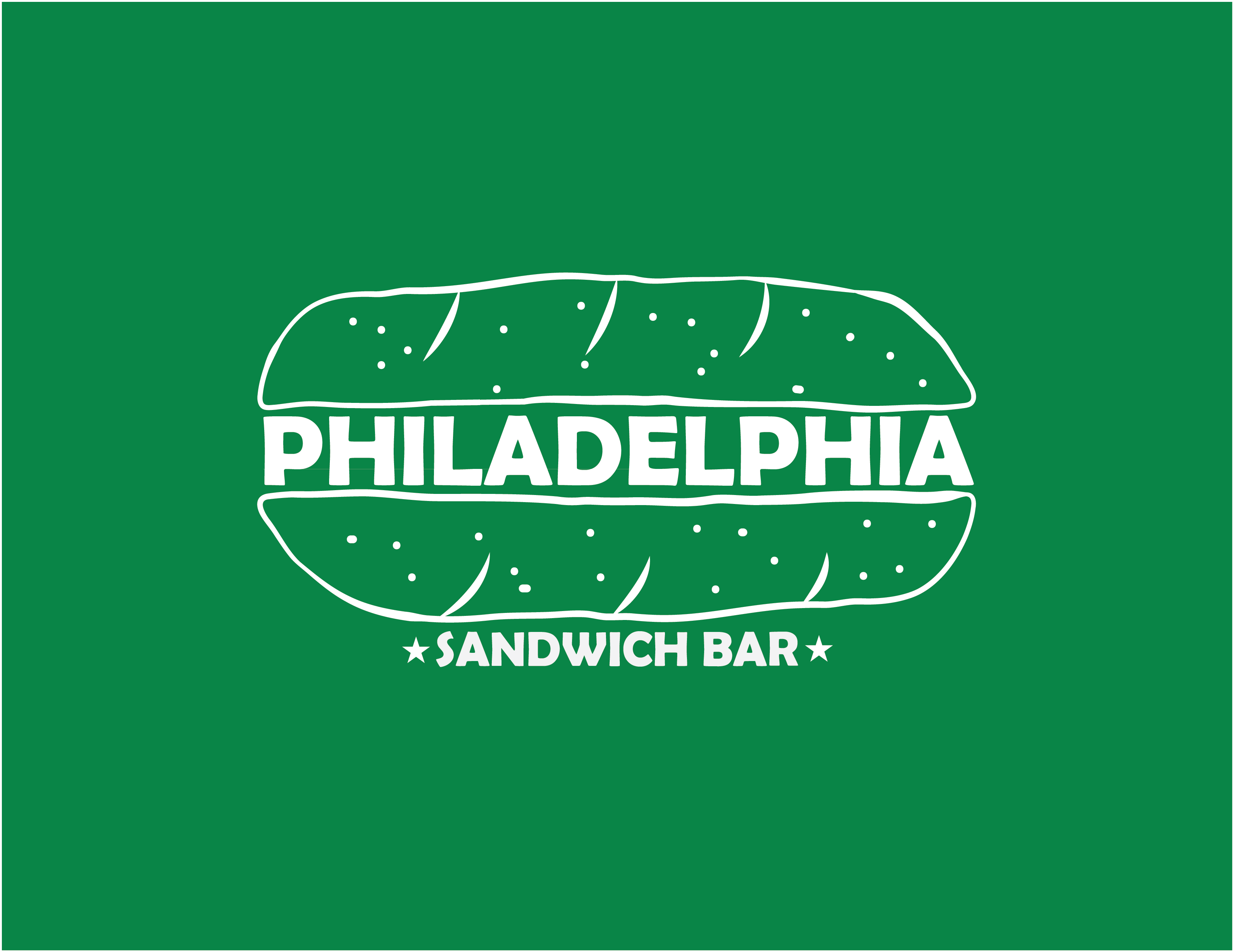
Philly sandwich bar
- Report
Matthew Thomas Raffe • 3 months ago
Hey,
I'm Joan, founder of Philadelphia Sandwich bar. I'm looking for someone that can make a good logo for my Sandwich bar. I think a combination mark will fit best with the business. Can you help me out?
I'm Joan, founder of Philadelphia Sandwich bar. I'm looking for someone that can make a good logo for my Sandwich bar. I think a combination mark will fit best with the business. Can you help me out?


Love this
3 months ago by Michele Breaux - Reply
Nice. It would have looked more attractive if the buns were brown.
3 months ago by Isha More - Reply
Nice logo. you might consider using a hand lettering font for the text to go along with the hand drawn style of the bun.
3 months ago by Bobbie Hall - Reply