


Jikku Thomas
Posts
2
Likes
2
Liked Posts
3
Given Feedback
6
Feedback
Hi Anna,
As Malcom needed its not so childish and colorful. Good work, keep going ahead.
3 months ago by Jikku Thomas
Hi Anna,
I dint mean to be rude, it was my first feedbacks and was checking how this really work. Let me re-frame my comments.
As Malcom needed its not so childish and colorful. Its great, How you placed the images and texts, which dint go overlapping. Just a small suggestion, to with a lil dark colors so will be better in printing these card. Great work, keep going ahead.
3 months ago by Jikku Thomas
Thanks for that feedback. Will keep the point in next go :)
3 months ago by Jikku Thomas
You can also, give me a feedback as well please :)
https://fakeclients.com/feedback?post=5138
https://fakeclients.com/feedback?post=5139
3 months ago by Jikku Thomas
Would be better with dark/bright color combination. This one may be not in a good quality when card is printed. Just a suggestion. But good work, keep going ahead.
3 months ago by Jikku Thomas
Amazing

3 months ago by Jikku Thomas
Posts

Jennifer's Heaven
- Report
Jikku Thomas • 3 months ago
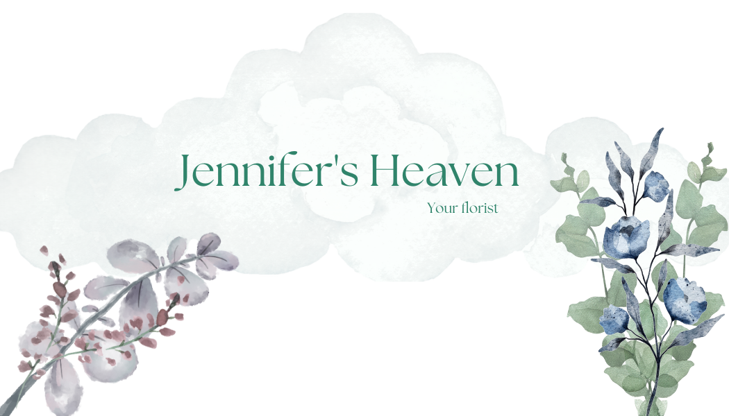
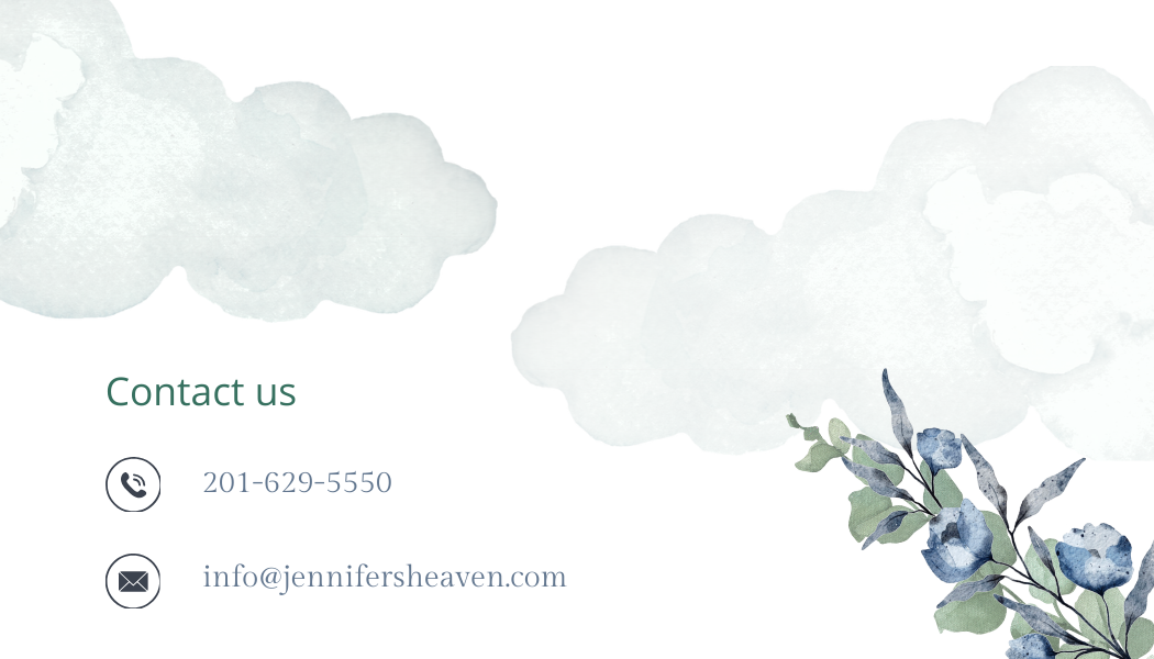
Jennifer's Heavengraphic
Jennifer's Heaven Back View


Nice. I like the colors. It's a lot different from the blues and grays that we're seeing in a lot of the submissions.
3 months ago by Bobbie Hall - Reply
It's beautiful! I love the color scheme, but I would make the background more transparent and possibly use a script or calligraphy font.
3 months ago by Jen - Reply
I think there is to much negative space. Consider moving "Jennifers Heaven" across the top with "florist centered underneath. then the phone number and email across the bottom. This would move the negative space into the middle while still maintaining the rule of 3.
3 months ago by Matthew Thomas Raffe - Reply
I couldn't even do this in my wildest dreams I love it!
3 months ago by Lehavah Nachalah - Reply
hard to read
3 months ago by Elad - Reply
Jennifer's Heaven
- Report
Jikku Thomas • 3 months ago
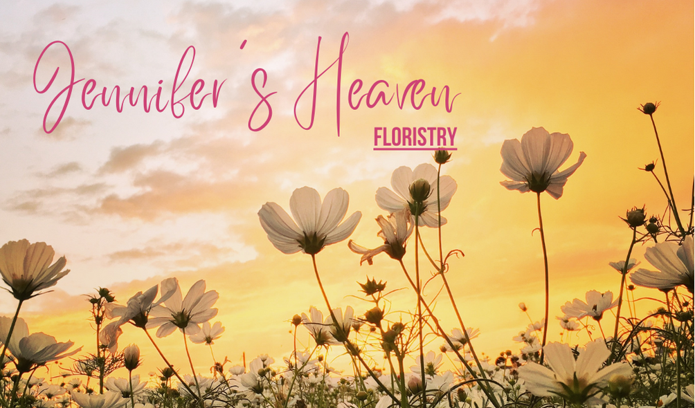
Jennifer's Heavengraphic
Jennifer's Heaven Front View

Well I can't read fancy writing but The artwork is amazing
3 months ago by Lehavah Nachalah - Reply
Love it, such a soft and soothing yellow color other then that it is just that florist is close to a flower but hard to move up the text or move down the flowers with out ruin them somehow
3 months ago by Anna - Reply
Thanks for that feedback. Will keep the point in next go :)
3 months ago by Jikku Thomas - Reply
No problem, ofc :) it is hard to give feedback without sounding rude.
3 months ago by Anna - Reply