


Anna
Posts
20
Likes
28
Liked Posts
17
Given Feedback
38
Feedback
I like it! Can´t find anything to give feedback on. Bobbie you are talented! May I ask where have you made it? I may have asked this on other project you done but that just shows you doing good :)
2 months ago by Anna
I like it! Is the prompt from here? Can´t find it.

2 months ago by Anna
Thank you for feedback :)
2 months ago by Anna
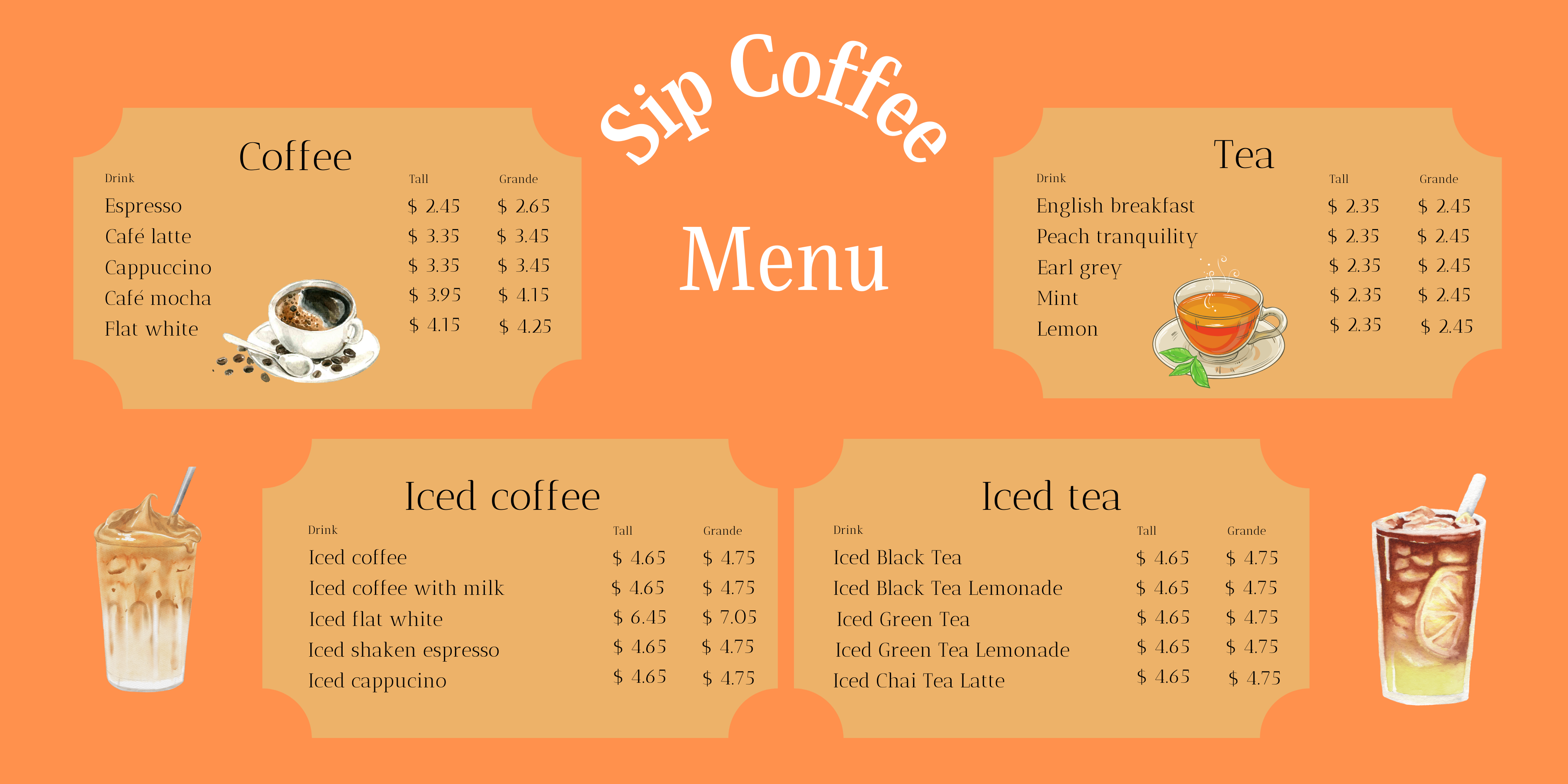
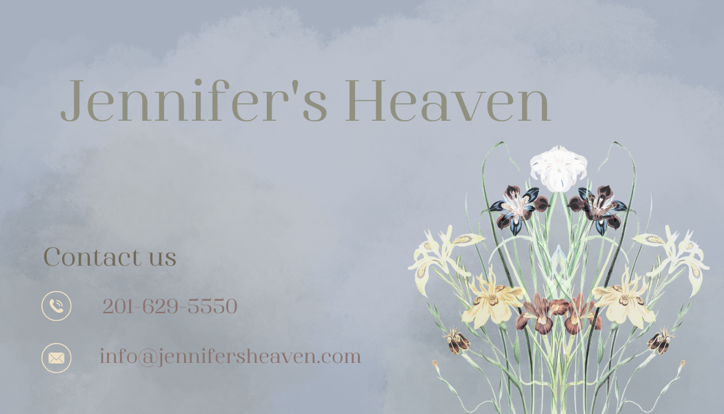
Thank you for the feedback, do you have an example of elements? :) This was really hard one to do,since he wants the monstrera leafes at the sides.
2 months ago by Anna
Oh I like this one especially the pancake plate! The thing that is abit off for me is the strawberries in the upper corner, maybe just have them infront of the plate so it looks like they have fallen off, perhaps :) and to not make it so empty move the text abit to right. Just suggestions you know.

2 months ago by Anna
Thank you, will try that out :)

2 months ago by Anna
Thank you I will try that :)
2 months ago by Anna
Thank you!
2 months ago by Anna
oh thank you so much!
2 months ago by Anna
Thank you :)
2 months ago by Anna
Thank you! I am gonna try that :)
2 months ago by Anna
Thank you, glad to hear!
3 months ago by Anna
Cool! Thank you for answer

3 months ago by Anna
what program do you do your creations in? You are good!
3 months ago by Anna
Thank you Bobbie 👌🏻
3 months ago by Anna
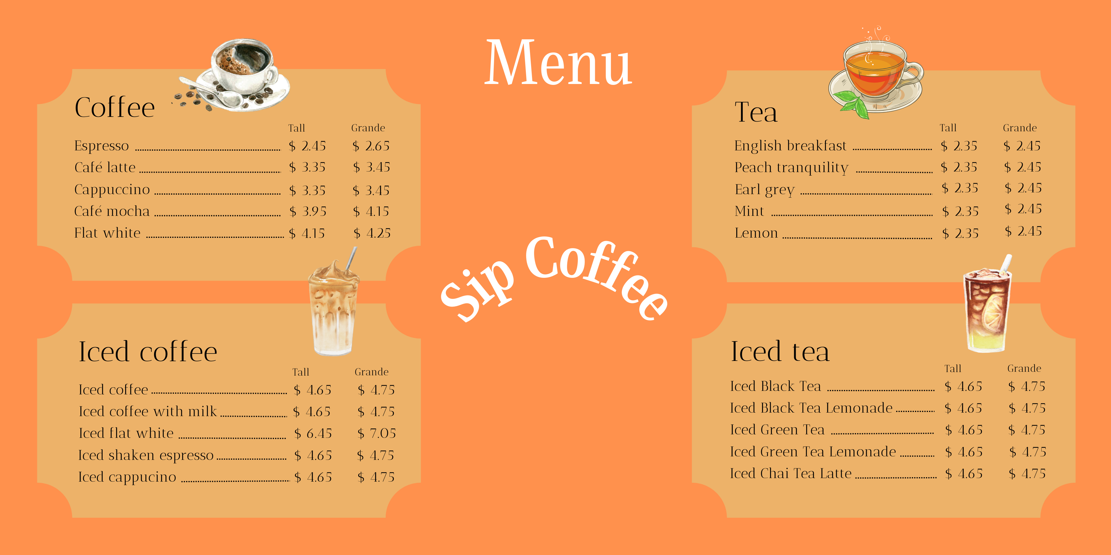
Thank you, it is good feedback had abit of a hard time with both my menues
3 months ago by Anna
Thank you!
3 months ago by Anna
Oh thank you so much

3 months ago by Anna
Okay, suggestion where?😊
3 months ago by Anna
Or maybe just clean up the confetti in the background abit?
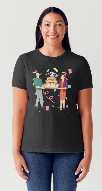
3 months ago by Anna
Correct me if I missunderstand. Take away the sparkles in the cake next to 2 becouse of confetti and the sparkles make it to much? If so I will try with out sparkles on cake 😊 thank you!
3 months ago by Anna
Thank you

3 months ago by Anna
Amazing! Sorta reminds of and indian tea shop or alice in wonderland
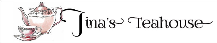
3 months ago by Anna
The only thing I miss is the target group and else it is perfect like a flyer and possible poster should look like!
3 months ago by Anna
Thank you so much!
3 months ago by Anna
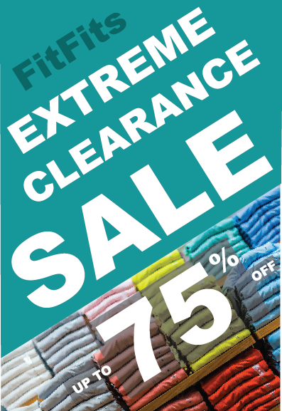
Love it! i got real hungry. What would happen if you move the with text "burger" abit so that it does not cover the letters behind? I love the combo with the text and it might be a personal opinion that its abit hard to read maniac.
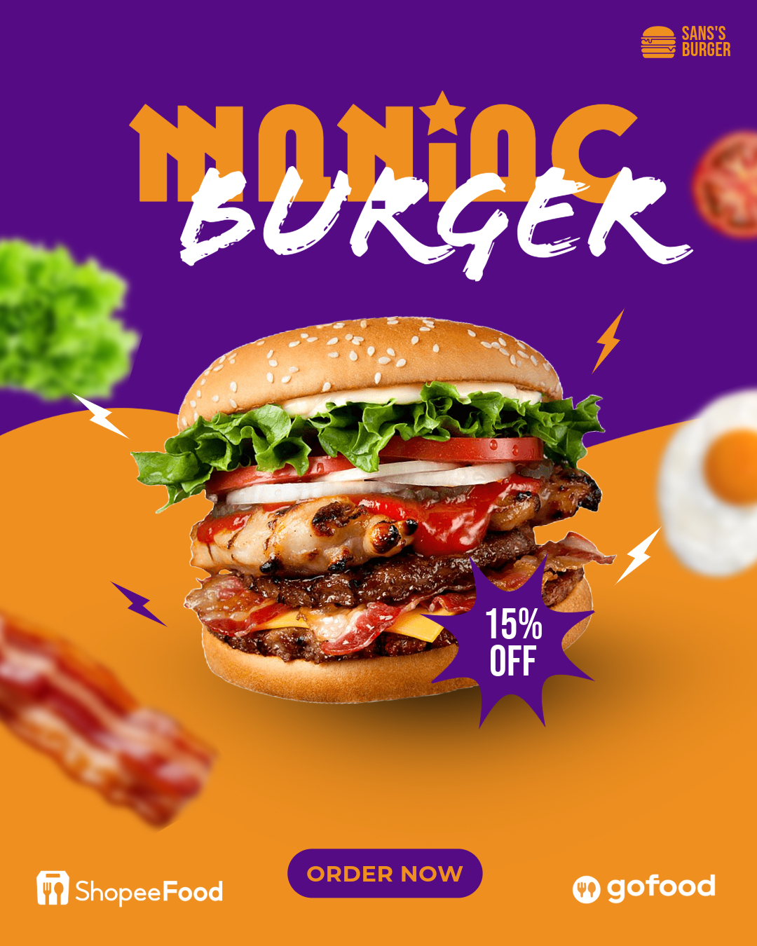
3 months ago by Anna
oh wow what a different it made :o Thank you so much!

3 months ago by Anna
Thank you!
3 months ago by Anna
You make me glad, thank you!
3 months ago by Anna
Okay, thank you, gonna try that to see how it looks. I was going for bold colors and bold text, like stand out :)

3 months ago by Anna
Thank you! Gonna look into it.
3 months ago by Anna
Thank you!
3 months ago by Anna
Thank you, it is okey, I understand it is not easy☺️
3 months ago by Anna
No problem, ofc :) it is hard to give feedback without sounding rude.
3 months ago by Anna
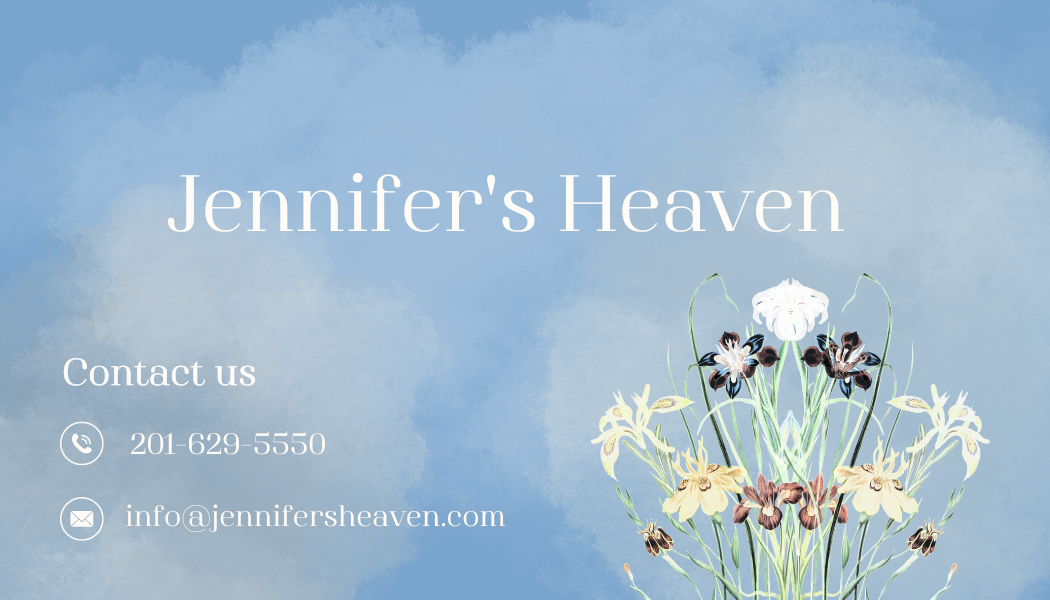
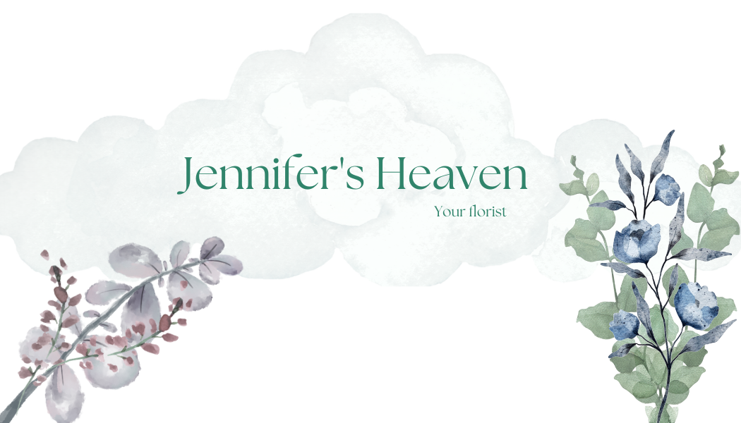
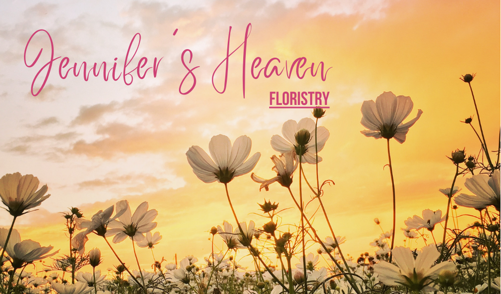
Love it, such a soft and soothing yellow color other then that it is just that florist is close to a flower but hard to move up the text or move down the flowers with out ruin them somehow
3 months ago by Anna
Thank you! 😊 Will take it with me.
3 months ago by Anna
As written on the backside, any recommendations?
3 months ago by Anna
Any recommendations?
3 months ago by Anna
Posts


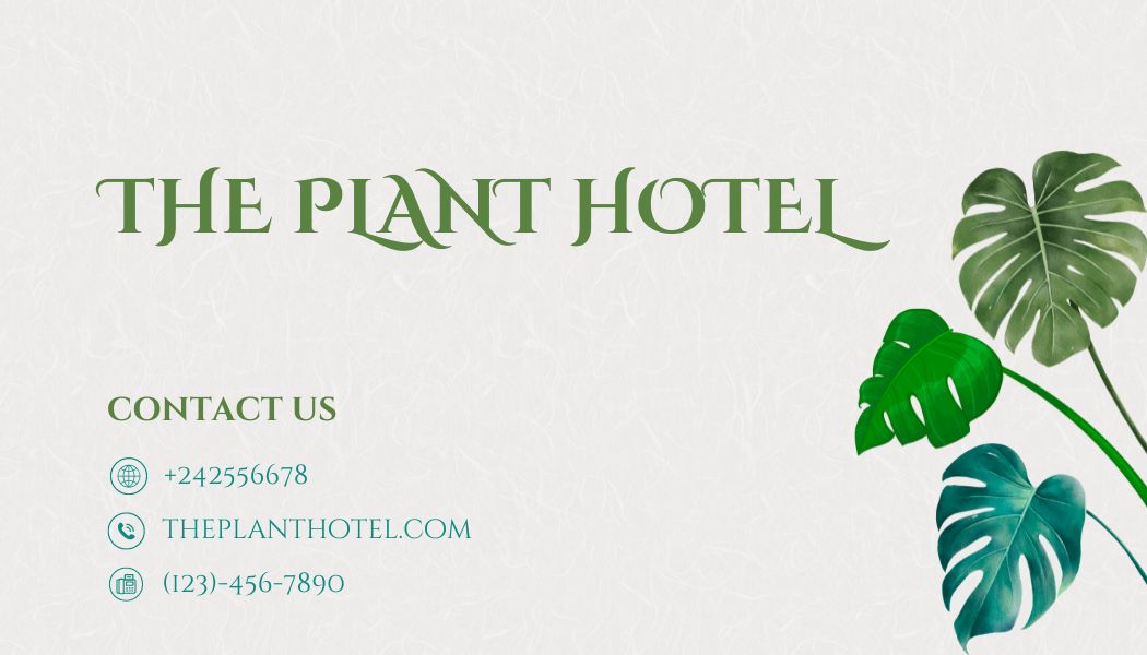
simple and elegant!!
2 months ago by Akshaya sri Arasada - Reply
it's nice, but maybe you could bolden the font for the contact info, kinda hard to see it
2 months ago by Sa-Rah - Reply
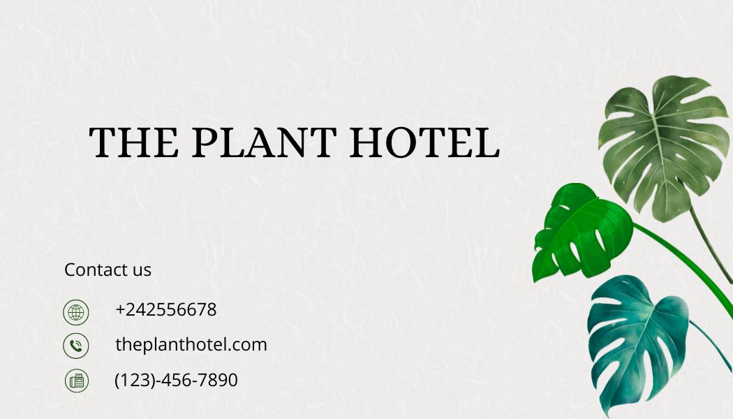
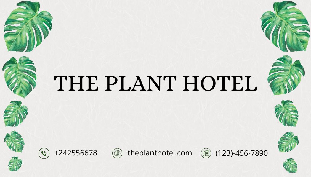
I like your typeface choices. They give the notion that the location maybe in an upscale, tropical environment. The text color choices resembles the plant colors... excellent choice. The light gray background pulls everything together towards the feeling of high-quality or high-value will be provided.
2 months ago by Jason A. Boone - Reply
its fine
2 months ago by keo - Reply
color combo is really nice
2 months ago by Zinia Alexis John - Reply
The color palette really shows the theme of the design. I just noticed that the borders of the top and button are not equal. On the other hand, adding elements adds a lot to this design.
2 months ago by Chloe Nicole - Reply
Thank you for the feedback, do you have an example of elements? :) This was really hard one to do,since he wants the monstrera leafes at the sides.
2 months ago by Anna - Reply
THE FONT AND PLANTS ARE GOOD. YOU SHOULD HAVE TO FILL SPACE.
2 months ago by Zainul Abdeen - Reply
Thank you for feedback :)
2 months ago by Anna - Reply

the first one was better
2 months ago by keo - Reply
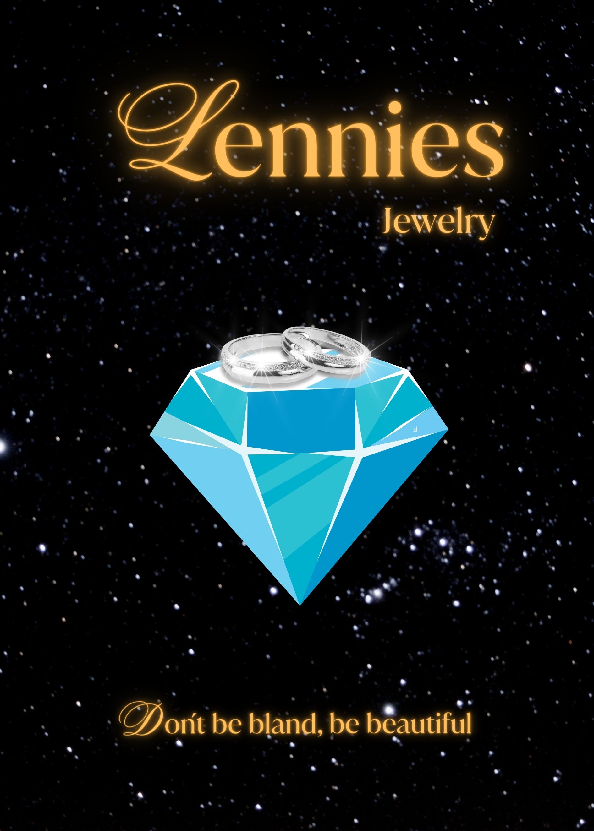
loved to work with ,
2 months ago by akanksha - Reply
Nice and to the point.
2 months ago by Bobbie Hall - Reply
It was great dessign but it can be more creative
2 months ago by VIRAJ RASAL - Reply

It looks childish
2 months ago by keo - Reply
Love how minimal it is, but it missed a mark somehow
2 months ago by saumya kushwaha - Reply
selection of the right font. But the center feels very empty. Maybe you can add ornamental objects such as shadows or the logo of the hotel as a complement.
2 months ago by Elsalben - Reply
Try experimenting with various font sizes.
2 months ago by VIRAJ RASAL - Reply

It is good, but starting should be initialized as it lacks the initial hook vibes.
2 months ago by VIRAJ RASAL - Reply
Cool
2 months ago by S - Reply
I love the graphic. One of those designs that looks a lot simpler than it probably was to design (one of the characteristics of an effective logo).
2 months ago by Bobbie Hall - Reply
Thank you :)
2 months ago by Anna - Reply
This is a very creative design. Maybe try using a real diamond and using colours that compliment the colour of the diamond in your lettering.
2 months ago by Euné Venter - Reply
Thank you! I am gonna try that :)
2 months ago by Anna - Reply

A jewelry brand needs to look more elegant
2 months ago by keo - Reply
looks cool, there is some problem with the heading alignment
2 months ago by saumya kushwaha - Reply
Nice solid design. I like the color of the lettering better than your other version. The rings on top of the stone stand out more also. Maybe combine the lettering and rings with the graphic of your other version.
2 months ago by Bobbie Hall - Reply
Thank you I will try that :)
2 months ago by Anna - Reply
I love the colours you used for the lettering!! Add a bit of spark to the diamond.
2 months ago by Euné Venter - Reply
Thank you, will try that out :)
2 months ago by Anna - Reply