leaflife is a logo for a vegen food company .
- Report
djedaini nassim adlane • 3 months ago
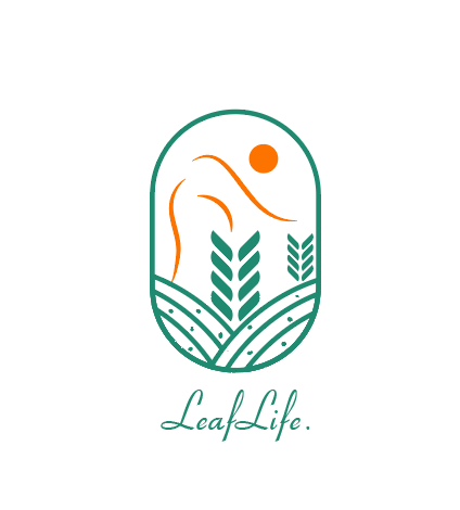


So cool, I suggest taking away the orange 3 lines, because they are too distracting and overcrowding. I also suggest taking the 2nd wheat illustration out of the smaller one it's unnecessary to have it because it is overcrowded. I recommend moving the orange circle to the centre and making it slightly bigger. It's important for white space also in the logo. The typeface would be better bigger and bolder and your vector to be smaller than the typeface. The typeface doesn't match the vector you designed. Well done keep going!! There is always room for improvement!
3 months ago by Sasha Stevens - Reply
Looks pretty realistic to me
3 months ago by Lehavah Nachalah - Reply
The orange streaks look like they could be placed differently
3 months ago by Ivy Gao - Reply