GAP
- Report
1 year ago by Abhinand
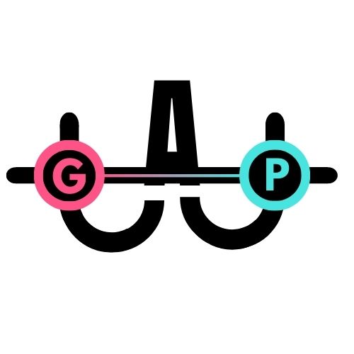
it is an abstract mark. I've tried making it creative and intrusive, the G and P are put in distance to show the "gap".
Hey!
I am Ivonne, I just founded a new business called Gap. I am looking for someone that can design a professional logo for my business. I would like the logo to be an abstract mark. Can you help me out?
I am Ivonne, I just founded a new business called Gap. I am looking for someone that can design a professional logo for my business. I would like the logo to be an abstract mark. Can you help me out?
 1 Like
 2
2
The way its made is unique , but the G and the P don't look original rest all the creativity and way you made it is amazing maybe try changing the G and P
10 months ago by WriterOftheNation - Reply
so good!
1 year ago by Abhinand - Reply


